Preliminary task
Andjela
Roganovic
Preliminary Task: using DTP and an image manipulation program, produce
the front page and the content page of a new school/college magazine,
featuring a photograph of a student in medium close-up plus some
appropriately laid-out text and a masthead. Additionally candidates must
produce a DTP mock-up of the layout of the contents page to demonstrate
their grasp of the program.
In order to successfully complete this initial assignment I will carry
out:
• Secondary & Primary Research
• Front Cover Rough Draft/Flat Plan
• Photoshoot
• Design Front Cover & Content Page
• Task & Product Evaluation
Secondary research is a research method that involves using already
existing data. Existing data is summarized and collated to increase the overall
effectiveness of the research.
The essential elements of a magazine cover
design:
Masthead
Issue and dateline
Main image
Lead article
Supporting cover lines
Bar code
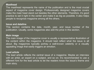
Masthead
The masthead represents the name of the publication and is the most crucial
aspect of magazine cover design. Professionally designed magazine covers
make the mast head stand out besides the other elements. Therefore, it’s good
practice to set it right in the center and make it as big as possible. It also helps
people to recognize magazine among all the others.
Issue and dateline
This section contains the date, month, year, and issue number of the
publication. Usually, some magazines also add the price in this section.
Main image
The main image of the magazine cover is usually a representative illustration of
the content within the magazine. It should best reflect what the issue is all
about. Big magazines typically portray a well-known celebrity or a visually
appealing image that easily triggers an emotion.
Lead article
The lead article reflects the central issue of a magazine. Maybe an interview
with an artist, an expert on a subject, and so on. It’s recommended to use a
different font for the lead article to let the readers know the issue’s theme and
main story.
Supporting cover lines
The supporting cover lines are topics that can revolve around the same theme
or simply be completely different subjects. When it comes to placing them on
the magazine’s cover, the key is balance. Cover lines are clear, short, and
concise. Usually they are done in a more subtle font and smaller size to avoid
distracting the reader from the main attractions.
Bar code
Mandatory but not design feature. Usually such elements are placed in the
corner area.
Magazine Design Rules:
• the magazine name is placed in the most obvious place
• the same cover template is used for all magazine issues
• The design is done with grids and layouts
• Must have focus point and everything else is built around it
• font styles must be unique and easily associated with magazine attributes
• powerful words must be emphasised
• magazine cover design must be infused with a healthy dose of color &
contrast
• a portrait is usually featured on the cover
• avoid busy backgrounds
Masthead
Cover lines Main cover line
Screamer
Upper third
border divider
Main image/Focal
point
Lower bar
Cover line
Selling line
Date
Price
Masthead
Date, price & issue
Page title Featured images
Address
Contact details
Page numbers
Topics
Cover line
Article quote
The contents page is very rigid and formal
in terms of overall design. The design and
layout is following main contents page
design codes and conventions. The layout
is well organized and the reader is able to
easily navigate and find desired
information. The color scheme and choice
of font reflects school logo but at the same
time these elements st6and out from the
background.
The featured article page number are
aligned on the left hand side and are
framed within the navy blue shape. This
makes page number stand out from the
background. Page numbers are placed
next to articles but I think that it is not so
easy and straight forward to connect the
page number with specific article.
The use of written and visual elements
again is very formal but its simplification
makes it easy to navigate and get the
information very quickly.
The school logo is placed in a top
right corner besides contents title.
This compositional placement creates
straight forward link between the
content and who is the content aimed
at.
The main headings are written in the
navy blue color in an arial bold font in
order to clearly suggest what is article
about. In addition the anchorage text
is used under the main titles in
smaller font to provide additional
information about each article
The overall contents page mise-en-
scene complies with magazine design
codes and conventions. The grid
structure and clear and simple
composition is easy to read and it
relates symbolically with the school
attributes and student life.
The language used directly provides key
information and is appropriate for the
desired audience. The summurised article
information is another important contents
page design technique, but on this
example use of written repetition for few
articles makes it rushed and not well
planned and thought trough.
Masthead: The typeface is composed out
of serif and sans-serif fonts. Both fonts
connotes professional and traditional feel
with relaxed and informal attitude. The
masthead is in white color in order to stand
out and to be noticeable. The choice of
color represents calmness and peace
which reflects school ethos.
The date, price, issue number as well as
school webpage is written in clear and
crisp font. Those information are placed
just below the masthead so that everything
is framed in one segment so that target
audience can access information easily.
The main cover lines are placed on the left
hand side of the magazine in order to
frame main image and are written in
contemporary font using capital letters to
draw attention. Sub heading is added to
provide additional information and main
cover lines are framed with faded block of
color to add additional focus to the reader.
The cover lines are short, snappy and
easy to read and understand in order for
desired audience to be attracted to read
the articles and find out additional
information about school and student life.
The main image is a medium shot of a
smiley relaxed school girl wearing a school
uniform in a informal manner. The choice
of model represents the school and
students in a professional and traditional
way but at the same time the models body
language and uniform connotes that the
school life is fun and enjoyable.
The color scheme used for fonts is
simple and plain and it stands out
from the main image but at the same
time the choice of colors compliments
the main image to. The use of vibrant
yellow color stands out and attracts
the audience from a distance.
The Plug is placed in a top right hand
corner so is easily noticeable but it
does not disrupts and dominants the
rest of the front cover design. This
advertising techniques is used
commonly by well established print
publications.
The focal cover line is specifically
aimed at potential target audience
and is relevant to their every day
school life. The main article is
informative and educational and
provides useful tips how to cope with
teenage stress. The use of hand
written font makes it informal and
personal so that target audience can
identify with it.
Overall this front cover mise-en-
scene reflects school and students in
a positive light with the professional
and serious attitude that is relaxed
and informal. The front cover follows
main design codes and conventions
and it is very appealing and visually
pleasing.
Primary market research is a unique study conducted to discover the wants
and needs of consumers who fit the description of target market. The process
involves approaching targeted source and asking questions about specific
product or service. This is done through different interviewing methods:
questionnaire, in-person, phone calls, focus groups, and online surveys.
According to my questionnaire most
people answering are age 16, and
they are identified as my main target
audience. Therefor my magazine
will focus on featuring topics and
issues that are closely related to that
specific group.
Majority of participants in this survey
are female and according to these
findings I will need to make sure that
my magazine attracts them in
regards to design as well as featured
articles.
As expected most participants are
not willing to purchase school
magazine, most probably because
they believe that school itself should
fund magazine publishing. I strongly
agree with this because magazine
would be beneficial to overall school
environment in a positive way.
With this question my aim was to
identify my target audience
disposable income and their
willingness to purchase school
magazine if I fail to secure regular
publishing fund from school.
As the results of this question show
most students would prefer for
magazine to be published every 2
weeks or every month. In order to
sustain quality and manage
workload, I will most defiantly publish
magazine every month.
Answers in this question further
reinforced my belief that students are
equally interested in written elements
and in a visual appeal. This finding
will definitely have input in my
magazine overall structure and
design.
This findings show me that most
students would be attracted to
a colorful layout. This is essential
design element and it shows as well
that my target audience is influenced
by eye noticing and eye catching
magazine design composition.
On my magazine front cover I will
feature image of a student that my
target audience can relate to and at
the same time admire.
As my product needs to relate to my target
audience and at the same time needs to
be appropriate for the institution and what
the school stands for, I language in my
magazine will have informal note but the
tone of it will be subtle underlining which is
not vulgar or offensive.
This publishing selling point is very
often used by well known and
established magazines. In order to
attract my target audience as well
as other age groups I will make sure
to include free gift and prizes in my
magazine. In order to avoid
additional costs these prizes will be
provided by potential sponsors.
Magazine specifications are based on initial preliminary task brief and my
secondary and primary research findings.
• Magazine will be published every month
• Overall magazine design must be visually attractive and noticeable
• Design features must be uniformed in order to create sense of branding
• Magazine masthead must be associated with the school
• Language must be appealing to potential target audience
• Image must feature student/students
• No more than 3 fonts to be used
• Color scheme must be complimentary and at the same time must relate to
institution that is publishing it
• Featured articles must consider female target audience but must not alienate
male audience
A flatplan is a magazine plan laid out in such a way that
designer can see all the pages. This can be done digitally,
or physically, with paper spread out across a table.
“Flatplan” refers to simply laying ideas out flat and
arranging them.
Masthead
Cover line
Cover line
Cover line
Issue & Date
Barcode
Pug
Main image
School magazine front cover & contents page flat plan
Masthead
Contents
title
Cover line
Cover line
Cover line
Cover line
Cover line
Cover line
Cover line
Cover line
Cover line
Cover line
Cover line
Cover line
Issue & Date
Cover line
image
Cover line
image
Cover line
image
Cover line
image
Cover line
image
Cover line
image
P.N0
P.N0
P.N0
P.N0
P.N0
P.N0
P.N0
P.N0
P.N0
P.N0
P.N0
P.N0
School
Logo
An occasion when a professional photographer takes
pictures of someone for use in a magazine.
Front cover Photoshoot
Contents Page & Photoshoot
CAD (computer-aided design) is the use of computer-
based software to aid in design processes. CAD software is
frequently used by different types of engineers and
designers.
School Magazine Masthead CAD
Final Masthead Design
School Magazine Front Cover CAD
School Magazine Contents Page CAD

Andjela preliminary task.pptx

  • 1.
  • 2.
    Preliminary Task: usingDTP and an image manipulation program, produce the front page and the content page of a new school/college magazine, featuring a photograph of a student in medium close-up plus some appropriately laid-out text and a masthead. Additionally candidates must produce a DTP mock-up of the layout of the contents page to demonstrate their grasp of the program. In order to successfully complete this initial assignment I will carry out: • Secondary & Primary Research • Front Cover Rough Draft/Flat Plan • Photoshoot • Design Front Cover & Content Page • Task & Product Evaluation
  • 3.
    Secondary research isa research method that involves using already existing data. Existing data is summarized and collated to increase the overall effectiveness of the research.
  • 4.
    The essential elementsof a magazine cover design: Masthead Issue and dateline Main image Lead article Supporting cover lines Bar code
  • 5.
    Masthead The masthead representsthe name of the publication and is the most crucial aspect of magazine cover design. Professionally designed magazine covers make the mast head stand out besides the other elements. Therefore, it’s good practice to set it right in the center and make it as big as possible. It also helps people to recognize magazine among all the others. Issue and dateline This section contains the date, month, year, and issue number of the publication. Usually, some magazines also add the price in this section. Main image The main image of the magazine cover is usually a representative illustration of the content within the magazine. It should best reflect what the issue is all about. Big magazines typically portray a well-known celebrity or a visually appealing image that easily triggers an emotion. Lead article The lead article reflects the central issue of a magazine. Maybe an interview with an artist, an expert on a subject, and so on. It’s recommended to use a different font for the lead article to let the readers know the issue’s theme and main story.
  • 6.
    Supporting cover lines Thesupporting cover lines are topics that can revolve around the same theme or simply be completely different subjects. When it comes to placing them on the magazine’s cover, the key is balance. Cover lines are clear, short, and concise. Usually they are done in a more subtle font and smaller size to avoid distracting the reader from the main attractions. Bar code Mandatory but not design feature. Usually such elements are placed in the corner area. Magazine Design Rules: • the magazine name is placed in the most obvious place • the same cover template is used for all magazine issues • The design is done with grids and layouts • Must have focus point and everything else is built around it • font styles must be unique and easily associated with magazine attributes • powerful words must be emphasised • magazine cover design must be infused with a healthy dose of color & contrast • a portrait is usually featured on the cover • avoid busy backgrounds
  • 7.
    Masthead Cover lines Maincover line Screamer Upper third border divider Main image/Focal point Lower bar Cover line Selling line Date Price
  • 8.
    Masthead Date, price &issue Page title Featured images Address Contact details Page numbers Topics Cover line Article quote
  • 9.
    The contents pageis very rigid and formal in terms of overall design. The design and layout is following main contents page design codes and conventions. The layout is well organized and the reader is able to easily navigate and find desired information. The color scheme and choice of font reflects school logo but at the same time these elements st6and out from the background. The featured article page number are aligned on the left hand side and are framed within the navy blue shape. This makes page number stand out from the background. Page numbers are placed next to articles but I think that it is not so easy and straight forward to connect the page number with specific article. The use of written and visual elements again is very formal but its simplification makes it easy to navigate and get the information very quickly. The school logo is placed in a top right corner besides contents title. This compositional placement creates straight forward link between the content and who is the content aimed at. The main headings are written in the navy blue color in an arial bold font in order to clearly suggest what is article about. In addition the anchorage text is used under the main titles in smaller font to provide additional information about each article The overall contents page mise-en- scene complies with magazine design codes and conventions. The grid structure and clear and simple composition is easy to read and it relates symbolically with the school attributes and student life. The language used directly provides key information and is appropriate for the desired audience. The summurised article information is another important contents page design technique, but on this example use of written repetition for few articles makes it rushed and not well planned and thought trough.
  • 10.
    Masthead: The typefaceis composed out of serif and sans-serif fonts. Both fonts connotes professional and traditional feel with relaxed and informal attitude. The masthead is in white color in order to stand out and to be noticeable. The choice of color represents calmness and peace which reflects school ethos. The date, price, issue number as well as school webpage is written in clear and crisp font. Those information are placed just below the masthead so that everything is framed in one segment so that target audience can access information easily. The main cover lines are placed on the left hand side of the magazine in order to frame main image and are written in contemporary font using capital letters to draw attention. Sub heading is added to provide additional information and main cover lines are framed with faded block of color to add additional focus to the reader. The cover lines are short, snappy and easy to read and understand in order for desired audience to be attracted to read the articles and find out additional information about school and student life. The main image is a medium shot of a smiley relaxed school girl wearing a school uniform in a informal manner. The choice of model represents the school and students in a professional and traditional way but at the same time the models body language and uniform connotes that the school life is fun and enjoyable. The color scheme used for fonts is simple and plain and it stands out from the main image but at the same time the choice of colors compliments the main image to. The use of vibrant yellow color stands out and attracts the audience from a distance. The Plug is placed in a top right hand corner so is easily noticeable but it does not disrupts and dominants the rest of the front cover design. This advertising techniques is used commonly by well established print publications. The focal cover line is specifically aimed at potential target audience and is relevant to their every day school life. The main article is informative and educational and provides useful tips how to cope with teenage stress. The use of hand written font makes it informal and personal so that target audience can identify with it. Overall this front cover mise-en- scene reflects school and students in a positive light with the professional and serious attitude that is relaxed and informal. The front cover follows main design codes and conventions and it is very appealing and visually pleasing.
  • 11.
    Primary market researchis a unique study conducted to discover the wants and needs of consumers who fit the description of target market. The process involves approaching targeted source and asking questions about specific product or service. This is done through different interviewing methods: questionnaire, in-person, phone calls, focus groups, and online surveys.
  • 13.
    According to myquestionnaire most people answering are age 16, and they are identified as my main target audience. Therefor my magazine will focus on featuring topics and issues that are closely related to that specific group. Majority of participants in this survey are female and according to these findings I will need to make sure that my magazine attracts them in regards to design as well as featured articles.
  • 14.
    As expected mostparticipants are not willing to purchase school magazine, most probably because they believe that school itself should fund magazine publishing. I strongly agree with this because magazine would be beneficial to overall school environment in a positive way. With this question my aim was to identify my target audience disposable income and their willingness to purchase school magazine if I fail to secure regular publishing fund from school.
  • 15.
    As the resultsof this question show most students would prefer for magazine to be published every 2 weeks or every month. In order to sustain quality and manage workload, I will most defiantly publish magazine every month. Answers in this question further reinforced my belief that students are equally interested in written elements and in a visual appeal. This finding will definitely have input in my magazine overall structure and design.
  • 16.
    This findings showme that most students would be attracted to a colorful layout. This is essential design element and it shows as well that my target audience is influenced by eye noticing and eye catching magazine design composition. On my magazine front cover I will feature image of a student that my target audience can relate to and at the same time admire.
  • 17.
    As my productneeds to relate to my target audience and at the same time needs to be appropriate for the institution and what the school stands for, I language in my magazine will have informal note but the tone of it will be subtle underlining which is not vulgar or offensive. This publishing selling point is very often used by well known and established magazines. In order to attract my target audience as well as other age groups I will make sure to include free gift and prizes in my magazine. In order to avoid additional costs these prizes will be provided by potential sponsors.
  • 18.
    Magazine specifications arebased on initial preliminary task brief and my secondary and primary research findings. • Magazine will be published every month • Overall magazine design must be visually attractive and noticeable • Design features must be uniformed in order to create sense of branding • Magazine masthead must be associated with the school • Language must be appealing to potential target audience • Image must feature student/students • No more than 3 fonts to be used • Color scheme must be complimentary and at the same time must relate to institution that is publishing it • Featured articles must consider female target audience but must not alienate male audience
  • 19.
    A flatplan isa magazine plan laid out in such a way that designer can see all the pages. This can be done digitally, or physically, with paper spread out across a table. “Flatplan” refers to simply laying ideas out flat and arranging them.
  • 20.
    Masthead Cover line Cover line Coverline Issue & Date Barcode Pug Main image School magazine front cover & contents page flat plan Masthead Contents title Cover line Cover line Cover line Cover line Cover line Cover line Cover line Cover line Cover line Cover line Cover line Cover line Issue & Date Cover line image Cover line image Cover line image Cover line image Cover line image Cover line image P.N0 P.N0 P.N0 P.N0 P.N0 P.N0 P.N0 P.N0 P.N0 P.N0 P.N0 P.N0 School Logo
  • 21.
    An occasion whena professional photographer takes pictures of someone for use in a magazine.
  • 22.
  • 23.
    Contents Page &Photoshoot
  • 24.
    Contents Page &Photoshoot
  • 25.
    Contents Page &Photoshoot
  • 26.
    Contents Page &Photoshoot
  • 27.
    CAD (computer-aided design)is the use of computer- based software to aid in design processes. CAD software is frequently used by different types of engineers and designers.
  • 28.
    School Magazine MastheadCAD Final Masthead Design
  • 29.
  • 30.