The document analyzes and compares the design elements of three different sixth form college magazines:
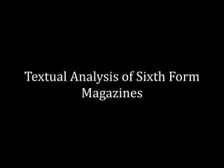
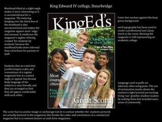
1) King Edward IV college magazine uses an unconventionally tilted masthead and hanging lettering to seem more informal for a student-created magazine. Photos are at a canted angle to appear less formal as well.
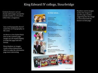
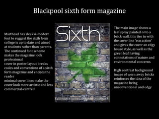
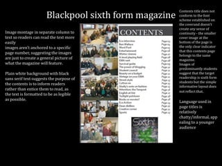
2) Blackpool sixth form magazine has a sleek modern masthead suggesting it keeps up with students. The cover is in a poster layout to entice readers. Images on the contents page are not anchored to specific pages.
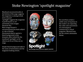
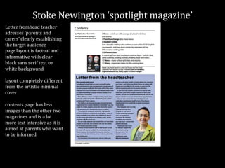
3) Stoke Newington 'spotlight' magazine unusually places the masthead at the bottom, suggesting an arts focus. The cover features illuminated objects on a black background