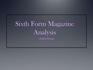
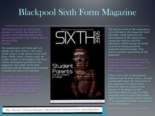
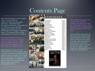
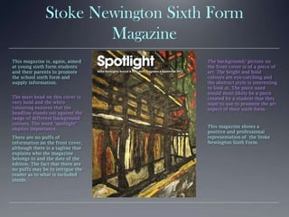
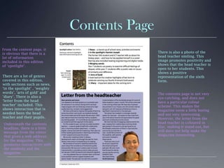
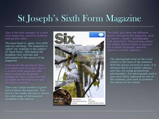
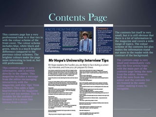
Sixth Form Magazine
Analysis
Shelby Biscoe
Blackpool Sixth Form Magazine
This Magazine has an educational
purpose, to inform the students of
certain events and information that
may be important to the student and/or
parents of the
student.
The masthead is very bold and very
simple, but also creative. The word
‘Sixth’ relates to the matter of the sixth
form, whilst ‘sense’ creates a play on
words, or pun. It also implies that there
will be information provided in the
magazine. The colour of the font
contrasts with the background ensuring
it stands out and is eye-catching.
The tagline of the magazine is kept
simple, but is important. The first
part explains what the magazine is
and which school it belongs to. The
second part of the tagline acts like a
little slogan that students will
recognize.
There is not a lot of information
displayed on the front cover, , but has
a small puff about the main focus of
the magazine/ it’s main article.
However, there is a panel at the
bottom of the magazine that
advertises different aspects of the
magazine used to attract the reader.
Again this emphasizes certain focuses
of the magazine without revealing too
much information.
The picture used on the magazine is
very relevant to the magazine itself.
The baby could represent the
development of the mind from a
young age which is aided by
education, whilst having the detail
created in writing promotes
academia and knowledge. This
shows a positive promotion of the
magazine.
From the information given on the
front cover, it is easy to see that the
magazine is aimed at young
students in the sixth form and/or
their parents.
Contents Page
This contents page is very simple.
There is a clear list of
topics/articles and their page
reference, with little other
description. However, from this list
it is obvious to see that the
magazine contains a lot of
information on a range of different
topics. This means there will be
something for everyone to look at.
The topics included focus on
educational topics in a fun way,
such as entertainment, cinema,
‘survival guide’, beauty, style,
books, art and academia. This
will relate to a wider audience.
Although there is not a lot of
information on the front page, there
is a large selection of photos of the
school, used to promote the school
and it’s students. The photos were
most likely taken by students as
they do not have a professional
look to them, promoting
photography talent.
The contents page does not
seem to have a colour
scheme, and uses very dull
grey and white colours. This
does not look so professional
and informative as the front
page.
This contents page does not
have the same professional
representation as the front
cover, however fits in well
with the sixth form theme. I
also think it is relevant
because the topics covered
are not too serious and
important, although they do
seem to be educational.
Stoke Newington Sixth Form
Magazine
This magazine is, again, aimed
at young sixth form students
and their parents to promote
the school sixth form and
supply information.
The mast head on this cover is
very bold and the white
colouring ensures that the
headline stands out against the
range of different background
colours. The word ‘spotlight’
implies importance.
There are no puffs of
information on the front cover,
although there is a tagline that
explains who the magazine
belongs to and the date of the
edition. The fact that there are
no puffs may be to intrigue the
reader as to what is included
inside.
The background/ picture on
the front cover is of a piece of
art. The bright and bold
colours are eye-catching and
the abstract style is interesting
to look at. The piece used
would most likely be a piece
created by a student that they
want to use to promote the art
aspect of their sixth form.
This magazine shows a
positive and professional
representation of the Stoke
Newington Sixth Form.
Contents Page
From the content page, it
is obvious that there is a
lot of information
included in this edition
of ‘spotlight’.
There are a lot of genres
covered in this edition,
with sections such as news,
‘in the spotlight’ , ‘weighty
words’, ‘arts of gold’ and
‘diary’. There is also a
‘letter from the head
teacher’ included. This
shows interaction that is
needed been the head
teacher and their pupils.
The contents page is not very
eye-catching, and does not
have a particular colour
scheme. This makes the
magazine seem a little boring
and not very interesting.
However, the letter from the
head teacher is coloured in
lilac, making it stand out, but
still does not help make the
magazine interesting.
Underneath the contents
headline, there is a little
message from the editor
that gives a web address
for the magazine. This
promotes interactivity with
the students and the
magazine.
There is also a photo of the
head teacher smiling. This
image promotes positivity and
shows that the head teacher is
open to her students. This
shows a positive
representation of the sixth
form.
St Joseph’s Sixth Form Magazine
This is the final example of a sixth
form magazine, aimed at students
and parents alike.
The mast head is, again, very bold
and eye catching. The magazine is
called ‘six’ relating to the subject
of ‘Sixth form’. This makes the
headline very relevant and
informative of the nature of the
magazine.
Underneath the masthead, there
is a tagline that describes that it
is a sixth form magazine, and
which school the magazine
belongs to. There is also the date
included on the front cover and
the edition number.
There are a large number of puffs
dotted about the magazine. This
entices the reader because it shows
the wide range of information
included in the edition.
The puffs also show the different
genres covered in the magazine, such
as ‘sports’, ‘music’, ‘photography’
and ‘university’. This will also entice
the reader, because there is interest
for a variety of people, and will
appeal to a wider audience.
The photograph used on the cover
relates to the time of the audition.
With the leaves covered in snow, it is
obvious that it is a winter edition,
and they are using promotional
photography. The photograph used is
also most likely captured by one of
the students, and used to promote
the talents of the school.
Contents Page
This contents page has a very
professional look to it that ties in
with the colour scheme of the
front cover. The colour scheme
includes blue, white black and
green, which is a much brighter
difference compared to the
previous colour schemes. The
brighter colours make the page
more interesting to look at, but
still professional.
This contents page is very
informative, and is written
directly to the reader. This
magazine includes a message
from the editor encouraging
interactivity with the
magazine, and also ‘tips’ from
teachers. This adds a light
hearted tone to the magazine
so it is not too serious. This is
suitable for the audience
because it is a stress free
release from a-levels.
The contents list itself is very
small, but it is still obvious that
there is a lot of information in
the magazine and covers a wide
range of topics. The colour
scheme of the contents list also
makes the information stand
out more to the reader with the
contrast of the background.
The contents page is very
small and immediately cuts
into the first article/topic,
with the main part of the
contents page being the note
from the editor. However,
both the note from the
editor and the contents list
are framed in the same
colour, making it easy to
recognise.

Sixth form magazine analysis

  • 1.
  • 2.
    Blackpool Sixth FormMagazine This Magazine has an educational purpose, to inform the students of certain events and information that may be important to the student and/or parents of the student. The masthead is very bold and very simple, but also creative. The word ‘Sixth’ relates to the matter of the sixth form, whilst ‘sense’ creates a play on words, or pun. It also implies that there will be information provided in the magazine. The colour of the font contrasts with the background ensuring it stands out and is eye-catching. The tagline of the magazine is kept simple, but is important. The first part explains what the magazine is and which school it belongs to. The second part of the tagline acts like a little slogan that students will recognize. There is not a lot of information displayed on the front cover, , but has a small puff about the main focus of the magazine/ it’s main article. However, there is a panel at the bottom of the magazine that advertises different aspects of the magazine used to attract the reader. Again this emphasizes certain focuses of the magazine without revealing too much information. The picture used on the magazine is very relevant to the magazine itself. The baby could represent the development of the mind from a young age which is aided by education, whilst having the detail created in writing promotes academia and knowledge. This shows a positive promotion of the magazine. From the information given on the front cover, it is easy to see that the magazine is aimed at young students in the sixth form and/or their parents.
  • 3.
    Contents Page This contentspage is very simple. There is a clear list of topics/articles and their page reference, with little other description. However, from this list it is obvious to see that the magazine contains a lot of information on a range of different topics. This means there will be something for everyone to look at. The topics included focus on educational topics in a fun way, such as entertainment, cinema, ‘survival guide’, beauty, style, books, art and academia. This will relate to a wider audience. Although there is not a lot of information on the front page, there is a large selection of photos of the school, used to promote the school and it’s students. The photos were most likely taken by students as they do not have a professional look to them, promoting photography talent. The contents page does not seem to have a colour scheme, and uses very dull grey and white colours. This does not look so professional and informative as the front page. This contents page does not have the same professional representation as the front cover, however fits in well with the sixth form theme. I also think it is relevant because the topics covered are not too serious and important, although they do seem to be educational.
  • 4.
    Stoke Newington SixthForm Magazine This magazine is, again, aimed at young sixth form students and their parents to promote the school sixth form and supply information. The mast head on this cover is very bold and the white colouring ensures that the headline stands out against the range of different background colours. The word ‘spotlight’ implies importance. There are no puffs of information on the front cover, although there is a tagline that explains who the magazine belongs to and the date of the edition. The fact that there are no puffs may be to intrigue the reader as to what is included inside. The background/ picture on the front cover is of a piece of art. The bright and bold colours are eye-catching and the abstract style is interesting to look at. The piece used would most likely be a piece created by a student that they want to use to promote the art aspect of their sixth form. This magazine shows a positive and professional representation of the Stoke Newington Sixth Form.
  • 5.
    Contents Page From thecontent page, it is obvious that there is a lot of information included in this edition of ‘spotlight’. There are a lot of genres covered in this edition, with sections such as news, ‘in the spotlight’ , ‘weighty words’, ‘arts of gold’ and ‘diary’. There is also a ‘letter from the head teacher’ included. This shows interaction that is needed been the head teacher and their pupils. The contents page is not very eye-catching, and does not have a particular colour scheme. This makes the magazine seem a little boring and not very interesting. However, the letter from the head teacher is coloured in lilac, making it stand out, but still does not help make the magazine interesting. Underneath the contents headline, there is a little message from the editor that gives a web address for the magazine. This promotes interactivity with the students and the magazine. There is also a photo of the head teacher smiling. This image promotes positivity and shows that the head teacher is open to her students. This shows a positive representation of the sixth form.
  • 6.
    St Joseph’s SixthForm Magazine This is the final example of a sixth form magazine, aimed at students and parents alike. The mast head is, again, very bold and eye catching. The magazine is called ‘six’ relating to the subject of ‘Sixth form’. This makes the headline very relevant and informative of the nature of the magazine. Underneath the masthead, there is a tagline that describes that it is a sixth form magazine, and which school the magazine belongs to. There is also the date included on the front cover and the edition number. There are a large number of puffs dotted about the magazine. This entices the reader because it shows the wide range of information included in the edition. The puffs also show the different genres covered in the magazine, such as ‘sports’, ‘music’, ‘photography’ and ‘university’. This will also entice the reader, because there is interest for a variety of people, and will appeal to a wider audience. The photograph used on the cover relates to the time of the audition. With the leaves covered in snow, it is obvious that it is a winter edition, and they are using promotional photography. The photograph used is also most likely captured by one of the students, and used to promote the talents of the school.
  • 7.
    Contents Page This contentspage has a very professional look to it that ties in with the colour scheme of the front cover. The colour scheme includes blue, white black and green, which is a much brighter difference compared to the previous colour schemes. The brighter colours make the page more interesting to look at, but still professional. This contents page is very informative, and is written directly to the reader. This magazine includes a message from the editor encouraging interactivity with the magazine, and also ‘tips’ from teachers. This adds a light hearted tone to the magazine so it is not too serious. This is suitable for the audience because it is a stress free release from a-levels. The contents list itself is very small, but it is still obvious that there is a lot of information in the magazine and covers a wide range of topics. The colour scheme of the contents list also makes the information stand out more to the reader with the contrast of the background. The contents page is very small and immediately cuts into the first article/topic, with the main part of the contents page being the note from the editor. However, both the note from the editor and the contents list are framed in the same colour, making it easy to recognise.