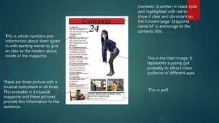
Contents’ is written in black bold
and highlighted with red to
show it clear and dominant on
the Content page. Magazine
name’24’ is anchorage to the
contents title.
This is the main image. It
represents a young girl
probably to attract more
audience of different ages.
This is article numbers and
information about them typed
in with exciting words to give
an idea to the readers about
inside of the magazine.
These are three picture with a
musical instrument in all three.
This probably is a musical
magazine and these pictures
provide this information to the
audience.
This is puff.
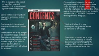
Contents is anchorage to the name of
magazine ‘EMPIRE’. It is written in white
and is enlarged to create a demanding
effect. To emphasize the demanding effect
against the dark background red stroke is
added to the ‘ CONTENTS’ This gives a
thrilling effect to the page.
The content numbers are in large
font in white, headings in red and
descriptions are anchorage to the
headings. This content page looks
very informative and attractive,
This is magazine title placed
on top of an enlarged
CONTENTS. It is black in bold
against white background.
Date is written in a very stylish
way and is anchorage to the
‘CONTENTS’.
This is margin in white which
does not square whole content
page.
There are not too many images
on this content page. Instead it
has only one dominating image
that forms background of the
content page. It has various
colour palettes, black is
dominating. It is very attracting
for audience
This is article line. It is very
thrilling and intrigues the reader
so he wants to pry inside.
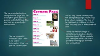
This is a very simple content page
with a simple heading Content page.
It is a school magazine. The font of
the heading is in bold and bright in
color. Shocking pink is a very cheerful
color.
There are different image os
school ground, students, books,
direction board. All are precisely
and neatly placed on one side to
give the content page a decent
and serious look.
The page number is given
along with the’ page’ and the
description given below is
precise and in light blue. Blue
and pink are a good color
combination.
The background is
white and clear. There
is no further
information. It is a very
precise content page.

Content ramsha zz

  • 1.
    Contents’ is writtenin black bold and highlighted with red to show it clear and dominant on the Content page. Magazine name’24’ is anchorage to the contents title. This is the main image. It represents a young girl probably to attract more audience of different ages. This is article numbers and information about them typed in with exciting words to give an idea to the readers about inside of the magazine. These are three picture with a musical instrument in all three. This probably is a musical magazine and these pictures provide this information to the audience. This is puff.
  • 2.
    Contents is anchorageto the name of magazine ‘EMPIRE’. It is written in white and is enlarged to create a demanding effect. To emphasize the demanding effect against the dark background red stroke is added to the ‘ CONTENTS’ This gives a thrilling effect to the page. The content numbers are in large font in white, headings in red and descriptions are anchorage to the headings. This content page looks very informative and attractive, This is magazine title placed on top of an enlarged CONTENTS. It is black in bold against white background. Date is written in a very stylish way and is anchorage to the ‘CONTENTS’. This is margin in white which does not square whole content page. There are not too many images on this content page. Instead it has only one dominating image that forms background of the content page. It has various colour palettes, black is dominating. It is very attracting for audience This is article line. It is very thrilling and intrigues the reader so he wants to pry inside.
  • 3.
    This is avery simple content page with a simple heading Content page. It is a school magazine. The font of the heading is in bold and bright in color. Shocking pink is a very cheerful color. There are different image os school ground, students, books, direction board. All are precisely and neatly placed on one side to give the content page a decent and serious look. The page number is given along with the’ page’ and the description given below is precise and in light blue. Blue and pink are a good color combination. The background is white and clear. There is no further information. It is a very precise content page.