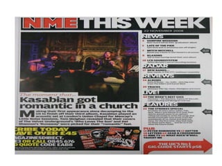
Contents page analysis
By Nishat Aziz.
• This is a contents page from ‘NME’ magazine.
Pictures in the main image is British band
‘Kasabian’. The picture is of Kasabian
performing live in a church. Because they are
performing and it is dark the picture is fairly
unclear as to exactly what is happening. The
picture is taken in the crowd of this concert.
We know this from how the bottom third is
the heads of people in crowd watching the
concert. By doing this, it makes the reader feel
more involved in what is going on.
The title of the contents page is displayed at the
top of the page. In the title the text for ‘NME’ is
red with a white trim, this is the magazine logo.
This helps create a brand identity for NME. The
rest of the title which reads ‘This week’ is
displayed in white, bold text with a black, square
outlining which is re-used on the rest of the
page.
The small article below the main image is very
much something that is not usually used on
other contents pages. It is a short paragraph
describing what is happening in the picture. To
start the article there is a large capital letter for
the ‘M’ which is much larger than the rest of the
text. The whole article is displayed in a plain,
black font.
The colour pallet which is used on this contents
page consists of three main colours, red, white
and black. The black text stands out against the
white background as does the red text.
In the bottom left hand corner, they have included a
promotional deal which informs people to
subscribe to NME. They would advertise it because
although it may initially cost them, in the long run
they will make up for the money as more people
subscribe. In the text they have included details of
how to subscribe, such as a phone number and
website. The text is displayed in yellow while the
key words of how you sign up are highlighted in
white making it stand out more.

Contents page analysis 1

  • 1.
  • 3.
    • This isa contents page from ‘NME’ magazine. Pictures in the main image is British band ‘Kasabian’. The picture is of Kasabian performing live in a church. Because they are performing and it is dark the picture is fairly unclear as to exactly what is happening. The picture is taken in the crowd of this concert. We know this from how the bottom third is the heads of people in crowd watching the concert. By doing this, it makes the reader feel more involved in what is going on.
  • 4.
    The title ofthe contents page is displayed at the top of the page. In the title the text for ‘NME’ is red with a white trim, this is the magazine logo. This helps create a brand identity for NME. The rest of the title which reads ‘This week’ is displayed in white, bold text with a black, square outlining which is re-used on the rest of the page.
  • 5.
    The small articlebelow the main image is very much something that is not usually used on other contents pages. It is a short paragraph describing what is happening in the picture. To start the article there is a large capital letter for the ‘M’ which is much larger than the rest of the text. The whole article is displayed in a plain, black font.
  • 6.
    The colour palletwhich is used on this contents page consists of three main colours, red, white and black. The black text stands out against the white background as does the red text.
  • 7.
    In the bottomleft hand corner, they have included a promotional deal which informs people to subscribe to NME. They would advertise it because although it may initially cost them, in the long run they will make up for the money as more people subscribe. In the text they have included details of how to subscribe, such as a phone number and website. The text is displayed in yellow while the key words of how you sign up are highlighted in white making it stand out more.