SlideShare a Scribd company logo
1 of 5
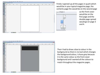
Firstly I opened up all the pages in quark which
would be in your typical magazine page, the
contents page the would be on the second page
                             as the front cover
                             would be on the
                             first page and the
                             double page spread
                             would go on page 3
                             and 4.


Then I had to draw a box to colour in the
background as there is no tool which changes
the background colour, I chose grey because
it is the same colour as the front cover
background and I wanted all the colours to
match throughout the magazine pages.
When choosing the title font and colour I
did it the same as the front cover title, I had
it on a black box background which makes it
stand out more and also I added a drop
shadow to make the title more dramatic
and stand out.


 I split my contents page into three
 columns as I thought that it looked better
 than just having it split into two. I added
 subtitles at the top of each column which
 had boxes behind them to again make
 them stand out and they match the
 ongoing colour scheme.
The numbers for all of the pages in the
magazine are all down the side of the
columns and they are bigger than the text. I
like that the numbers stand out on the page
as that’s the reason you have a contents page
to find out the page numbers.


For the pictures on the page I put a red box
behind them to give them a background and
an outline as I thought it looked better than
just having the images there with nothing
around them.
The pictures that I used are relevant to the
stories inside and I thought that they worked
well with the colour scheme in the magazine.
The page numbers overlap the images that
are related to each other so that you can see
which picture links with which page and story.


 The text for each story are in bold with a
 smaller text under it with a simple
 sentence to sum up what the article is
 about. I put thin black lines in between
 each one as I thought it made it look better
 as it was a bit plain without them.
My finished contents
                                                                      page includes an
                                                                      editors note which I
                                                                      wrote about how I took
                                                                      the time to think of
                                                                      how to create the
                                                                      magazine and what
                                                                      inspired me and why I
                                                                      chose to do things the
                                                                      way I did. The contents
                                                                      page is very similar to
                                                                      the front cover with
                                                                      the colours and fonts. I
                                                                      like the images that I
used on the page as I think they look good and I think that the one at the top of the page
that takes over two columns looks good because it matches the colour scheme. The boxes
behind the images and titles make them stand out and look better and it makes the page
look like there is a lot going on which I think makes it better.

More Related Content

What's hot

What's hot (17)

Double page spread plans
Double page spread plansDouble page spread plans
Double page spread plans
 
Dps construction
Dps constructionDps construction
Dps construction
 
Final magazine review
Final magazine reviewFinal magazine review
Final magazine review
 
Contents construction
Contents constructionContents construction
Contents construction
 
Cover construction
Cover constructionCover construction
Cover construction
 
Screen Shots
Screen ShotsScreen Shots
Screen Shots
 
Front Cover Progress 2
Front Cover Progress 2Front Cover Progress 2
Front Cover Progress 2
 
Layout designs
Layout designsLayout designs
Layout designs
 
Final%20 magazine%20–%20double%20page%20spread[2]
Final%20 magazine%20–%20double%20page%20spread[2]Final%20 magazine%20–%20double%20page%20spread[2]
Final%20 magazine%20–%20double%20page%20spread[2]
 
contents page
contents pagecontents page
contents page
 
Question 7
Question 7Question 7
Question 7
 
Task 7
Task 7Task 7
Task 7
 
Preliminary Task: Content Page Evaluation
Preliminary Task: Content Page EvaluationPreliminary Task: Content Page Evaluation
Preliminary Task: Content Page Evaluation
 
Contents
ContentsContents
Contents
 
3. production experiments 2
3. production experiments 23. production experiments 2
3. production experiments 2
 
College magazine evaluation
College magazine evaluationCollege magazine evaluation
College magazine evaluation
 
Flat plan evaluation
Flat plan evaluationFlat plan evaluation
Flat plan evaluation
 

Viewers also liked

Letter to the council
Letter to the councilLetter to the council
Letter to the councilalextate7985
 
Las Redes Sociales
Las Redes SocialesLas Redes Sociales
Las Redes SocialesKomo Lo Zupo
 
Presentación sin título
Presentación sin títuloPresentación sin título
Presentación sin títuloCatalina7a
 
raffles drapping demo front
raffles drapping demo frontraffles drapping demo front
raffles drapping demo frontDeborah Salvador
 
The lodge logo powerpoint
The lodge logo powerpointThe lodge logo powerpoint
The lodge logo powerpointforrestsmyth
 
Final scene story 1
Final scene story 1Final scene story 1
Final scene story 1etwinlego
 
How to effectively integrate guest/visiting lecturers into HEI provision.
How to effectively integrate guest/visiting lecturers into HEI provision.How to effectively integrate guest/visiting lecturers into HEI provision.
How to effectively integrate guest/visiting lecturers into HEI provision.Simon Haslett
 
绘本《一片叶子落下来》
绘本《一片叶子落下来》绘本《一片叶子落下来》
绘本《一片叶子落下来》政宏 陈
 
Ci 350 westward expansion unit plan
Ci 350 westward expansion unit planCi 350 westward expansion unit plan
Ci 350 westward expansion unit planburdette94
 
Critical thinking blanco (3)
Critical thinking blanco (3)Critical thinking blanco (3)
Critical thinking blanco (3)burdette94
 
CR-update-2014
CR-update-2014CR-update-2014
CR-update-2014Meg Moss
 

Viewers also liked (16)

Letter to the council
Letter to the councilLetter to the council
Letter to the council
 
Las Redes Sociales
Las Redes SocialesLas Redes Sociales
Las Redes Sociales
 
Trabajo de jumilla y vicente medinas
Trabajo de jumilla y vicente medinasTrabajo de jumilla y vicente medinas
Trabajo de jumilla y vicente medinas
 
Presentación sin título
Presentación sin títuloPresentación sin título
Presentación sin título
 
raffles drapping demo front
raffles drapping demo frontraffles drapping demo front
raffles drapping demo front
 
HUAWEI E9000
HUAWEI E9000HUAWEI E9000
HUAWEI E9000
 
The lodge logo powerpoint
The lodge logo powerpointThe lodge logo powerpoint
The lodge logo powerpoint
 
Style place
Style placeStyle place
Style place
 
1 fuentes
1 fuentes1 fuentes
1 fuentes
 
6
66
6
 
Final scene story 1
Final scene story 1Final scene story 1
Final scene story 1
 
How to effectively integrate guest/visiting lecturers into HEI provision.
How to effectively integrate guest/visiting lecturers into HEI provision.How to effectively integrate guest/visiting lecturers into HEI provision.
How to effectively integrate guest/visiting lecturers into HEI provision.
 
绘本《一片叶子落下来》
绘本《一片叶子落下来》绘本《一片叶子落下来》
绘本《一片叶子落下来》
 
Ci 350 westward expansion unit plan
Ci 350 westward expansion unit planCi 350 westward expansion unit plan
Ci 350 westward expansion unit plan
 
Critical thinking blanco (3)
Critical thinking blanco (3)Critical thinking blanco (3)
Critical thinking blanco (3)
 
CR-update-2014
CR-update-2014CR-update-2014
CR-update-2014
 

Similar to Contents page screen shots

Analysis of my music magazine
Analysis of my music magazineAnalysis of my music magazine
Analysis of my music magazine07palmerdan
 
6. production reflection
6. production reflection6. production reflection
6. production reflectionrachel haw
 
Magazine Drafts
Magazine DraftsMagazine Drafts
Magazine Draftsliv1308
 
Evaluation for contents and front cover page
Evaluation for contents and front cover pageEvaluation for contents and front cover page
Evaluation for contents and front cover pagePariswood
 
Development diary
Development diaryDevelopment diary
Development diaryloisbeare
 
Development diary
Development diaryDevelopment diary
Development diaryloisbeare
 
Screen shots for contents
Screen shots for contentsScreen shots for contents
Screen shots for contentscharrrlll
 
Making of my contents
Making of my contentsMaking of my contents
Making of my contentsMitchElsey
 
Double page spread
Double page spreadDouble page spread
Double page spreadKatieMould27
 
Magazine Print Scenes
Magazine Print ScenesMagazine Print Scenes
Magazine Print ScenesChloe Main
 
Task 10 evaluation
Task 10   evaluationTask 10   evaluation
Task 10 evaluationolibrandon
 
Making of my contents
Making of my contentsMaking of my contents
Making of my contentsMitchElsey
 
Making of my contents
Making of my contentsMaking of my contents
Making of my contentsMitchElsey
 

Similar to Contents page screen shots (20)

Task 4
Task 4Task 4
Task 4
 
Analysis of my music magazine
Analysis of my music magazineAnalysis of my music magazine
Analysis of my music magazine
 
6. production reflection
6. production reflection6. production reflection
6. production reflection
 
Magazine Drafts
Magazine DraftsMagazine Drafts
Magazine Drafts
 
Evaluation for contents and front cover page
Evaluation for contents and front cover pageEvaluation for contents and front cover page
Evaluation for contents and front cover page
 
Development diary
Development diaryDevelopment diary
Development diary
 
Development diary
Development diaryDevelopment diary
Development diary
 
Task 4
Task 4Task 4
Task 4
 
The soup presentation
The soup presentationThe soup presentation
The soup presentation
 
The soup presentation
The soup presentationThe soup presentation
The soup presentation
 
The soup presentation
The soup presentationThe soup presentation
The soup presentation
 
Screen shots for contents
Screen shots for contentsScreen shots for contents
Screen shots for contents
 
Making of my contents
Making of my contentsMaking of my contents
Making of my contents
 
Double page spread
Double page spreadDouble page spread
Double page spread
 
Magazine Print Scenes
Magazine Print ScenesMagazine Print Scenes
Magazine Print Scenes
 
Contents page
Contents pageContents page
Contents page
 
Task 10 evaluation
Task 10   evaluationTask 10   evaluation
Task 10 evaluation
 
Development diary
Development diaryDevelopment diary
Development diary
 
Making of my contents
Making of my contentsMaking of my contents
Making of my contents
 
Making of my contents
Making of my contentsMaking of my contents
Making of my contents
 

More from bethwhitehead95 (20)

Codes and conventions of newspaper advertisements
Codes and conventions of newspaper advertisementsCodes and conventions of newspaper advertisements
Codes and conventions of newspaper advertisements
 
Evaluation question 4
Evaluation question 4Evaluation question 4
Evaluation question 4
 
Evaluation question 2
Evaluation question  2Evaluation question  2
Evaluation question 2
 
Evaluation question 3
Evaluation question 3Evaluation question 3
Evaluation question 3
 
Evaluation question 1
Evaluation question 1Evaluation question 1
Evaluation question 1
 
Types of documentaries
Types of documentariesTypes of documentaries
Types of documentaries
 
Presentation1
Presentation1Presentation1
Presentation1
 
Codes and conventions of radio trailers
Codes and conventions of radio trailersCodes and conventions of radio trailers
Codes and conventions of radio trailers
 
Bbc move to manc research
Bbc move to manc researchBbc move to manc research
Bbc move to manc research
 
Proposal
ProposalProposal
Proposal
 
Proposal
ProposalProposal
Proposal
 
Doc analysis 6
Doc analysis 6Doc analysis 6
Doc analysis 6
 
Doc analysis 5
Doc analysis 5Doc analysis 5
Doc analysis 5
 
Doc analysis 4
Doc analysis 4Doc analysis 4
Doc analysis 4
 
Doc analysis 3
Doc analysis 3Doc analysis 3
Doc analysis 3
 
Doc analysis 2
Doc analysis 2Doc analysis 2
Doc analysis 2
 
Doc analysis 2
Doc analysis 2Doc analysis 2
Doc analysis 2
 
Doc analysis 1
Doc analysis 1Doc analysis 1
Doc analysis 1
 
Tv scheduling
Tv schedulingTv scheduling
Tv scheduling
 
conventions of a documentary
conventions of a documentaryconventions of a documentary
conventions of a documentary
 

Contents page screen shots

  • 1. Firstly I opened up all the pages in quark which would be in your typical magazine page, the contents page the would be on the second page as the front cover would be on the first page and the double page spread would go on page 3 and 4. Then I had to draw a box to colour in the background as there is no tool which changes the background colour, I chose grey because it is the same colour as the front cover background and I wanted all the colours to match throughout the magazine pages.
  • 2. When choosing the title font and colour I did it the same as the front cover title, I had it on a black box background which makes it stand out more and also I added a drop shadow to make the title more dramatic and stand out. I split my contents page into three columns as I thought that it looked better than just having it split into two. I added subtitles at the top of each column which had boxes behind them to again make them stand out and they match the ongoing colour scheme.
  • 3. The numbers for all of the pages in the magazine are all down the side of the columns and they are bigger than the text. I like that the numbers stand out on the page as that’s the reason you have a contents page to find out the page numbers. For the pictures on the page I put a red box behind them to give them a background and an outline as I thought it looked better than just having the images there with nothing around them.
  • 4. The pictures that I used are relevant to the stories inside and I thought that they worked well with the colour scheme in the magazine. The page numbers overlap the images that are related to each other so that you can see which picture links with which page and story. The text for each story are in bold with a smaller text under it with a simple sentence to sum up what the article is about. I put thin black lines in between each one as I thought it made it look better as it was a bit plain without them.
  • 5. My finished contents page includes an editors note which I wrote about how I took the time to think of how to create the magazine and what inspired me and why I chose to do things the way I did. The contents page is very similar to the front cover with the colours and fonts. I like the images that I used on the page as I think they look good and I think that the one at the top of the page that takes over two columns looks good because it matches the colour scheme. The boxes behind the images and titles make them stand out and look better and it makes the page look like there is a lot going on which I think makes it better.