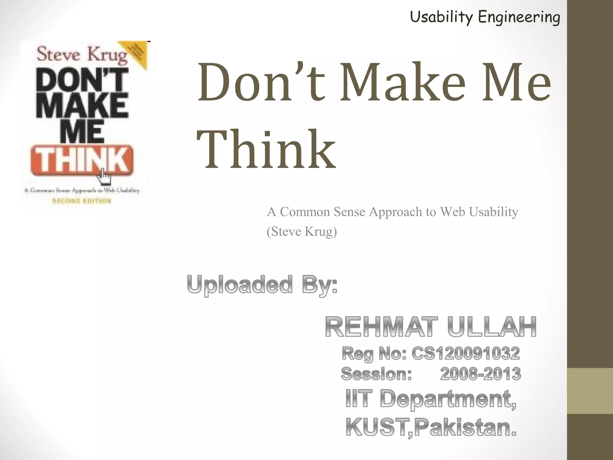
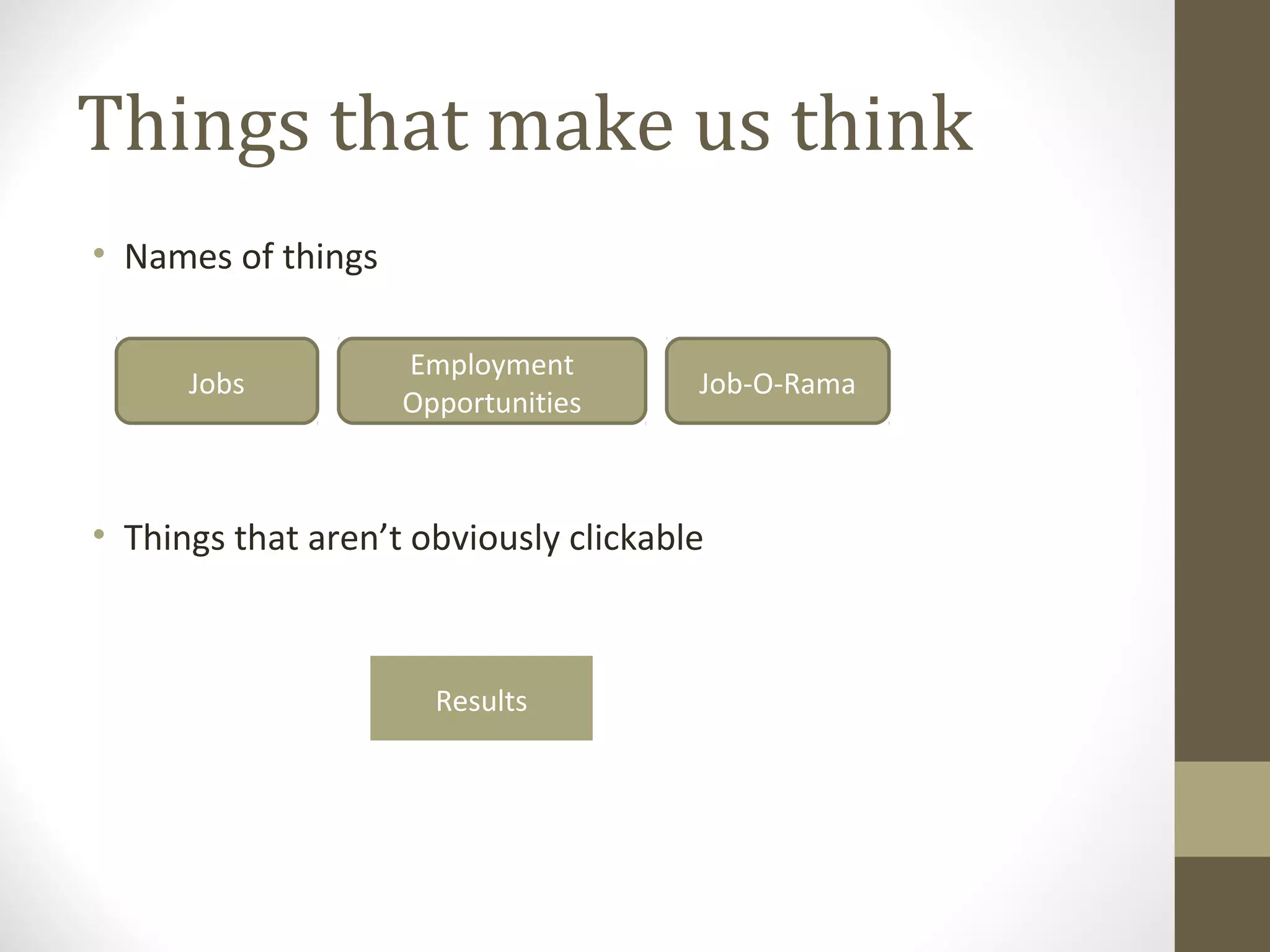
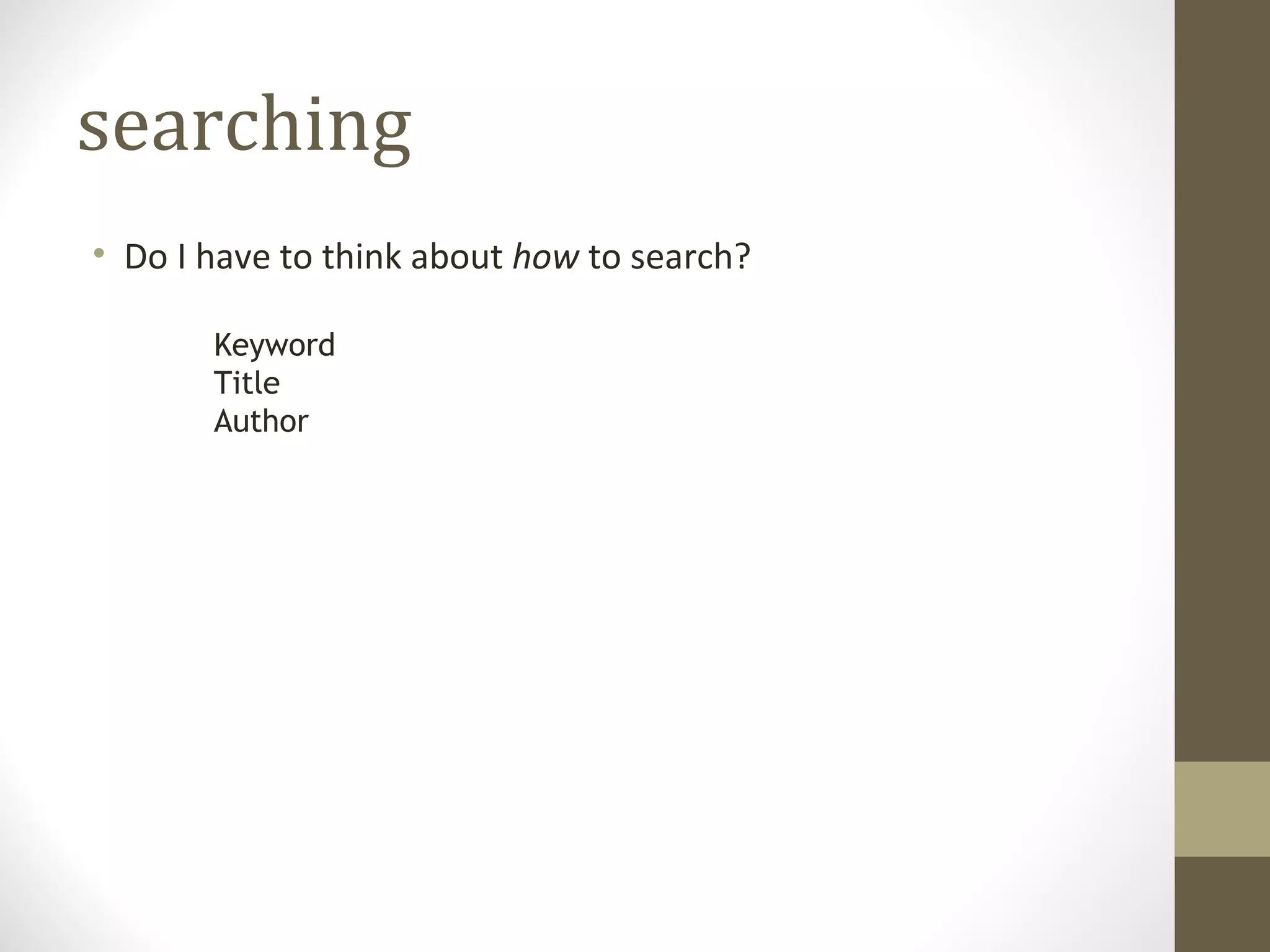
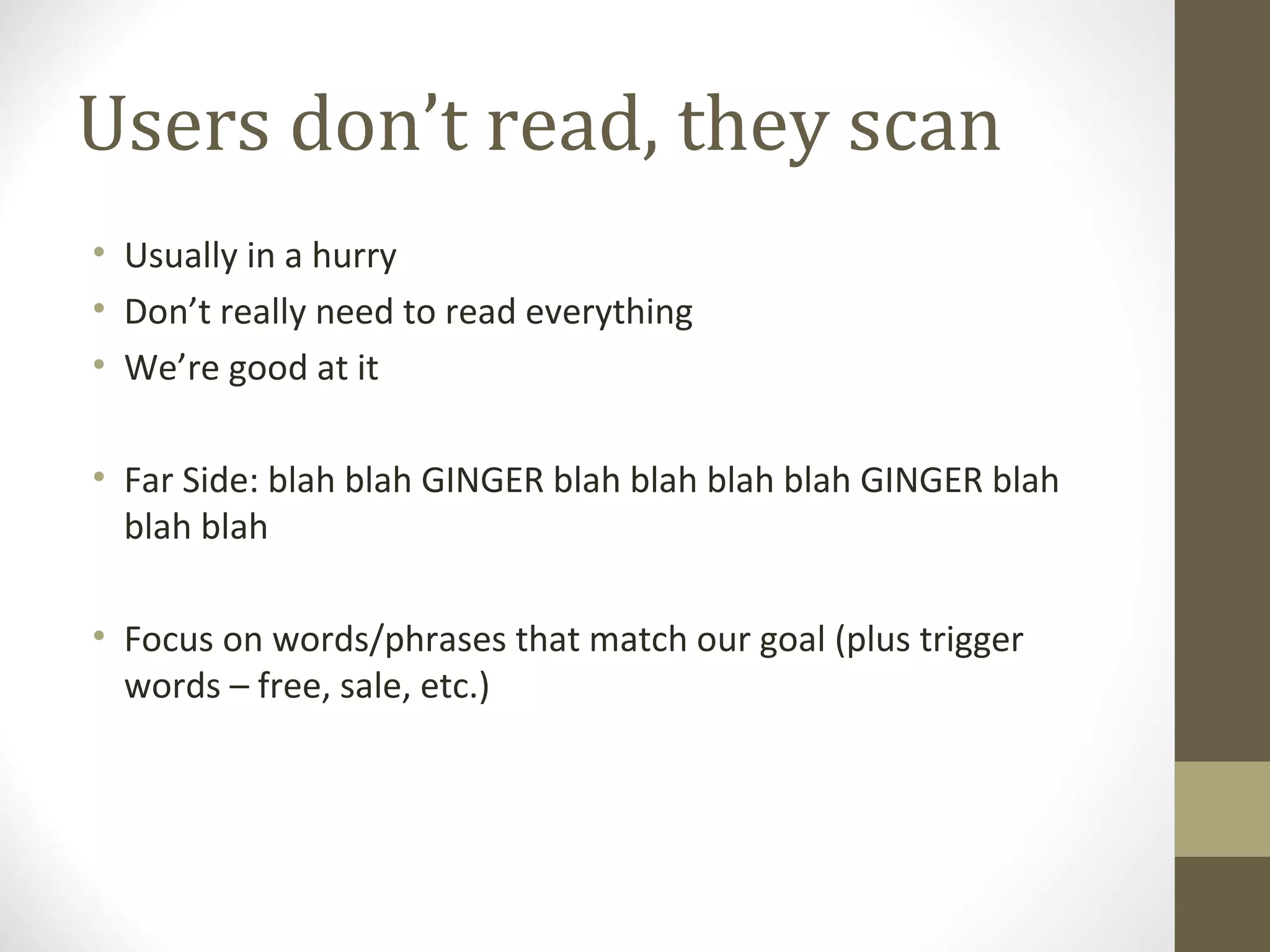
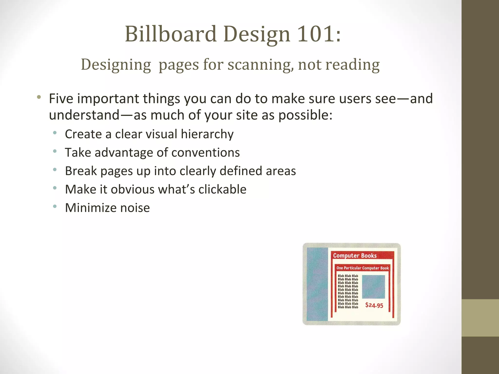
Usability Engineering


Don’t Make Me
Think
  A Common Sense Approach to Web Usability
  (Steve Krug)
So you want a user-friendly
  site… what’s most important?

• Nothing important should ever be more than two clicks
  away
• Be consistent
• Speak the user’s language
• Leave plenty of whitespace
• Don’t make me think
Why do we care?
• Puzzling over things that don’t matter to us tends to sap our
  energy and enthusiasm – and time
• On the internet, the competition is always just one click away,
  so if you frustrate users they’ll head somewhere else.
Things that make us think
• Names of things

                    Employment
      Jobs                             Job-O-Rama
                    Opportunities


• Things that aren’t obviously clickable


                      Results
searching
• Do I have to think about how to search?

       Keyword
       Title
       Author
How we really use the web
• We’d like to think users will read our site from top to bottom,
  then make choices.

• What really happens?
Users don’t read, they scan
• Usually in a hurry
• Don’t really need to read everything
• We’re good at it

• Far Side: blah blah GINGER blah blah blah blah GINGER blah
  blah blah

• Focus on words/phrases that match our goal (plus trigger
  words – free, sale, etc.)
satisficing
• Users often don’t take the time to make optimal choices
• Often choose the first reasonable option – satisfice
• Study of fire commanders – didn’t compare options, took first
  reasonable plan, did mental test for problems, took action

• Satisficing definitely applies to choosing web pages (no
  penalty, easier to click than weigh options)
Muddling through
• Users often don’t take the time to figure out how things work
  (why? May not care)
• Find a way to achieve goal (even if know it’s not optimal),
  continue to do it that way
• May have completely wrong views about how things really
  work
• Even true of “savvy” users
• Ex: type entire URL into Yahoo search box every time
What’s the lesson?

• If your audience is going to act like you’re designing
  billboards, then design billboards.
Billboard Design 101:
        Designing pages for scanning, not reading
• Five important things you can do to make sure users see—and
  understand—as much of your site as possible:
  •   Create a clear visual hierarchy
  •   Take advantage of conventions
  •   Break pages up into clearly defined areas
  •   Make it obvious what’s clickable
  •   Minimize noise

Common sense approach to web usability

  • 1.
    Usability Engineering Don’t MakeMe Think A Common Sense Approach to Web Usability (Steve Krug)
  • 2.
    So you wanta user-friendly site… what’s most important? • Nothing important should ever be more than two clicks away • Be consistent • Speak the user’s language • Leave plenty of whitespace • Don’t make me think
  • 3.
    Why do wecare? • Puzzling over things that don’t matter to us tends to sap our energy and enthusiasm – and time • On the internet, the competition is always just one click away, so if you frustrate users they’ll head somewhere else.
  • 4.
    Things that makeus think • Names of things Employment Jobs Job-O-Rama Opportunities • Things that aren’t obviously clickable Results
  • 5.
    searching • Do Ihave to think about how to search? Keyword Title Author
  • 6.
    How we reallyuse the web • We’d like to think users will read our site from top to bottom, then make choices. • What really happens?
  • 7.
    Users don’t read,they scan • Usually in a hurry • Don’t really need to read everything • We’re good at it • Far Side: blah blah GINGER blah blah blah blah GINGER blah blah blah • Focus on words/phrases that match our goal (plus trigger words – free, sale, etc.)
  • 8.
    satisficing • Users oftendon’t take the time to make optimal choices • Often choose the first reasonable option – satisfice • Study of fire commanders – didn’t compare options, took first reasonable plan, did mental test for problems, took action • Satisficing definitely applies to choosing web pages (no penalty, easier to click than weigh options)
  • 9.
    Muddling through • Usersoften don’t take the time to figure out how things work (why? May not care) • Find a way to achieve goal (even if know it’s not optimal), continue to do it that way • May have completely wrong views about how things really work • Even true of “savvy” users • Ex: type entire URL into Yahoo search box every time
  • 10.
    What’s the lesson? •If your audience is going to act like you’re designing billboards, then design billboards.
  • 11.
    Billboard Design 101: Designing pages for scanning, not reading • Five important things you can do to make sure users see—and understand—as much of your site as possible: • Create a clear visual hierarchy • Take advantage of conventions • Break pages up into clearly defined areas • Make it obvious what’s clickable • Minimize noise