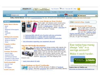
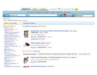
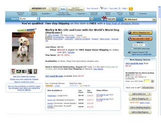
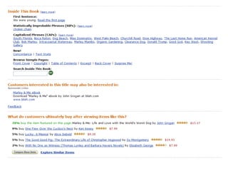
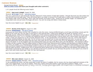
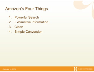
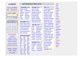
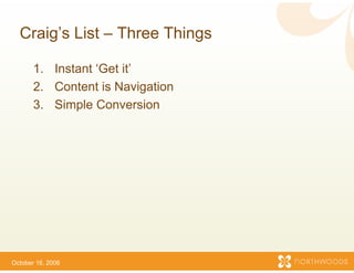
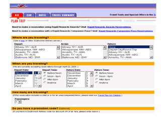
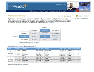
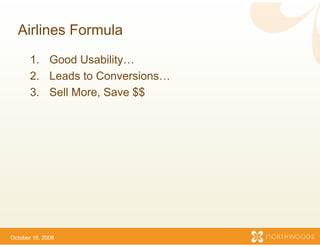
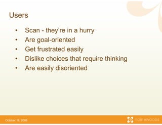
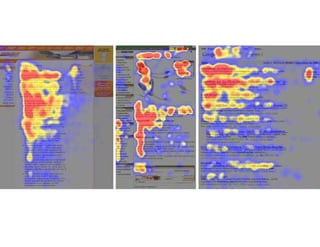
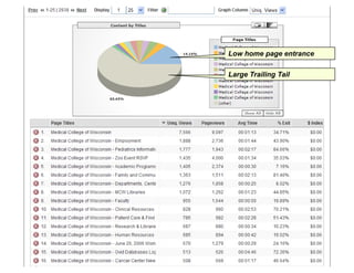
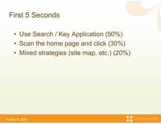
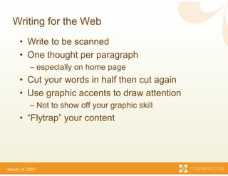
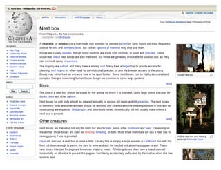
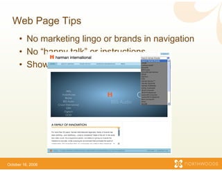
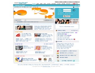
Principles of Usability II
   Strategy and Des g for Web Sites
         gy       sign

                        Prese by
                            ent
    Patrick Bieser Sr Preside Northwoods Software
                   Sr.,     ent
Who am I?
      •   Created hundreds of web sites
      •   Search logs and web site statistics
                                 e
      •   Usability studies
      •   Usability books
      •   Made mistakes
      •   Studied best / most succ
                                 cessful sites
      •   Mom and D d are web u
          M        d Dad       b users
      •   User (just like you)


March 14, 2007
Summary of Today s P
             Today’s Presentation
       • Lots of little things
          • McDonalds
       •   Examples
             a p es
       •   User behaviors
       •   More examples
           M             l
       •   Usability testing
            • Fixes cost 75% less b
                                  before launch
       • No “right” way. It dep ds
          o g        ay       pe
                              pends.


October 16, 2006
If your web site is too hard to use…
                      people wo use it.
                              on’t


October 16, 2006
Amazon s
  Amazon’s Four Things
                     s
       1.     Powerful Search
       2.     Exhaustive Information
                                   n
       3.
       3      Clean
       4.     Simple Conversion


October 16, 2006
Craig s
  Craig’s List – Three Th
                        hings

       1.
       1 Instant ‘Get it
                  Get it’
       2. Content is Navigation
       3.
       3 Simple Conversion


October 16, 2006
Airlines Formula
       1. Good Usability…
       2. Leads to Conversions…
       3.
       3 Sell More, Save $$
              More


October 16, 2006
Users

       •      Scan - they’re in a h
                      they re      hurry
       •      Are goal-oriented
       •      Get frustrated
              G t f t t d easily ily
       •      Dislike choices that require thinking
       •      Are easily disorienteed


October 16, 2006
Aoccdrnig to a rschee  earch at Cmabrigde
Uinervtisy, it deosn't mttaer in waht oredr
the ltteers in a wrod a the olny
                      are,
                      are
iprmoatnt tihng is tah the frist and lsat
                      ht
ltteer b at th rghit p l
ltt    be t the hit pclae. Tih i b
                             Tihs is bcuseae
the huamn mnid deos not raed ervey lteter
                       s
by istlef, but the wrod as a wlohe.
                      d
Low home page entrance

Large Trailing Tail
First 5 Seconds

      • Use S
            Search / Key App  plication ( %)
                                        (50%)
      • Scan the home page and click (30%)
                       p g               (    )
      • Mixed strategies (site map, etc.) (20%)


October 16, 2006
Writing for the Web
      • Write to be scanned
      • One thought per paraagraph
           – especially on home pa
                                 age
      • Cut your words in half then cut again
                             f
      • Use graphic accents t draw attention
                             to
           – Not to show off your g
                             y    graphic skill
      • “Flytrap” your content
                             t


March 14, 2007
Web Page Tips
      • No marketing lingo or brands in navigation
                             r
      • No “happy talk” or ins
                             structions
      • Show – don’t tell!
               don t


October 16, 2006
Home Page - I
      •   Don’t make content lo like an Ad
                              ook
      •   Skip “Welcome!” mes ssages
      •   Magic 7
      •   Group Corporate stuff
                              ff
           – about us, stock price, contact us, jobs, etc.
      • Group Utilities
            p
           – search, site map, login etc.
                                   n,
      • Graphics: less is more
                             e
           – 5% - 15%


October 16, 2006
Home Page - II
      • Avoid navigation redu
                   g         undancyy
        – waste of space
      • Use conventions of poopular sites
        – search
        – site map
        – breadcrumbs
        – logo click takes you to Home Page
                             u


October 16, 2006
Summary of Lessons So Far
                 s
 Key Ratios
   y
 • Content (Substance) 90% to Brand (Sizzle) 10%
                           %
 • Conventions 75% to Cre eative 25%
 • Simplicity = Usability
 • Usability = Successful W
                          Website
The Differences
 The purpose of non-web marketing
                      b
 •   Grab eyeballs
 •   Create an impression
 •   Build brand awareness
 •   Drive conversions (i.e. go to your website)
                                 o
 The purpose of a website
                        e
 • Offer intuitive and useful info
                                 ormation, without
   annoying or confusing your visitor, so they will
   reach a goal p g and conv
            g     page          vert.
Web
Designers
Stereotypes of Key Inf
                     fluencers

Web Designers
• Are not normal
• They are p
      y     power users
• Don’t think / behave like our au  udiences
• Went to school to learn: visual design, branding and
  marketing for print TV radio
                 print, TV, radio.
• Not taught about the web
• Hire to be creative and clever, not to follow conventions
                                   ,
Web
            Executives
Designers
Stereotypes of Key Inf
                     fluencers
Directors / Executives
• Have a skewed list of favorite w sites
                                  web
• Want more “Sizzle”
• Listen to well meaning people t they trust (who also have a
  skewed list of favorite web sites
                                  s)
• Need to be patiently educated by credible sources
Web                          IT
            Executives
Designers                Professionals
Stereotypes of Key Inf
                     fluencers

IT Professionals
•   Web is a technology
•   Branding? Usability? Whatev    ver….
•   Tools, certifications, and integr
                                    ration needs
•   Need to have their web sensiti y p
                                    ivity patiently
                                                  y
    increased by credible sources
Web                          IT          Marketing
            Executives
Designers                Professionals   Professionals
Stereotypes of Key Inf
                     fluencers

Marketing Types
•   Put too much emphasis on look and feel
                                 k
•   See the web as an extension o their branding initiatives
                                of
•   Assume print and web are mos the same
                                stly
•   Need to read ‘Don’t Make Me T
                                Think’
Aim for sim
                mplicity

The truth is…simp
                plicity is hard
Group Usa
        ability Study
    Can you find…
          u
October 16, 2006
Usability Methods
 • Card Sorting:
   –GGroup top and second navigation
           t     d      d    i ti
   – Name them
 • C
   Current Sit
         t Site:
   – Ten tasks
   – T lk out loud
     Talk t l d
   – Tape it
 • P
   Paper P t t
         Prototype:
   – What would you click o
                          on?
 • Look at web / search l
                        logs
 • 80% of 80%
Usability Testing

• Informal
• Low cost and effective
                       e
• A few as 3-5 users
  As f      35
“It’s not the num
                mber of clicks...
  it s
  it’s how hard e
                each click is!”
                            is!
                    - Steve Krug
                               g

Principles of Web Usabilty II - Fall 2007

  • 1.
    Principles of UsabilityII Strategy and Des g for Web Sites gy sign Prese by ent Patrick Bieser Sr Preside Northwoods Software Sr., ent
  • 2.
    Who am I? • Created hundreds of web sites • Search logs and web site statistics e • Usability studies • Usability books • Made mistakes • Studied best / most succ cessful sites • Mom and D d are web u M d Dad b users • User (just like you) March 14, 2007
  • 3.
    Summary of Todays P Today’s Presentation • Lots of little things • McDonalds • Examples a p es • User behaviors • More examples M l • Usability testing • Fixes cost 75% less b before launch • No “right” way. It dep ds o g ay pe pends. October 16, 2006
  • 4.
    If your website is too hard to use… people wo use it. on’t October 16, 2006
  • 12.
    Amazon s Amazon’s Four Things s 1. Powerful Search 2. Exhaustive Information n 3. 3 Clean 4. Simple Conversion October 16, 2006
  • 14.
    Craig s Craig’s List – Three Th hings 1. 1 Instant ‘Get it Get it’ 2. Content is Navigation 3. 3 Simple Conversion October 16, 2006
  • 17.
    Airlines Formula 1. Good Usability… 2. Leads to Conversions… 3. 3 Sell More, Save $$ More October 16, 2006
  • 18.
    Users • Scan - they’re in a h they re hurry • Are goal-oriented • Get frustrated G t f t t d easily ily • Dislike choices that require thinking • Are easily disorienteed October 16, 2006
  • 20.
    Aoccdrnig to arschee earch at Cmabrigde Uinervtisy, it deosn't mttaer in waht oredr the ltteers in a wrod a the olny are, are iprmoatnt tihng is tah the frist and lsat ht ltteer b at th rghit p l ltt be t the hit pclae. Tih i b Tihs is bcuseae the huamn mnid deos not raed ervey lteter s by istlef, but the wrod as a wlohe. d
  • 23.
    Low home pageentrance Large Trailing Tail
  • 24.
    First 5 Seconds • Use S Search / Key App plication ( %) (50%) • Scan the home page and click (30%) p g ( ) • Mixed strategies (site map, etc.) (20%) October 16, 2006
  • 30.
    Writing for theWeb • Write to be scanned • One thought per paraagraph – especially on home pa age • Cut your words in half then cut again f • Use graphic accents t draw attention to – Not to show off your g y graphic skill • “Flytrap” your content t March 14, 2007
  • 32.
    Web Page Tips • No marketing lingo or brands in navigation r • No “happy talk” or ins structions • Show – don’t tell! don t October 16, 2006
  • 35.
    Home Page -I • Don’t make content lo like an Ad ook • Skip “Welcome!” mes ssages • Magic 7 • Group Corporate stuff ff – about us, stock price, contact us, jobs, etc. • Group Utilities p – search, site map, login etc. n, • Graphics: less is more e – 5% - 15% October 16, 2006
  • 36.
    Home Page -II • Avoid navigation redu g undancyy – waste of space • Use conventions of poopular sites – search – site map – breadcrumbs – logo click takes you to Home Page u October 16, 2006
  • 44.
    Summary of LessonsSo Far s Key Ratios y • Content (Substance) 90% to Brand (Sizzle) 10% % • Conventions 75% to Cre eative 25% • Simplicity = Usability • Usability = Successful W Website
  • 45.
    The Differences Thepurpose of non-web marketing b • Grab eyeballs • Create an impression • Build brand awareness • Drive conversions (i.e. go to your website) o The purpose of a website e • Offer intuitive and useful info ormation, without annoying or confusing your visitor, so they will reach a goal p g and conv g page vert.
  • 46.
  • 47.
    Stereotypes of KeyInf fluencers Web Designers • Are not normal • They are p y power users • Don’t think / behave like our au udiences • Went to school to learn: visual design, branding and marketing for print TV radio print, TV, radio. • Not taught about the web • Hire to be creative and clever, not to follow conventions ,
  • 48.
    Web Executives Designers
  • 49.
    Stereotypes of KeyInf fluencers Directors / Executives • Have a skewed list of favorite w sites web • Want more “Sizzle” • Listen to well meaning people t they trust (who also have a skewed list of favorite web sites s) • Need to be patiently educated by credible sources
  • 50.
    Web IT Executives Designers Professionals
  • 51.
    Stereotypes of KeyInf fluencers IT Professionals • Web is a technology • Branding? Usability? Whatev ver…. • Tools, certifications, and integr ration needs • Need to have their web sensiti y p ivity patiently y increased by credible sources
  • 52.
    Web IT Marketing Executives Designers Professionals Professionals
  • 53.
    Stereotypes of KeyInf fluencers Marketing Types • Put too much emphasis on look and feel k • See the web as an extension o their branding initiatives of • Assume print and web are mos the same stly • Need to read ‘Don’t Make Me T Think’
  • 54.
    Aim for sim mplicity The truth is…simp plicity is hard
  • 55.
    Group Usa ability Study Can you find… u
  • 56.
  • 57.
    Usability Methods •Card Sorting: –GGroup top and second navigation t d d i ti – Name them • C Current Sit t Site: – Ten tasks – T lk out loud Talk t l d – Tape it • P Paper P t t Prototype: – What would you click o on? • Look at web / search l logs • 80% of 80%
  • 58.
    Usability Testing • Informal •Low cost and effective e • A few as 3-5 users As f 35
  • 64.
    “It’s not thenum mber of clicks... it s it’s how hard e each click is!” is! - Steve Krug g