Download as PDF, PPTX

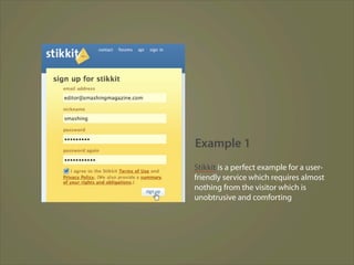
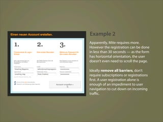
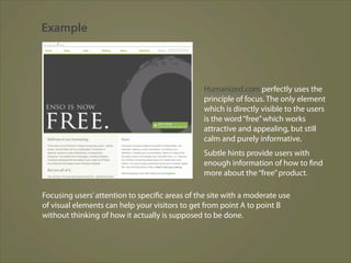


The document provides guidelines for effective web design based on how users interact with websites. It discusses how users scan pages rather than read linearly, are impatient and want instant gratification, and follow intuitions rather than optimal paths. It provides examples of websites that exemplify principles like reducing cognitive load and unnecessary questions, exposing key features visually, using concise writing, and prioritizing simplicity over complexity. The overall message is that web design should minimize cognitive effort for users and focus their attention on important content.