Download to read offline

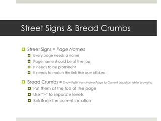
![Use Persistent Navigation
“Navigation isn’t just a feature of the site, it is the site.”
It tells us how to use the site.
Persistent Navigation – Set of navigation elements that appear on every page
Site ID – Logo in top left corner of the page
Sections [Primary/Secondary]
Utilities – Things that help me use the site, or publisher information (Only 4-5)
Home Button
Search Box / Link to a Search Page](https://image.slidesharecdn.com/book3presentation-150508072800-lva1-app6891/85/How-to-Design-Effective-Websites-19-320.jpg)

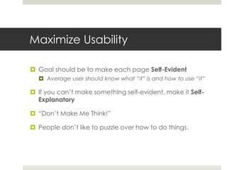
The document provides guidance on designing effective websites. It discusses maximizing usability by making pages self-evident and not requiring users to think too much. Additional tips include following existing conventions to leverage standard patterns, creating a clear visual hierarchy to emphasize important information, and supporting scanning of content through formatting with headings, bullets and short paragraphs. Usability testing throughout the design process is also recommended to identify and address issues.