Download to read offline

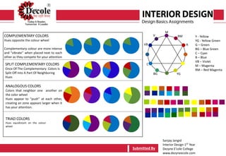
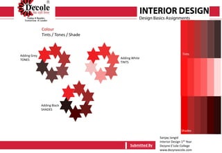
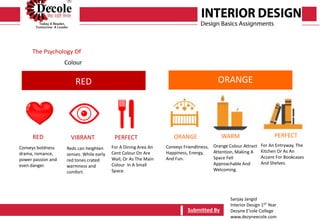
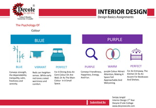
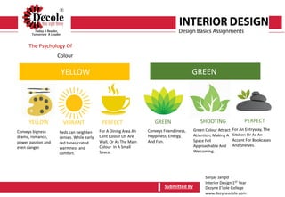
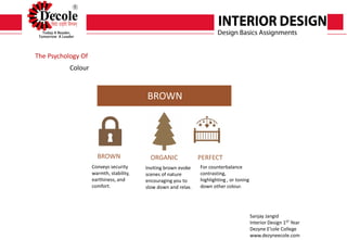
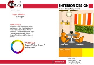
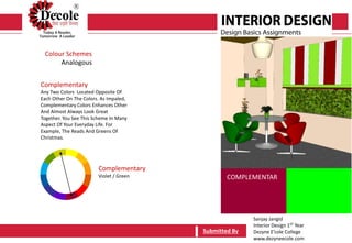
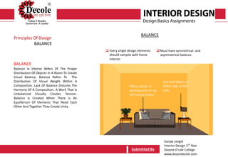
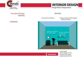
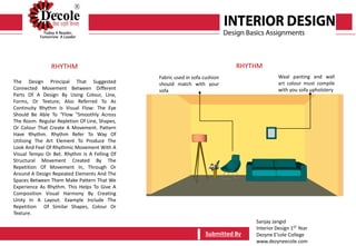
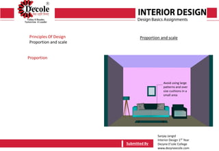
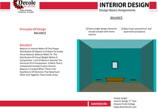


This document contains notes and information from Sanjay Jangid's first year interior design course. It discusses color theory basics like primary, secondary, tertiary, complementary, and analogous colors. It also covers color psychology and schemes like split complementary. Other sections explain principles of design such as balance, rhythm, harmony, proportion, and scale. Examples are provided to illustrate concepts like using symmetrical and asymmetrical balance in a room. Overall, the document serves as a study guide, summarizing key color and design lessons for an introductory interior design student.