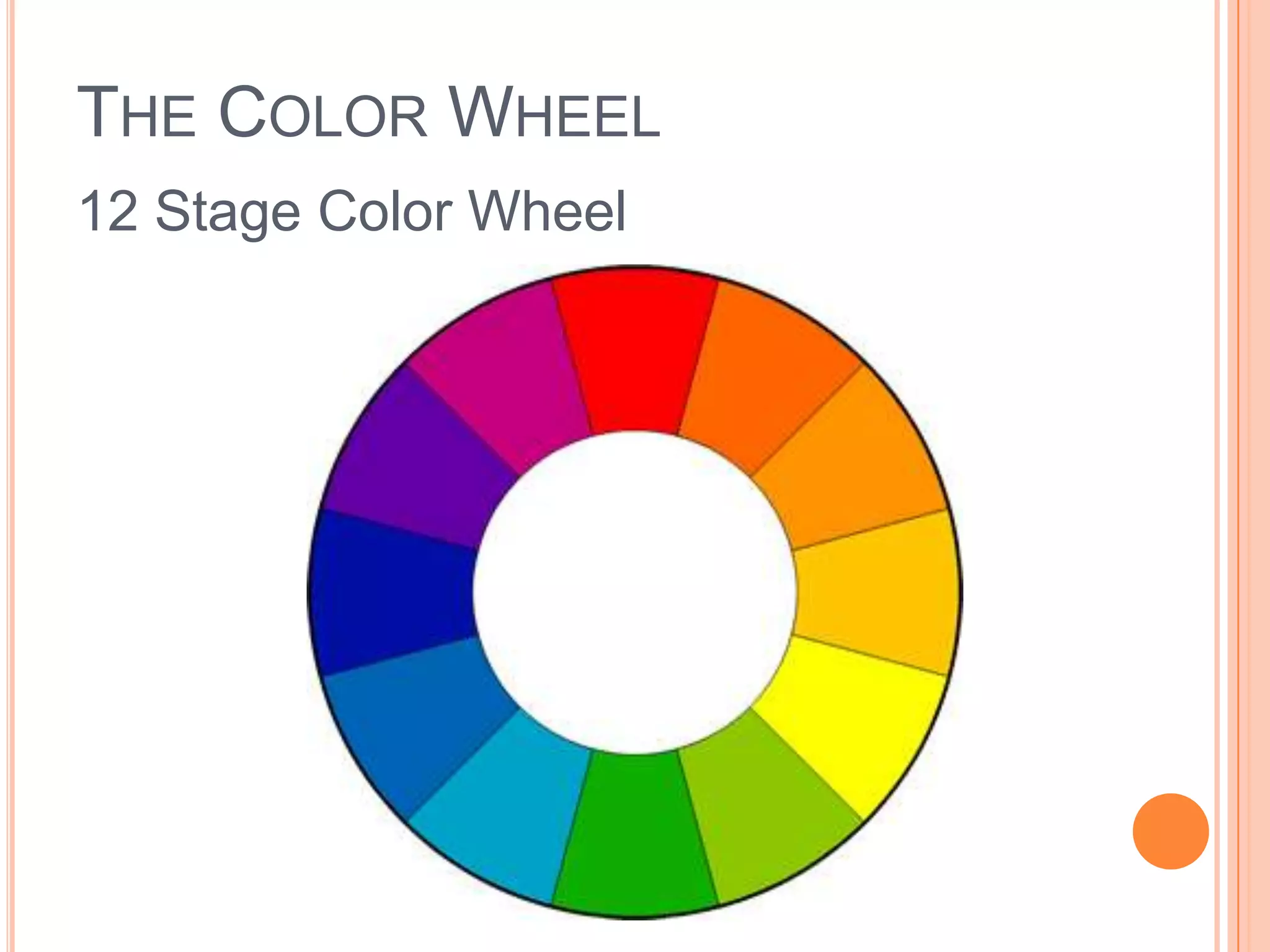
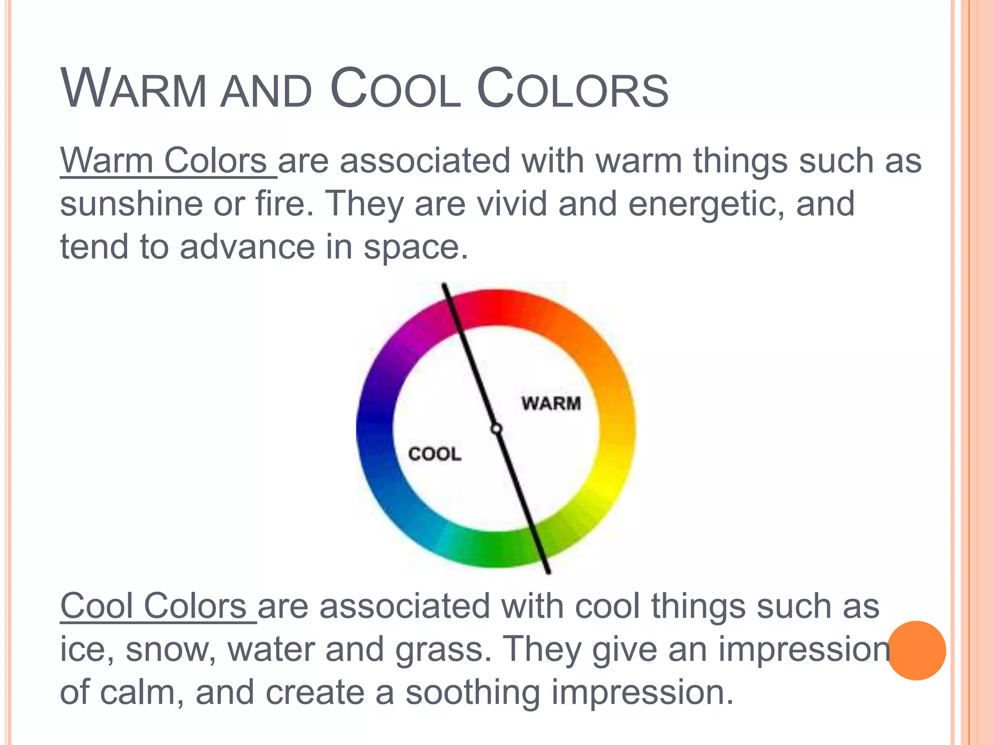
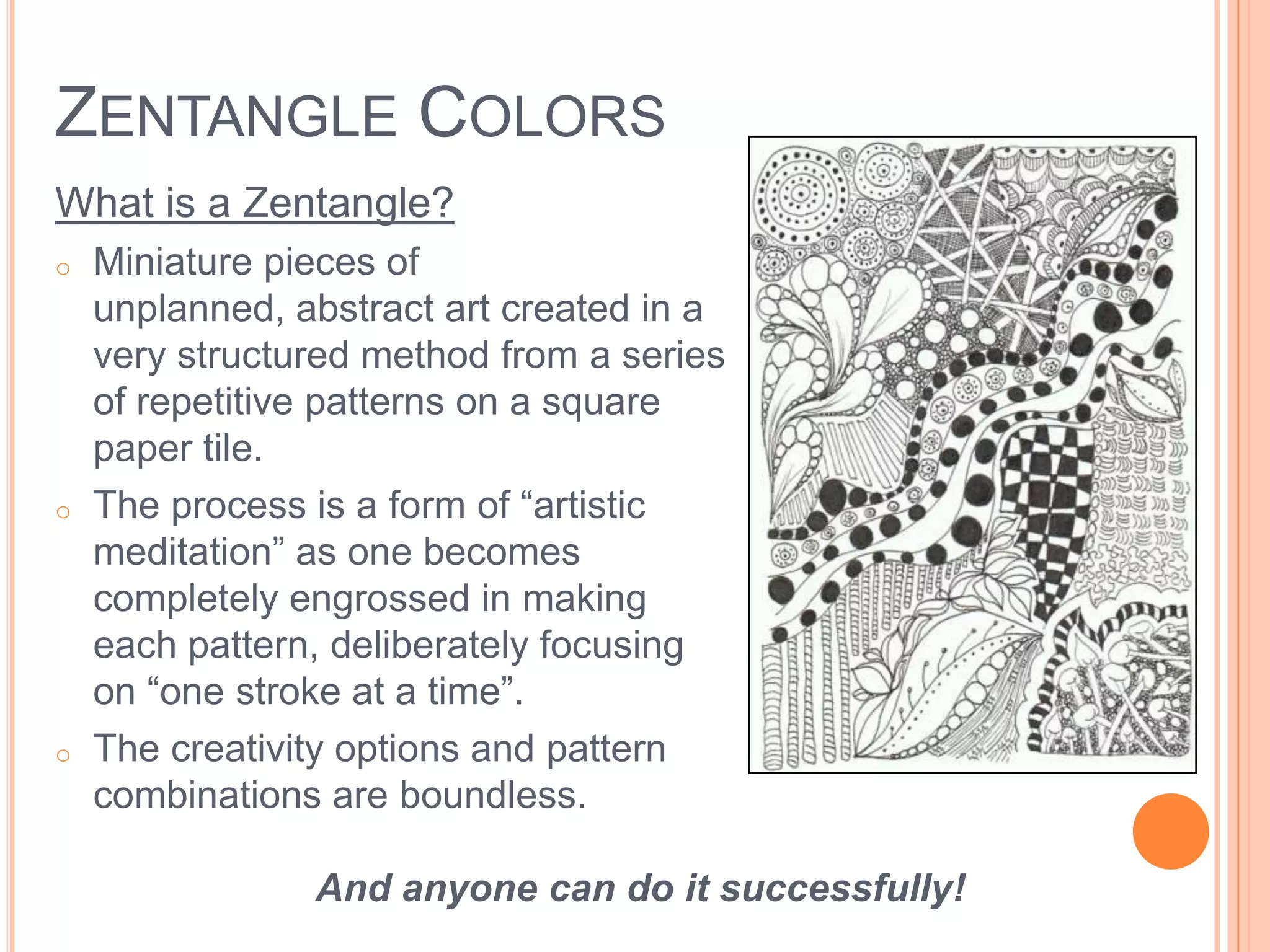
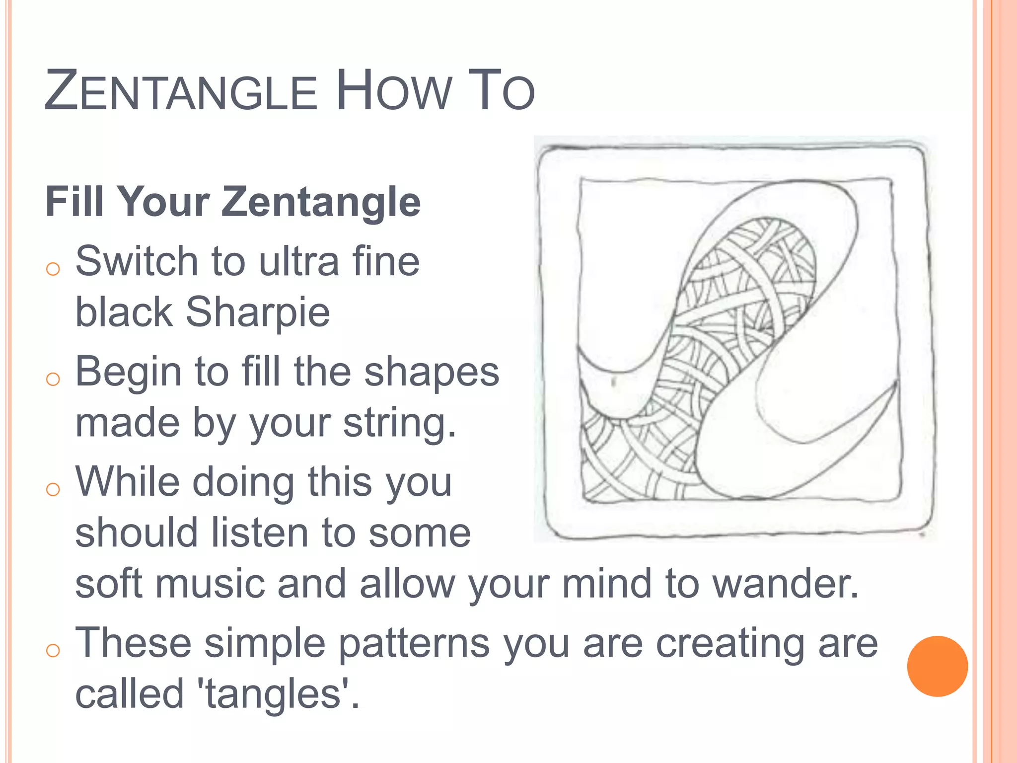
This document provides information about color theory, including the three properties of color (hue, intensity, and value), different color wheels (additive and subtractive), primary and secondary colors, warm and cool colors, and color schemes like monochromatic, complementary, analogous, split complementary, and triadic. It also discusses tints, shades, and tones, and provides instructions for creating Zentangle art using repetitive patterns and doodling within a border on paper.
8. PRIMARY COLORS
In the RYB (or subtractive) color model, the
primary colors are red, yellow and blue.
Red Yellow Blue
9. SECONDARY COLORS
The three secondary colors (orange, green
and violet) are created by mixing two
primary colors.
Orange Green Violet
10. INTERMEDIATE/TERTIARY COLORS
Another six intermediate or tertiary colors
are created by mixing primary and
secondary colors.
Red-Orange Yellow-Green Blue-Green
Red-Violet Yellow-Orange Blue-Violet
11. WARM AND COOL COLORS
Warm Colors are associated with warm things such as
sunshine or fire. They are vivid and energetic, and
tend to advance in space.
Cool Colors are associated with cool things such as
ice, snow, water and grass. They give an impression
of calm, and create a soothing impression.
12. TINTS, SHADES AND TONES
Terms are often used incorrectly, although they describe
fairly simple color concepts.
Tints
If a color is made lighter by adding white, the result is
called a tint.
13. Shades
If black is added, the darker version is called a shade.
14. Tones
If the compliment is added, the result is a tone.
18. SPLIT COMPLEMENTARY COLORS
Split Complementary color scheme is a
combination of one hue plus the hues on
each side of it’s complement.
19. TRIADIC COLORS
A triadic color scheme uses colors that
are evenly spaced around the color
wheel.
20. Triadic color schemes tend to be quite
vibrant, even if you use pale or unsaturated
versions of your hues.
To use a triadic harmony successfully, the
colors should be carefully balanced - let one
color dominate and use the two others for
accent.
21. ZENTANGLE COLORS
What is a Zentangle?
o Miniature pieces of
unplanned, abstract art created in a
very structured method from a series
of repetitive patterns on a square
paper tile.
o The process is a form of “artistic
meditation” as one becomes
completely engrossed in making
each pattern, deliberately focusing
on “one stroke at a time”.
o The creativity options and pattern
combinations are boundless.
And anyone can do it successfully!
22. ZENTANGLE HOW TO
Create a Border
o Using a pencil, draw
a border around the
square of
paper, about a ¼”
from the edge as
shown.
o Do it freehand and let
it be 'rough'.
23. ZENTANGLE HOW TO
Draw a ‘String’
o Draw a light random line
within the border
o Can be anything but keep
it simple.
o Aim to create areas in which
to doodle.
o Experiment until you get something you are
happy with.
24. ZENTANGLE HOW TO
Fill Your Zentangle
o Switch to ultra fine
black Sharpie
o Begin to fill the shapes
made by your string.
o While doing this you
should listen to some
soft music and allow your mind to wander.
o These simple patterns you are creating are
called 'tangles'.
25. ZENTANGLE HOW TO
Are you relaxed?
o Keep going. Don't worry
about patterns, as you
do more, the next pattern seems
to suggest itself.
o You can work up to the
border, however, you
don't have to – leaving white space can work
well too.