The document summarizes a student's work on creating a magazine for their school.
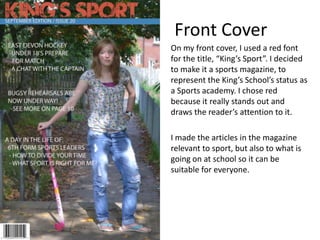
The student designed the front cover of the magazine titled "King's Sport" using red font to represent the school's status as a sports academy.
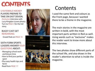
For the contents page, the student used the same font and colors as the front cover to create continuity. Important stories were written in bold and parts in red to draw attention. Photos were included to showcase school life.
In their evaluation, the student reflects that they could have added more color to the front cover and left space for a competition. They also feel the photos on the contents page were too long and they didn't properly plan space.