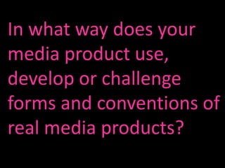
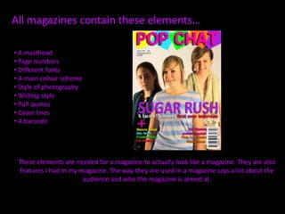
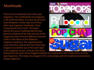
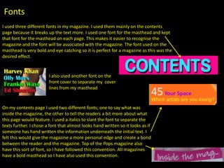
In what way does your
media product use,
develop or challenge
forms and conventions of
real media products?
All magazines contain these elements…

• A masthead
• Page numbers
• Different fonts
• A main colour scheme
• Style of photography
• Writing style
• Pull quotes
• Cover lines
• A barcode


 These elements are needed for a magazine to actually look like a magazine. They are also
 features I had in my magazine. The way they are used in a magazine says a lot about the
                       audience and who the magazine is aimed at.
Mastheads

These are all mastheads from other pop
magazines. The masthead for my magazine
is the third one down. It is clear to see that I
have followed a similar style to all these
other pop magazine mastheads. I have
incorporated a bit of each. The boxes
behind the actual masthead (which have
become a feature of the title and rest of the
magazine) came from the different coloured
circles in the letters of the Billboard
magazine masthead. The capitalised font
came from that used by the Top of the Pops
magazine (as did the use of the word ‘pop’
in my magazine name). I also put the artists
featured on the cover of my magazine behind my masthead as this is featured in all other
pop magazines. This makes my magazine fit in and comply with the traditional conventions
of pop magazines.
Colour Scheme
In my magazine the colour scheme was bright colours. I used pink,
blue, orange, purple, yellow, red and green throughout my
magazine. This goes against the usual conventions as most pop
magazines stick to around three colours and use that as their colour
scheme (but use three different colours in each issue), but I have
used bright colours which is always apparent in pop magazines.
Because pop magazines are aimed at females, there is often a
theme of pink running through the colour scheme. I have complied
with this convention as my masthead is bright pink
Fonts
I used three different fonts in my magazine. I used them mainly on the contents
page because it breaks up the text more. I used one font for the masthead and kept
that font for the masthead on each page. This makes it easier to recognise the
magazine and the font will be associated with the magazine. The font used on the
masthead is very bold and eye catching so it is perfect for a magazine as this was the
desired effect.


                        I also used another font on the
                        front cover to separate my cover
                        lines from my masthead


On my contents page I used two different fonts; one to say what was
inside the magazine, the other to tell the readers a bit more about what
this page would feature. I used a italics to slant the font to separate the
texts further. I chose a font that almost looks hand written so it looks as if
someone has hand written the information underneath the initial text. I
felt this would give the magazine a more personal edge and create a bond
between the reader and the magazine. Top of the Pops magazine also
have this sort of font, so I have followed this convention. All magazines
have a bold masthead so I have also used this convention.
Style of Photography
  For my front cover photo’s I booked the college studio so I could have this as the
  background for my photo’s. I did this because all pop magazines I looked at had the
  artists posing in a well-lit studio, so I followed this convention to make my magazine
  look more realistic and pop-like. It is unusual to see a pop artist having their photo
  taken in front of a graffiti covered building, which is why I didn’t do this. I found
  with other pop magazines that the artists were posing, the images were not
  natural. I looked at magazines which had photographed groups as I had chosen to
  use a group and found that the pictures often make the band look very close by
  sitting them close together or making them all do the same pose, so I used this as
  inspiration for my photo’s. I have followed all the conventions in my style of
  photography, otherwise my magazine would not have looked like a pop magazine.

Codes & Conventions

  • 1.
    In what waydoes your media product use, develop or challenge forms and conventions of real media products?
  • 2.
    All magazines containthese elements… • A masthead • Page numbers • Different fonts • A main colour scheme • Style of photography • Writing style • Pull quotes • Cover lines • A barcode These elements are needed for a magazine to actually look like a magazine. They are also features I had in my magazine. The way they are used in a magazine says a lot about the audience and who the magazine is aimed at.
  • 3.
    Mastheads These are allmastheads from other pop magazines. The masthead for my magazine is the third one down. It is clear to see that I have followed a similar style to all these other pop magazine mastheads. I have incorporated a bit of each. The boxes behind the actual masthead (which have become a feature of the title and rest of the magazine) came from the different coloured circles in the letters of the Billboard magazine masthead. The capitalised font came from that used by the Top of the Pops magazine (as did the use of the word ‘pop’ in my magazine name). I also put the artists featured on the cover of my magazine behind my masthead as this is featured in all other pop magazines. This makes my magazine fit in and comply with the traditional conventions of pop magazines.
  • 4.
    Colour Scheme In mymagazine the colour scheme was bright colours. I used pink, blue, orange, purple, yellow, red and green throughout my magazine. This goes against the usual conventions as most pop magazines stick to around three colours and use that as their colour scheme (but use three different colours in each issue), but I have used bright colours which is always apparent in pop magazines. Because pop magazines are aimed at females, there is often a theme of pink running through the colour scheme. I have complied with this convention as my masthead is bright pink
  • 5.
    Fonts I used threedifferent fonts in my magazine. I used them mainly on the contents page because it breaks up the text more. I used one font for the masthead and kept that font for the masthead on each page. This makes it easier to recognise the magazine and the font will be associated with the magazine. The font used on the masthead is very bold and eye catching so it is perfect for a magazine as this was the desired effect. I also used another font on the front cover to separate my cover lines from my masthead On my contents page I used two different fonts; one to say what was inside the magazine, the other to tell the readers a bit more about what this page would feature. I used a italics to slant the font to separate the texts further. I chose a font that almost looks hand written so it looks as if someone has hand written the information underneath the initial text. I felt this would give the magazine a more personal edge and create a bond between the reader and the magazine. Top of the Pops magazine also have this sort of font, so I have followed this convention. All magazines have a bold masthead so I have also used this convention.
  • 6.
    Style of Photography For my front cover photo’s I booked the college studio so I could have this as the background for my photo’s. I did this because all pop magazines I looked at had the artists posing in a well-lit studio, so I followed this convention to make my magazine look more realistic and pop-like. It is unusual to see a pop artist having their photo taken in front of a graffiti covered building, which is why I didn’t do this. I found with other pop magazines that the artists were posing, the images were not natural. I looked at magazines which had photographed groups as I had chosen to use a group and found that the pictures often make the band look very close by sitting them close together or making them all do the same pose, so I used this as inspiration for my photo’s. I have followed all the conventions in my style of photography, otherwise my magazine would not have looked like a pop magazine.