This document summarizes how the media product uses and develops conventions of real music magazines. It discusses using a simple masthead font across the top of the page like Cosmopolitan. Images are used on the front cover and contents page similarly to other pop music magazines. Sections include fashion, celebrities, and interviews, mimicking real magazines. Font styles, layouts, and use of images are consistent throughout to emulate established magazine conventions.
Intelex Top 5 Environmental Stats - Green Office Benefits (Infographic)Intelex
This Top 5 Environmental Stats Infographic outlines benefits of implementing Green Office strategies. Try Intelex’s Sustainability Performance Indicators (SPI) software to help you report, track and analyze environmental sustainability data in your organization: http://bit.ly/1g0zKhx
Take a look at the first phase completed for Wellington Hospital at the platinum building.
Since completing this project we have gone on to complete 2 others at the hospital with additional signage and screen options included.
Introduction to AI for Nonprofits with Tapp NetworkTechSoup
Dive into the world of AI! Experts Jon Hill and Tareq Monaur will guide you through AI's role in enhancing nonprofit websites and basic marketing strategies, making it easy to understand and apply.
Acetabularia Information For Class 9 .docxvaibhavrinwa19
Acetabularia acetabulum is a single-celled green alga that in its vegetative state is morphologically differentiated into a basal rhizoid and an axially elongated stalk, which bears whorls of branching hairs. The single diploid nucleus resides in the rhizoid.
Instructions for Submissions thorugh G- Classroom.pptxJheel Barad
This presentation provides a briefing on how to upload submissions and documents in Google Classroom. It was prepared as part of an orientation for new Sainik School in-service teacher trainees. As a training officer, my goal is to ensure that you are comfortable and proficient with this essential tool for managing assignments and fostering student engagement.
Synthetic Fiber Construction in lab .pptxPavel ( NSTU)
Synthetic fiber production is a fascinating and complex field that blends chemistry, engineering, and environmental science. By understanding these aspects, students can gain a comprehensive view of synthetic fiber production, its impact on society and the environment, and the potential for future innovations. Synthetic fibers play a crucial role in modern society, impacting various aspects of daily life, industry, and the environment. ynthetic fibers are integral to modern life, offering a range of benefits from cost-effectiveness and versatility to innovative applications and performance characteristics. While they pose environmental challenges, ongoing research and development aim to create more sustainable and eco-friendly alternatives. Understanding the importance of synthetic fibers helps in appreciating their role in the economy, industry, and daily life, while also emphasizing the need for sustainable practices and innovation.
Model Attribute Check Company Auto PropertyCeline George
In Odoo, the multi-company feature allows you to manage multiple companies within a single Odoo database instance. Each company can have its own configurations while still sharing common resources such as products, customers, and suppliers.
How to Make a Field invisible in Odoo 17Celine George
It is possible to hide or invisible some fields in odoo. Commonly using “invisible” attribute in the field definition to invisible the fields. This slide will show how to make a field invisible in odoo 17.
The French Revolution, which began in 1789, was a period of radical social and political upheaval in France. It marked the decline of absolute monarchies, the rise of secular and democratic republics, and the eventual rise of Napoleon Bonaparte. This revolutionary period is crucial in understanding the transition from feudalism to modernity in Europe.
For more information, visit-www.vavaclasses.com
2024.06.01 Introducing a competency framework for languag learning materials ...Sandy Millin
http://sandymillin.wordpress.com/iateflwebinar2024
Published classroom materials form the basis of syllabuses, drive teacher professional development, and have a potentially huge influence on learners, teachers and education systems. All teachers also create their own materials, whether a few sentences on a blackboard, a highly-structured fully-realised online course, or anything in between. Despite this, the knowledge and skills needed to create effective language learning materials are rarely part of teacher training, and are mostly learnt by trial and error.
Knowledge and skills frameworks, generally called competency frameworks, for ELT teachers, trainers and managers have existed for a few years now. However, until I created one for my MA dissertation, there wasn’t one drawing together what we need to know and do to be able to effectively produce language learning materials.
This webinar will introduce you to my framework, highlighting the key competencies I identified from my research. It will also show how anybody involved in language teaching (any language, not just English!), teacher training, managing schools or developing language learning materials can benefit from using the framework.
Francesca Gottschalk - How can education support child empowerment.pptxEduSkills OECD
Francesca Gottschalk from the OECD’s Centre for Educational Research and Innovation presents at the Ask an Expert Webinar: How can education support child empowerment?
Palestine last event orientationfvgnh .pptxRaedMohamed3
An EFL lesson about the current events in Palestine. It is intended to be for intermediate students who wish to increase their listening skills through a short lesson in power point.
Honest Reviews of Tim Han LMA Course Program.pptxtimhan337
Personal development courses are widely available today, with each one promising life-changing outcomes. Tim Han’s Life Mastery Achievers (LMA) Course has drawn a lot of interest. In addition to offering my frank assessment of Success Insider’s LMA Course, this piece examines the course’s effects via a variety of Tim Han LMA course reviews and Success Insider comments.
A Strategic Approach: GenAI in EducationPeter Windle
Artificial Intelligence (AI) technologies such as Generative AI, Image Generators and Large Language Models have had a dramatic impact on teaching, learning and assessment over the past 18 months. The most immediate threat AI posed was to Academic Integrity with Higher Education Institutes (HEIs) focusing their efforts on combating the use of GenAI in assessment. Guidelines were developed for staff and students, policies put in place too. Innovative educators have forged paths in the use of Generative AI for teaching, learning and assessments leading to pockets of transformation springing up across HEIs, often with little or no top-down guidance, support or direction.
This Gasta posits a strategic approach to integrating AI into HEIs to prepare staff, students and the curriculum for an evolving world and workplace. We will highlight the advantages of working with these technologies beyond the realm of teaching, learning and assessment by considering prompt engineering skills, industry impact, curriculum changes, and the need for staff upskilling. In contrast, not engaging strategically with Generative AI poses risks, including falling behind peers, missed opportunities and failing to ensure our graduates remain employable. The rapid evolution of AI technologies necessitates a proactive and strategic approach if we are to remain relevant.
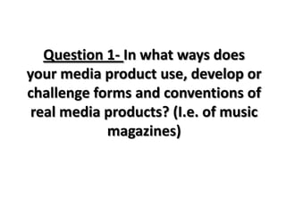
1. Question 1- In what ways does
your media product use, develop or
challenge forms and conventions of
real media products? (I.e. of music
magazines)
2. This is the masthead of my pop music magazine. I have called my music magazine Listen
because I asked teenagers between the ages of 12-16+ what name they would like the
magazine to be called and this was the name that the majority of teenagers voted for. I
thought of this name because the audience listens to music so I thought it was a good name to
call a music magazine. On my front cover I have used a simple font which other magazines use
such as cosmopolitan magazine.
I have spread the text across the top of the page which is used in most magazines usually the
main image over laps the text but I thought that the text needed to stand out and be clear
because sometimes the image makes it hard for the audience to read the masthead for
example Glamour magazine has the “M” covered by the image.
Although most magazines have used this technique I decided that I wanted
my magazine to be different for the rest. I have coloured the text white
because it made it stand out more. I wanted to use pink originally because
most teen magazine have a pink masthead but I didn’t want to overpower
the colour pink because I used a lot of pink further down the page.
3. This is my magazine front cover. The layout of my front cover
follows some of the traditional conventions of magazine. I
have placed the mast head at the top of the page and
stretched it across so it fits across the top. This is used in many
magazines so I wanted to use this convention in my magazine.
I have also got a bottom strip line which is used in pop music
magazine I have looked at but not normally a convention in a
glamour/ professional magazine. Although I wanted to make
my magazine professional I wanted to follow the conventions
of a pop music magazine. This bottom strap line includes
prizes to win and images of features inside the magazine. In
other pop music magazine I they use this bottom strap line to
promote competitions and prizes. I have also used a puff
which is a common convention in all magazines. I have used
mine to promote a prize which the audience can win by
entering a competition inside the magazine. I have also used straplines which all magazines
have to entice the readers in. I have made my strapline quite small which most magazine
have a lot of straplines on both sides of the main image. I wanted to make my straplines
small so the audience would focus mainly on the image and the main feature in this
magazine. Straplines are a main convention in any magazine. My main image is in the middle
of the page which most magazine front cover images are in the middle of the page so I
thought I would follow the same conventions to make my magazine similar to ones on the
market.
4. By looking at my front cover you can tell my magazine is
made for teenage girls and that it is a pop music
magazine. The first thing that could give it away is the
colours I have used. I have used three main pink, white
and yellow. These colours are seen as girly and feminine.
Another factor that you can tell this magazine is made
for girls is that the main image is of a teenage girl which
would be more relatable to a teenager then to a person
of an older generation. A factor that the audience would
tell that my magazine is made for pop music and
teenage girls is the One Direction poster. The poster
appeals to the teenage audience because they are one
of the biggest boy bands. So by looking at this poster it is
obvious to see that this magazine is pop because One
Direction are known for their pop music.
5. In my magazine contents page I looked at other music
magazines contents pages and most pop music
magazines have features about fashion and celebrities
so I decided to follow the same conventions to make my
magazine similar to others on the market. I have four
text boxes that all feature different things throughout
the magazine. Most pop music magazine have many
sections of their contents page so I have split my text
boxes up like the layout on other pop music magazines.
I have quite a lot of white space but most magazines are
like this because they don’t want to over crowd the
reader when they open the magazine. I have spread out
the images so that this page does not look cluttered.
The masthead is the same as the masthead on the front
of the magazine this is a common convention of any
magazine that the font of the mast head is the same on
both contents page and front cover.
6. I have used images of people that feature on the front cover
of my magazine. I have done this because in other pop music
magazine I saw that they used the same people on the font
but in different outfits. So I followed the same conventions
of other pop music magazines. I have also added images of
the same people for repetition to let the audience know
exactly who is featured in this magazine.
7. For the title of the magazine I have used the same font
style as the front of the magazine. I have done this
because in almost every magazine they use the same
font style for the title of the magazine and the contents
page masthead. I have used the same font style for the
text as the font on the front cover. I have done this
because it makes the magazine flow as the font styles
are the same. I have used a different font style for the
headers for each text box. I have used a font style that
is different because most headings are different to the
actual text. I have only used three font styles on this
page.
8. The mise en scene of this image is the
model reflection. I have cut out the
model and just kept the reflection
because it makes the model look more
mysterious. The image has no colour only
black and white which makes the model
stands out. The gold and silver foil stands
out against the models skin tone. The
model is also wearing black which blends
in with the black and white background.
The other three images I have made
black and white but kept the colour of
the gold and silver foil.
9. For this image I used gold and silver foil
which I stuck onto the models face with
special face glue on the models face
because I was looking up makeup looks
on google images and found a makeup
look similar to this and I decided to
recreate this look.
10. In my double page spread I have made
up an interview about the person on
the front of the magazine. I have made
up eleven questions and wrote an
answer to all of them in the perspective
of a pop artist just starting out in the
music industry. I have made up an
interview because in most magazines
the double page spread is an interview
with a pop music artist usually the one
on the front cover. I have wrote about
how she started out in the music
industry and what is she going to do in
the future. For these questions I looked
at other music magazines double page
interview and adapted the questions to
make them my own.