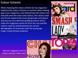
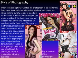
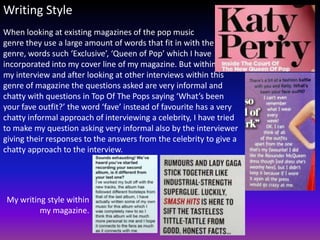
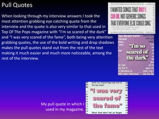
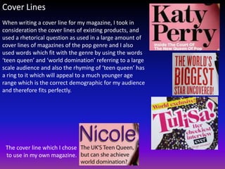
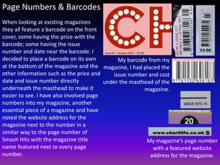
In what ways does your media product use, develop or
challenge forms and conventions of real media products?
A magazine is made up of certain elements, here are a few of the main points which
make up a magazine:

•   Page numbers
•   Masthead
•   Fonts
•   Colour scheme
•   Style of photography
•   Writing style
•   Pull quotes
•   Cover lines
•   Barcode


All magazines feature these factors, but their layout and style in which they choose to
use for their magazine expresses the genre of the magazine and appeals to their target
audience.
Mastheads
With my research on the other magazines
I have looked at I was able to compare the
font and colour scheme of the
mastheads, helping me to make the same
choices when creating my own masthead.
I have also looked at the way in which the
magazines have chosen whether to layer
the cover photo over or under the
masthead, Top of the Pops being the only
magazine not to layer over the
masthead, I followed the most
common, used by both Smash Hits and
                                             My own magazine I created, Chart Life
Billboard by choosing to layer the cover
photo over the top of the masthead.
Fonts
When choosing the fonts for my magazine I have looked at
the fonts used in existing magazines aimed towards the
same genre as my own, I have used for my double page
spread a plain simple, easy to read font and as my double
page spread was an interview I have used bold text for the
questions of the interview and plain text for the
answers, to make the text easier to read. I have used pull
quotes within my text as well, in the centre of chunks of
text and have used a different bold font with a drop
shadow and a different colour in a similar style to the
other magazines I had looked at in a way in which the pull
quote stands out from the rest of the text and is much
more attention grabbing.


        My font used within my
                     magazine
Colour Scheme
When choosing the colour scheme for my magazine I
looked at the colour schemes as used for other existing
pop music magazines, and noticed how the colours red
and pink were the most used colours, the colours used
also fit the mood of the music being lively and vibrant
and also are very attention grabbing colours which
make the magazines stand out from the rest and the
colours used are aimed towards the correct
demographic of consumers with the young age
range, mostly female audience.


  My own magazine and the
 colour scheme I have used.
Style of Photography
When considering how I wanted my photograph to be like for my
front cover, I wanted a very feminine, well made-up cover star
with a striking punchy colour to stand out
on the cover, in which I photoshopped the
image to airbrush the image and change
the stars hair colour to a vibrant red to
stand out on the front cover. The pose on
the front cover is also well
suited to the cover with
her pose and having space
to fit the text around the
image in the same way in
which other popular pop
music magazines have
done. I also have used a
photography in which the
star is looking at the
camera, to create a                            My front cover
relationship with the                          main
audience.                                      photograph.
Writing Style
When looking at existing magazines of the pop music
genre they use a large amount of words that fit in with the
genre, words such ‘Exclusive’, ‘Queen of Pop’ which I have
incorporated into my cover line of my magazine. But within
my interview and after looking at other interviews within this
genre of magazine the questions asked are very informal and
chatty with questions in Top Of The Pops saying ‘What’s been
your fave outfit?’ the word ‘fave’ instead of favourite has a very
chatty informal approach of interviewing a celebrity, I have tried
to make my question asking very informal also by the interviewer
giving their responses to the answers from the celebrity to give a
chatty approach to the interview.


My writing style within
         my magazine.
Pull Quotes
When looking through my interview answers I took the
most attention grabbing eye catching quote from the
interview and the quote is also very similar to that used in
Top Of The Pops magazine with “I’m so scared of the dark”
and “I was very scared of the fame”, both being very attention
grabbing quotes, the use of the bold writing and drop shadows
makes the pull quotes stand out from the rest of the text
making it much easier and much more noticeable, among the
rest of the interview.


                     My pull quote in which I
                      used in my magazine.
Cover Lines
When writing a cover line for my magazine, I took in
consideration the cover lines of existing products, and
used a rhetorical question as used in a large amount of
cover lines of magazines of the pop genre and I also
used words which fit with the genre by using the words
‘teen queen’ and ‘world domination’ referring to a large
scale audience and also the rhyming of ‘teen queen’ has
a ring to it which will appeal to a much younger age
range which is the correct demographic for my audience
and therefore fits perfectly.


 The cover line which I chose
 to use in my own magazine.
Page Numbers & Barcodes
When looking at existing magazines
they all feature a barcode on the front
cover, some having the price with the
barcode; some having the issue
number and date near the barcode. I
decided to place a barcode on its own         My barcode from my
at the bottom of the magazine and the magazine, I had placed the
other information such as the price and     issue number and cost
date and issue number directly           under the masthead of the
underneath the masthead to make it                      magazine.
easier to see. I have also involved page
numbers into my magazine, another
essential piece of a magazine and have
noted the website address for the
magazine next to the number in a
similar way to the page number of
Smash Hits with the magazine title                       My magazine’s page number
name featured next to every page                           with a featured website
number.                                                   address for the magazine.

Conventions powerpoint

  • 1.
    In what waysdoes your media product use, develop or challenge forms and conventions of real media products? A magazine is made up of certain elements, here are a few of the main points which make up a magazine: • Page numbers • Masthead • Fonts • Colour scheme • Style of photography • Writing style • Pull quotes • Cover lines • Barcode All magazines feature these factors, but their layout and style in which they choose to use for their magazine expresses the genre of the magazine and appeals to their target audience.
  • 2.
    Mastheads With my researchon the other magazines I have looked at I was able to compare the font and colour scheme of the mastheads, helping me to make the same choices when creating my own masthead. I have also looked at the way in which the magazines have chosen whether to layer the cover photo over or under the masthead, Top of the Pops being the only magazine not to layer over the masthead, I followed the most common, used by both Smash Hits and My own magazine I created, Chart Life Billboard by choosing to layer the cover photo over the top of the masthead.
  • 3.
    Fonts When choosing thefonts for my magazine I have looked at the fonts used in existing magazines aimed towards the same genre as my own, I have used for my double page spread a plain simple, easy to read font and as my double page spread was an interview I have used bold text for the questions of the interview and plain text for the answers, to make the text easier to read. I have used pull quotes within my text as well, in the centre of chunks of text and have used a different bold font with a drop shadow and a different colour in a similar style to the other magazines I had looked at in a way in which the pull quote stands out from the rest of the text and is much more attention grabbing. My font used within my magazine
  • 4.
    Colour Scheme When choosingthe colour scheme for my magazine I looked at the colour schemes as used for other existing pop music magazines, and noticed how the colours red and pink were the most used colours, the colours used also fit the mood of the music being lively and vibrant and also are very attention grabbing colours which make the magazines stand out from the rest and the colours used are aimed towards the correct demographic of consumers with the young age range, mostly female audience. My own magazine and the colour scheme I have used.
  • 5.
    Style of Photography Whenconsidering how I wanted my photograph to be like for my front cover, I wanted a very feminine, well made-up cover star with a striking punchy colour to stand out on the cover, in which I photoshopped the image to airbrush the image and change the stars hair colour to a vibrant red to stand out on the front cover. The pose on the front cover is also well suited to the cover with her pose and having space to fit the text around the image in the same way in which other popular pop music magazines have done. I also have used a photography in which the star is looking at the camera, to create a My front cover relationship with the main audience. photograph.
  • 6.
    Writing Style When lookingat existing magazines of the pop music genre they use a large amount of words that fit in with the genre, words such ‘Exclusive’, ‘Queen of Pop’ which I have incorporated into my cover line of my magazine. But within my interview and after looking at other interviews within this genre of magazine the questions asked are very informal and chatty with questions in Top Of The Pops saying ‘What’s been your fave outfit?’ the word ‘fave’ instead of favourite has a very chatty informal approach of interviewing a celebrity, I have tried to make my question asking very informal also by the interviewer giving their responses to the answers from the celebrity to give a chatty approach to the interview. My writing style within my magazine.
  • 7.
    Pull Quotes When lookingthrough my interview answers I took the most attention grabbing eye catching quote from the interview and the quote is also very similar to that used in Top Of The Pops magazine with “I’m so scared of the dark” and “I was very scared of the fame”, both being very attention grabbing quotes, the use of the bold writing and drop shadows makes the pull quotes stand out from the rest of the text making it much easier and much more noticeable, among the rest of the interview. My pull quote in which I used in my magazine.
  • 8.
    Cover Lines When writinga cover line for my magazine, I took in consideration the cover lines of existing products, and used a rhetorical question as used in a large amount of cover lines of magazines of the pop genre and I also used words which fit with the genre by using the words ‘teen queen’ and ‘world domination’ referring to a large scale audience and also the rhyming of ‘teen queen’ has a ring to it which will appeal to a much younger age range which is the correct demographic for my audience and therefore fits perfectly. The cover line which I chose to use in my own magazine.
  • 9.
    Page Numbers &Barcodes When looking at existing magazines they all feature a barcode on the front cover, some having the price with the barcode; some having the issue number and date near the barcode. I decided to place a barcode on its own My barcode from my at the bottom of the magazine and the magazine, I had placed the other information such as the price and issue number and cost date and issue number directly under the masthead of the underneath the masthead to make it magazine. easier to see. I have also involved page numbers into my magazine, another essential piece of a magazine and have noted the website address for the magazine next to the number in a similar way to the page number of Smash Hits with the magazine title My magazine’s page number name featured next to every page with a featured website number. address for the magazine.