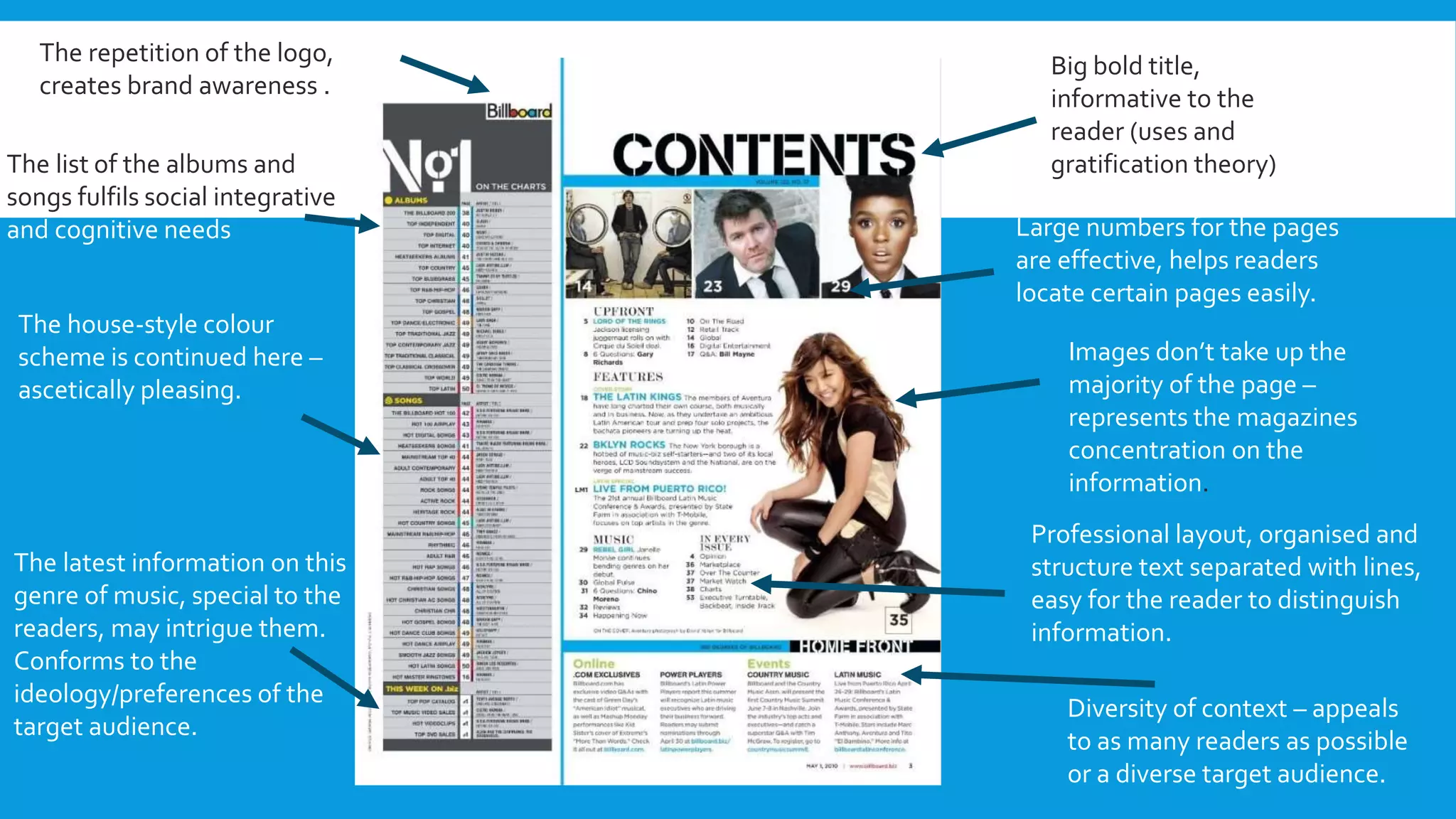
CODES AND CONVENTIONS OF
CONTENTS PAGE
Big bold title,
informative to the
reader (uses and
gratification theory)
Large numbers for the pages
are effective, helps readers
locate certain pages easily.
Images don’t take up the
majority of the page –
represents the magazines
concentration on the
information.
Professional layout, organised and
structure text separated with lines,
easy for the reader to distinguish
information.
Diversity of context – appeals
to as many readers as possible
or a diverse target audience.
The repetition of the logo,
creates brand awareness .
The list of the albums and
songs fulfils social integrative
and cognitive needs
The house-style colour
scheme is continued here –
ascetically pleasing.
The latest information on this
genre of music, special to the
readers, may intrigue them.
Conforms to the
ideology/preferences of the
target audience.
CODES AND CONVENTIONS
 House-style colour scheme is recognisable and gives a professional finish to the
piece (the same colours used in the masthead)
 The images are not the main feature of the page – may vary in size according to
relevance/importance.
 Structured layout, professional and organised impression.
 Lines separates information – make it easier for reader to differentiate between
important pieces of information.
 The chart list is informative to readers, keeps the magazine up-to-date with their
genre – this appeals to their target audience.
Appearance of ‘V’ has
conations of the
masthead ‘Vibe’ – not
obvious brand
awareness here.
Titles are relatively
small, but in bold font
which is eye-catching
to the reader.
Cognitive needs are
fulfilled here, the
popular pages are
listed in clear, bold, san
serif.
The image here takes up 2/3’s of
the page – reflects the importance
of the artist to the magazine.
No direct mode of address, proairetic
codes are created, shows the artists
focus on their music (Barthes)
Mise-en-scene conforms to the colour
scheme of the masthead – gender
neutral colours
Organised layout gives a professional
impression, conforms to the ideology
of the target audience. Makes it easier
to locate certain information.
CODES AND CONVENTIONS
• Uses shortened version of the logo – effective and familiar to the audience
• Images are very large – more visual for the readers.The scale of the image could represent the
importance of the artist which attracts audiences.
• The contents is relatively short and kept on a single page – condenses the information which is
easier for the reader.
• Gender neutral colours are used throughout to conform with the house style and creates a
professional appearance to the page.

Codes and conventions of contents page soren

  • 1.
    CODES AND CONVENTIONSOF CONTENTS PAGE
  • 2.
    Big bold title, informativeto the reader (uses and gratification theory) Large numbers for the pages are effective, helps readers locate certain pages easily. Images don’t take up the majority of the page – represents the magazines concentration on the information. Professional layout, organised and structure text separated with lines, easy for the reader to distinguish information. Diversity of context – appeals to as many readers as possible or a diverse target audience. The repetition of the logo, creates brand awareness . The list of the albums and songs fulfils social integrative and cognitive needs The house-style colour scheme is continued here – ascetically pleasing. The latest information on this genre of music, special to the readers, may intrigue them. Conforms to the ideology/preferences of the target audience.
  • 3.
    CODES AND CONVENTIONS House-style colour scheme is recognisable and gives a professional finish to the piece (the same colours used in the masthead)  The images are not the main feature of the page – may vary in size according to relevance/importance.  Structured layout, professional and organised impression.  Lines separates information – make it easier for reader to differentiate between important pieces of information.  The chart list is informative to readers, keeps the magazine up-to-date with their genre – this appeals to their target audience.
  • 4.
    Appearance of ‘V’has conations of the masthead ‘Vibe’ – not obvious brand awareness here. Titles are relatively small, but in bold font which is eye-catching to the reader. Cognitive needs are fulfilled here, the popular pages are listed in clear, bold, san serif. The image here takes up 2/3’s of the page – reflects the importance of the artist to the magazine. No direct mode of address, proairetic codes are created, shows the artists focus on their music (Barthes) Mise-en-scene conforms to the colour scheme of the masthead – gender neutral colours Organised layout gives a professional impression, conforms to the ideology of the target audience. Makes it easier to locate certain information.
  • 5.
    CODES AND CONVENTIONS •Uses shortened version of the logo – effective and familiar to the audience • Images are very large – more visual for the readers.The scale of the image could represent the importance of the artist which attracts audiences. • The contents is relatively short and kept on a single page – condenses the information which is easier for the reader. • Gender neutral colours are used throughout to conform with the house style and creates a professional appearance to the page.