Codes and Conventions
Billboard
The resident
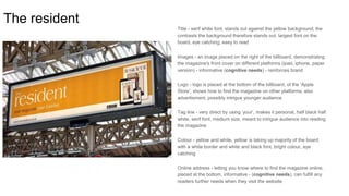
Title - serif white font, stands out against the yellow background, the
contrasts the background therefore stands out, largest font on the
board, eye catching, easy to read
Images - an image placed on the right of the billboard, demonstrating
the magazine's front cover on different platforms (ipad, iphone, paper
version) - informative (cognitive needs) - reinforces brand
Logo - logo is placed at the bottom of the billboard, of the ‘Apple
Store’, shows how to find the magazine on other platforms, also
advertisment, possibly intrigue younger audience
Tag line - very direct by using ‘your’, makes it personal, half black half
white, serif font, medium size, meant to intrigue audience into reading
the magazine
Colour - yellow and white, yellow is taking up majority of the board
with a white border and white and black font, bright colour, eye
catching
Online address - letting you know where to find the magazine online,
placed at the bottom, informative - (cognitive needs), can fulfill any
readers further needs when they visit the website
ELLE
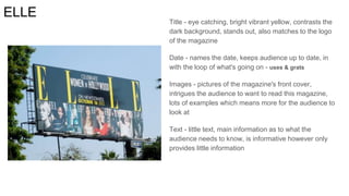
Title - eye catching, bright vibrant yellow, contrasts the
dark background, stands out, also matches to the logo
of the magazine
Date - names the date, keeps audience up to date, in
with the loop of what's going on - uses & grats
Images - pictures of the magazine's front cover,
intrigues the audience to want to read this magazine,
lots of examples which means more for the audience to
look at
Text - little text, main information as to what the
audience needs to know, is informative however only
provides little information
Vogue Title - large font, is the logo of the magazine, white font which
contrast the red background, eye catching
Text - name of celebrity is in a large font to try and attract their
target audience, also white which contrasts the red,
‘EXCLUSIVE’ also written in large font however in a black box
with gold font, this attracts customers as it makes them want to
read due to the exclusive claim that they only get this
information from this particular magazine. Other text is written
in a white font.
Image - a picture of the exclusive front cover of the magazine
this is exciting for the audience, it's blown up on the billboard
so it's very easy for the audience to see clearly which may
make them look longer and be attracted more therefore ending
up being intrigue and buying the magazine
Website address - white font with a black box bordering, the
monochrome makes this stand out - informative as it lets you
know how to find the magazine online (cognitive needs)
Colour - main colour white and red, red is vibrant and eye
catching which will attract people's attention
Three One Three
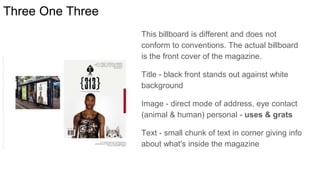
This billboard is different and does not
conform to conventions. The actual billboard
is the front cover of the magazine.
Title - black front stands out against white
background
Image - direct mode of address, eye contact
(animal & human) personal - uses & grats
Text - small chunk of text in corner giving info
about what's inside the magazine
Common Conventions of Billboards
● Minimal text on billboard, so audience more likely to read the little text on the
board.
● Large images, eye catching, exciting and the audience will immediately be
attracted to look.
● Websites featured on the billboards this is a easy web address the audience
can remeber to find out more information online about what the billboard is
advertising.
● Fonts typically serif, and bold
● Colour schemes are bright and colourful to get the attention of passer buyers
● Tries to be as visual as possible as it's something people look at for a couple
of seconds and then move on e.g they are in the street and you walk/drive
past, the info has to be brief for the passer buyers to take anything in

Billboards

  • 1.
  • 2.
    The resident Title -serif white font, stands out against the yellow background, the contrasts the background therefore stands out, largest font on the board, eye catching, easy to read Images - an image placed on the right of the billboard, demonstrating the magazine's front cover on different platforms (ipad, iphone, paper version) - informative (cognitive needs) - reinforces brand Logo - logo is placed at the bottom of the billboard, of the ‘Apple Store’, shows how to find the magazine on other platforms, also advertisment, possibly intrigue younger audience Tag line - very direct by using ‘your’, makes it personal, half black half white, serif font, medium size, meant to intrigue audience into reading the magazine Colour - yellow and white, yellow is taking up majority of the board with a white border and white and black font, bright colour, eye catching Online address - letting you know where to find the magazine online, placed at the bottom, informative - (cognitive needs), can fulfill any readers further needs when they visit the website
  • 3.
    ELLE Title - eyecatching, bright vibrant yellow, contrasts the dark background, stands out, also matches to the logo of the magazine Date - names the date, keeps audience up to date, in with the loop of what's going on - uses & grats Images - pictures of the magazine's front cover, intrigues the audience to want to read this magazine, lots of examples which means more for the audience to look at Text - little text, main information as to what the audience needs to know, is informative however only provides little information
  • 4.
    Vogue Title -large font, is the logo of the magazine, white font which contrast the red background, eye catching Text - name of celebrity is in a large font to try and attract their target audience, also white which contrasts the red, ‘EXCLUSIVE’ also written in large font however in a black box with gold font, this attracts customers as it makes them want to read due to the exclusive claim that they only get this information from this particular magazine. Other text is written in a white font. Image - a picture of the exclusive front cover of the magazine this is exciting for the audience, it's blown up on the billboard so it's very easy for the audience to see clearly which may make them look longer and be attracted more therefore ending up being intrigue and buying the magazine Website address - white font with a black box bordering, the monochrome makes this stand out - informative as it lets you know how to find the magazine online (cognitive needs) Colour - main colour white and red, red is vibrant and eye catching which will attract people's attention
  • 5.
    Three One Three Thisbillboard is different and does not conform to conventions. The actual billboard is the front cover of the magazine. Title - black front stands out against white background Image - direct mode of address, eye contact (animal & human) personal - uses & grats Text - small chunk of text in corner giving info about what's inside the magazine
  • 6.
    Common Conventions ofBillboards ● Minimal text on billboard, so audience more likely to read the little text on the board. ● Large images, eye catching, exciting and the audience will immediately be attracted to look. ● Websites featured on the billboards this is a easy web address the audience can remeber to find out more information online about what the billboard is advertising. ● Fonts typically serif, and bold ● Colour schemes are bright and colourful to get the attention of passer buyers ● Tries to be as visual as possible as it's something people look at for a couple of seconds and then move on e.g they are in the street and you walk/drive past, the info has to be brief for the passer buyers to take anything in