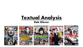
The document analyzes the covers and contents pages of three music magazines: Q, Kerrang!, and NME. For the covers, it examines elements like plugs, images, logos, prices, and sub-images. It finds that Q and Kerrang! use eye-contact images and buzzwords to draw readers in, while NME's cover is less personal. For contents pages, it analyzes layout, images, fonts, page numbers, and branding. It notes Q uses large images and minimal text, while Kerrang! uses more text and NME fewer images. Overall, the document provides a detailed qualitative textual analysis of design elements across the magazines.


