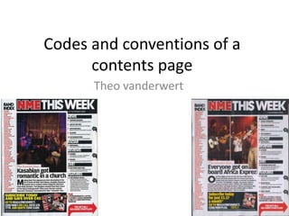
2. Main/central image,
which is usually an
artist from the front
page, main feature
article.
Secondary images, used to
promote or to draw other
readers in.
IMAGES
Personal identity,
image of the music
what the reader likes.
One main image,
and usually have
other secondary
images. Incase the
reader doesn’t like
the main artist.
Main
picture
with the
main
storyline.
3. TEXT
Masthead in
a unique
font so it
stands out.
Sections of what the
magazine involves so the
reader gets to know what
information they will be
able to get.
Smaller print
underneath the sub
headings, for an
overview about that
page or topic.
All headings
same size and
type of font.
Colours of the text
do not clash, which
makes it easier to
read.
Positioning statement, to
sell themselves as the
best.
Type size 11.
Line gap
between each
section.
Font makes it easy
to read.
Regular content.
Feature articles.
4. COLOURNo colours on
the page clash
with each other,
which makes it
easier to read for
the reader.
Plain
background,
which is easy on
the eye for the
reader.
Master head in a
unique font and colour
to the rest of the page.
Different background
colour to attract the
reader to the
information.
Colour scheme
simple and similar to
the front cover
5. SMALL DETAILS
Page number by each
topic so the reader knows
where to go for a
particular.
Contact details and
address.
Split into two or three
columns.Information
about
subscribing.
Date of issue
released.
Masthead repeated to
make the audience feel
familiar.
Usually an
editors letter
on this page,
with
information
about the
issue.