Codes and conventions of a
magazine front cover
Jeannine Hyde
Colour house
styles, red, black,
white , gold all
gender neautral
colours
Masthead in
red a bold
and
eyecatching
colour that is
memorable
Footer heading is
Bold but simple providing
Information about stuff
Inside
Mid shot allows
Us to see artists
Body language
Artists name in bigger/san
Serif font to attract fans
Round badge stands
Out from rest of the
CoverPull quote as an incite
To an article in the magazine
Skyline banner in different colour gives
The impression of exclusiveness
Plain white background so
Subject stands out
Codes and conventions of NME front
cover
• The same house style is used through all of NME’s issues which makes the magazine easy to
recognise this is a common convention
• NME has has a bold masthead in a san serif font, this makes it easy to read and also helps
audiences to recognise the magazine and keeps it consistent, I plan on using a bold san serif
font in my own magazine.
• Using four coloured house style of red white black and gold is different to the conventions of
most other magazines as they usually only have 3. However this is a special issue of the
magazine and the gold border shows that well and makes it stand out without causing the
cover to become to overpowering.
• The main sell line ‘I don’t give a sh*t about the royal wedding’ is in large and bold writing
which contrasts the white background causing it to stand out. This creates hermeneutic code
as it causes the audience to question why?.
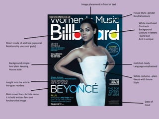
Direct mode of address (personal
Relationship uses and grats)
Date of
Issue
House Style- gender
Neutral colours
White masthead
Contrasts
Background
Colours in letters
stand out
And is unique
Main cover line – Artists name
It is bold entices fans and
Anchors the image
Insight into the article
Intrigues readers
mid shot- body
Language emphasized
White costume –plain
Keeps with house
Style
Background simple
And plain keeping
House style
Image placement in front of text
Codes and conventions of Billboard
magazine
• The colour scheme consists of mainly blue and white, they are more subtle than colours used
in most other music magazines, however I till feel that the magazine is eyecatching nd it
works well
• The dress the model is wearing also contrasts with the background causing her to stand out
more making sure she is the main focus on the cover.
• Often mastheads are usually block text and in capitals, however this magazine shows it in
lowercase which is not a usual convention.
• The masthead changes from black to white dependant on the issue and which colour works
best with the background this is not something I could try as I am not making more than one
issue.
Three colour house
Style, white black and
Grey
Masthead bold –simple
And stands out – easily recognisable
Close up of model –
High key lighting used
Direct mode of
Address
Background
Plain makes
Subject stand
Out
Main cover line anchors
The image – hermanuetic
Code causes audience to question
And be intrigued
Cover lines in
Smaller text
Insight into
Article
Very simplistic cover
Not crowded
Codes and conventions of CLASH front
cover
• Subtle tones are used and counteract the usual convention of bold and bright badges and
colours to catch audiences attention
• The model is the subject of the front cover, this is a common convention as it is used as the
main feature to attract audiences. In my magazine I plan on the model being the subject of
the front cover.
• The house style of the cover only uses 3 colours which is another common convention but
they are not the usual colours that would be used in most magazines, having too many
colours on the magazine front cover could cause it to become to overpowering so I plan on
using 3 colours on my magazine.
• The magazine has a bold and simple white masthead that is the same in every issue of the
magazine, this is good for consistency and means the magazine is easy to recognise. This
convention is used in other magazines and I’d like to use it in my own magazine.
Masthead in bold
and colourful font
That makes it more
Eyecatching ,Lowercase
Direct mode of adress
Creates idea of a personal
Relationship with the reader
Agressive hand gesture
And expression attracts audience
High key
Lighting used
Plain background subject
Stands out
Artists name in bold and
Contrasting colour, stands
Out , anchors image
Three colour house
Style ,red white and
Black, gender neutral
Colours
Subtitles –bold , and
Contrasting colours
Insight into article
Intrigue audience
Positioning statement (uses
And grats) hypodermic needle
Theory , audience needs to find
Out more
Codes and conventions of rolling stone
magazine
• The image of the artist on the front cover is clearly the main attraction on the page as it takes
up a large amount of the cover, the artist also overlaps the masthead of the magazine making
them more prominent, this is a common convention used in most magazines and I plan on
using it in my own
• The artists pose is slightly aggressive and this is another way of the magazine being able to
catch the audiences attention and is something I could consider using in my own magazine
• The masthead of the magazine is not in capitals like most other magazines however it is a
very rocognisable masthead billboard magazine also uses this technique.
• Subtitiles are in bold black and red text which contrasts the white background and stands out
and attracts the reader to read the text.
Masthead- simple design
Bold colours (red and white)
Eye catching
Positioning rule of thirds
Models eyes nose and mouth
Are in centre segment –features
Of interest
Badge eye catching –
Suggests special issue
Subtitle –plain bold
Text – easy to read
Short insights into
Articles
Close up shot type
So subject stands out
Expressions are more visual
Creates personal relationship
Uses and grats
Direct mode of
Address
Main sell line
Bold and simplistic
In contrasting colour to
Background
Three colour house
Style , gender neutral
And eye catching
Header to entice
Readers to buy
magazine
Codes and conventions of Q magazine
Front cover
• The Subtitles have been placed in a very organised way even though there is a lot of things
on the front cover of the magzine it does not look cluttered, it looks tidy and appealing, I plan
to use this sort of organisation style on my front cover.
• The use of hermeneutic codes is a conventional feature as many magazines use it to intrigue
the audience as it creates an unanswered question, it is effective to get the audience to buy
the magazine therefore I would like to try and use it in my own magazine
• The house style is consistent the ole way through the issue making the magazine easily
recognisable as ‘Q’, this is a widely used convention in many magazines and I plan to use it in
my own.
• The colour scheme consists of red white and black which are gender neutral colours and also
means that readers that are colour blind will still be able to see the colours and read the
magazine.
Common codes and conventions of
music magazine front covers
• Hermeneutic codes to create tension and entice the audience
• Bold and simple mastheads typically in capitals at the top of the page are used.
• The image on the front cover is usually either a close up or a mid shot which creates a
personal relationship between the artist and the reader by using direct mode of address
(uses and grats)
• Large and bold text either on or near the main image to anchor the image
• Different colours and fonts used to attract audiences attention
• Bold subtitiles to catch the audiences eye and attract readers.
• Bold colour schemes although some music magazines challenge this convention

Codes and conventions

  • 1.
    Codes and conventionsof a magazine front cover Jeannine Hyde
  • 2.
    Colour house styles, red,black, white , gold all gender neautral colours Masthead in red a bold and eyecatching colour that is memorable Footer heading is Bold but simple providing Information about stuff Inside Mid shot allows Us to see artists Body language Artists name in bigger/san Serif font to attract fans Round badge stands Out from rest of the CoverPull quote as an incite To an article in the magazine Skyline banner in different colour gives The impression of exclusiveness Plain white background so Subject stands out
  • 3.
    Codes and conventionsof NME front cover • The same house style is used through all of NME’s issues which makes the magazine easy to recognise this is a common convention • NME has has a bold masthead in a san serif font, this makes it easy to read and also helps audiences to recognise the magazine and keeps it consistent, I plan on using a bold san serif font in my own magazine. • Using four coloured house style of red white black and gold is different to the conventions of most other magazines as they usually only have 3. However this is a special issue of the magazine and the gold border shows that well and makes it stand out without causing the cover to become to overpowering. • The main sell line ‘I don’t give a sh*t about the royal wedding’ is in large and bold writing which contrasts the white background causing it to stand out. This creates hermeneutic code as it causes the audience to question why?.
  • 4.
    Direct mode ofaddress (personal Relationship uses and grats) Date of Issue House Style- gender Neutral colours White masthead Contrasts Background Colours in letters stand out And is unique Main cover line – Artists name It is bold entices fans and Anchors the image Insight into the article Intrigues readers mid shot- body Language emphasized White costume –plain Keeps with house Style Background simple And plain keeping House style Image placement in front of text
  • 5.
    Codes and conventionsof Billboard magazine • The colour scheme consists of mainly blue and white, they are more subtle than colours used in most other music magazines, however I till feel that the magazine is eyecatching nd it works well • The dress the model is wearing also contrasts with the background causing her to stand out more making sure she is the main focus on the cover. • Often mastheads are usually block text and in capitals, however this magazine shows it in lowercase which is not a usual convention. • The masthead changes from black to white dependant on the issue and which colour works best with the background this is not something I could try as I am not making more than one issue.
  • 6.
    Three colour house Style,white black and Grey Masthead bold –simple And stands out – easily recognisable Close up of model – High key lighting used Direct mode of Address Background Plain makes Subject stand Out Main cover line anchors The image – hermanuetic Code causes audience to question And be intrigued Cover lines in Smaller text Insight into Article Very simplistic cover Not crowded
  • 7.
    Codes and conventionsof CLASH front cover • Subtle tones are used and counteract the usual convention of bold and bright badges and colours to catch audiences attention • The model is the subject of the front cover, this is a common convention as it is used as the main feature to attract audiences. In my magazine I plan on the model being the subject of the front cover. • The house style of the cover only uses 3 colours which is another common convention but they are not the usual colours that would be used in most magazines, having too many colours on the magazine front cover could cause it to become to overpowering so I plan on using 3 colours on my magazine. • The magazine has a bold and simple white masthead that is the same in every issue of the magazine, this is good for consistency and means the magazine is easy to recognise. This convention is used in other magazines and I’d like to use it in my own magazine.
  • 8.
    Masthead in bold andcolourful font That makes it more Eyecatching ,Lowercase Direct mode of adress Creates idea of a personal Relationship with the reader Agressive hand gesture And expression attracts audience High key Lighting used Plain background subject Stands out Artists name in bold and Contrasting colour, stands Out , anchors image Three colour house Style ,red white and Black, gender neutral Colours Subtitles –bold , and Contrasting colours Insight into article Intrigue audience Positioning statement (uses And grats) hypodermic needle Theory , audience needs to find Out more
  • 9.
    Codes and conventionsof rolling stone magazine • The image of the artist on the front cover is clearly the main attraction on the page as it takes up a large amount of the cover, the artist also overlaps the masthead of the magazine making them more prominent, this is a common convention used in most magazines and I plan on using it in my own • The artists pose is slightly aggressive and this is another way of the magazine being able to catch the audiences attention and is something I could consider using in my own magazine • The masthead of the magazine is not in capitals like most other magazines however it is a very rocognisable masthead billboard magazine also uses this technique. • Subtitiles are in bold black and red text which contrasts the white background and stands out and attracts the reader to read the text.
  • 10.
    Masthead- simple design Boldcolours (red and white) Eye catching Positioning rule of thirds Models eyes nose and mouth Are in centre segment –features Of interest Badge eye catching – Suggests special issue Subtitle –plain bold Text – easy to read Short insights into Articles Close up shot type So subject stands out Expressions are more visual Creates personal relationship Uses and grats Direct mode of Address Main sell line Bold and simplistic In contrasting colour to Background Three colour house Style , gender neutral And eye catching Header to entice Readers to buy magazine
  • 11.
    Codes and conventionsof Q magazine Front cover • The Subtitles have been placed in a very organised way even though there is a lot of things on the front cover of the magzine it does not look cluttered, it looks tidy and appealing, I plan to use this sort of organisation style on my front cover. • The use of hermeneutic codes is a conventional feature as many magazines use it to intrigue the audience as it creates an unanswered question, it is effective to get the audience to buy the magazine therefore I would like to try and use it in my own magazine • The house style is consistent the ole way through the issue making the magazine easily recognisable as ‘Q’, this is a widely used convention in many magazines and I plan to use it in my own. • The colour scheme consists of red white and black which are gender neutral colours and also means that readers that are colour blind will still be able to see the colours and read the magazine.
  • 12.
    Common codes andconventions of music magazine front covers • Hermeneutic codes to create tension and entice the audience • Bold and simple mastheads typically in capitals at the top of the page are used. • The image on the front cover is usually either a close up or a mid shot which creates a personal relationship between the artist and the reader by using direct mode of address (uses and grats) • Large and bold text either on or near the main image to anchor the image • Different colours and fonts used to attract audiences attention • Bold subtitiles to catch the audiences eye and attract readers. • Bold colour schemes although some music magazines challenge this convention