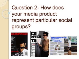
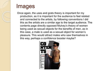
1) The document discusses the representation of social groups in the media product of a hip hop magazine. Eye-line shots and direct address were used sparingly to create engagement while also generating mystery about the artists.
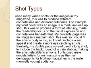
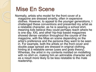
2) Shot types including medium close-up, medium, and long shots were used to create different connotations and outcomes for the front cover, contents page, and double page spread. Only male models were featured to target the magazine's main young male demographic.
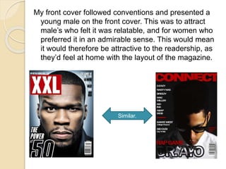
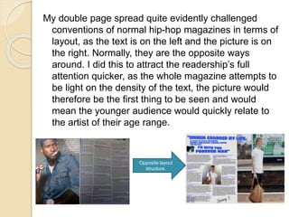
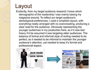
3) Conventions like featuring a young male on the front cover were followed to attract male and female readers but layouts and styles were challenged, like placing the image before text, to quickly engage younger audiences.
Luxembourg Private Equity and Venture Capital Association (LPEA) is celebrating its 5th anniversary this February amid a community that keeps growing steadily in a market rich with potential.
On the back of a small group of actors in 2010, our industry was able to build a reputable representative body which is now heard in the country’s highest instances.
Capital V is a window on Luxembourg’s private equity and venture capital industry. The four previous editions illustrated part of the common story we have been building over the past 5 years.
We will never thank enough our members for their contribution to the current issue, as well as to all those that keep supporting LPEA’s work on a regular basis, making Luxembourg Europe’s leading private equity hub.
Enjoy the reading.
Possibly, the most captivating tour in the vast Indian sub-continent. India Holiday Mall’s Golden Triangle of the three cities perfectly captures the pageantry of India. A gorgeous panorama of majestic architectural creations and a rich tradition of art and culture.
Discover India with Indian Cultural Tours and explore its ancient flavors, monuments, religions, unique art & culture, a glorious past and blend of tradition, unique smells of incense, visual wealth of ancient architecture, extremely beautiful palaces, havelis, terrific temples.
Capital V #9 Swancap: Seeking Every Opportunity for Higer ReturnsLPEA
Featured articles:
About the LPEA Insights: 360 GP View
News: Deals / Brexit / EQT Ventures Fund
Enovos & CREOS launch new Corporate VC
Private Loan Funds
Private Equity's Business Model is changing
Interview Swancap (COVER)
Shortcomings in Buyout Firm’s Self-evaluation of their Performance
Tax: Permanent Establishement for AIF Managers
IT Tools for PE Professionals
Climate Finance
Region Profile: Africa
Lifestyle: Marathon in Luxembourg
Photo Gallery
Market Figures
Events’ Calenda
Hadj Ounis's most notable work is his sculpture titled "Metamorphosis." This piece showcases Ounis's mastery of form and texture, as he seamlessly combines metal and wood to create a dynamic and visually striking composition. The juxtaposition of the two materials creates a sense of tension and harmony, inviting viewers to contemplate the relationship between nature and industry.
2137ad - Characters that live in Merindol and are at the center of main storiesluforfor
Kurgan is a russian expatriate that is secretly in love with Sonia Contado. Henry is a british soldier that took refuge in Merindol Colony in 2137ad. He is the lover of Sonia Contado.
Explore the multifaceted world of Muntadher Saleh, an Iraqi polymath renowned for his expertise in visual art, writing, design, and pharmacy. This SlideShare delves into his innovative contributions across various disciplines, showcasing his unique ability to blend traditional themes with modern aesthetics. Learn about his impactful artworks, thought-provoking literary pieces, and his vision as a Neo-Pop artist dedicated to raising awareness about Iraq's cultural heritage. Discover why Muntadher Saleh is celebrated as "The Last Polymath" and how his multidisciplinary talents continue to inspire and influence.
2137ad Merindol Colony Interiors where refugee try to build a seemengly norm...luforfor
This are the interiors of the Merindol Colony in 2137ad after the Climate Change Collapse and the Apocalipse Wars. Merindol is a small Colony in the Italian Alps where there are around 4000 humans. The Colony values mainly around meritocracy and selection by effort.
Question 2 how does your media product represent particular social groups (memory stick)
1. Question 2- How does
your media product
represent particular social
groups?
2. Shot Types
In order to create engagement between the audience and the artists, the
use of eye-line shots were vital. These shots emphasised whether or
not direct mode of address was used; some cases it was used in order
to form personal connections with the audience (as proposed in the
uses and gratifications theory). However, for the majority of images, I
did not use direct mode of address, this was because I aimed to grab
the reader’s attention by creating a sort of mystery behind the artists,
one which they would want to read the article and answer the
questions they constantly propose in their head.
3. Shot Types
I used many varied shots for the images in my
magazine, this was to produce different
connotations and different outcomes. For example,
my front cover was an image in a medium-close up
shot, this was to produce a form of intensity, made
the readership focus on the facial expression and
connotations beneath that. My contents page was
an image in a medium shot, this was so I could fit
the artist’s body in too, so I could include a sex
appeal and create a more eye catching article.
Similarly, my double page spread used a long shot,
to include the background of a train station, making
the artist relatable to anyone. I only used male
models/artists for my magazine as the main
demographic for hip-hop magazines is the male
(normally young) audience.
4. My front cover followed conventions and presented a
young male on the front cover. This was to attract
male’s who felt it was relatable, and for women who
preferred it in an admirable sense. This would mean
it would therefore be attractive to the readership, as
they’d feel at home with the layout of the magazine.
Similar.
5. My double page spread quite evidently challenged
conventions of normal hip-hop magazines in terms of
layout, as the text is on the left and the picture is on
the right. Normally, they are the opposite ways
around. I did this to attract the readership’s full
attention quicker, as the whole magazine attempts to
be light on the density of the text, the picture would
therefore be the first thing to be seen and would
mean the younger audience would quickly relate to
the artist of their age range.
Opposite layout
structure.
6. Mise En Scene
Normally, artists who model for the front cover of a
magazine are dressed smartly, often in expensive
clothes. However, to appeal to the younger generations, I
challenged these conventions and presented my artist as
a relatable character, as he is wearing a school shirt,
meaning kids believe they could perhaps reach where he
is one day. XXL and other hip-hop based magazines
showed dense variation throughout the course of the
magazine, with the Mise en scene depending on the
artist’s preference and the persona they want to be seen
in. For example, both the artists on the front cover and
double page spread are dressed in original clothing,
hinting at a relatable sense (uses and grats theory).
Whereas, the artist in my contents insisted on modelling
with no shirt on, making him an admirable character and
as a result more likely to be less relatable to the male
readership.
7. Layout
Evidently, from my target audience research I knew which
demographic of the readership I was mainly basing my
magazine around. To reflect our target audience’s
stereotypical preferences, I used a simplistic layout, with
everything neatly arranged with no overcrowding, producing a
clear read for the audience. Obviously representing the
younger audiences in my production here, as if it was text
heavy it’d be assumed it was targeting older audiences. The
balance of formal and informal style of writing needed to be
perfect, as it needed to be informal to maintain the younger
audience’s attention, yet needed to keep it’s formal and
professional aspect.
Conventions
followed
8. Images
Once again, the uses and grats theory is important for my
production, as it is important for the audience to feel related
and connected to the artists, by following conventions I did
this as the artists are a similar age to the target audience. The
contents page directly opposed Mulvey’s theory of women
being used as sexual objects for the benefits of men, as in
this case, a male is used as a sexual object for women’s
pleasure. This would attract males who saw themselves in
this way, perhaps a confidence booster maybe?
9. Simple but yet affective main aim for the
double page spread is to attract
reader’s based on how relatable it is
and originality. For example, the image
is shown a man waiting for a train, this
is a regular occurrence for many
people, and people can relate so
therefore feel inclined to read on.
Similarly, it’s clear the Mise en scene is
very minimal, thus enforcing this
natural aspect of the image.
10. Ideology
The whole basis of my magazine tends to be
centred around the idea of artists being
relatable to the readership. Ordinary
surroundings and low budget clothing
enhances this idea, as well as the use of
artists that are in a similar age range to the
target audience. This enforces the idea that
the artists are representing the teenagers
reading, so they wan to read about their
potential. The camera shots (eye-line shots)
and informality helped support the idea that
they are related and in some way similar to
the audience.