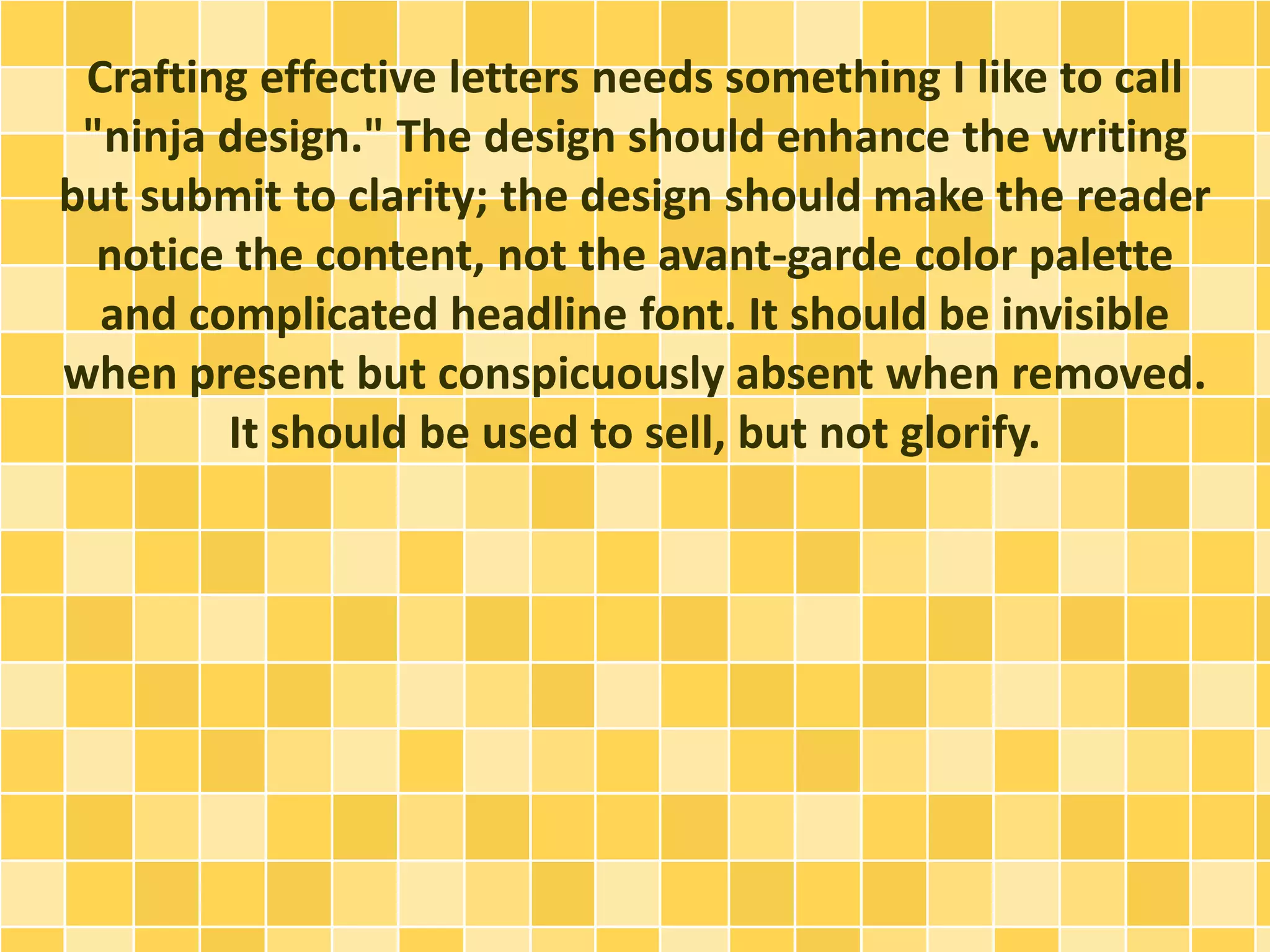
Designing Strong Direct Mail Letters
Direct mail is one of the world's venerable advertising 
systems, a spin-off from the text-heavy ads that used to 
appear in magazines. Reduced to almost a pure science 
through obsessive list management and refined 
copywriting techniques, it remains an amazingly 
effective means of branding, acquisition and retention. 
(Look no further than Citibank, who distributes tens of 
billions of acquisition pieces every year.)
Advertising agencies know what works and what 
doesn't. Those who deal in producing direct mail often 
specialize in direct mail, and they have teams of writers, 
creative directors and designers working in tandem to 
produce exhaustive campaigns.
Design Tips for Non-Agency Types
For the lonely freelancer who may not have agency 
experience, there are some guides to get your design off 
the ground and help your client see strong results.
1. Color -- Use It, But Use It Well.
A consumer opening an envelope to find a sheet of 
white paper with blocks of small black text is an 
invitation to the circular file. Consider using colored type 
in the headlines. Try borders, gradients, even pictures if 
the design is full-color. It will make the piece look 
decidedly more "direct mail," but 99.99% of the time, 
the consumer knew that opening the letter anyway.
2. Explore Beyond Letter Size.
To make the piece a bit more interesting, and if you can 
squeeze a few more dollars out of the budget, try going 
beyond 8.5"x11". Maybe smaller is better -- 7"x10"? Or 
push larger -- go legal size and spread things out a bit 
more.
3. Smart Typography.
This point is really split. First, make headline copy 
interesting and second, make the body copy ultra-readable. 
Readability is absolutely imperative -- people 
need to pick up the paper and quickly understand the 
material just by scanning. Making the reader squint, 
turn the paper sideways, or generally forcing them to 
think about the words will put them off quickly. Serif 
fonts are best for readability in the body. Keep the point 
size decent, around 11 or 12, with generous leading to 
help scanning without interference.
4. Bullet the Points. Break up paragraphs with short, 
bulleted points highlighting the features and benefits. 
Readers will absorb this material better than 
paragraphs.
5. Break It. If the document goes front and back, break 
the copy in the middle of a sentence. This helps iterate 
that there's more to read, and makes them more 
inclined to keep reading.
6. Vary the text. Use italics and bolds to highlight key 
terms. Don't go too crazy with this one -- maybe three or 
four bolds at most.
7. Make the ending PostScript copy large and readable.
Try a handwriting font to give it more credence.
8. Lose the Clipart. Unless a picture directly reinforces a 
major point in the copy, avoid it. Don't use random 
shinies or tacky clipart. It detracts from what matters 
(the copy) and can confuse the masses. Save the stock 
photography for your next PowerPoint presentation.
9. Be careful in the placement of logos. If it works with 
the headline, or if it is for a household company 
(Microsoft, Johnson & Johnson), it may be appropriate 
on the front. However, the logo or letterhead cannot 
compete with the headline, since the headline -- and not 
the logo -- will lead the reader into the body copy.
The Copy
For projects like this, content is king. This is important to 
understand. Even the best design can't save bad copy, 
and the best copy can't save a bad headline.
There are also many, many important points about 
copywriting for direct mail letters that designers should 
be aware of. Short sentences, short words, crisp and 
clear language, a clear call to action (very important) 
and copy that shows the benefits to the consumer, not 
tells them about the company, are all very important. If 
you're freelancing, you may often find yourself asked to 
proofread or edit copy, and raising concerns to the client 
before the piece is launched will benefit them far more 
than having the project fail in the real world.
As a designer, your job is not copywriting. But remaining 
aware of what constitutes successful sales copy will only 
enhance your delivered product.
The Final Tip: The Three Most Read Items (in order):
1. Headline
2. First Sentence
3. Postscript
Ninja Design
Crafting effective letters needs something I like to call 
"ninja design." The design should enhance the writing 
but submit to clarity; the design should make the reader 
notice the content, not the avant-garde color palette 
and complicated headline font. It should be invisible 
when present but conspicuously absent when removed. 
It should be used to sell, but not glorify.
http://internetbusinessesathomesite.info/form.php?id= 
630985

Designing Strong Direct Mail Letters

  • 1.
  • 2.
    Direct mail isone of the world's venerable advertising systems, a spin-off from the text-heavy ads that used to appear in magazines. Reduced to almost a pure science through obsessive list management and refined copywriting techniques, it remains an amazingly effective means of branding, acquisition and retention. (Look no further than Citibank, who distributes tens of billions of acquisition pieces every year.)
  • 3.
    Advertising agencies knowwhat works and what doesn't. Those who deal in producing direct mail often specialize in direct mail, and they have teams of writers, creative directors and designers working in tandem to produce exhaustive campaigns.
  • 4.
    Design Tips forNon-Agency Types
  • 5.
    For the lonelyfreelancer who may not have agency experience, there are some guides to get your design off the ground and help your client see strong results.
  • 6.
    1. Color --Use It, But Use It Well.
  • 7.
    A consumer openingan envelope to find a sheet of white paper with blocks of small black text is an invitation to the circular file. Consider using colored type in the headlines. Try borders, gradients, even pictures if the design is full-color. It will make the piece look decidedly more "direct mail," but 99.99% of the time, the consumer knew that opening the letter anyway.
  • 8.
    2. Explore BeyondLetter Size.
  • 9.
    To make thepiece a bit more interesting, and if you can squeeze a few more dollars out of the budget, try going beyond 8.5"x11". Maybe smaller is better -- 7"x10"? Or push larger -- go legal size and spread things out a bit more.
  • 10.
  • 11.
    This point isreally split. First, make headline copy interesting and second, make the body copy ultra-readable. Readability is absolutely imperative -- people need to pick up the paper and quickly understand the material just by scanning. Making the reader squint, turn the paper sideways, or generally forcing them to think about the words will put them off quickly. Serif fonts are best for readability in the body. Keep the point size decent, around 11 or 12, with generous leading to help scanning without interference.
  • 12.
    4. Bullet thePoints. Break up paragraphs with short, bulleted points highlighting the features and benefits. Readers will absorb this material better than paragraphs.
  • 13.
    5. Break It.If the document goes front and back, break the copy in the middle of a sentence. This helps iterate that there's more to read, and makes them more inclined to keep reading.
  • 14.
    6. Vary thetext. Use italics and bolds to highlight key terms. Don't go too crazy with this one -- maybe three or four bolds at most.
  • 15.
    7. Make theending PostScript copy large and readable.
  • 16.
    Try a handwritingfont to give it more credence.
  • 17.
    8. Lose theClipart. Unless a picture directly reinforces a major point in the copy, avoid it. Don't use random shinies or tacky clipart. It detracts from what matters (the copy) and can confuse the masses. Save the stock photography for your next PowerPoint presentation.
  • 18.
    9. Be carefulin the placement of logos. If it works with the headline, or if it is for a household company (Microsoft, Johnson & Johnson), it may be appropriate on the front. However, the logo or letterhead cannot compete with the headline, since the headline -- and not the logo -- will lead the reader into the body copy.
  • 19.
  • 20.
    For projects likethis, content is king. This is important to understand. Even the best design can't save bad copy, and the best copy can't save a bad headline.
  • 21.
    There are alsomany, many important points about copywriting for direct mail letters that designers should be aware of. Short sentences, short words, crisp and clear language, a clear call to action (very important) and copy that shows the benefits to the consumer, not tells them about the company, are all very important. If you're freelancing, you may often find yourself asked to proofread or edit copy, and raising concerns to the client before the piece is launched will benefit them far more than having the project fail in the real world.
  • 22.
    As a designer,your job is not copywriting. But remaining aware of what constitutes successful sales copy will only enhance your delivered product.
  • 23.
    The Final Tip:The Three Most Read Items (in order):
  • 24.
  • 25.
  • 26.
  • 27.
  • 28.
    Crafting effective lettersneeds something I like to call "ninja design." The design should enhance the writing but submit to clarity; the design should make the reader notice the content, not the avant-garde color palette and complicated headline font. It should be invisible when present but conspicuously absent when removed. It should be used to sell, but not glorify.
  • 29.