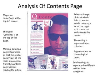
Vibe Magazine is a music and entertainment magazine founded in 1993 that features R&B and hip-hop artists. It publishes every other month and costs $3.99. Q Magazine focuses on modern rock music and has been publishing monthly since 1986 for £3.75. Both magazines use only a few colors on the cover and contents page for visual appeal. The covers catch readers' eyes with large mastheads and eye-catching cover models. Contents pages list articles in columns with images and minimal text. Double page spreads feature large central images relating to the article alongside columns of text.