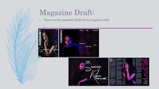
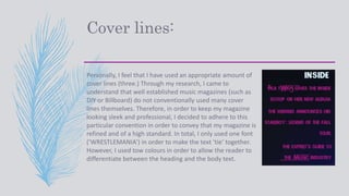
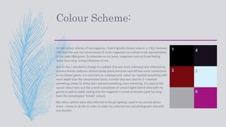
Brand
Guidelines
Magazine Draft:
– These are the exported JPEGS of my magazine draft:
Cover lines:
Personally, I feel that I have used an appropriate amount of
cover lines (three.) Through my research, I came to
understand that well established music magazines (such as
DIY or Billboard) do not conventionally used many cover
lines themselves. Therefore, in order to keep my magazine
looking sleek and professional, I decided to adhere to this
particular convention in order to convey that my magazine is
refined and of a high standard. In total, I only used one font
(‘WRESTLEMANIA’) in order to make the text ‘tie’ together.
However, I used tow colours in order to allow the reader to
differentiate between the heading and the body text.
Colour Scheme:
For the colour scheme of my magazine, I had originally chosen colours 1, 2 &3, however,
I felt that this was too conventional of music magazines as a whole to be representative
of the Indie R&B genre. To elaborate on my point, magazines such as Q and Rolling
Stone have clear, strong influences of red.
Due to this, I decided to change to a palette that was more individual and reflected my
primary female audience without being overly feminine and still had some connections
to my chosen genre. 4 is used here as a background colour as I wanted something with
more depth than the conventional black, a similar idea was used for 5- I wanted
something similar to white, but I wanted something more refreshing. 6 is used as the
accent colour here as it has a brief connotation of concert lights (which links with my
genre) as well as subtly stating that the magazine is aimed at females (pink has long
been the stereotypical ‘female’ colour).
My colour options were also reflected in the gel lighting I used in my second photo-
shoot. I chose to do this in order to make my coloured text and photographs link with
one another
1
2
3
4
5
6
Tone:
The tone of my magazine is laid back but with a slight edge to it. The strong lighting
and specific poses that the model exhibits show that there is something different
to her, she seems ‘cool’ to her target audience. Due to this, they're more likely to
want to listen to what she says if they feel like she has a higher influence than
them,, but since she is still identifiable, it isn’t too much of a reach to identify with
her. The magazine seems vaguely informal due to the lack of serif fonts. By using
sans serif fonts, I have made the magazine seem more relatable and down-to-
earth. If consumers saw the publication as being too informal and too pretentious,
they would be hesitant to listen to what it says and continue to buy it on a regular
basis.
Conclusion:
Overall, I feel that the making of my magazine went particularly well as I thoroughly
thought out specific elements of my work (such as the colour scheme, fonts, images
etc.). As well as this, I paid attention to the codes and conventions of all magazines as
well as those of a music genre; I adhered to these when necessary but I also strayed
from them when needed (i.e. the removal of red from the colour palette I chose to use)
in order to give my potential audience a refreshing take on music magazines.
Furthermore, I exhibited traits of the Indie genre as these are typically lesser known
artists who play in smaller settings with stronger lighting. This is represented through
my choice of colours and lighting in my images. My images connote the feeling of a
concert due to the use of bright gel lights around the model throughout my magazine.

Brand guidelines

  • 1.
  • 2.
    Magazine Draft: – Theseare the exported JPEGS of my magazine draft:
  • 3.
    Cover lines: Personally, Ifeel that I have used an appropriate amount of cover lines (three.) Through my research, I came to understand that well established music magazines (such as DIY or Billboard) do not conventionally used many cover lines themselves. Therefore, in order to keep my magazine looking sleek and professional, I decided to adhere to this particular convention in order to convey that my magazine is refined and of a high standard. In total, I only used one font (‘WRESTLEMANIA’) in order to make the text ‘tie’ together. However, I used tow colours in order to allow the reader to differentiate between the heading and the body text.
  • 4.
    Colour Scheme: For thecolour scheme of my magazine, I had originally chosen colours 1, 2 &3, however, I felt that this was too conventional of music magazines as a whole to be representative of the Indie R&B genre. To elaborate on my point, magazines such as Q and Rolling Stone have clear, strong influences of red. Due to this, I decided to change to a palette that was more individual and reflected my primary female audience without being overly feminine and still had some connections to my chosen genre. 4 is used here as a background colour as I wanted something with more depth than the conventional black, a similar idea was used for 5- I wanted something similar to white, but I wanted something more refreshing. 6 is used as the accent colour here as it has a brief connotation of concert lights (which links with my genre) as well as subtly stating that the magazine is aimed at females (pink has long been the stereotypical ‘female’ colour). My colour options were also reflected in the gel lighting I used in my second photo- shoot. I chose to do this in order to make my coloured text and photographs link with one another 1 2 3 4 5 6
  • 5.
    Tone: The tone ofmy magazine is laid back but with a slight edge to it. The strong lighting and specific poses that the model exhibits show that there is something different to her, she seems ‘cool’ to her target audience. Due to this, they're more likely to want to listen to what she says if they feel like she has a higher influence than them,, but since she is still identifiable, it isn’t too much of a reach to identify with her. The magazine seems vaguely informal due to the lack of serif fonts. By using sans serif fonts, I have made the magazine seem more relatable and down-to- earth. If consumers saw the publication as being too informal and too pretentious, they would be hesitant to listen to what it says and continue to buy it on a regular basis.
  • 6.
    Conclusion: Overall, I feelthat the making of my magazine went particularly well as I thoroughly thought out specific elements of my work (such as the colour scheme, fonts, images etc.). As well as this, I paid attention to the codes and conventions of all magazines as well as those of a music genre; I adhered to these when necessary but I also strayed from them when needed (i.e. the removal of red from the colour palette I chose to use) in order to give my potential audience a refreshing take on music magazines. Furthermore, I exhibited traits of the Indie genre as these are typically lesser known artists who play in smaller settings with stronger lighting. This is represented through my choice of colours and lighting in my images. My images connote the feeling of a concert due to the use of bright gel lights around the model throughout my magazine.