This tutorial on Twitter Bootstrap serves as a comprehensive guide for web development using this popular mobile-first front-end framework, which utilizes HTML, CSS, and JavaScript. It is structured into various sections covering essential topics like the bootstrap structure, CSS layout components, and plugins, aimed at individuals with a fundamental understanding of HTML and CSS. After completing the tutorial, users should achieve moderate proficiency in developing web projects with Bootstrap.


![Bootstrap
5
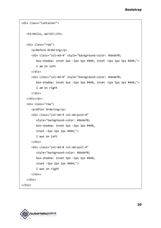
<!DOCTYPE html>
<html>
<head>
<title>Bootstrap 101 Template</title>
<meta name="viewport" content="width=device-width, initial-
scale=1.0">
<!-- Bootstrap -->
<link href="css/bootstrap.min.css" rel="stylesheet">
<!-- HTML5 Shim and Respond.js IE8 support of HTML5 elements and
media queries -->
<!-- WARNING: Respond.js doesn't work if you view the page
via file:// -->
<!--[if lt IE 9]>
<script src="https://oss.maxcdn.com/libs/html5shiv/3.7.0/
html5shiv.js"></script>
<script src="https://oss.maxcdn.com/libs/respond.js/1.3.0/
respond.min.js"></script>
<![endif]-->
</head>
<body>
<h1>Hello, world!</h1>
<!-- jQuery (necessary for Bootstrap's JavaScript plugins) -->
<script src="https://code.jquery.com/jquery.js"></script>
<!-- Include all compiled plugins (below), or include individual
files as needed -->
<script src="js/bootstrap.min.js"></script>
</body>
</html>
Here you can see the jquery.js, bootstrap.min.js and bootstrap.min.css files
that are included to make a normal HTM file to the Bootstrapped Template. Just
make sure to include jQuery library before you include Bootstrap library.
More details about each of the elements in this above piece of code will be
discussed in the chapter Bootstrap CSS Overview.](https://image.slidesharecdn.com/bootstraptutorial-170125205352/85/Bootstrap-tutorial-16-320.jpg)


![Bootstrap
156
ProgrammaticAPI
The developers of Bootstrap believe that you should be able to use all of the
plugins purely through the JavaScript API. All public APIs are single, chainable
methods, and return the collection acted upon say for example:
$(".btn.danger").button("toggle").addClass("fat")
All methods accept an optional options object, a string which targets a particular
method, or nothing (which initiates a plugin with default behavior) as shown
below:
// initialized with defaults
$("#myModal").modal()
// initialized with no keyboard
$("#myModal").modal({ keyboard: false })
// initializes and invokes show immediately
$("#myModal").modal('show')
Each plugin also exposes its raw constructor on a Constructor property
:$.fn.popover.Constructor. If you'd like to get a particular plugin instance,
retrieve it directly from an element:
$('[rel=popover]').data('popover').
NoConflict
Bootstrap plugins can sometimes be used with other UI frameworks. In these
circumstances, namespace collisions can occasionally occur. To overcome this
call .noConflict on the plugin you wish to revert the value of.
// return $.fn.button to previously assigned value
var bootstrapButton = $.fn.button.noConflict()
// give $().bootstrapBtn the Bootstrap functionality
$.fn.bootstrapBtn = bootstrapButton
Events
Bootstrap provides custom events for most plugin's unique actions. Generally,
these events come in two forms:](https://image.slidesharecdn.com/bootstraptutorial-170125205352/85/Bootstrap-tutorial-167-320.jpg)


![Bootstrap
175
Options
Options can be passed via data attributes or JavaScript. Following table lists the
options:
Option
Name
Type/Default
Value
Data
attribute
name
Description
offset number
Default: 10
data-offset Pixels to offset from top when
calculating position of scroll.
Methods
.scrollspy('refresh'): When calling the scrollspy via the JavaScript method,
you need to call the .refresh method to update the DOM. This is helpful if any
elements of the DOM have changed i.e. if you have added or removed some
elements. Following would be the syntax to use this method.
$('[data-spy="scroll"]').each(function () {
var $spy = $(this).scrollspy('refresh')
})
Example
The following example demonstrates the use of .scrollspy('refresh') method:
<nav id="myScrollspy" class="navbar navbar-default navbar-static"
role="navigation">
<div class="navbar-header">
<button class="navbar-toggle" type="button" data-toggle="collapse"
data-target=".bs-js-navbar-scrollspy">
<span class="sr-only">Toggle navigation</span>](https://image.slidesharecdn.com/bootstraptutorial-170125205352/85/Bootstrap-tutorial-186-320.jpg)


![Bootstrap
178
</div>
<script type="text/javascript">
$(function(){
removeSection = function(e) {
$(e).parents(".section").remove();
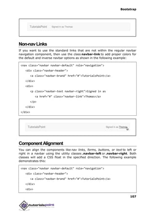
$('[data-spy="scroll"]').each(function () {
var $spy = $(this).scrollspy('refresh')
});
}
$("#myScrollspy").scrollspy();
});
</script>
Events
The following table lists the events to work with scrollspy. This event may be
used to hook into the function.
Event Description Example
activate.bs.scrollspy This event
fires
whenever a
new item
becomes
activated by
the scrollspy.
$('#myScrollspy').on('activate.bs.scrollspy',
function () {
// do something…
})](https://image.slidesharecdn.com/bootstraptutorial-170125205352/85/Bootstrap-tutorial-189-320.jpg)


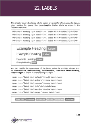
![Bootstrap
181
Web Logic etc.</p>
</div>
<div class="section">
<h4 id="spring">Spring</h4>
<p>Spring framework is an open source Java platform that provides
comprehensive infrastructure support for developing robust Java
applications very easily and very rapidly.</p>
<p>Spring framework was initially written by Rod Johnson and was
first released under the Apache 2.0 license in June 2003.</p>
</div>
</div>
<script type="text/javascript">
$(function(){
removeSection = function(e) {
$(e).parents(".section").remove();
$('[data-spy="scroll"]').each(function () {
var $spy = $(this).scrollspy('refresh')
});
}
$("#myScrollspy").scrollspy();
$('#myScrollspy').on('activate.bs.scrollspy', function () {
var currentItem = $(".nav li.active > a").text();
$("#activeitem").html("Currently you are viewing - " + currentItem);
})
});
</script>](https://image.slidesharecdn.com/bootstraptutorial-170125205352/85/Bootstrap-tutorial-192-320.jpg)

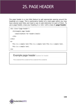
![Bootstrap
183
Tabs were introduced in the chapter Bootstrap Navigation Elements. By
combining a few data attributes, you can easily create a tabbed interface. With
this plugin you can transition through panes of local content in tabs or pills, even
via dropdown menus.
If you want to include this plugin functionality individually, then you will
need tab.js. Else, as mentioned in the chapter Bootstrap Plugins Overview, you
can include bootstrap.js or the minified bootstrap.min.js.
Usage
You can enable tabs in the following two ways:
Via data attributes: you need to add data-toggle="tab" or data-
toggle="pill" to the anchors.
Adding the nav and nav-tabs classes to the tab ul will apply the
Bootstrap tab styling, while adding the nav and nav-pills classes will
apply pill styling.
<ul class="nav nav-tabs">
<li><a href="#identifier" data-toggle="tab">Home</a></li>
...
</ul>
Via JavaScript: you can enable tabs using Javscript as below :
$('#myTab a').click(function (e) {
e.preventDefault()
$(this).tab('show')
})
Here’s an example of different ways to activate individual tabs:
// Select tab by name
$('#myTab a[href="#profile"]').tab('show')
// Select first tab
$('#myTab a:first').tab('show')
38. TAB PLUGIN](https://image.slidesharecdn.com/bootstraptutorial-170125205352/85/Bootstrap-tutorial-194-320.jpg)


![Bootstrap
188
for building highly scalable and robust enterprise level
applications to be deployed on J2EE compliant
Application Server such as JBOSS, Web Logic etc.
</p>
</div>
</div>
<script>
$(function () {
$('#myTab li:eq(1) a').tab('show');
});
</script>
Events
Following table lists the events to work with tab plugin. This event may be used
to hook into the function.
Event Description Example
show.bs.tab This event fires on tab show,
but before the new tab has
been shown.
Use event.target and
event.relatedTarget to
target the active tab and the
previous active tab (if
available) respectively.
$('a[data-
toggle="tab"]').on('show.bs.tab',
function (e) {
e.target // activated tab
e.relatedTarget // previous tab
})
shown.bs.tab This event fires on tab show
after a tab has been shown.
Use event.target and
event.relatedTarget to
target the active tab and the
$('a[data-
toggle="tab"]').on('shown.bs.tab',
function (e) {
e.target // activated tab](https://image.slidesharecdn.com/bootstraptutorial-170125205352/85/Bootstrap-tutorial-199-320.jpg)
![Bootstrap
190
<p>iOS is a mobile operating system developed and distributed by Apple
Inc. Originally released in 2007 for the iPhone, iPod Touch, and
Apple TV. iOS is derived from OS X, with which it shares the
Darwin foundation. iOS is Apple's mobile version of the
OS X operating system used on Apple computers.</p>
</div>
<div class="tab-pane fade" id="jmeter">
<p>jMeter is an Open Source testing software. It is 100% pure
Java application for load and performance testing.</p>
</div>
<div class="tab-pane fade" id="ejb">
<p>Enterprise Java Beans (EJB) is a development architecture
for building highly scalable and robust enterprise level
applications to be deployed on J2EE compliant
Application Server such as JBOSS, Web Logic etc.
</p>
</div>
</div>
<script>
$(function(){
$('a[data-toggle="tab"]').on('shown.bs.tab', function (e) {
// Get the name of active tab
var activeTab = $(e.target).text();
// Get the name of previous tab
var previousTab = $(e.relatedTarget).text();
$(".active-tab span").html(activeTab);
$(".previous-tab span").html(previousTab);
});
});
</script>](https://image.slidesharecdn.com/bootstraptutorial-170125205352/85/Bootstrap-tutorial-201-320.jpg)

![Bootstrap
192
Tooltips are useful when you need to describe a link. The plugin was inspired by
jQuery.tipsy plugin written by Jason Frame. Tooltips have since been updated to
work without images, animate with a CSS animation, and data-attributes for
local title storage.
If you want to include this plugin functionality individually, then you will need
tooltip.js. Else, as mentioned in the chapter Bootstrap Plugins Overview, you
can include bootstrap.js or the minified bootstrap.min.js.
Usage
The tooltip plugin generates content and markup on demand, and by default
places tooltips after their trigger element. You can add tooltips in the following
two ways:
Via data attributes: To add a tooltip, add data-toggle="tooltip" to an
anchor tag. The title of the anchor will be the text of a tooltip. By default,
tooltip is set to top by the plugin.
<a href="#" data-toggle="tooltip" title="Example tooltip">Hover
over me</a>
Via JavaScript: Trigger the tooltip via JavaScript:
$('#identifier').tooltip(options)
Tooltip plugin is NOT only-css plugins like dropdown or other plugins discussed
in previous chapters. To use this plugin you MUST activate it using jquery (read
javascript). To enable all the tooltips on your page just use this script:
$(function () { $("[data-toggle='tooltip']").tooltip(); });
Example
The following example demonstrates the use of tooltip plugin via data attributes.
<h4>Tooltip examples for anchors</h4>
This is a <a href="#" class="tooltip-test" data-toggle="tooltip"
title="Tooltip on left">
Default Tooltip
</a>.
39. TOOLTIP PLUGIN](https://image.slidesharecdn.com/bootstraptutorial-170125205352/85/Bootstrap-tutorial-203-320.jpg)

![Bootstrap
194
data-placement="bottom" title="Tooltip on bottom">
Tooltip on bottom
</button>
<button type="button" class="btn btn-default" data-toggle="tooltip"
data-placement="right" title="Tooltip on right">
Tooltip on right
</button>
<script>
$(function () { $("[data-toggle='tooltip']").tooltip(); });
</script>
Options
There are certain options which can be added via the Bootstrap Data API or
invoked via JavaScript. Following table lists the options:
Option
Name
Type/Default
Value
Data
attribute
name
Description
animation boolean
Default: true
data-
animation
Applies a CSS fade transition to the
tooltip.
html boolean
Default: false
data-html Inserts HTML into the tooltip. If
false, jQuery’s text method will be
used to insert content into the dom.
Use text if you’re worried about
XSS attacks.
placement string|function
Default: top
data-
placement
Specifies how to position the tooltip
(i.e., top|bottom|left|right|auto).
When auto is specified, it will
dynamically reorient the tooltip. For](https://image.slidesharecdn.com/bootstraptutorial-170125205352/85/Bootstrap-tutorial-205-320.jpg)


![Bootstrap
200
The popover is similar to tooltip, offering an extended view complete with a
heading. For the popover to activate, a user just needs to hover the cursor over
the element. The content of the popover can be populated entirely using the
Bootstrap Data API. This method requires a tooltip.
If you want to include this plugin functionality individually, then you will need
the popover.js and it has a dependency of the tooltip plugin. Else, as mentioned
in the chapter Bootstrap Plugins Overview, you can include bootstrap.js or the
minified bootstrap.min.js.
Usage
The popover plugin generates content and markup on demand, and by default
places popover after their trigger element. You can add popover in the following
two ways:
Via data attributes: To add a popover, add data-toggle="popover" to
an anchor/button tag. The title of the anchor will be the text of a popover.
By default, popover is set to top by the plugin.
<a href="#" data-toggle="popover" title="Example popover">
Hover over me
</a>
Via JavaScript: Enable popovers via JavaScript using the following
syntax:
$('#identifier').popover(options)
Popover plugin is NOT only css plugins like dropdown or other plugins discussed
in previous chapters. To use this plugin you MUST activate it using jquery (read
javascript). To enable all the popovers on your page just use this script:
$(function () { $("[data-toggle='popover']").popover(); });
Example
The following example demonstrates the use of popover plugin via data
attributes.
<div class="container" style="padding: 100px 50px 10px;" >
40. POPOVER PLUGIN](https://image.slidesharecdn.com/bootstraptutorial-170125205352/85/Bootstrap-tutorial-211-320.jpg)
![Bootstrap
201
<button type="button" class="btn btn-default" title="Popover title"
data-container="body" data-toggle="popover" data-placement="left"
data-content="Some content in Popover on left">
Popover on left
</button>
<button type="button" class="btn btn-primary" title="Popover title"
data-container="body" data-toggle="popover" data-placement="top"
data-content="Some content in Popover on top">
Popover on top
</button>
<button type="button" class="btn btn-success" title="Popover title"
data-container="body" data-toggle="popover" data-placement="bottom"
data-content="Some content in Popover on bottom">
Popover on bottom
</button>
<button type="button" class="btn btn-warning" title="Popover title"
data-container="body" data-toggle="popover" data-placement="right"
data-content="Some content in Popover on right">
Popover on right
</button>
</div>
<script>$(function ()
{ $("[data-toggle='popover']").popover();
});
</script>
</div>](https://image.slidesharecdn.com/bootstraptutorial-170125205352/85/Bootstrap-tutorial-212-320.jpg)


![Bootstrap [part 1]](https://cdn.slidesharecdn.com/ss_thumbnails/bootstrappart-11-170208154053-thumbnail.jpg?width=640&height=640&fit=bounds)