BOOTSTRAP
BOOTSTRAP
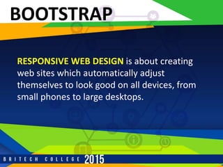
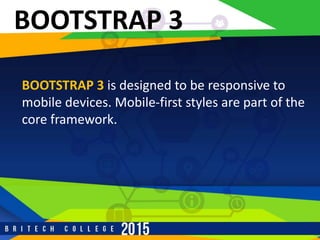
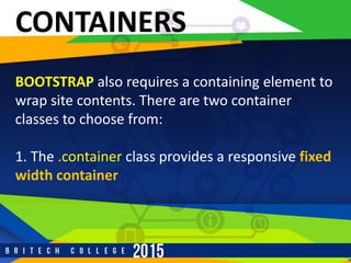
•Bootstrap is a free front-end framework for faster
and easier web development
•Bootstrap includes HTML and CSS based design
templates for typography, forms, buttons, tables,
navigation, modals, image carousels and many
other, as well as optional JavaScript plugins
BOOTSTRAP
•Bootstrap also gives you the ability to easily
create RESPONSIVE DESIGNS
BOOTSTRAP
RESPONSIVE WEB DESIGN is about creating
web sites which automatically adjust
themselves to look good on all devices, from
small phones to large desktops.
HISTORY
BOOTSTRAP was developed by Mark Otto
and Jacob Thornton at Twitter, and released
as an open source product in August 2011
on GitHub.
ADVANTAGES
Easy to use: Anybody with just basic
knowledge of HTML and CSS can start using
Bootstrap
Responsive features: Bootstrap's responsive
CSS adjusts to phones, tablets, and desktops
ADVANTAGES
Mobile-first approach: In Bootstrap 3,
mobile-first styles are part of the core
framework
Browser compatibility: Bootstrap is
compatible with all modern browsers
(Chrome, Firefox, Internet Explorer, Safari,
and Opera)
HOW TO GET
1. Download Bootstrap from
getbootstrap.com
1. Include Bootstrap from a CDN
r
BOOTSTRAP CDN
If you don't want to download and host
Bootstrap yourself, you can include it from a
CDN (Content Delivery Network).
r
ADD HTML 5
r
BOOTSTRAP 3
BOOTSTRAP 3 is designed to be responsive to
mobile devices. Mobile-first styles are part of the
core framework.
r
BOOTSTRAP 3
To ensure proper rendering and touch zooming,
add the following <meta> tag inside
the <head>element:
r
BOOTSTRAP 3
The width=device-width part sets the width of the
page to follow the screen-width of the device
(which will vary depending on the device).
The initial-scale=1 part sets the initial zoom level
when the page is first loaded by the browser.
r
CONTAINERS
BOOTSTRAP also requires a containing element to
wrap site contents. There are two container
classes to choose from:
1. The .container class provides a responsive fixed
width container
r
CONTAINERS
The .container-fluid class provides a full width
container, spanning the entire width of the
viewport
r
BOOTSTRAP GRID SYSTEM
BOOTSTRAP'S GRID SYSTEM allows up to 12
columns across the page.
If you do not want to use all 12 column
individually, you can group the columns together
to create wider columns:
r
BOOTSTRAP GRID SYSTEM
r
BOOTSTRAP GRID SYSTEM
Bootstrap's grid system is responsive, and
the columns will re-arrange automatically
depending on the screen size.
r
GRID CLASSES
The Bootstrap grid system has four classes:
xs (for phones)
sm (for tablets)
md (for desktops)
lg (for larger desktops)
r
GRID CLASSES
The classes above can be combined to create
more dynamic and flexible layouts.
r
BOOTSTRAP DEFAULT SETTINGS
Bootstrap's global default font-size is 14px,
with a line-height of 1.428.
This is applied to the <body> and all
paragraphs.
In addition, all <p> elements have a bottom
margin that equals half their computed line-
height (10px by default).
r
TYPOGRAPHY CLASSES

Boostrap - Start Up

  • 1.
  • 2.
    BOOTSTRAP •Bootstrap is afree front-end framework for faster and easier web development •Bootstrap includes HTML and CSS based design templates for typography, forms, buttons, tables, navigation, modals, image carousels and many other, as well as optional JavaScript plugins
  • 3.
    BOOTSTRAP •Bootstrap also givesyou the ability to easily create RESPONSIVE DESIGNS
  • 4.
    BOOTSTRAP RESPONSIVE WEB DESIGNis about creating web sites which automatically adjust themselves to look good on all devices, from small phones to large desktops.
  • 5.
    HISTORY BOOTSTRAP was developedby Mark Otto and Jacob Thornton at Twitter, and released as an open source product in August 2011 on GitHub.
  • 6.
    ADVANTAGES Easy to use:Anybody with just basic knowledge of HTML and CSS can start using Bootstrap Responsive features: Bootstrap's responsive CSS adjusts to phones, tablets, and desktops
  • 7.
    ADVANTAGES Mobile-first approach: InBootstrap 3, mobile-first styles are part of the core framework Browser compatibility: Bootstrap is compatible with all modern browsers (Chrome, Firefox, Internet Explorer, Safari, and Opera)
  • 8.
    HOW TO GET 1.Download Bootstrap from getbootstrap.com 1. Include Bootstrap from a CDN
  • 9.
    r BOOTSTRAP CDN If youdon't want to download and host Bootstrap yourself, you can include it from a CDN (Content Delivery Network).
  • 10.
  • 11.
    r BOOTSTRAP 3 BOOTSTRAP 3is designed to be responsive to mobile devices. Mobile-first styles are part of the core framework.
  • 12.
    r BOOTSTRAP 3 To ensureproper rendering and touch zooming, add the following <meta> tag inside the <head>element:
  • 13.
    r BOOTSTRAP 3 The width=device-widthpart sets the width of the page to follow the screen-width of the device (which will vary depending on the device). The initial-scale=1 part sets the initial zoom level when the page is first loaded by the browser.
  • 14.
    r CONTAINERS BOOTSTRAP also requiresa containing element to wrap site contents. There are two container classes to choose from: 1. The .container class provides a responsive fixed width container
  • 15.
    r CONTAINERS The .container-fluid classprovides a full width container, spanning the entire width of the viewport
  • 16.
    r BOOTSTRAP GRID SYSTEM BOOTSTRAP'SGRID SYSTEM allows up to 12 columns across the page. If you do not want to use all 12 column individually, you can group the columns together to create wider columns:
  • 17.
  • 18.
    r BOOTSTRAP GRID SYSTEM Bootstrap'sgrid system is responsive, and the columns will re-arrange automatically depending on the screen size.
  • 19.
    r GRID CLASSES The Bootstrapgrid system has four classes: xs (for phones) sm (for tablets) md (for desktops) lg (for larger desktops)
  • 20.
    r GRID CLASSES The classesabove can be combined to create more dynamic and flexible layouts.
  • 21.
    r BOOTSTRAP DEFAULT SETTINGS Bootstrap'sglobal default font-size is 14px, with a line-height of 1.428. This is applied to the <body> and all paragraphs. In addition, all <p> elements have a bottom margin that equals half their computed line- height (10px by default).
  • 22.