Sky line: The sky line goes above the 
masthead on the magazine and normally 
gives extra information about the issue 
and what’s inside. 
Masthead: Masthead is an alternative 
word for the title of the magazine. The 
Kerrang logo on this issue is red which 
matches part of the text on the cover line. 
Exclusive: The magazine says they have an 
exclusive story on Fall Out Boy’s new 
album. This might attract consumers who 
are fans of the band. 
Cover line: The main headline goes with 
the main image on the cover as Black Veil 
Brides are the band on the picture. They 
have used a quote and have not given 
very much information on the article so 
the reader can find out more about the 
main headline. This cover line tells you a 
lot about what the band have been doing, 
but they don’t give too much away that all 
of the information is on the front and you 
won’t need to read the inside, which may 
attract more people into buying it and 
wanting to find out more. 
Drop Caps: Every word on the cover of 
this magazine is in capital letters. Bold, 
capital letters will attract the readers to 
different stories talking about on the 
cover. 
Barcode: The barcode tells the readers 
the price of the magazine, the date and 
the issue number. The barcode also tells 
the employer how many magazines are 
left in the shop, therefore how many 
they can put out for customers to buy. 
Puff: this magazine is offering you a chance to 
win some free tickets to a show. The puff is the 
promotion of a bands show; it gives the band the 
publicity of the show and will hopefully get more 
people involved and wanting to go see their 
show. 
House style: the layout of this article is quite 
packed and doesn’t seem to fit a theme, things 
are placed anywhere, however it’s still easy to 
read everything on the actual page. The reason 
everything is so clear to read but still together is 
because of the bold and the well-used colours. 
The main ones are; yellow, red, white, with 
black outlines. These colours all work really well 
together, which makes the page seem better to 
read and to notice things more. The black 
outline brings out the text and the things that 
would have gotten lost behind everything else. 
The white background brings the picture out 
more, when a coloured one would have made it 
look unappealing because of the dark tones, the 
picture has. The font used makes the cover look 
smart and organized, even though it is not, the 
writing is clear because of how spacious it is 
and because of the dark colours used 
underneath it. A member of the band on the 
front covers up some of the title of the 
magazine; however they use a font which a lot 
of people can recognize now, and his head also 
doesn’t cover up a lot of it, but highlights the 
band as well. The small photos and text around 
the edges, tell you a lot about what’s going to 
be inside and although they come across as 
small, they are still big enough for you to read. 
Photos of the posters are displayed at the top 
so it will attract readers into buying it, because 
it may be one of the first things they see.
Issue number and cover date: kerrang has put 
this information at the top of the page, this is so 
it’s the center of attention and because it helps 
the reader know what issue they are actually 
reading and how old the magazine is. Especially 
for collectors it will help them keep up to date 
and so they can put their collection in the 
correct order. 
Contents: At the top of the page as well it 
tells you what this page is actually called. The 
word ‘contents’ is shown in a black circle, 
which makes it easier to read the white 
writing especially because of the white 
background. The contents word, allows 
people to know what they will actually find on 
this page, making it easier for them to 
maneuver from page to page easier. 
Underneath it also shows a punch line that 
changes through the issues, this is simply for 
entertainment purposes. 
House style: the main background colour is 
white, which is also like the front page; this 
color makes it easier to read any other colour 
of it. The main colours stick with the same 
theme as the cover and have used: yellow, 
red, white and black. The limited use of 
colours makes this page look smarter and not 
as busy as it could have done. The yellow and 
the red are quite bright colours; therefore 
stand out more against the black boxes and 
text. The page numbers are in red and 
against the black text makes it easier for the 
reader to know what pages they could go to. 
All the writing is in the same font which 
makes it more appealing rather than messy, 
however its still bold, which stands out more. 
Feature photo: kerrang for this article 
have used a different photo to what 
would be shown on the double paged 
article. I think because of this it allows 
people to get curious as to what they 
may get to read about , which could get 
more people into buying the magazine, if 
they the read the contents first. This 
photo was mentioned on the cover, 
which could be a reason as to why they 
put this here, or because they know a lot 
of people would be interested in what 
this picture offers. There isn’t really 
much said on the front for this photo, 
which could get people curious and 
would attract more fans. The page 
number is shown on the photo in bold, 
so people can quickly maneuver to that 
page, without having to go through it all 
if they don’t want to. 
Cover photo credit: this is here for copy 
right issues. Also so people who like the 
over could do further information onto 
the artist who created the cover or took 
the photo. 
Creator credits: this is to dedicate a special 
little part to whoever created the actual 
magazine. It’s to get them recognized for 
their work. It’s in a red box and stands 
outs a lot so people can see it and know 
more about the editor. It’s a lot more 
visual 
Sectioned stories: the stories are in sections 
which a lot of people will like because they 
can easily head to the page they want to 
know more about, if they are interested in 
one thing and not the others, also its makes 
the page look cleaner and more organized.
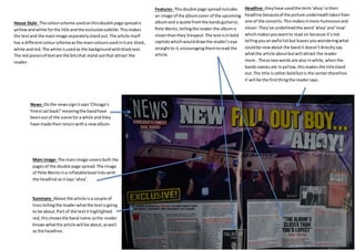
Headline- they have used the term ‘ahoy’ in their 
headline because of the picture underneath taken from 
one of the concerts. This makes it more humorous and 
clever. They’ve underlined the word ’ahoy’ and ‘new’ 
which makes you want to read on because it’s not 
telling you an awful lot but leaves you wondering what 
could be new about the band it doesn’t directly say 
what the article about but will attract the reader 
more.. These two words are also in white, when the 
bands names are in yellow, this makes the title stand 
out. The title is rather bold but is the center therefore 
it will be the first thing the reader says. 
Features- This double page spread includes 
an image of the album cover of the upcoming 
album and a quote from the bands guitarist, 
Pete Wentz, telling the reader the album is 
closer than they’d expect. The text is in bold 
capitals which would draw the reader’s eye 
straight to it, encouraging them to read the 
article. 
House Style- The colour scheme used on this double page spread is 
yellow and white for the title and the exclusive subtitle. This makes 
the text and the main image separately stand out. The article itself 
has a different colour scheme as the main colours used in it are black, 
white and red. The white is used as the background with black text. 
The red pieces of text are the bits that stand out that attract the 
reader. 
News- On the news sign it says ‘Chicago’s 
finest sail back!’ meaning the band have 
been out of the scene for a while and they 
have made their return with a new album. 
Main image- The main image covers both the 
pages of the double page spread. The image 
of Pete Wentz in a inflatable boat links with 
the headline as it says ‘ahoy’. 
Summary- Above the article is a couple of 
lines telling the reader what the text is going 
to be about. Part of the text it highlighted 
red, this shows the band name so the reader 
knows what the article will be about, as well 
as the headline.

Detailed analysis 2

  • 1.
    Sky line: Thesky line goes above the masthead on the magazine and normally gives extra information about the issue and what’s inside. Masthead: Masthead is an alternative word for the title of the magazine. The Kerrang logo on this issue is red which matches part of the text on the cover line. Exclusive: The magazine says they have an exclusive story on Fall Out Boy’s new album. This might attract consumers who are fans of the band. Cover line: The main headline goes with the main image on the cover as Black Veil Brides are the band on the picture. They have used a quote and have not given very much information on the article so the reader can find out more about the main headline. This cover line tells you a lot about what the band have been doing, but they don’t give too much away that all of the information is on the front and you won’t need to read the inside, which may attract more people into buying it and wanting to find out more. Drop Caps: Every word on the cover of this magazine is in capital letters. Bold, capital letters will attract the readers to different stories talking about on the cover. Barcode: The barcode tells the readers the price of the magazine, the date and the issue number. The barcode also tells the employer how many magazines are left in the shop, therefore how many they can put out for customers to buy. Puff: this magazine is offering you a chance to win some free tickets to a show. The puff is the promotion of a bands show; it gives the band the publicity of the show and will hopefully get more people involved and wanting to go see their show. House style: the layout of this article is quite packed and doesn’t seem to fit a theme, things are placed anywhere, however it’s still easy to read everything on the actual page. The reason everything is so clear to read but still together is because of the bold and the well-used colours. The main ones are; yellow, red, white, with black outlines. These colours all work really well together, which makes the page seem better to read and to notice things more. The black outline brings out the text and the things that would have gotten lost behind everything else. The white background brings the picture out more, when a coloured one would have made it look unappealing because of the dark tones, the picture has. The font used makes the cover look smart and organized, even though it is not, the writing is clear because of how spacious it is and because of the dark colours used underneath it. A member of the band on the front covers up some of the title of the magazine; however they use a font which a lot of people can recognize now, and his head also doesn’t cover up a lot of it, but highlights the band as well. The small photos and text around the edges, tell you a lot about what’s going to be inside and although they come across as small, they are still big enough for you to read. Photos of the posters are displayed at the top so it will attract readers into buying it, because it may be one of the first things they see.
  • 2.
    Issue number andcover date: kerrang has put this information at the top of the page, this is so it’s the center of attention and because it helps the reader know what issue they are actually reading and how old the magazine is. Especially for collectors it will help them keep up to date and so they can put their collection in the correct order. Contents: At the top of the page as well it tells you what this page is actually called. The word ‘contents’ is shown in a black circle, which makes it easier to read the white writing especially because of the white background. The contents word, allows people to know what they will actually find on this page, making it easier for them to maneuver from page to page easier. Underneath it also shows a punch line that changes through the issues, this is simply for entertainment purposes. House style: the main background colour is white, which is also like the front page; this color makes it easier to read any other colour of it. The main colours stick with the same theme as the cover and have used: yellow, red, white and black. The limited use of colours makes this page look smarter and not as busy as it could have done. The yellow and the red are quite bright colours; therefore stand out more against the black boxes and text. The page numbers are in red and against the black text makes it easier for the reader to know what pages they could go to. All the writing is in the same font which makes it more appealing rather than messy, however its still bold, which stands out more. Feature photo: kerrang for this article have used a different photo to what would be shown on the double paged article. I think because of this it allows people to get curious as to what they may get to read about , which could get more people into buying the magazine, if they the read the contents first. This photo was mentioned on the cover, which could be a reason as to why they put this here, or because they know a lot of people would be interested in what this picture offers. There isn’t really much said on the front for this photo, which could get people curious and would attract more fans. The page number is shown on the photo in bold, so people can quickly maneuver to that page, without having to go through it all if they don’t want to. Cover photo credit: this is here for copy right issues. Also so people who like the over could do further information onto the artist who created the cover or took the photo. Creator credits: this is to dedicate a special little part to whoever created the actual magazine. It’s to get them recognized for their work. It’s in a red box and stands outs a lot so people can see it and know more about the editor. It’s a lot more visual Sectioned stories: the stories are in sections which a lot of people will like because they can easily head to the page they want to know more about, if they are interested in one thing and not the others, also its makes the page look cleaner and more organized.
  • 3.
    Headline- they haveused the term ‘ahoy’ in their headline because of the picture underneath taken from one of the concerts. This makes it more humorous and clever. They’ve underlined the word ’ahoy’ and ‘new’ which makes you want to read on because it’s not telling you an awful lot but leaves you wondering what could be new about the band it doesn’t directly say what the article about but will attract the reader more.. These two words are also in white, when the bands names are in yellow, this makes the title stand out. The title is rather bold but is the center therefore it will be the first thing the reader says. Features- This double page spread includes an image of the album cover of the upcoming album and a quote from the bands guitarist, Pete Wentz, telling the reader the album is closer than they’d expect. The text is in bold capitals which would draw the reader’s eye straight to it, encouraging them to read the article. House Style- The colour scheme used on this double page spread is yellow and white for the title and the exclusive subtitle. This makes the text and the main image separately stand out. The article itself has a different colour scheme as the main colours used in it are black, white and red. The white is used as the background with black text. The red pieces of text are the bits that stand out that attract the reader. News- On the news sign it says ‘Chicago’s finest sail back!’ meaning the band have been out of the scene for a while and they have made their return with a new album. Main image- The main image covers both the pages of the double page spread. The image of Pete Wentz in a inflatable boat links with the headline as it says ‘ahoy’. Summary- Above the article is a couple of lines telling the reader what the text is going to be about. Part of the text it highlighted red, this shows the band name so the reader knows what the article will be about, as well as the headline.