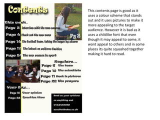
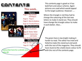
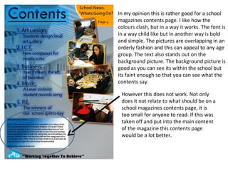
The document provides an analysis of different contents pages for a school magazine. It notes positives and negatives of each contents page. One contents page is praised for its bold color scheme and use of pictures but criticized for a childlike font. Another is said to have bold font and color but the triangle color needs adjusting. A third is criticized for a bright green color that makes the text hard to read. The last page is said to have clashing colors that work and pictures arranged orderly, but one section is too small to read.