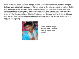
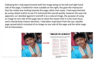
Construction and development
Double page spread
For my double page spread I have decided to use a large image which filled the whole of the
right hand side , this allowed me to fill the left hand side with an interview information and
artist names
I started off by taking several pictures which could be use as the main image and
appropriate towards the genre, the image itself had to reflect the mise en scene. It
was important that I took pictures which looked appropriate.
I had narrowed down to three images, which I had to choose from, the first image I
believe was not suitable because it did not apply to the mise en scene as well as that it
was an image which will look more appropriate on contents page, the next picture
consisted of too much lighting which I did not want, this is because it adds an extra
shine on the characters face, this I did not want so I decided against it, the last image
was perfect as it suited the genre very well and was a natural picture which did not
require any lighting.
This is the final image
which I chose to use for
my final double page
spread.
Following this I had experimented with the image being on the left and right hand
side of the page, it looked far more suitable on the right, this gave the impression
that the model was looking towards the page rather than away. I had experimented
by using a black outline to see if it enhanced the overall quality, however this was not
apparent, so I decided against it and left it as a natural image, the purpose of using
an image on one side of the page was to show the viewer that it is the main focus
and it should draw instant attention, I had taken inspiration from the Jay z double
page spread which consisted of an image on one side of the page and the other page
full of information.

Construction and development double page spread

  • 1.
  • 2.
    For my doublepage spread I have decided to use a large image which filled the whole of the right hand side , this allowed me to fill the left hand side with an interview information and artist names I started off by taking several pictures which could be use as the main image and appropriate towards the genre, the image itself had to reflect the mise en scene. It was important that I took pictures which looked appropriate.
  • 3.
    I had narroweddown to three images, which I had to choose from, the first image I believe was not suitable because it did not apply to the mise en scene as well as that it was an image which will look more appropriate on contents page, the next picture consisted of too much lighting which I did not want, this is because it adds an extra shine on the characters face, this I did not want so I decided against it, the last image was perfect as it suited the genre very well and was a natural picture which did not require any lighting. This is the final image which I chose to use for my final double page spread.
  • 4.
    Following this Ihad experimented with the image being on the left and right hand side of the page, it looked far more suitable on the right, this gave the impression that the model was looking towards the page rather than away. I had experimented by using a black outline to see if it enhanced the overall quality, however this was not apparent, so I decided against it and left it as a natural image, the purpose of using an image on one side of the page was to show the viewer that it is the main focus and it should draw instant attention, I had taken inspiration from the Jay z double page spread which consisted of an image on one side of the page and the other page full of information.