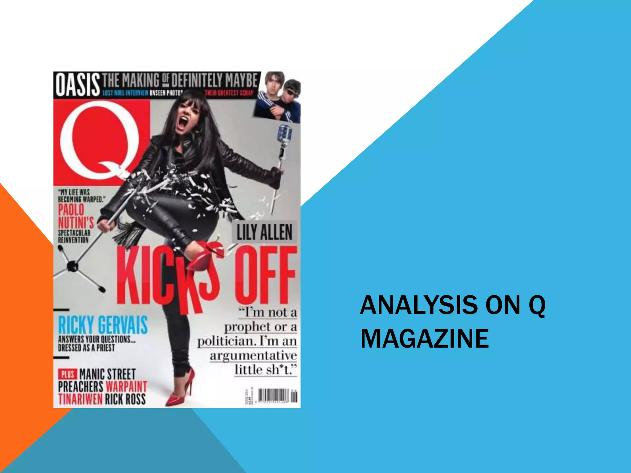
ANALYSIS ON Q 
MAGAZINE
MAIN FEATURE 
The main feature of the magazine is the image in the center of the 
magazine. It is different because it is a picture of Lily Allen 
kicking a microphone in half, which links to the cover story title 
‘Lily Allen kicks off’. This image has been purposely set up in a 
studio to match the cover story, and makes it look more 
appealing. For my magazine I would probably want to try out 
different things with my models and setting something up to 
match a cover story could be one of them, because it links to 
the target audience and makes it look more interesting.
MASTHEAD 
The masthead takes up a corner of the magazine and it stands out 
because it is bold and big. It is clear to read especially with the 
colour of it being white with a red box around it, which makes it 
completely separate to the rest of the magazine, so it draws 
attention to it. For my own magazine this is quite a good idea to 
have a box around the masthead, so it is clearer to read above 
the image and makes the mast head stand out more.
COLOUR AND FONT 
The main colours on this magazine are red and white. These 
colours work well together, they make the magazine look new 
and recent and also link to the target audience with how the 
colours have been used. The fonts used are easily readable and 
also link to the target audience, which I think would be aimed at 
around teens and young adults. Because of the colours and the 
fonts used for the cover stories, they look appealing and 
something that you would look at if you picked up this 
magazine in a store. Especially the cover story about Lily Allen, 
the words ‘kisks off’ are very big and draw attention the reader. 
It gives the magazine some interest.
OVERALL 
I like this magazine because it is very appealing and could easily 
draw attention to the target audience, which I would expect to 
be mainly female. I would probably use a fair few of the ideas on 
this front cover for my own magazine, because they work well 
together with the colours and fonts, and I think the photo being 
taken in the studio makes the magazine look more tidy and less 
cluttered with text. It also makes the text easier to read because 
it isn't overlapping an image behind it.

Analysis on Q magazine

  • 1.
    ANALYSIS ON Q MAGAZINE
  • 2.
    MAIN FEATURE Themain feature of the magazine is the image in the center of the magazine. It is different because it is a picture of Lily Allen kicking a microphone in half, which links to the cover story title ‘Lily Allen kicks off’. This image has been purposely set up in a studio to match the cover story, and makes it look more appealing. For my magazine I would probably want to try out different things with my models and setting something up to match a cover story could be one of them, because it links to the target audience and makes it look more interesting.
  • 3.
    MASTHEAD The mastheadtakes up a corner of the magazine and it stands out because it is bold and big. It is clear to read especially with the colour of it being white with a red box around it, which makes it completely separate to the rest of the magazine, so it draws attention to it. For my own magazine this is quite a good idea to have a box around the masthead, so it is clearer to read above the image and makes the mast head stand out more.
  • 4.
    COLOUR AND FONT The main colours on this magazine are red and white. These colours work well together, they make the magazine look new and recent and also link to the target audience with how the colours have been used. The fonts used are easily readable and also link to the target audience, which I think would be aimed at around teens and young adults. Because of the colours and the fonts used for the cover stories, they look appealing and something that you would look at if you picked up this magazine in a store. Especially the cover story about Lily Allen, the words ‘kisks off’ are very big and draw attention the reader. It gives the magazine some interest.
  • 5.
    OVERALL I likethis magazine because it is very appealing and could easily draw attention to the target audience, which I would expect to be mainly female. I would probably use a fair few of the ideas on this front cover for my own magazine, because they work well together with the colours and fonts, and I think the photo being taken in the studio makes the magazine look more tidy and less cluttered with text. It also makes the text easier to read because it isn't overlapping an image behind it.