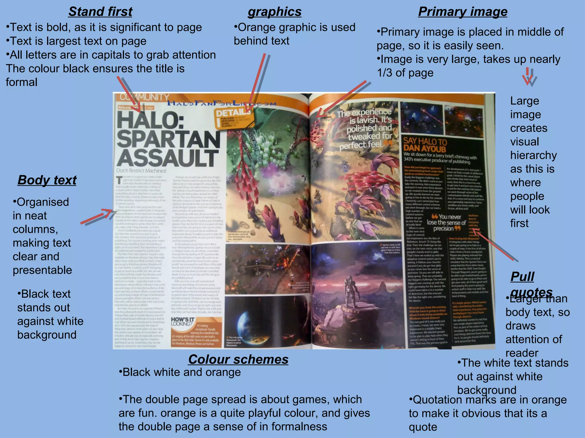
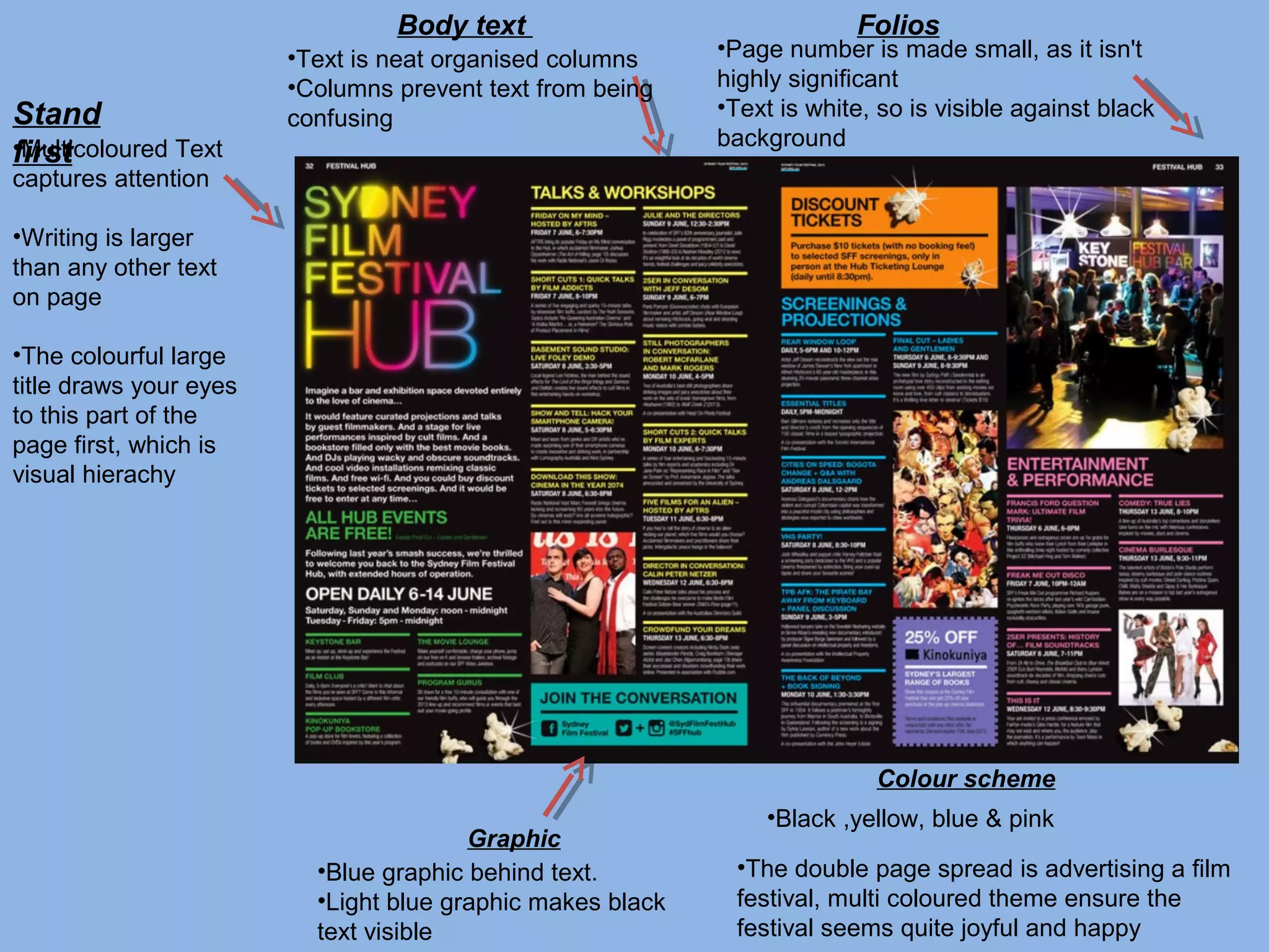
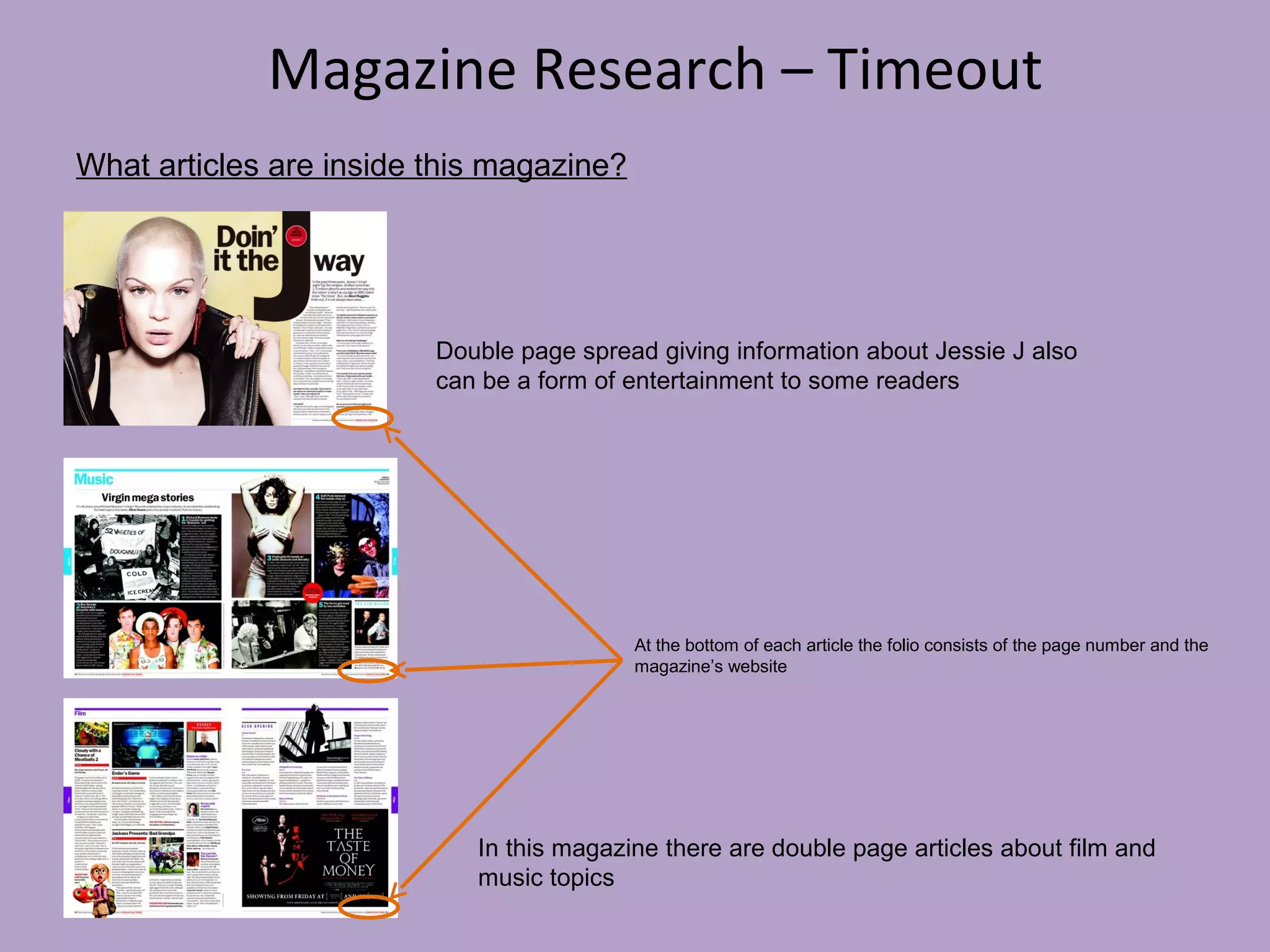
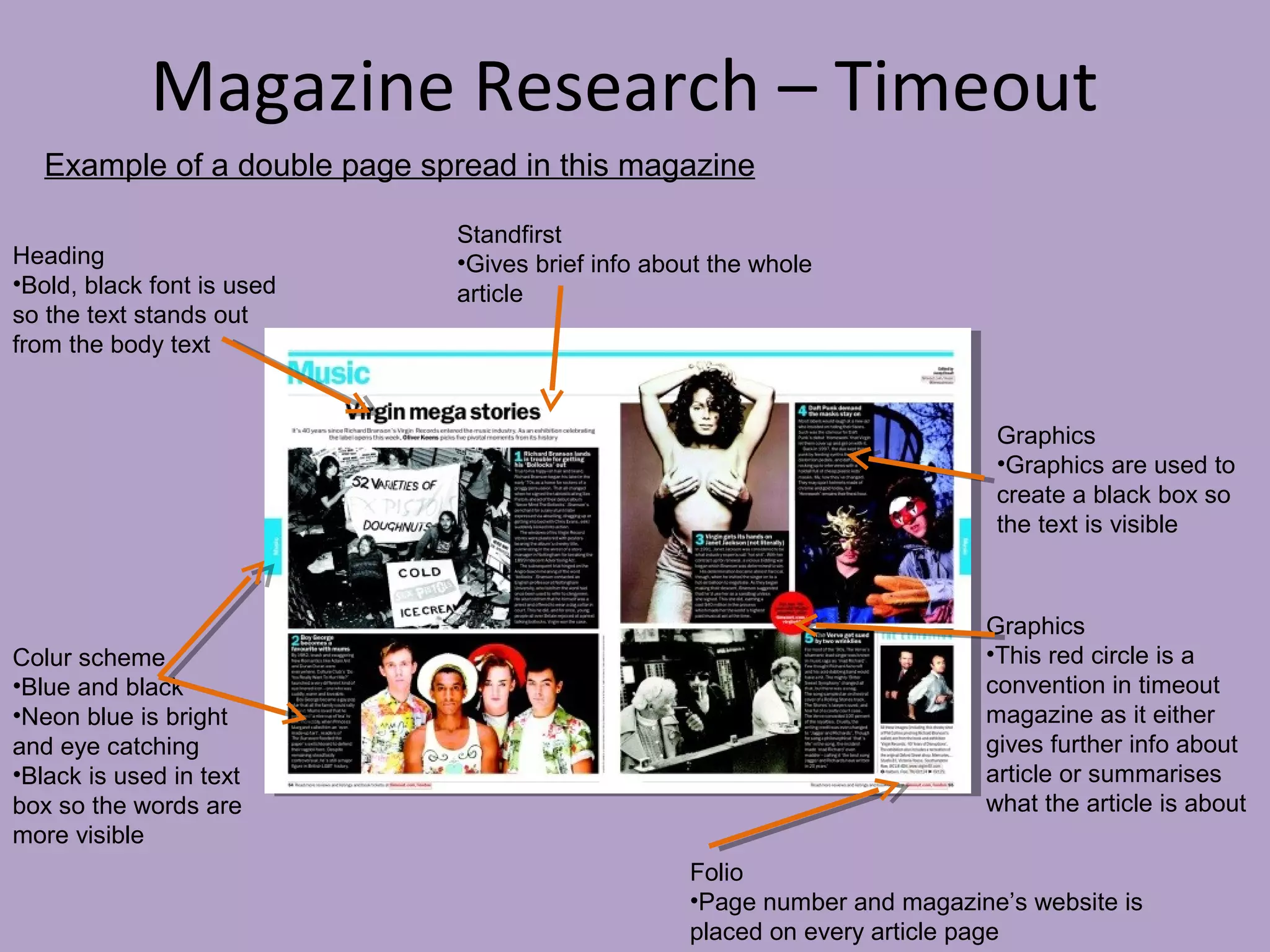
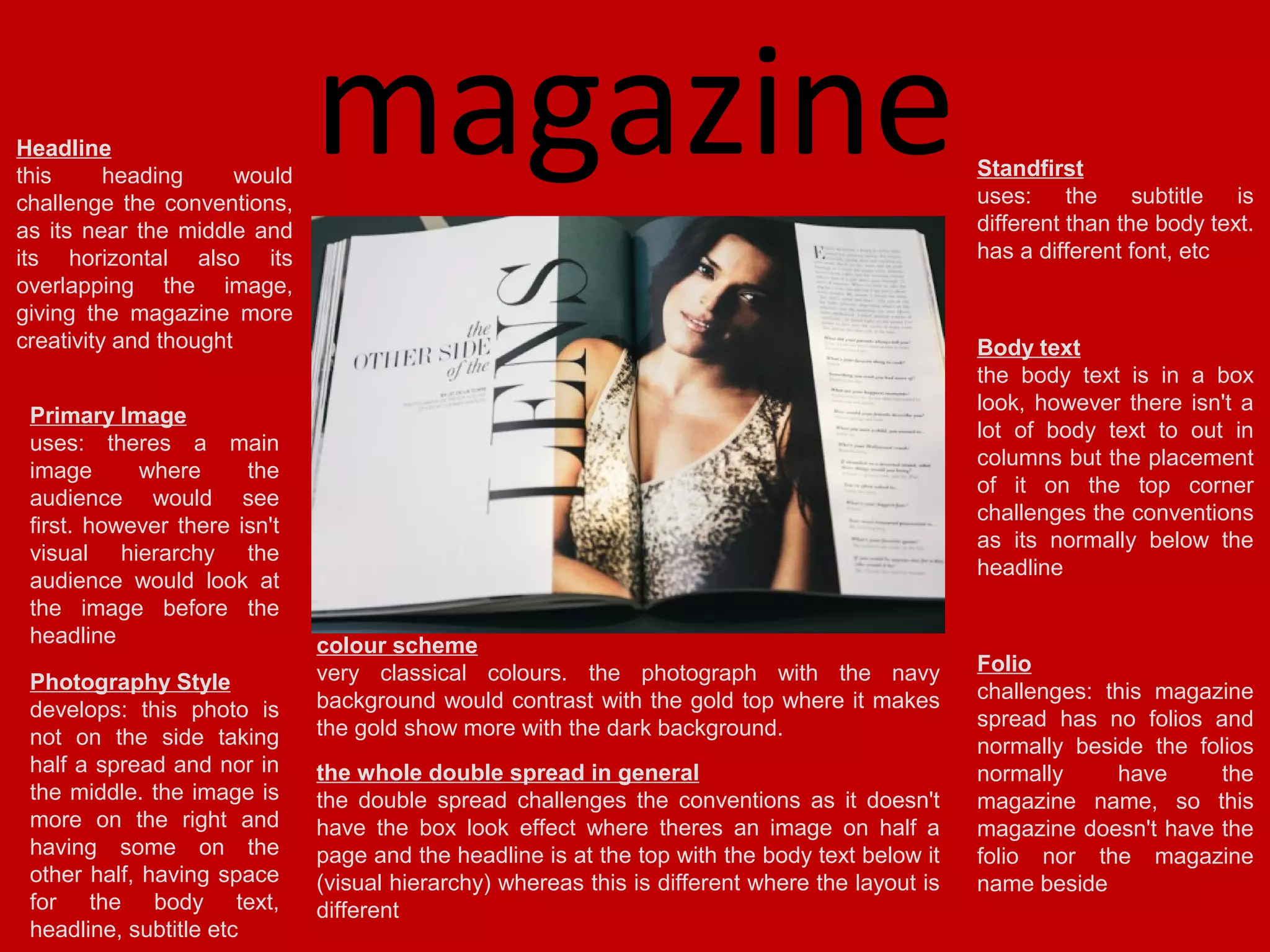
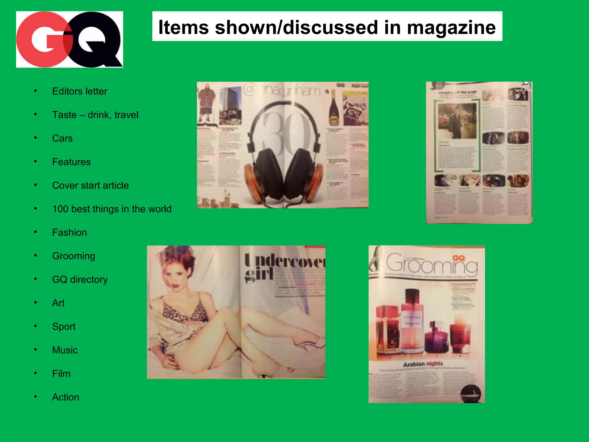
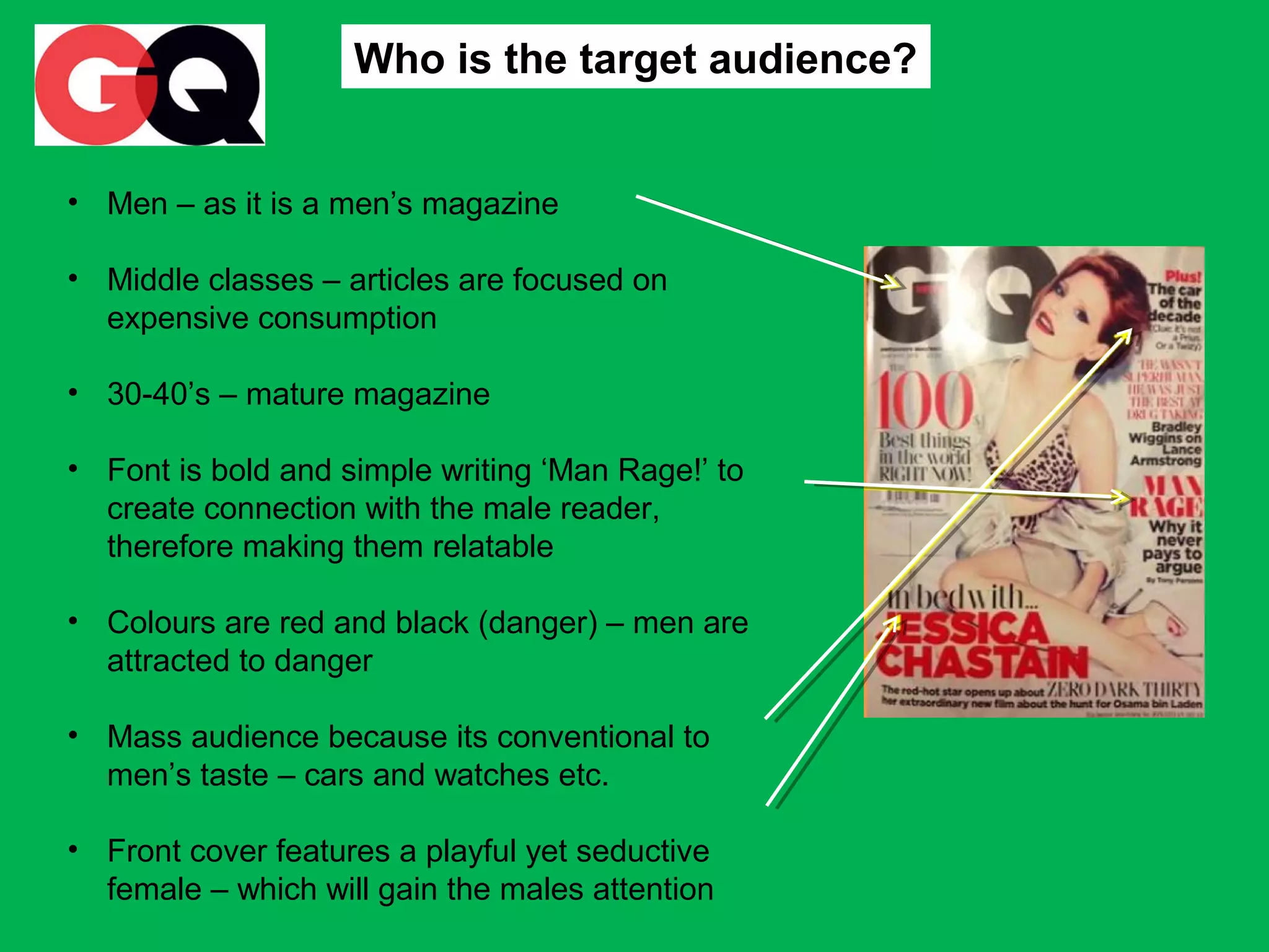
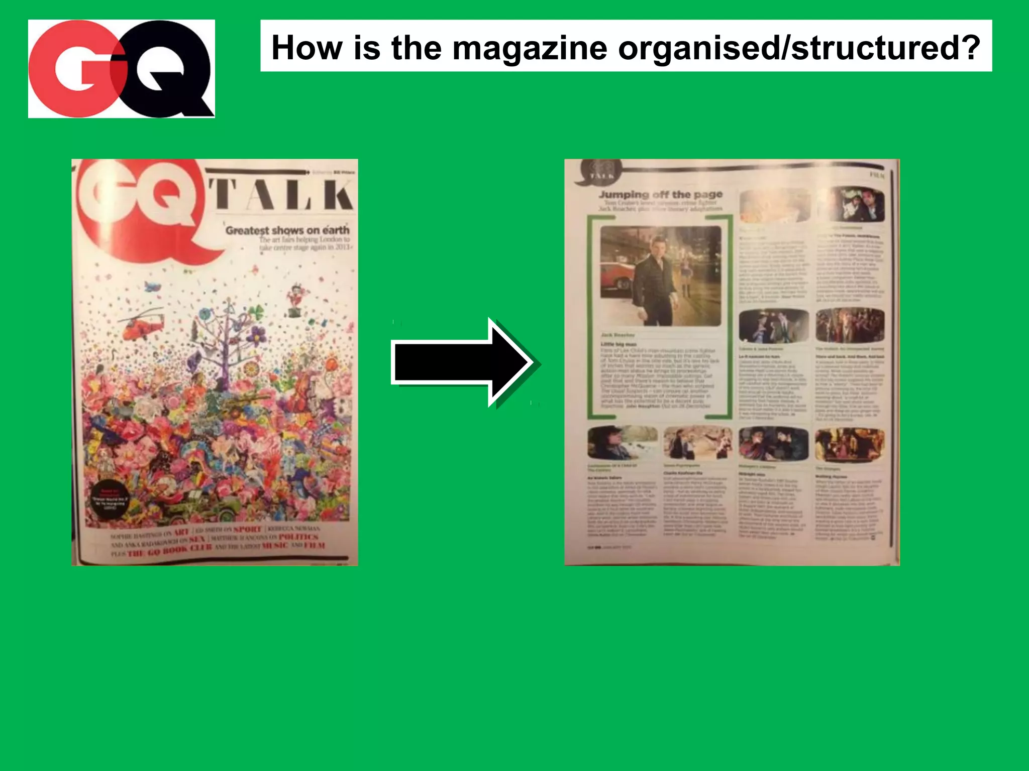
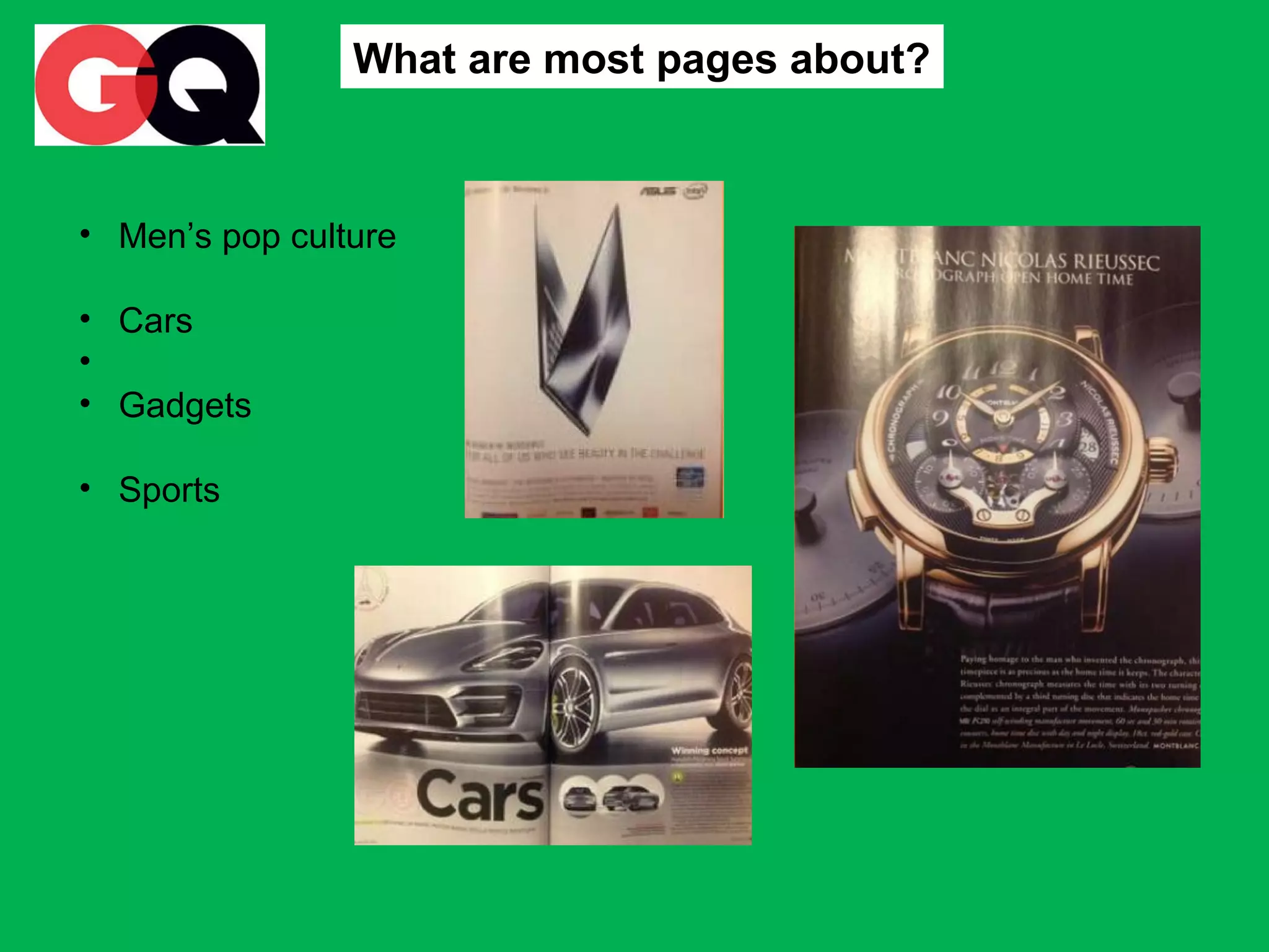
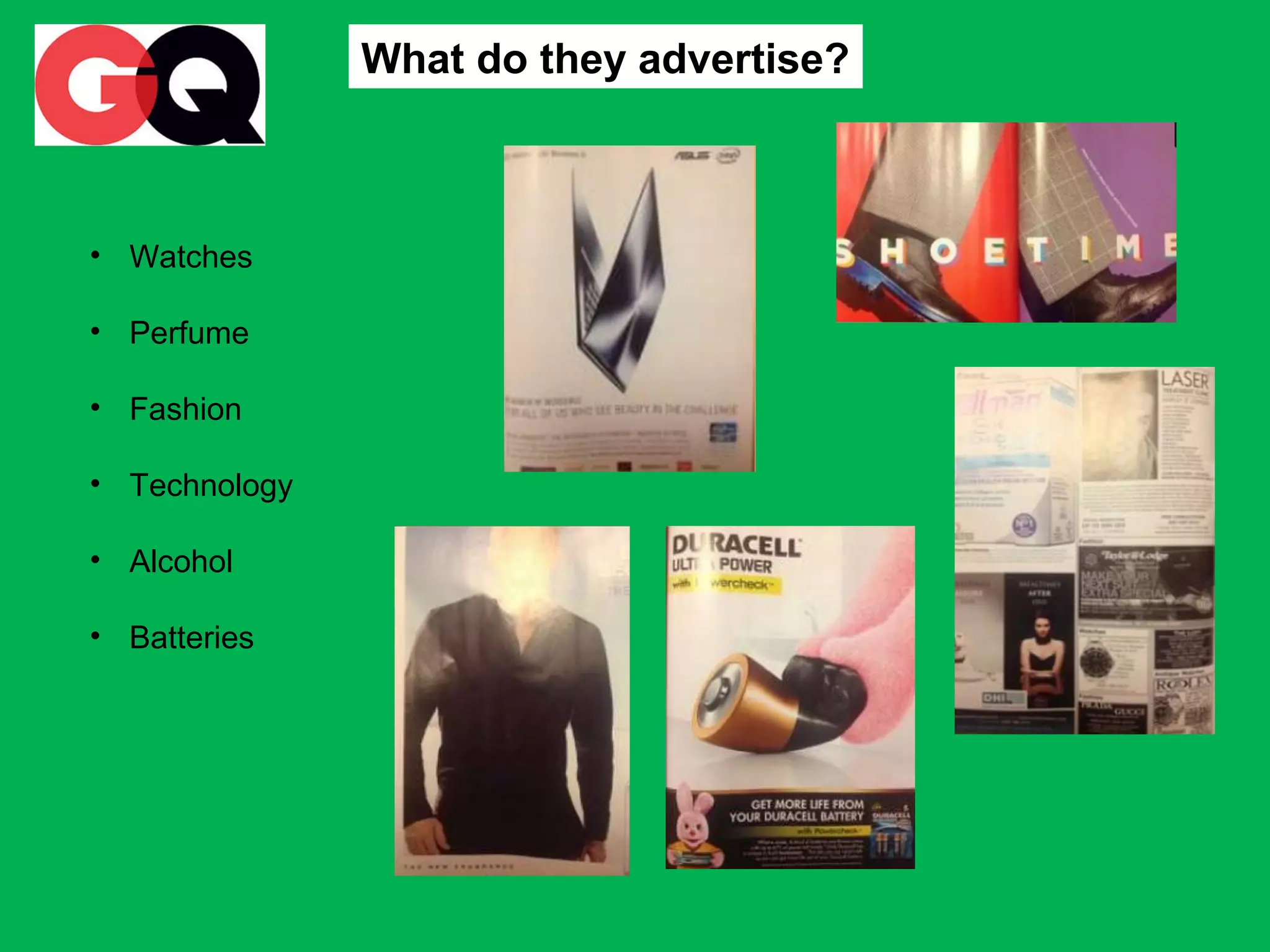
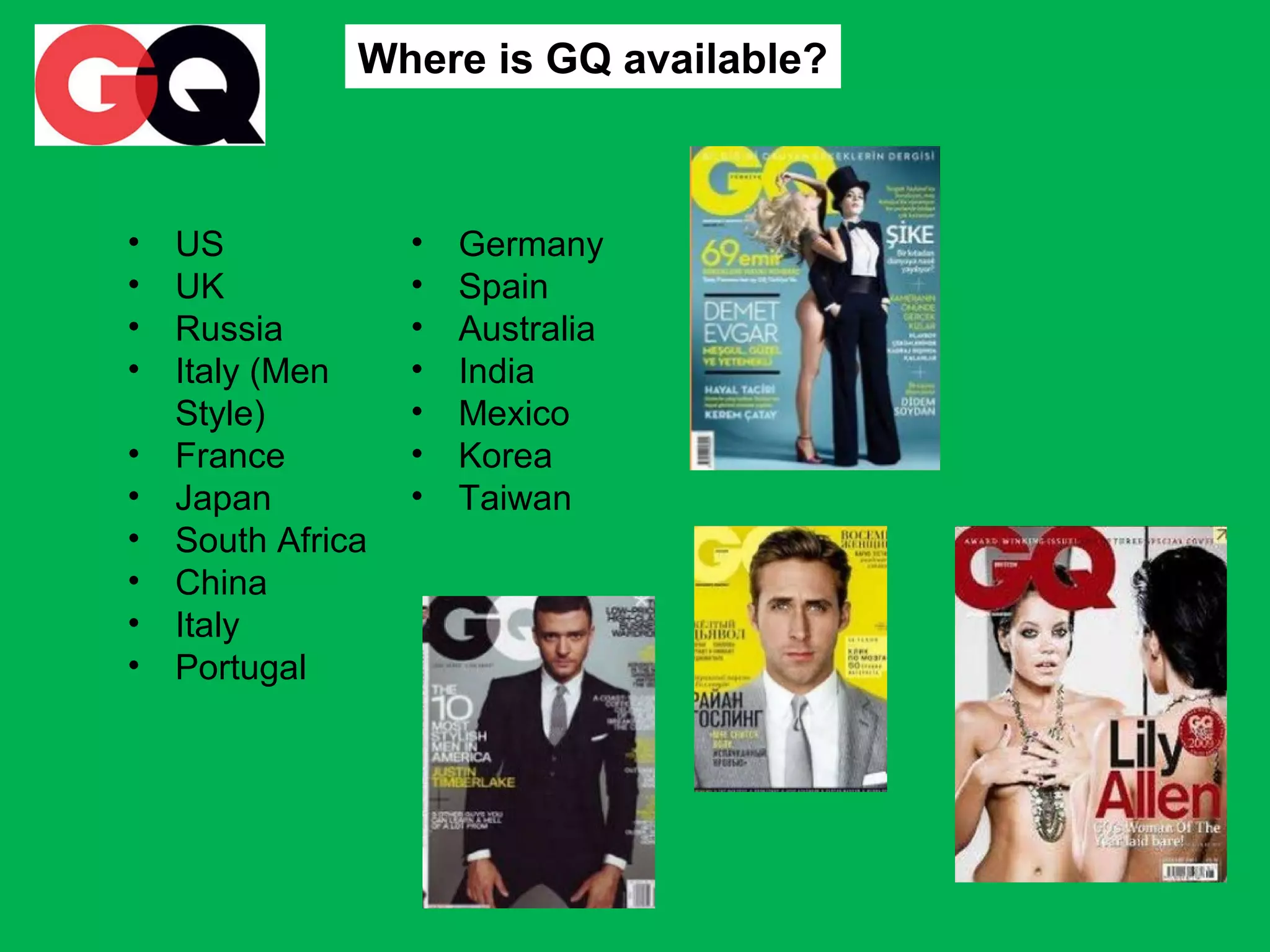
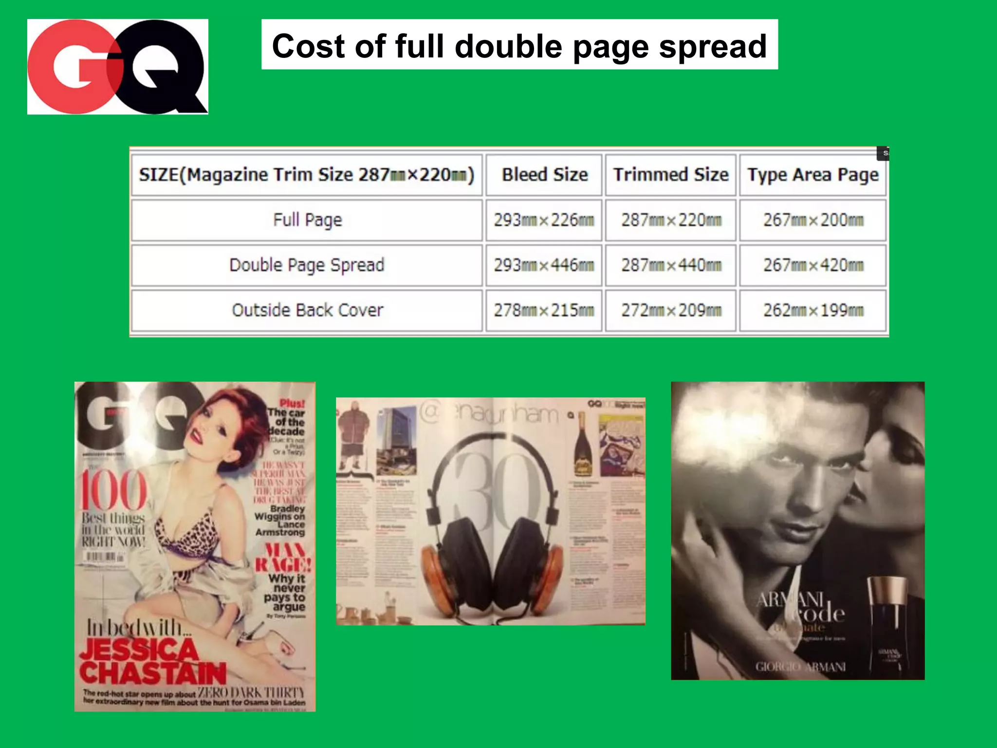
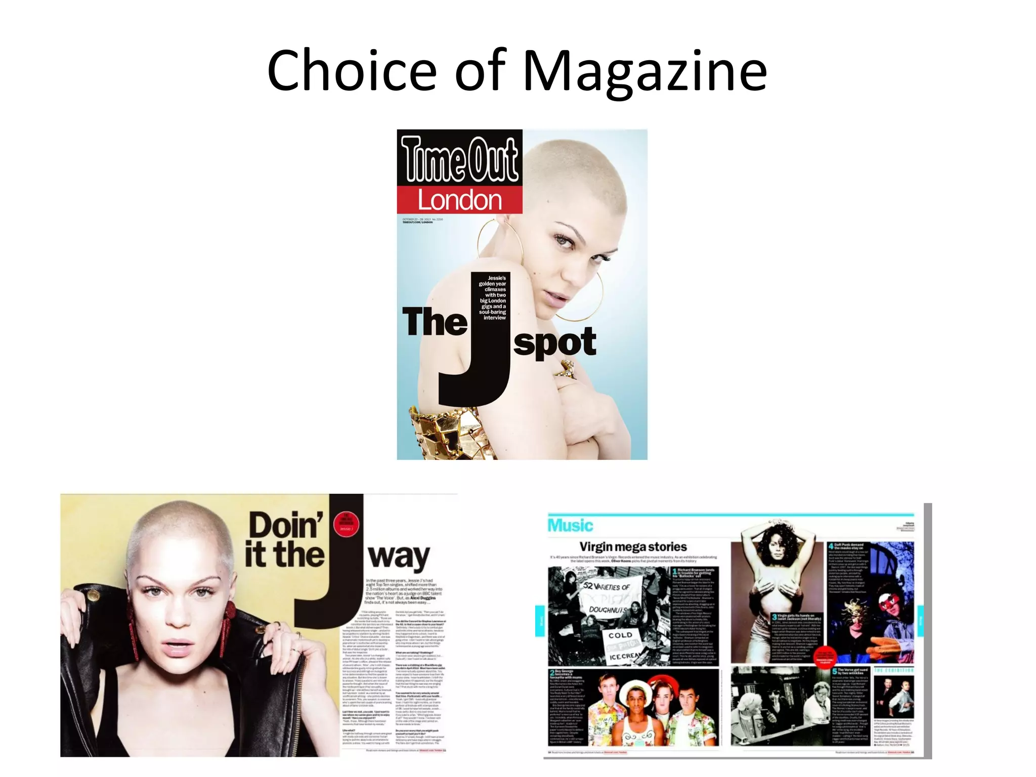
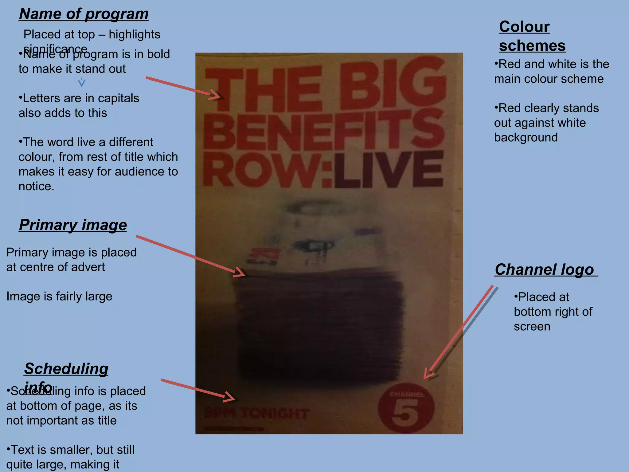
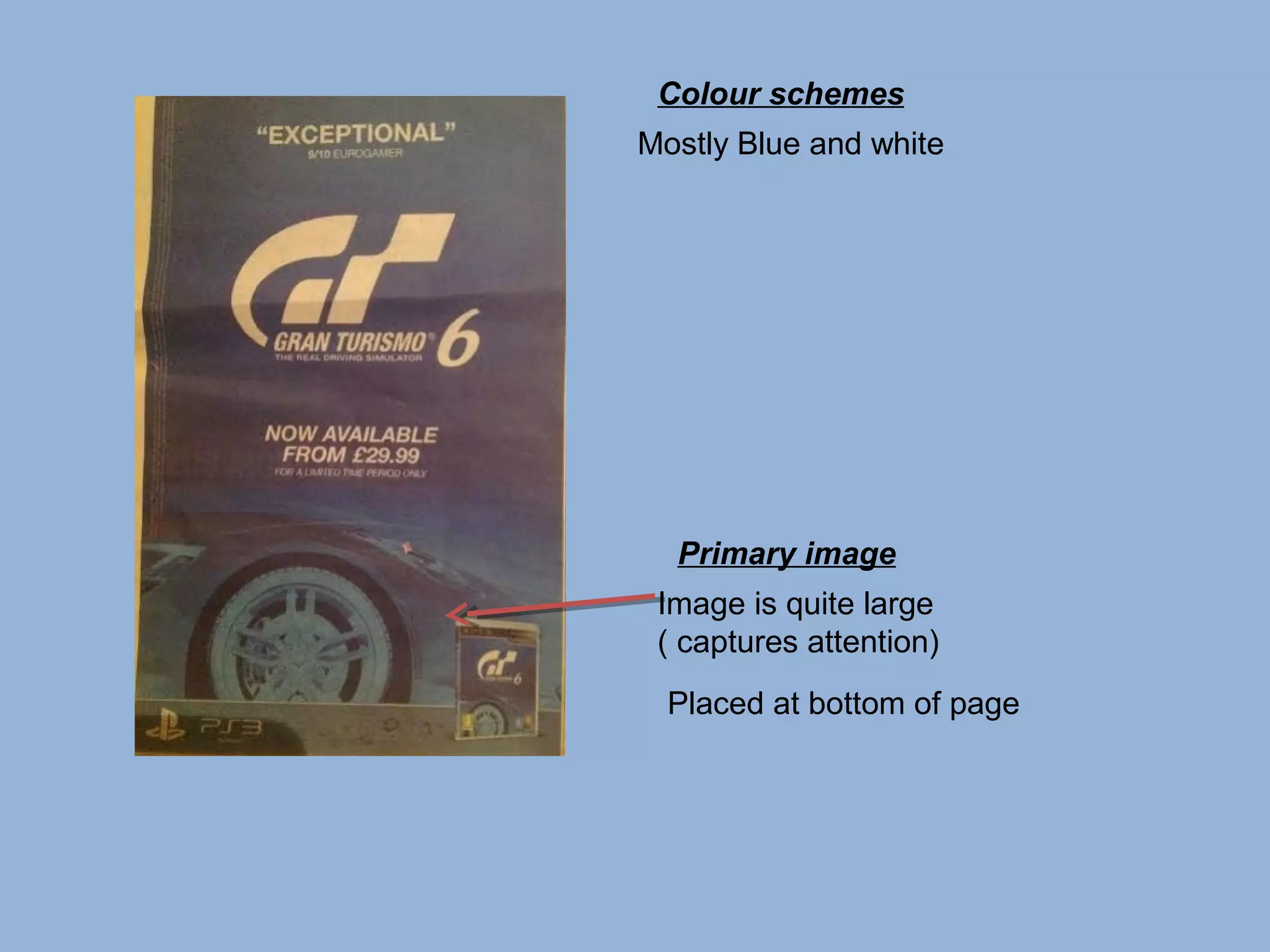
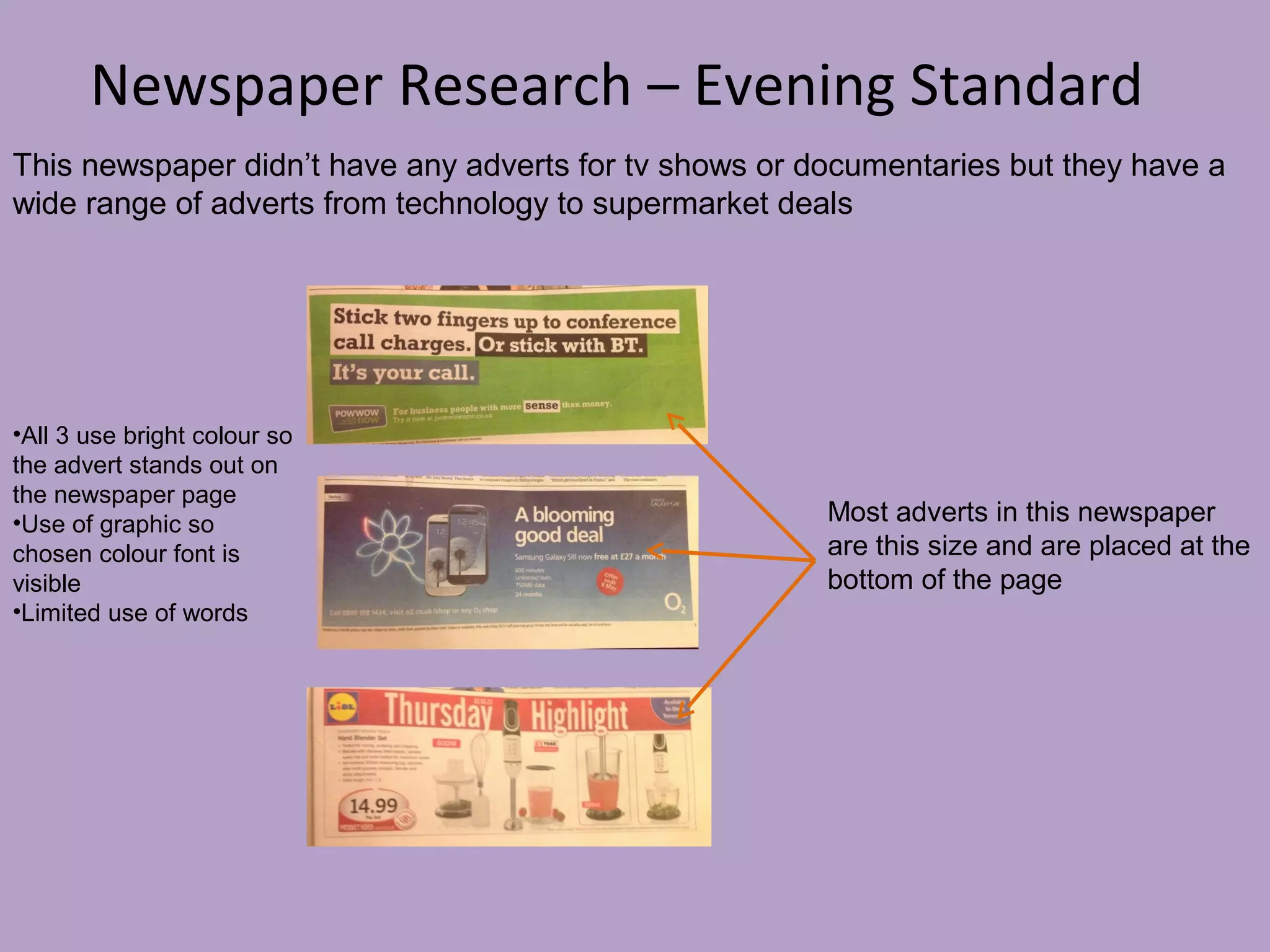
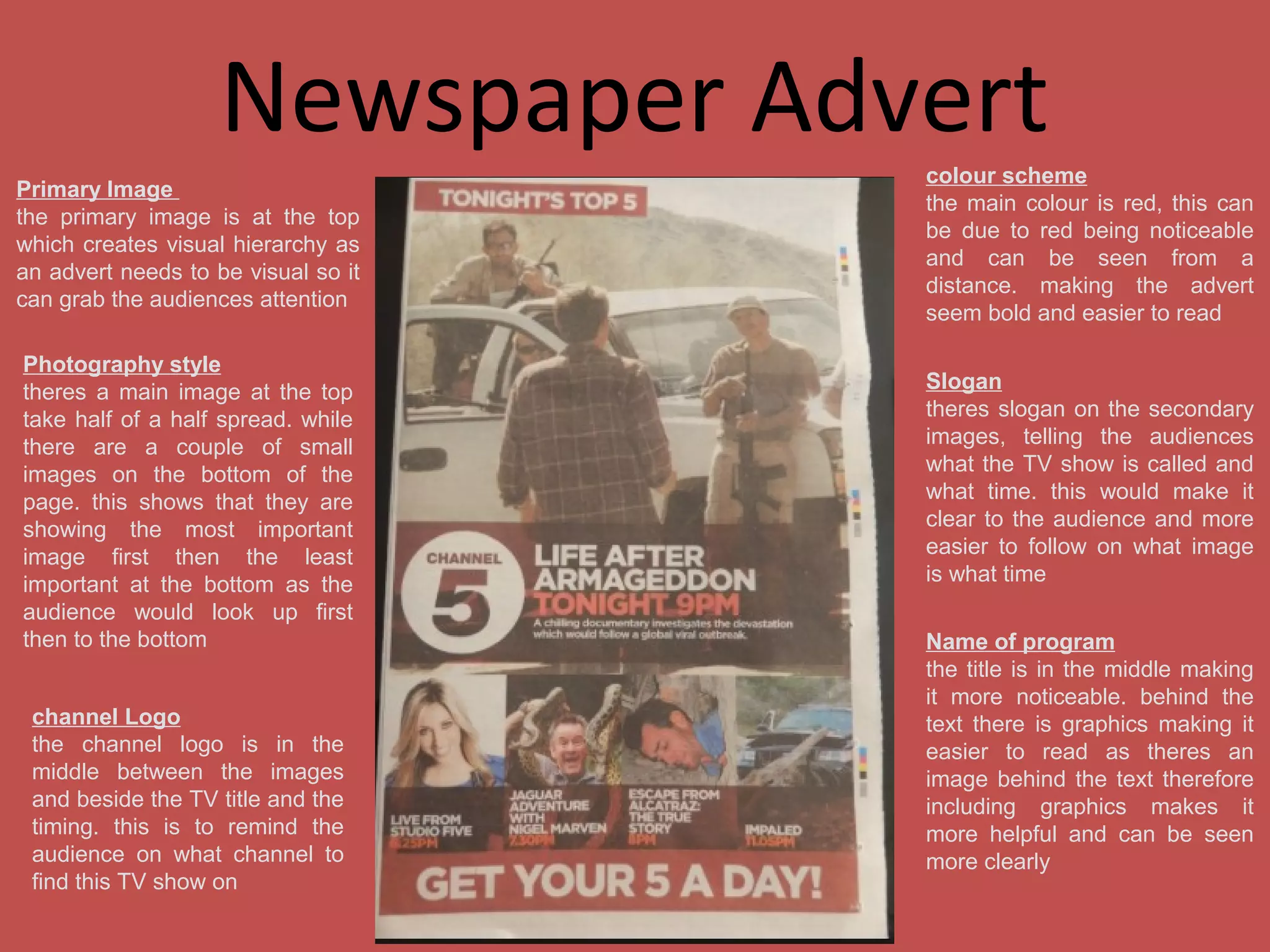
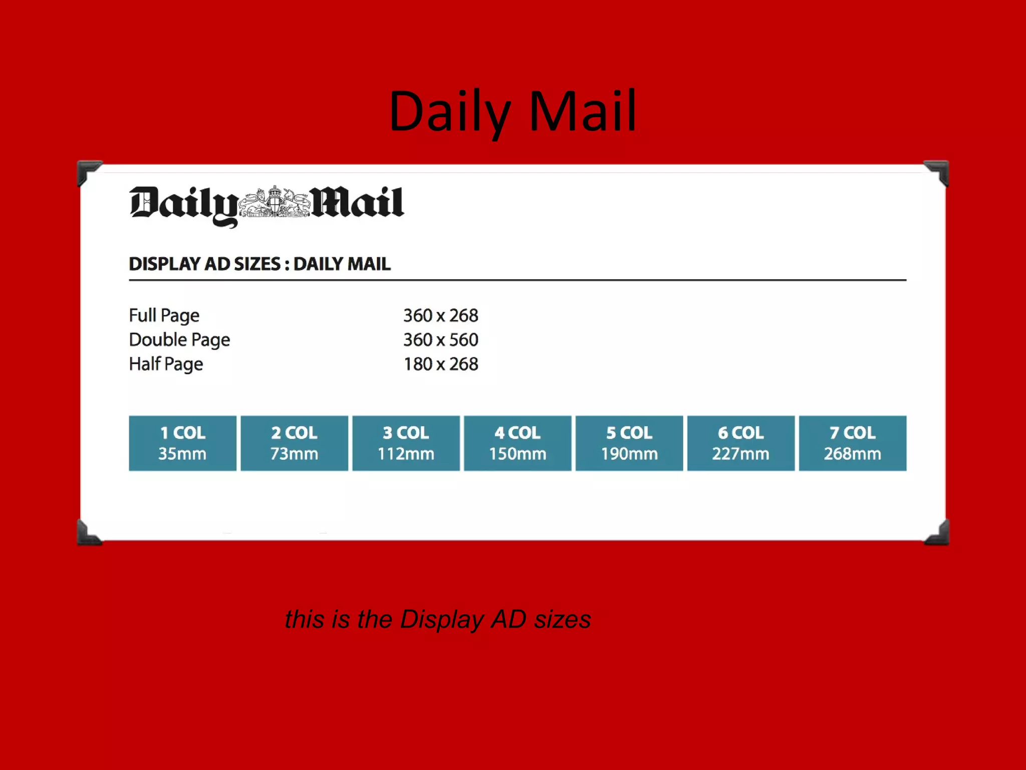
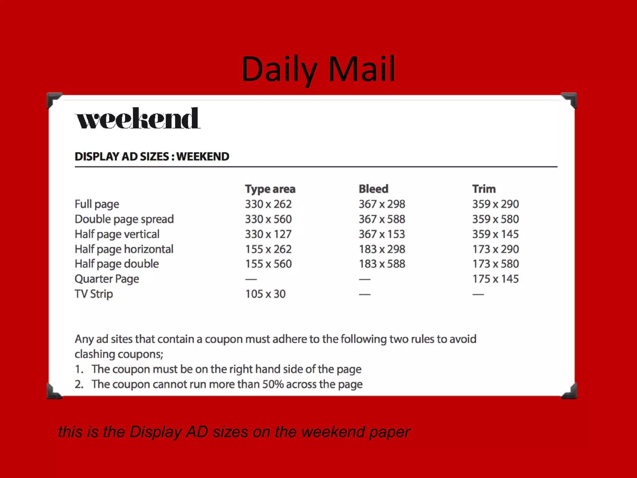
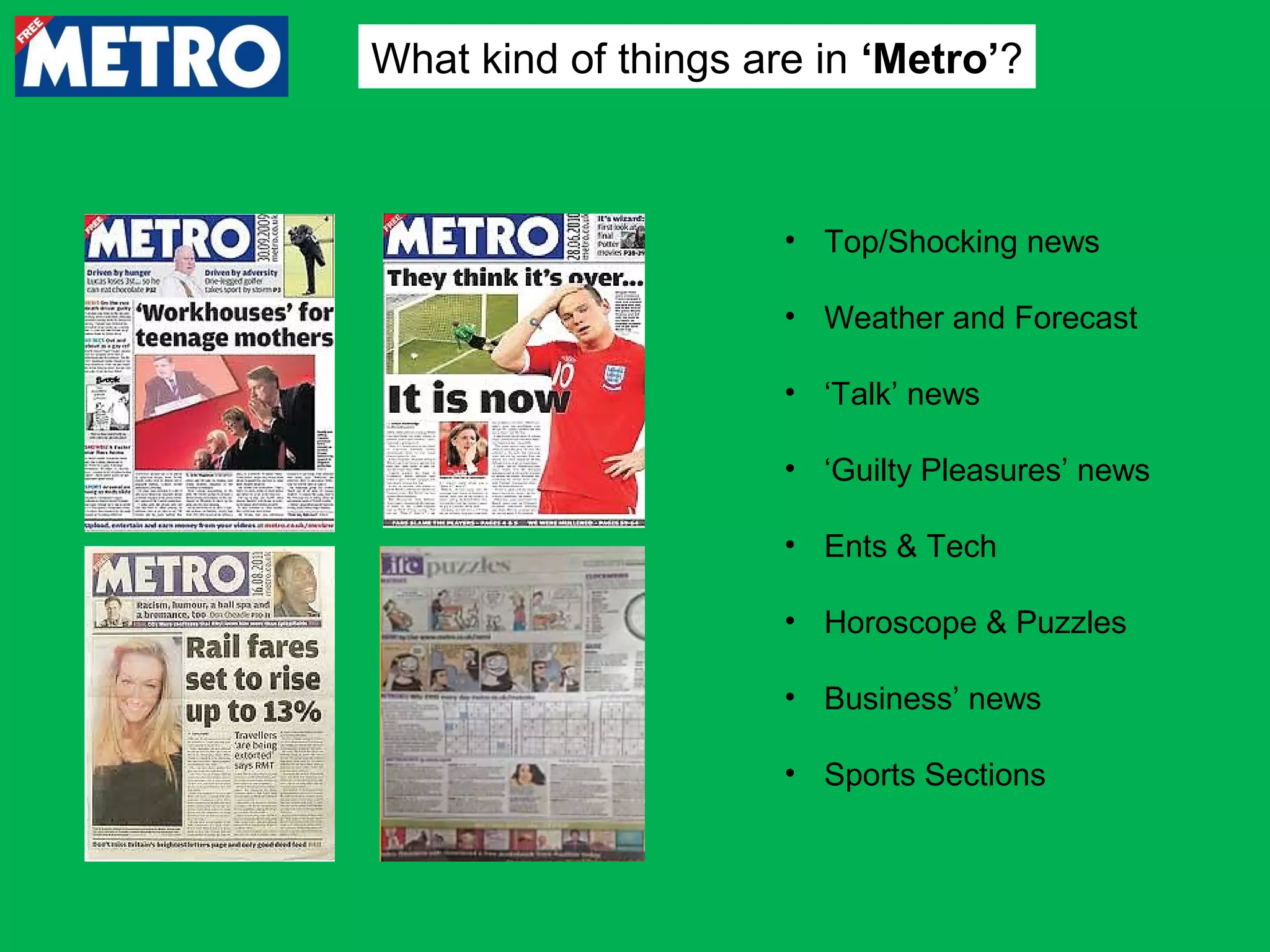
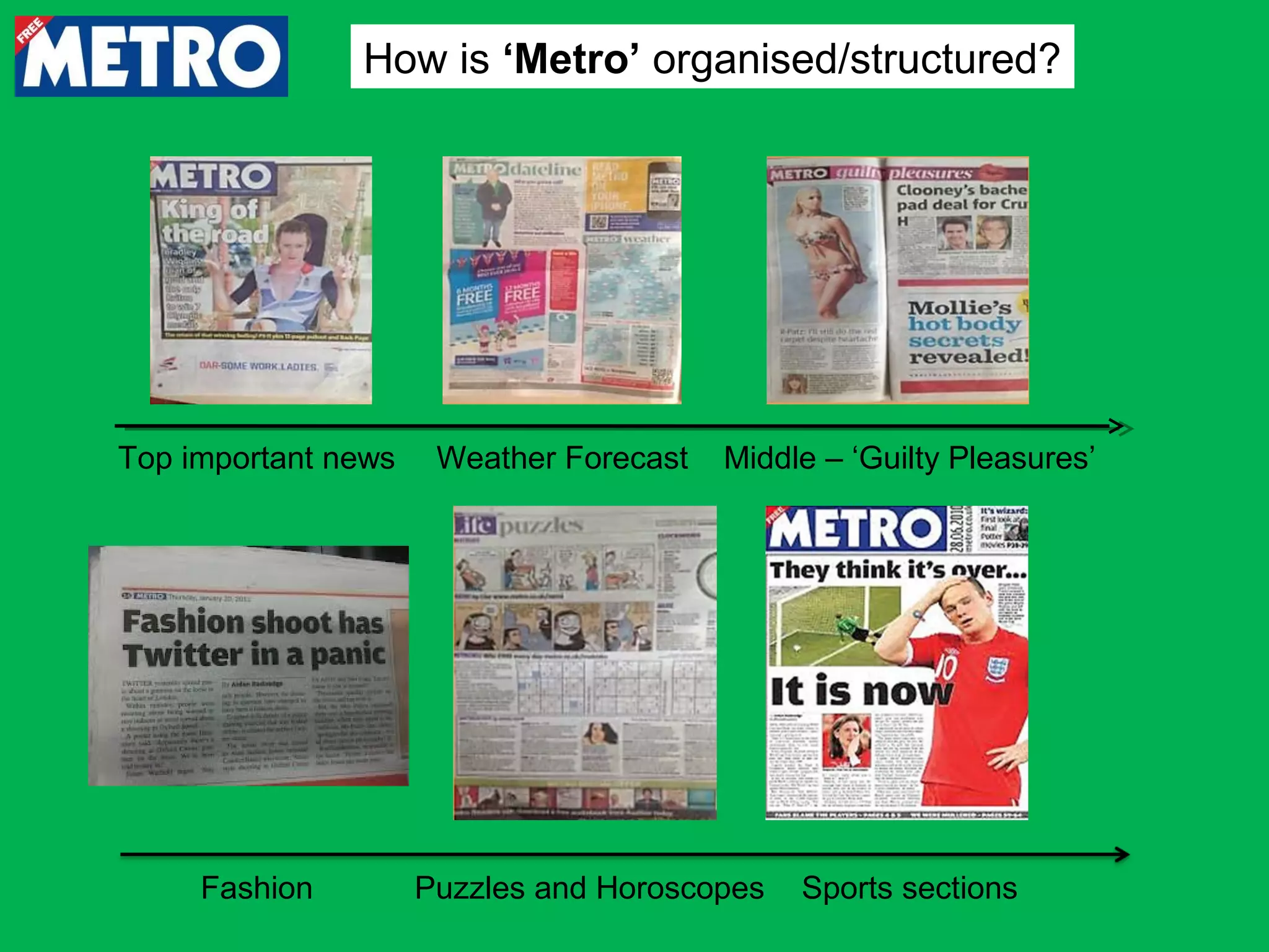
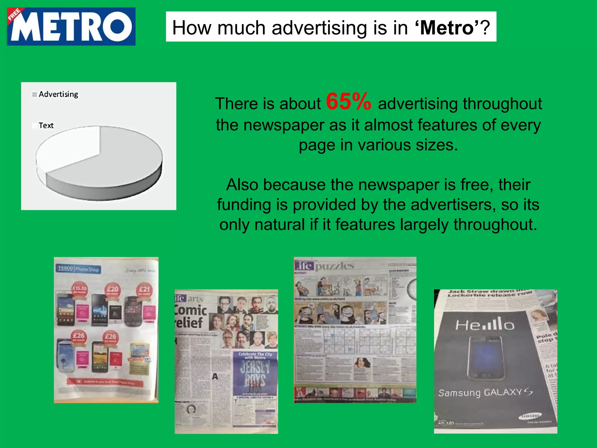
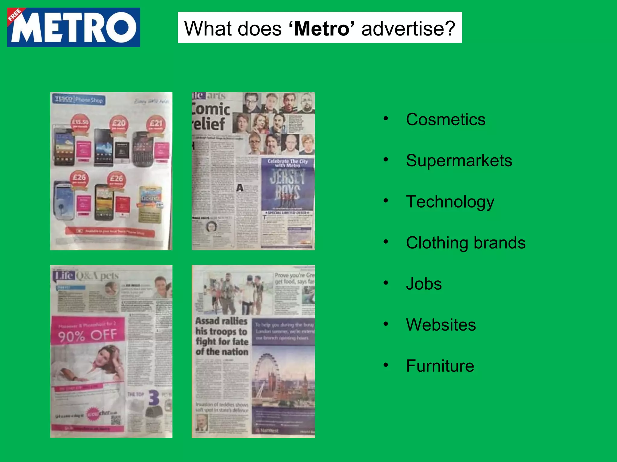
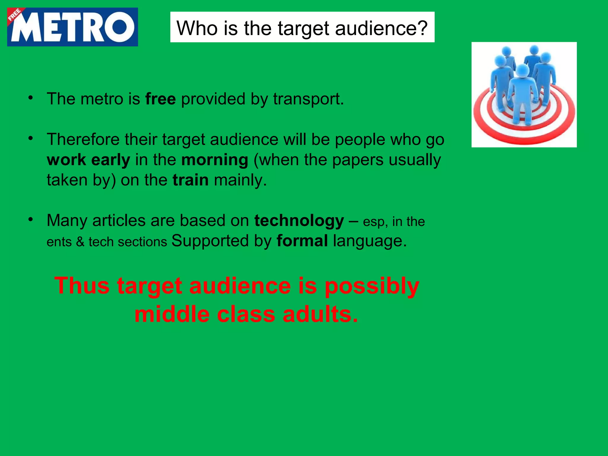
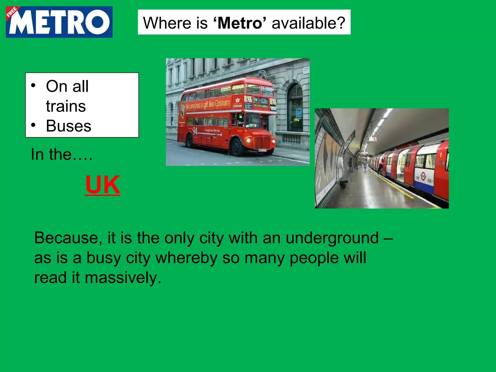
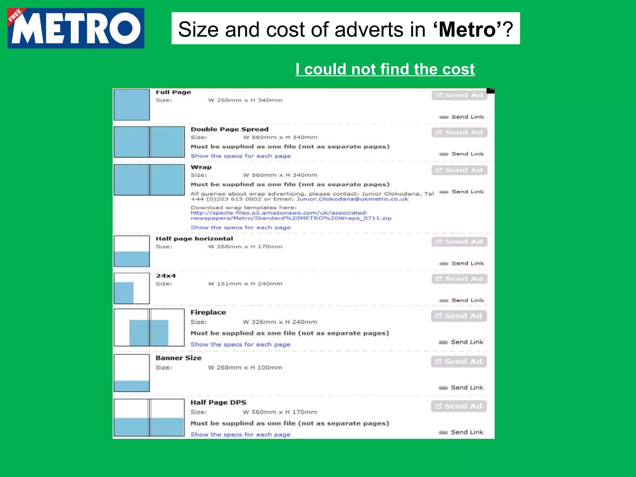
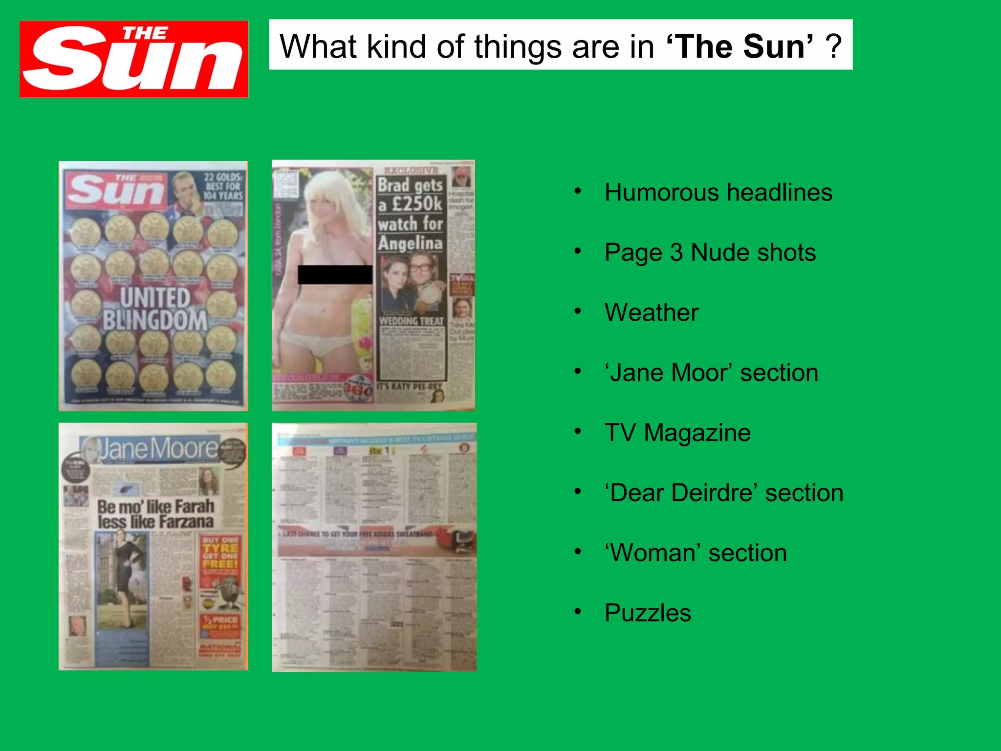
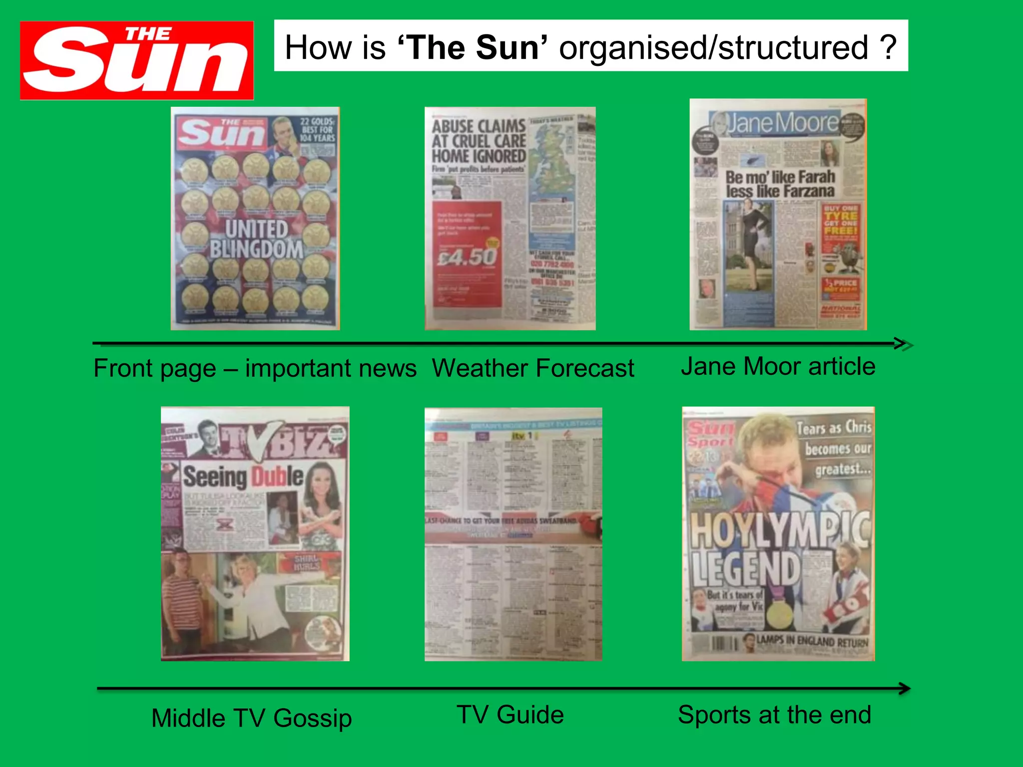
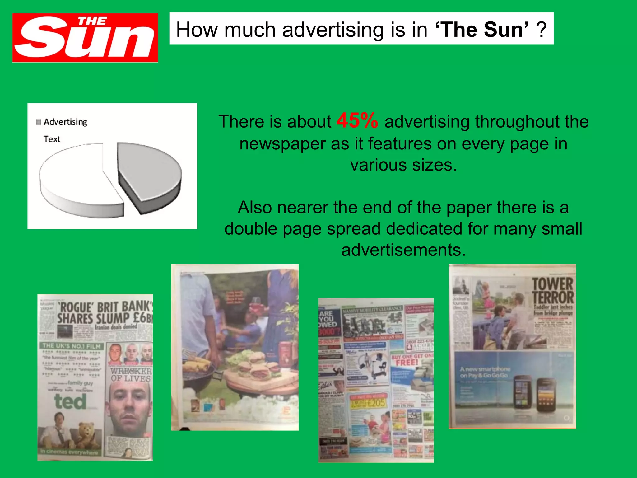
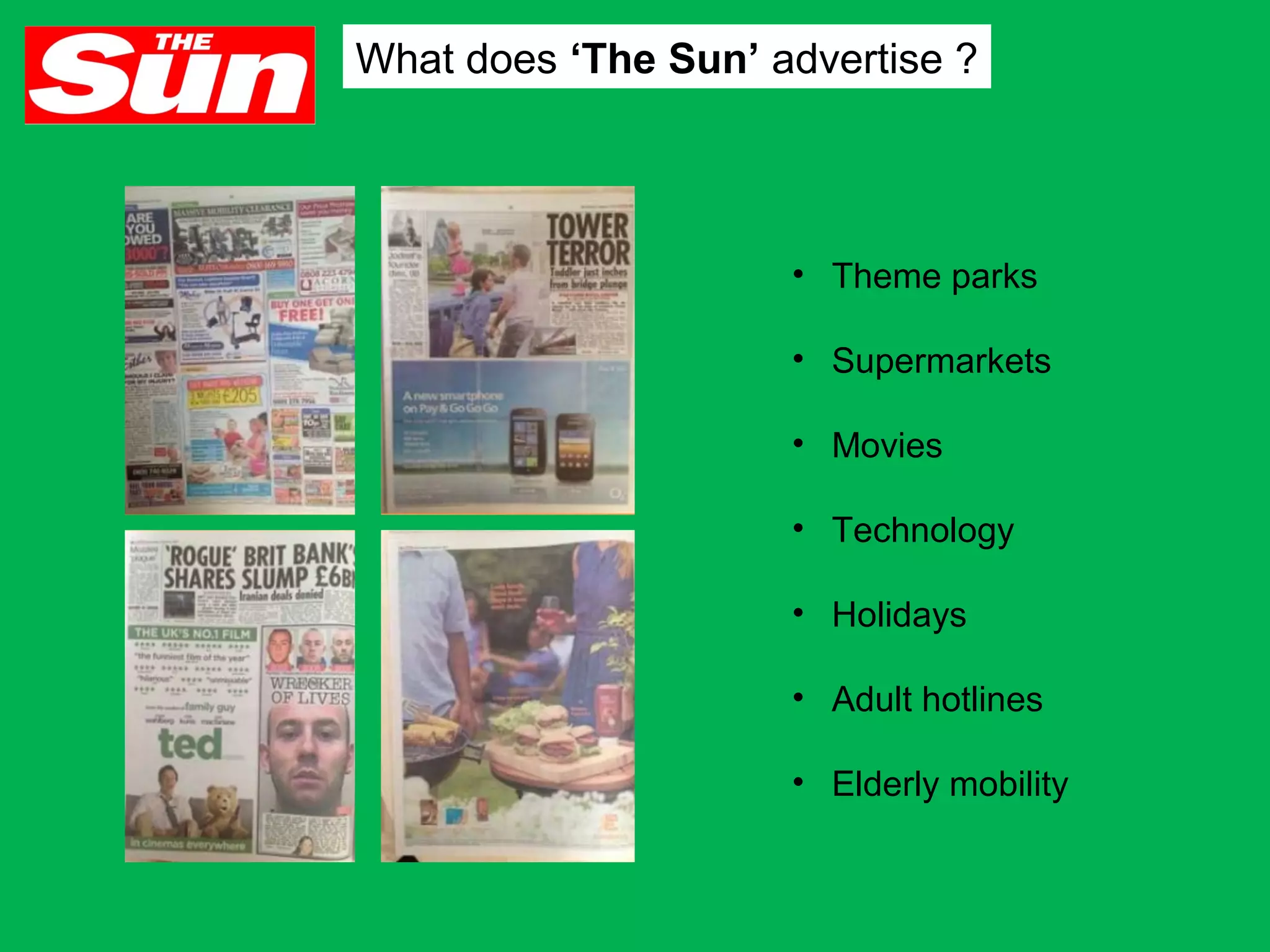
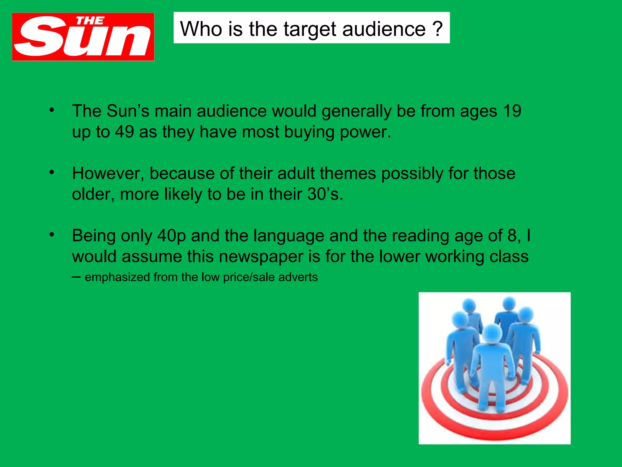
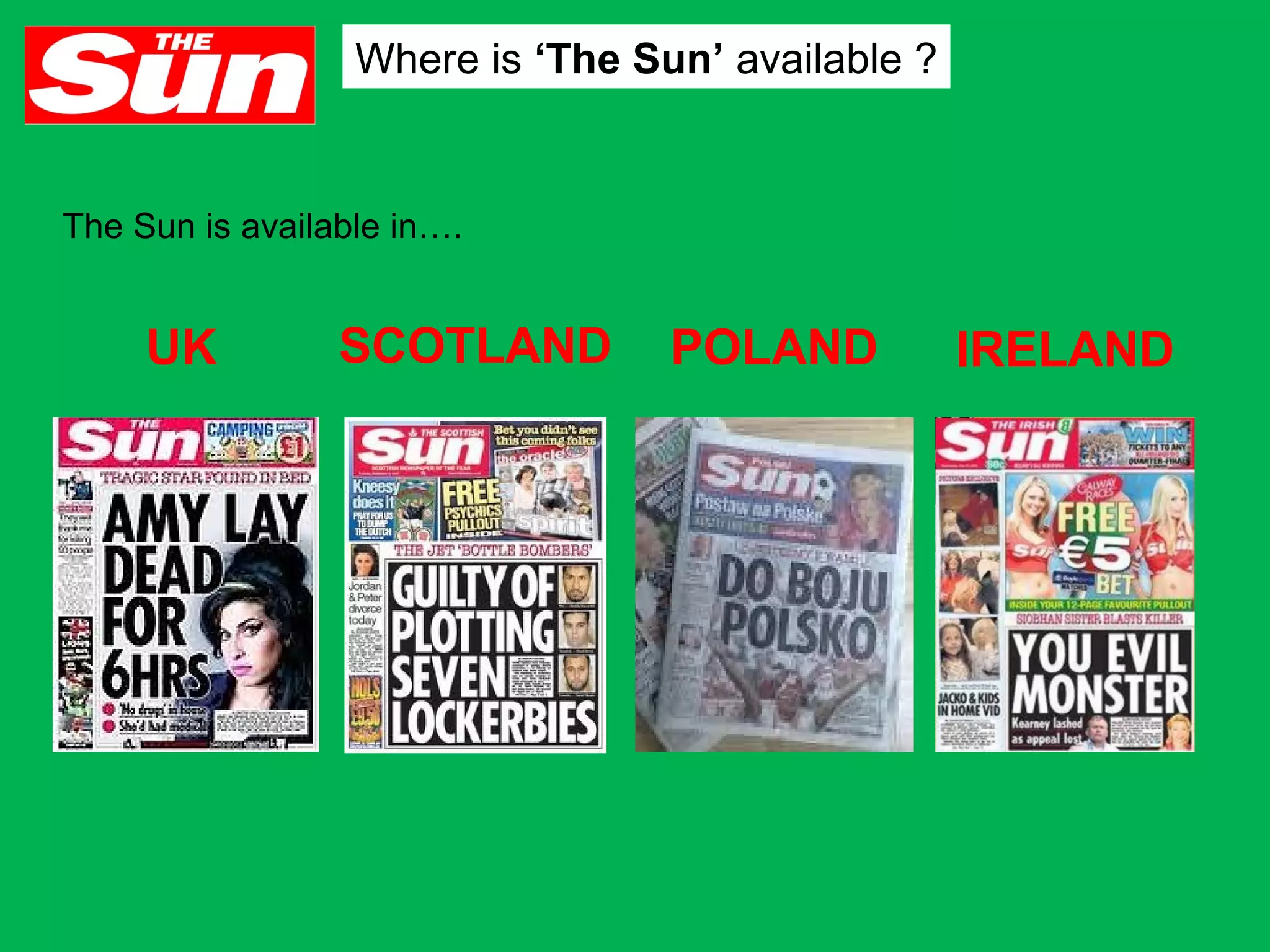
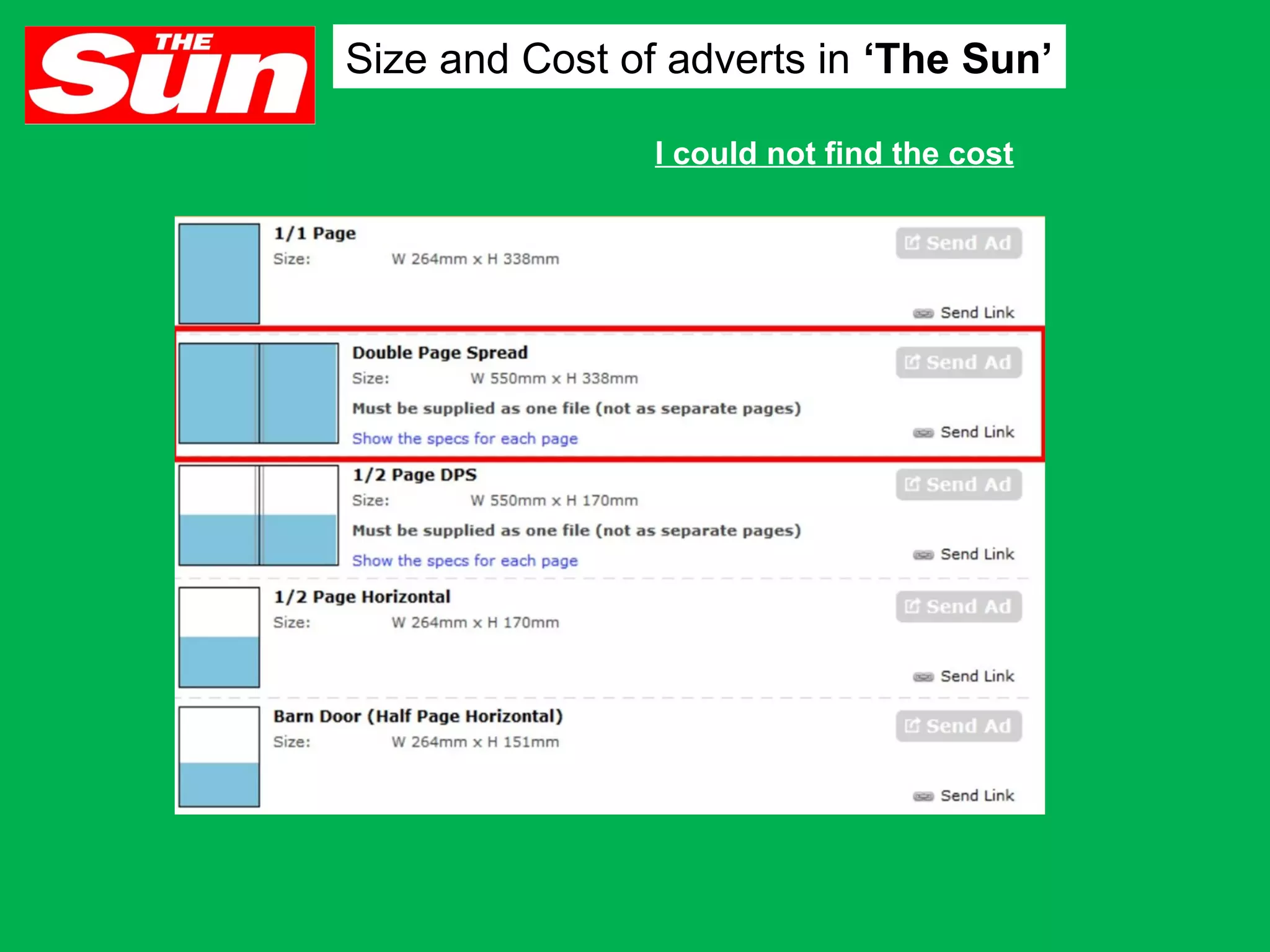
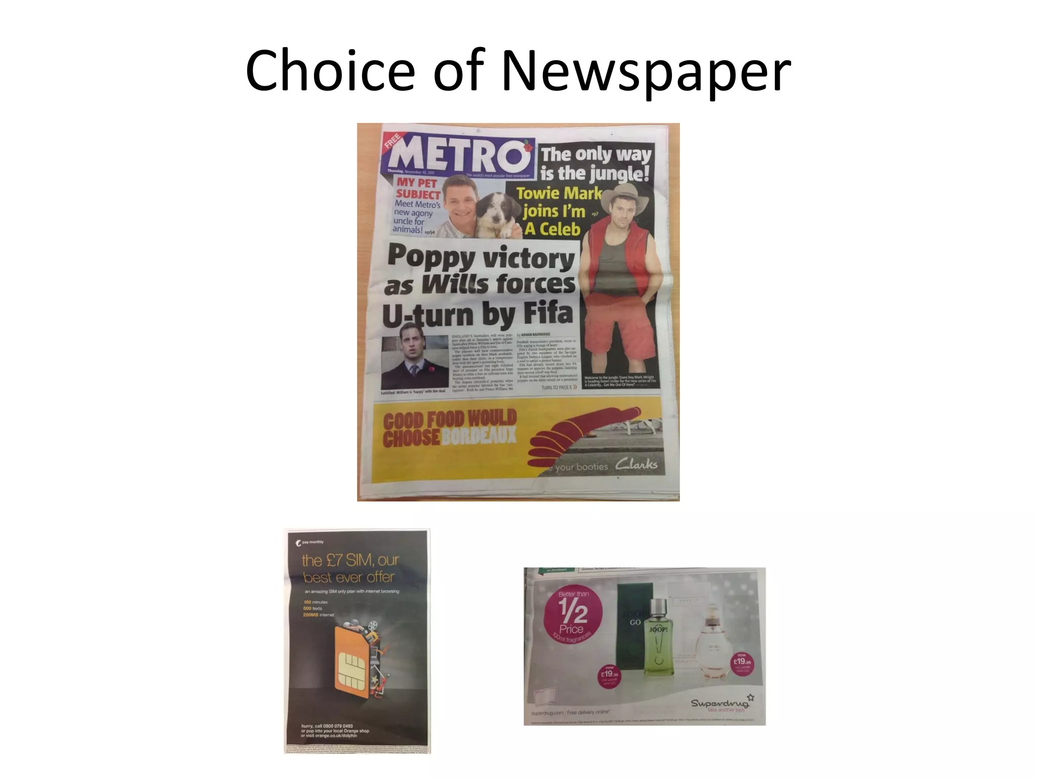
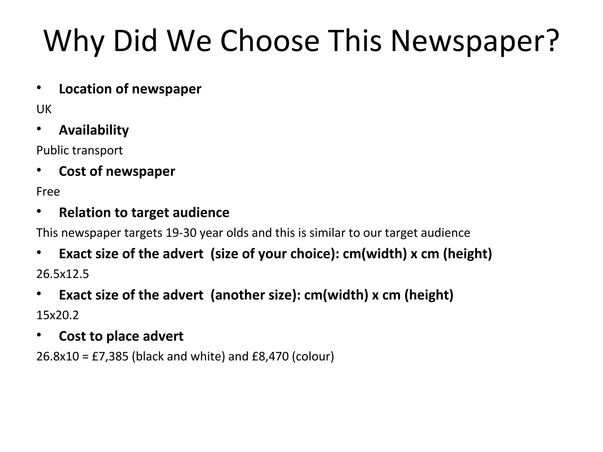
Assignment 30: Ancillary Text
Choice
Jodie Foster-Pilia
Abigail Menzies
Pamela Younes
Laura Cuk
Magazines
Stand first

graphics

•Text is bold, as it is significant to page
•Text is largest text on page
•All letters are in capitals to grab attention
The colour black ensures the title is
formal

•Orange graphic is used
behind text

Primary image
•Primary image is placed in middle of
page, so it is easily seen.
•Image is very large, takes up nearly
1/3 of page
Large
image
creates
visual
hierarchy
as this is
where
people
will look
first

Body text
•Organised
in neat
columns,
making text
clear and
presentable

Pull
quotes
•Larger than

•Black text
stands out
against white
background

Colour schemes

•Black white and orange

•The double page spread is about games, which
are fun. orange is a quite playful colour, and gives
the double page a sense of in formalness

body text, so
draws
attention of
reader
•The white text stands
out against white
background
•Quotation marks are in orange
to make it obvious that its a
quote
Body text

Stand
•Multicoloured Text
first

•Text is neat organised columns
•Columns prevent text from being
confusing

Folios

•Page number is made small, as it isn't
highly significant
•Text is white, so is visible against black
background

captures attention

•Writing is larger
than any other text
on page
•The colourful large
title draws your eyes
to this part of the
page first, which is
visual hierachy

Colour scheme
Graphic
•Blue graphic behind text.
•Light blue graphic makes black
text visible

•Black ,yellow, blue & pink
•The double page spread is advertising a film
festival, multi coloured theme ensure the
festival seems quite joyful and happy
Magazine Research – Timeout
What articles are inside this magazine?

Double page spread giving information about Jessie J also
can be a form of entertainment to some readers

At the bottom of each article the folio consists of the page number and the
magazine’s website

In this magazine there are double page articles about film and
music topics
Magazine Research – Timeout
Example of a double page spread in this magazine
Heading
•Bold, black font is used
so the text stands out
from the body text

Standfirst
•Gives brief info about the whole
article

Graphics
•Graphics are used to
create a black box so
the text is visible

Colur scheme
•Blue and black
•Neon blue is bright
and eye catching
•Black is used in text
box so the words are
more visible

Graphics
•This red circle is a
convention in timeout
magazine as it either
gives further info about
article or summarises
what the article is about
Folio
•Page number and magazine’s website is
placed on every article page
Headline
this
heading
would
challenge the conventions,
as its near the middle and
its horizontal also its
overlapping the image,
giving the magazine more
creativity and thought
Primary Image
uses: theres a main
image
where
the
audience would see
first. however there isn't
visual hierarchy the
audience would look at
the image before the
headline
Photography Style
develops: this photo is
not on the side taking
half a spread and nor in
the middle. the image is
more on the right and
having some on the
other half, having space
for the body text,
headline, subtitle etc

magazine

Standfirst
uses: the subtitle is
different than the body text.
has a different font, etc

Body text
the body text is in a box
look, however there isn't a
lot of body text to out in
columns but the placement
of it on the top corner
challenges the conventions
as its normally below the
headline
colour scheme
very classical colours. the photograph with the navy
background would contrast with the gold top where it makes
the gold show more with the dark background.
the whole double spread in general
the double spread challenges the conventions as it doesn't
have the box look effect where theres an image on half a
page and the headline is at the top with the body text below it
(visual hierarchy) whereas this is different where the layout is
different

Folio
challenges: this magazine
spread has no folios and
normally beside the folios
normally
have
the
magazine name, so this
magazine doesn't have the
folio nor the magazine
name beside
Items shown/discussed in magazine
•

Editors letter

•

Taste – drink, travel

•

Cars

•

Features

•

Cover start article

•

100 best things in the world

•

Fashion

•

Grooming

•

GQ directory

•

Art

•

Sport

•

Music

•

Film

•

Action
Who is the target audience?
• Men – as it is a men’s magazine
• Middle classes – articles are focused on
expensive consumption
• 30-40’s – mature magazine
• Font is bold and simple writing ‘Man Rage!’ to
create connection with the male reader,
therefore making them relatable
• Colours are red and black (danger) – men are
attracted to danger
• Mass audience because its conventional to
men’s taste – cars and watches etc.
• Front cover features a playful yet seductive
female – which will gain the males attention
How is the magazine organised/structured?
What are most pages about?

• Men’s pop culture
• Cars
•
• Gadgets
• Sports
What do they advertise?

• Watches
• Perfume
• Fashion
• Technology
• Alcohol
• Batteries
Where is GQ available?

•
•
•
•
•
•
•
•
•
•

US
UK
Russia
Italy (Men
Style)
France
Japan
South Africa
China
Italy
Portugal

•
•
•
•
•
•
•

Germany
Spain
Australia
India
Mexico
Korea
Taiwan
Cost of full double page spread
Choice of Magazine
Why Did We Choose This Magazine?
•

Design comments
n/a

•

Location of magazine
can be bought online, can be found in theatres, cafes, museums and at train stations zones 1-2 on
Tuesdays

•

Relation to target audience
This magazine can be found for free in London tube stations and can be bough online for those
who want to find out what is going on in London this would allow us to reach our secondary
target audience of adults aged 23-34

•
•

Cost to place DPS
--Exact size of the DPS cm(width) x cm (height)
Trim: 450mm x H 297mm
Bleed: 460mm x H 307mm

•

Margin width:

5mm

•

Bleed: yes or no?
Yes
Newspapers
Name of program
Placed at top – highlights
significance
•Name of program is in bold
to make it stand out
•Letters are in capitals
also adds to this
•The word live a different
colour, from rest of title which
makes it easy for audience to
notice.

Colour
schemes
•Red and white is the
main colour scheme
•Red clearly stands
out against white
background

Primary image
Primary image is placed
at centre of advert
Image is fairly large

Scheduling
info
•Scheduling info is placed
at bottom of page, as its
not important as title
•Text is smaller, but still
quite large, making it

Channel logo
•Placed at
bottom right of
screen
Colour schemes
Mostly Blue and white

Primary image
Image is quite large
( captures attention)
Placed at bottom of page
Newspaper Research – Evening Standard
This newspaper didn’t have any adverts for tv shows or documentaries but they have a
wide range of adverts from technology to supermarket deals

•All 3 use bright colour so
the advert stands out on
the newspaper page
•Use of graphic so
chosen colour font is
visible
•Limited use of words

Most adverts in this newspaper
are this size and are placed at the
bottom of the page
Newspaper Advert
Primary Image
the primary image is at the top
which creates visual hierarchy as
an advert needs to be visual so it
can grab the audiences attention
Photography style
theres a main image at the top
take half of a half spread. while
there are a couple of small
images on the bottom of the
page. this shows that they are
showing the most important
image first then the least
important at the bottom as the
audience would look up first
then to the bottom
channel Logo
the channel logo is in the
middle between the images
and beside the TV title and the
timing. this is to remind the
audience on what channel to
find this TV show on

colour scheme
the main colour is red, this can
be due to red being noticeable
and can be seen from a
distance. making the advert
seem bold and easier to read
Slogan
theres slogan on the secondary
images, telling the audiences
what the TV show is called and
what time. this would make it
clear to the audience and more
easier to follow on what image
is what time
Name of program
the title is in the middle making
it more noticeable. behind the
text there is graphics making it
easier to read as theres an
image behind the text therefore
including graphics makes it
more helpful and can be seen
more clearly
Daily Mail

this is the Display AD sizes
Daily Mail

this is the Display AD sizes on the weekend paper
What kind of things are in ‘Metro’?

• Top/Shocking news
• Weather and Forecast
• ‘Talk’ news
• ‘Guilty Pleasures’ news
• Ents & Tech
• Horoscope & Puzzles
• Business’ news
• Sports Sections
How is ‘Metro’ organised/structured?

Top important news

Fashion

Weather Forecast

Middle – ‘Guilty Pleasures’

Puzzles and Horoscopes

Sports sections
How much advertising is in ‘Metro’?
There is about 65% advertising throughout
the newspaper as it almost features of every
page in various sizes.
Also because the newspaper is free, their
funding is provided by the advertisers, so its
only natural if it features largely throughout.
What does ‘Metro’ advertise?

•

Cosmetics

•

Supermarkets

•

Technology

•

Clothing brands

•

Jobs

•

Websites

•

Furniture
Who is the target audience?
• The metro is free provided by transport.
• Therefore their target audience will be people who go
work early in the morning (when the papers usually
taken by) on the train mainly.
• Many articles are based on technology – esp, in the
ents & tech sections Supported by formal language.

Thus target audience is possibly
middle class adults.
Where is ‘Metro’ available?

• On all
trains
• Buses
In the….

UK
Because, it is the only city with an underground –
as is a busy city whereby so many people will
read it massively.
Size and cost of adverts in ‘Metro’?
I could not find the cost
What kind of things are in ‘The Sun’ ?

• Humorous headlines
• Page 3 Nude shots
• Weather
• ‘Jane Moor’ section
• TV Magazine
• ‘Dear Deirdre’ section
• ‘Woman’ section
• Puzzles
How is ‘The Sun’ organised/structured ?

Front page – important news Weather Forecast

Middle TV Gossip

TV Guide

Jane Moor article

Sports at the end
How much advertising is in ‘The Sun’ ?

There is about 45% advertising throughout the
newspaper as it features on every page in
various sizes.
Also nearer the end of the paper there is a
double page spread dedicated for many small
advertisements.
What does ‘The Sun’ advertise ?

• Theme parks
• Supermarkets
• Movies
• Technology
• Holidays
• Adult hotlines
• Elderly mobility
Who is the target audience ?

•

The Sun’s main audience would generally be from ages 19
up to 49 as they have most buying power.

•

However, because of their adult themes possibly for those
older, more likely to be in their 30’s.

•

Being only 40p and the language and the reading age of 8, I
would assume this newspaper is for the lower working class
– emphasized from the low price/sale adverts
Where is ‘The Sun’ available ?

The Sun is available in….

UK

SCOTLAND

POLAND

IRELAND
Size and Cost of adverts in ‘The Sun’
I could not find the cost
Choice of Newspaper
Why Did We Choose This Newspaper?
•

Location of newspaper

UK

•

Availability

Public transport

•

Cost of newspaper

Free

•

Relation to target audience

This newspaper targets 19-30 year olds and this is similar to our target audience

•

Exact size of the advert (size of your choice): cm(width) x cm (height)

26.5x12.5

•

Exact size of the advert (another size): cm(width) x cm (height)

15x20.2

•

Cost to place advert

26.8x10 = £7,385 (black and white) and £8,470 (colour)

Assignment 30

  • 1.
    Assignment 30: AncillaryText Choice Jodie Foster-Pilia Abigail Menzies Pamela Younes Laura Cuk
  • 2.
  • 3.
    Stand first graphics •Text isbold, as it is significant to page •Text is largest text on page •All letters are in capitals to grab attention The colour black ensures the title is formal •Orange graphic is used behind text Primary image •Primary image is placed in middle of page, so it is easily seen. •Image is very large, takes up nearly 1/3 of page Large image creates visual hierarchy as this is where people will look first Body text •Organised in neat columns, making text clear and presentable Pull quotes •Larger than •Black text stands out against white background Colour schemes •Black white and orange •The double page spread is about games, which are fun. orange is a quite playful colour, and gives the double page a sense of in formalness body text, so draws attention of reader •The white text stands out against white background •Quotation marks are in orange to make it obvious that its a quote
  • 4.
    Body text Stand •Multicoloured Text first •Textis neat organised columns •Columns prevent text from being confusing Folios •Page number is made small, as it isn't highly significant •Text is white, so is visible against black background captures attention •Writing is larger than any other text on page •The colourful large title draws your eyes to this part of the page first, which is visual hierachy Colour scheme Graphic •Blue graphic behind text. •Light blue graphic makes black text visible •Black ,yellow, blue & pink •The double page spread is advertising a film festival, multi coloured theme ensure the festival seems quite joyful and happy
  • 5.
    Magazine Research –Timeout What articles are inside this magazine? Double page spread giving information about Jessie J also can be a form of entertainment to some readers At the bottom of each article the folio consists of the page number and the magazine’s website In this magazine there are double page articles about film and music topics
  • 6.
    Magazine Research –Timeout Example of a double page spread in this magazine Heading •Bold, black font is used so the text stands out from the body text Standfirst •Gives brief info about the whole article Graphics •Graphics are used to create a black box so the text is visible Colur scheme •Blue and black •Neon blue is bright and eye catching •Black is used in text box so the words are more visible Graphics •This red circle is a convention in timeout magazine as it either gives further info about article or summarises what the article is about Folio •Page number and magazine’s website is placed on every article page
  • 7.
    Headline this heading would challenge the conventions, asits near the middle and its horizontal also its overlapping the image, giving the magazine more creativity and thought Primary Image uses: theres a main image where the audience would see first. however there isn't visual hierarchy the audience would look at the image before the headline Photography Style develops: this photo is not on the side taking half a spread and nor in the middle. the image is more on the right and having some on the other half, having space for the body text, headline, subtitle etc magazine Standfirst uses: the subtitle is different than the body text. has a different font, etc Body text the body text is in a box look, however there isn't a lot of body text to out in columns but the placement of it on the top corner challenges the conventions as its normally below the headline colour scheme very classical colours. the photograph with the navy background would contrast with the gold top where it makes the gold show more with the dark background. the whole double spread in general the double spread challenges the conventions as it doesn't have the box look effect where theres an image on half a page and the headline is at the top with the body text below it (visual hierarchy) whereas this is different where the layout is different Folio challenges: this magazine spread has no folios and normally beside the folios normally have the magazine name, so this magazine doesn't have the folio nor the magazine name beside
  • 8.
    Items shown/discussed inmagazine • Editors letter • Taste – drink, travel • Cars • Features • Cover start article • 100 best things in the world • Fashion • Grooming • GQ directory • Art • Sport • Music • Film • Action
  • 9.
    Who is thetarget audience? • Men – as it is a men’s magazine • Middle classes – articles are focused on expensive consumption • 30-40’s – mature magazine • Font is bold and simple writing ‘Man Rage!’ to create connection with the male reader, therefore making them relatable • Colours are red and black (danger) – men are attracted to danger • Mass audience because its conventional to men’s taste – cars and watches etc. • Front cover features a playful yet seductive female – which will gain the males attention
  • 10.
    How is themagazine organised/structured?
  • 11.
    What are mostpages about? • Men’s pop culture • Cars • • Gadgets • Sports
  • 12.
    What do theyadvertise? • Watches • Perfume • Fashion • Technology • Alcohol • Batteries
  • 13.
    Where is GQavailable? • • • • • • • • • • US UK Russia Italy (Men Style) France Japan South Africa China Italy Portugal • • • • • • • Germany Spain Australia India Mexico Korea Taiwan
  • 14.
    Cost of fulldouble page spread
  • 15.
  • 16.
    Why Did WeChoose This Magazine? • Design comments n/a • Location of magazine can be bought online, can be found in theatres, cafes, museums and at train stations zones 1-2 on Tuesdays • Relation to target audience This magazine can be found for free in London tube stations and can be bough online for those who want to find out what is going on in London this would allow us to reach our secondary target audience of adults aged 23-34 • • Cost to place DPS --Exact size of the DPS cm(width) x cm (height) Trim: 450mm x H 297mm Bleed: 460mm x H 307mm • Margin width: 5mm • Bleed: yes or no? Yes
  • 17.
  • 18.
    Name of program Placedat top – highlights significance •Name of program is in bold to make it stand out •Letters are in capitals also adds to this •The word live a different colour, from rest of title which makes it easy for audience to notice. Colour schemes •Red and white is the main colour scheme •Red clearly stands out against white background Primary image Primary image is placed at centre of advert Image is fairly large Scheduling info •Scheduling info is placed at bottom of page, as its not important as title •Text is smaller, but still quite large, making it Channel logo •Placed at bottom right of screen
  • 19.
    Colour schemes Mostly Blueand white Primary image Image is quite large ( captures attention) Placed at bottom of page
  • 20.
    Newspaper Research –Evening Standard This newspaper didn’t have any adverts for tv shows or documentaries but they have a wide range of adverts from technology to supermarket deals •All 3 use bright colour so the advert stands out on the newspaper page •Use of graphic so chosen colour font is visible •Limited use of words Most adverts in this newspaper are this size and are placed at the bottom of the page
  • 21.
    Newspaper Advert Primary Image theprimary image is at the top which creates visual hierarchy as an advert needs to be visual so it can grab the audiences attention Photography style theres a main image at the top take half of a half spread. while there are a couple of small images on the bottom of the page. this shows that they are showing the most important image first then the least important at the bottom as the audience would look up first then to the bottom channel Logo the channel logo is in the middle between the images and beside the TV title and the timing. this is to remind the audience on what channel to find this TV show on colour scheme the main colour is red, this can be due to red being noticeable and can be seen from a distance. making the advert seem bold and easier to read Slogan theres slogan on the secondary images, telling the audiences what the TV show is called and what time. this would make it clear to the audience and more easier to follow on what image is what time Name of program the title is in the middle making it more noticeable. behind the text there is graphics making it easier to read as theres an image behind the text therefore including graphics makes it more helpful and can be seen more clearly
  • 22.
    Daily Mail this isthe Display AD sizes
  • 23.
    Daily Mail this isthe Display AD sizes on the weekend paper
  • 24.
    What kind ofthings are in ‘Metro’? • Top/Shocking news • Weather and Forecast • ‘Talk’ news • ‘Guilty Pleasures’ news • Ents & Tech • Horoscope & Puzzles • Business’ news • Sports Sections
  • 25.
    How is ‘Metro’organised/structured? Top important news Fashion Weather Forecast Middle – ‘Guilty Pleasures’ Puzzles and Horoscopes Sports sections
  • 26.
    How much advertisingis in ‘Metro’? There is about 65% advertising throughout the newspaper as it almost features of every page in various sizes. Also because the newspaper is free, their funding is provided by the advertisers, so its only natural if it features largely throughout.
  • 27.
    What does ‘Metro’advertise? • Cosmetics • Supermarkets • Technology • Clothing brands • Jobs • Websites • Furniture
  • 28.
    Who is thetarget audience? • The metro is free provided by transport. • Therefore their target audience will be people who go work early in the morning (when the papers usually taken by) on the train mainly. • Many articles are based on technology – esp, in the ents & tech sections Supported by formal language. Thus target audience is possibly middle class adults.
  • 29.
    Where is ‘Metro’available? • On all trains • Buses In the…. UK Because, it is the only city with an underground – as is a busy city whereby so many people will read it massively.
  • 30.
    Size and costof adverts in ‘Metro’? I could not find the cost
  • 32.
    What kind ofthings are in ‘The Sun’ ? • Humorous headlines • Page 3 Nude shots • Weather • ‘Jane Moor’ section • TV Magazine • ‘Dear Deirdre’ section • ‘Woman’ section • Puzzles
  • 33.
    How is ‘TheSun’ organised/structured ? Front page – important news Weather Forecast Middle TV Gossip TV Guide Jane Moor article Sports at the end
  • 34.
    How much advertisingis in ‘The Sun’ ? There is about 45% advertising throughout the newspaper as it features on every page in various sizes. Also nearer the end of the paper there is a double page spread dedicated for many small advertisements.
  • 35.
    What does ‘TheSun’ advertise ? • Theme parks • Supermarkets • Movies • Technology • Holidays • Adult hotlines • Elderly mobility
  • 36.
    Who is thetarget audience ? • The Sun’s main audience would generally be from ages 19 up to 49 as they have most buying power. • However, because of their adult themes possibly for those older, more likely to be in their 30’s. • Being only 40p and the language and the reading age of 8, I would assume this newspaper is for the lower working class – emphasized from the low price/sale adverts
  • 37.
    Where is ‘TheSun’ available ? The Sun is available in…. UK SCOTLAND POLAND IRELAND
  • 38.
    Size and Costof adverts in ‘The Sun’ I could not find the cost
  • 39.
  • 40.
    Why Did WeChoose This Newspaper? • Location of newspaper UK • Availability Public transport • Cost of newspaper Free • Relation to target audience This newspaper targets 19-30 year olds and this is similar to our target audience • Exact size of the advert (size of your choice): cm(width) x cm (height) 26.5x12.5 • Exact size of the advert (another size): cm(width) x cm (height) 15x20.2 • Cost to place advert 26.8x10 = £7,385 (black and white) and £8,470 (colour)