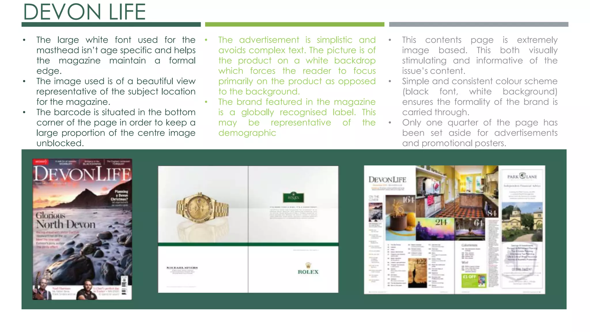
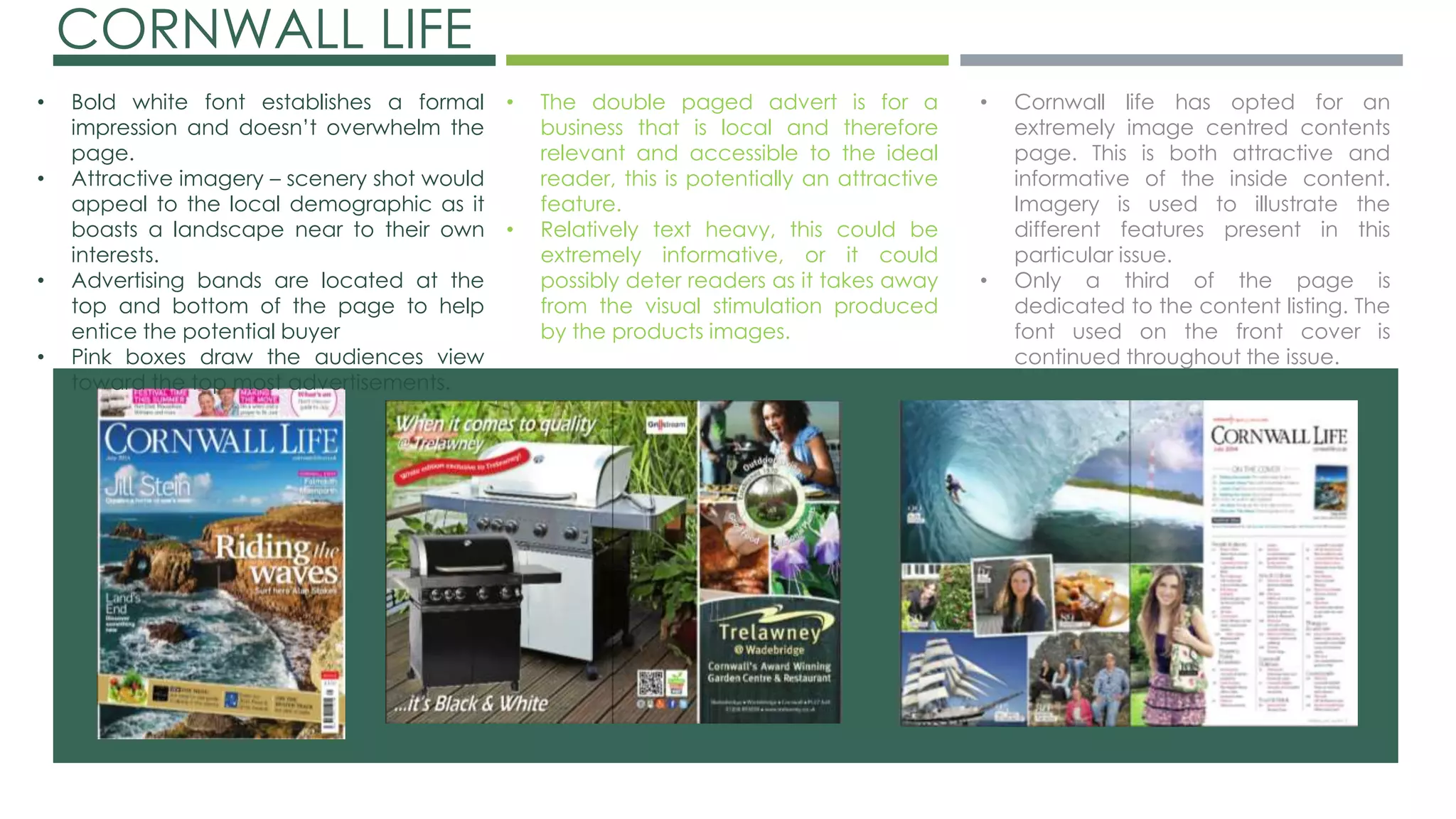
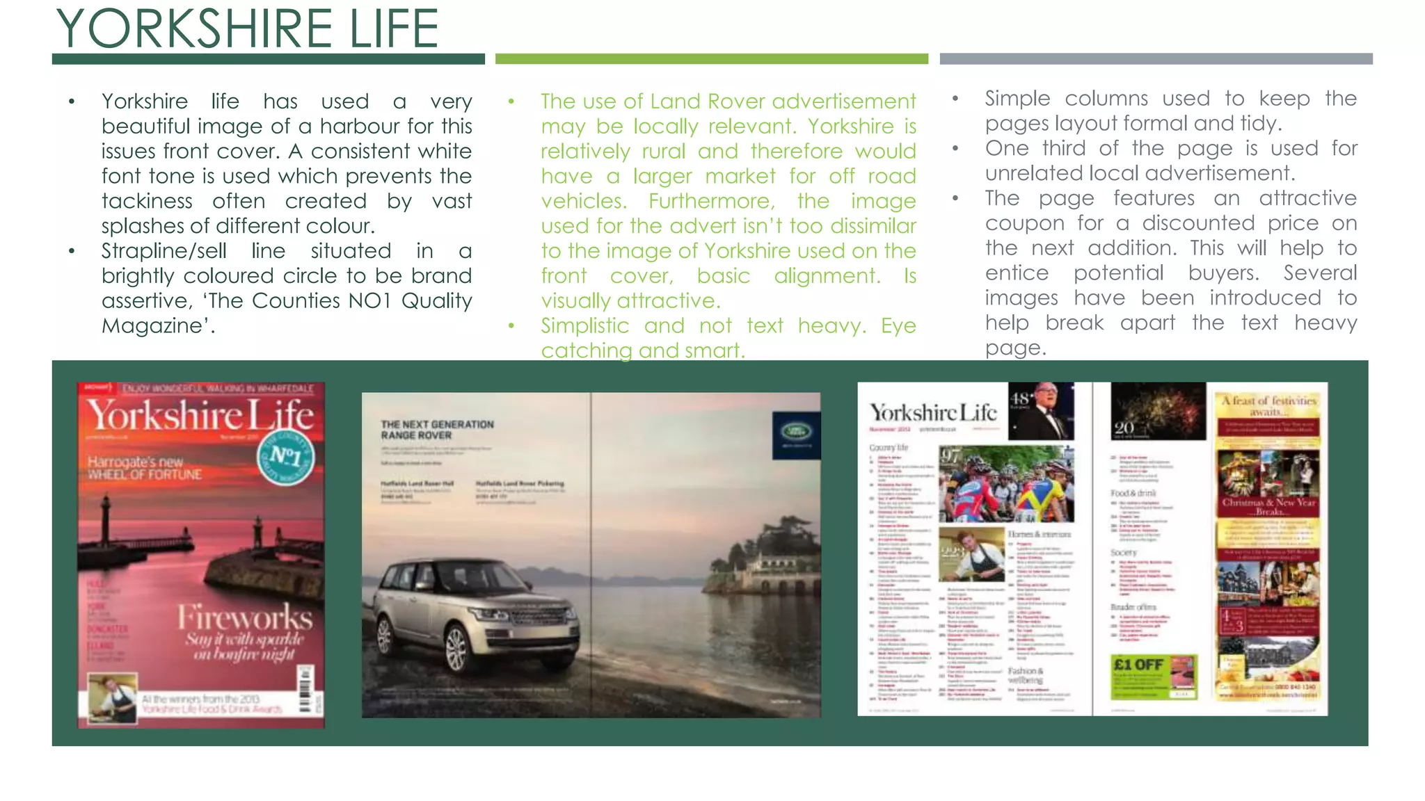
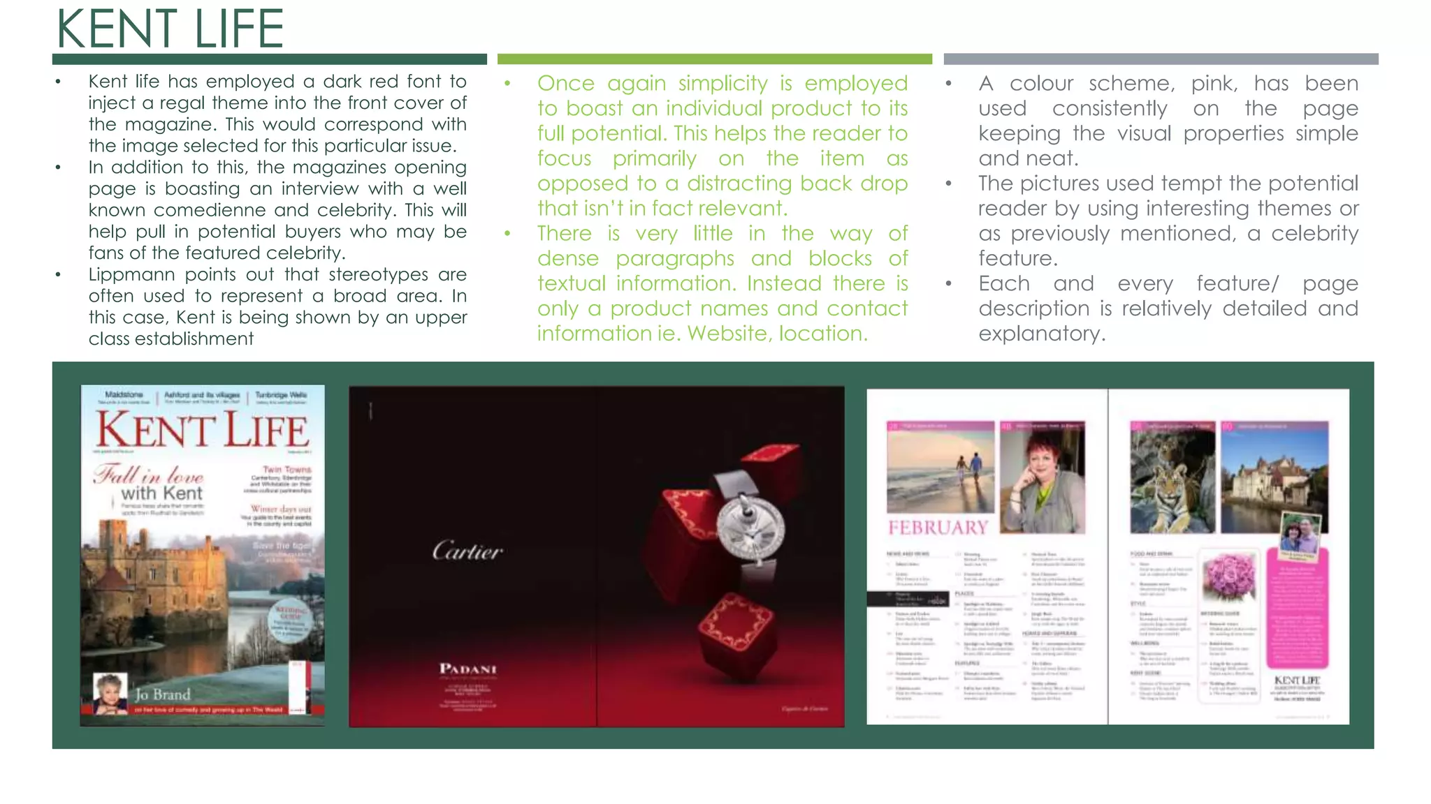
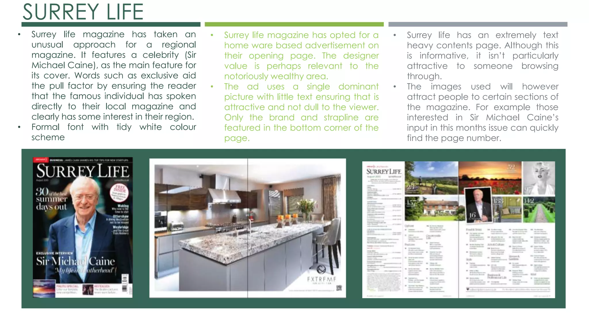
CHARLIE BARKER 
CODES & 
CONVENTIONS 
RESEARCH
DEVON LIFE 
• The large white font used for the 
masthead isn’t age specific and helps 
the magazine maintain a formal 
edge. 
• The image used is of a beautiful view 
representative of the subject location 
for the magazine. 
• The barcode is situated in the bottom 
corner of the page in order to keep a 
large proportion of the centre image 
unblocked. 
• The advertisement is simplistic and 
avoids complex text. The picture is of 
the product on a white backdrop 
which forces the reader to focus 
primarily on the product as opposed 
to the background. 
• The brand featured in the magazine 
is a globally recognised label. This 
may be representative of the 
demographic 
• This contents page is extremely 
image based. This both visually 
stimulating and informative of the 
issue’s content. 
• Simple and consistent colour scheme 
(black font, white background) 
ensures the formality of the brand is 
carried through. 
• Only one quarter of the page has 
been set aside for advertisements 
and promotional posters.
CORNWALL LIFE 
• Bold white font establishes a formal 
impression and doesn’t overwhelm the 
page. 
• Attractive imagery – scenery shot would 
appeal to the local demographic as it 
boasts a landscape near to their own 
interests. 
• Advertising bands are located at the 
top and bottom of the page to help 
entice the potential buyer 
• Pink boxes draw the audiences view 
toward the top most advertisements. 
• The double paged advert is for a 
business that is local and therefore 
relevant and accessible to the ideal 
reader, this is potentially an attractive 
feature. 
• Relatively text heavy, this could be 
extremely informative, or it could 
possibly deter readers as it takes away 
from the visual stimulation produced 
by the products images. 
• Cornwall life has opted for an 
extremely image centred contents 
page. This is both attractive and 
informative of the inside content. 
Imagery is used to illustrate the 
different features present in this 
particular issue. 
• Only a third of the page is 
dedicated to the content listing. The 
font used on the front cover is 
continued throughout the issue.
YORKSHIRE LIFE 
• The use of Land Rover advertisement 
may be locally relevant. Yorkshire is 
relatively rural and therefore would 
have a larger market for off road 
vehicles. Furthermore, the image 
used for the advert isn’t too dissimilar 
to the image of Yorkshire used on the 
front cover, basic alignment. Is 
visually attractive. 
• Simplistic and not text heavy. Eye 
catching and smart. 
• Yorkshire life has used a very 
beautiful image of a harbour for this 
issues front cover. A consistent white 
font tone is used which prevents the 
tackiness often created by vast 
splashes of different colour. 
• Strapline/sell line situated in a 
brightly coloured circle to be brand 
assertive, ‘The Counties NO1 Quality 
Magazine’. 
• Simple columns used to keep the 
pages layout formal and tidy. 
• One third of the page is used for 
unrelated local advertisement. 
• The page features an attractive 
coupon for a discounted price on 
the next addition. This will help to 
entice potential buyers. Several 
images have been introduced to 
help break apart the text heavy 
page.
KENT LIFE 
• Kent life has employed a dark red font to 
inject a regal theme into the front cover of 
the magazine. This would correspond with 
the image selected for this particular issue. 
• In addition to this, the magazines opening 
page is boasting an interview with a well 
known comedienne and celebrity. This will 
help pull in potential buyers who may be 
fans of the featured celebrity. 
• Lippmann points out that stereotypes are 
often used to represent a broad area. In 
this case, Kent is being shown by an upper 
class establishment 
• Once again simplicity is employed 
to boast an individual product to its 
full potential. This helps the reader to 
focus primarily on the item as 
opposed to a distracting back drop 
that isn’t in fact relevant. 
• There is very little in the way of 
dense paragraphs and blocks of 
textual information. Instead there is 
only a product names and contact 
information ie. Website, location. 
• A colour scheme, pink, has been 
used consistently on the page 
keeping the visual properties simple 
and neat. 
• The pictures used tempt the potential 
reader by using interesting themes or 
as previously mentioned, a celebrity 
feature. 
• Each and every feature/ page 
description is relatively detailed and 
explanatory.
SURREY LIFE 
• Surrey life magazine has taken an 
unusual approach for a regional 
magazine. It features a celebrity (Sir 
Michael Caine), as the main feature for 
its cover. Words such as exclusive aid 
the pull factor by ensuring the reader 
that the famous individual has spoken 
directly to their local magazine and 
clearly has some interest in their region. 
• Formal font with tidy white colour 
scheme 
• Surrey life magazine has opted for a 
home ware based advertisement on 
their opening page. The designer 
value is perhaps relevant to the 
notoriously wealthy area. 
• The ad uses a single dominant 
picture with little text ensuring that is 
attractive and not dull to the viewer. 
Only the brand and strapline are 
featured in the bottom corner of the 
page. 
• Surrey life has an extremely text 
heavy contents page. Although this 
is informative, it isn’t particularly 
attractive to someone browsing 
through. 
• The images used will however 
attract people to certain sections of 
the magazine. For example those 
interested in Sir Michael Caine’s 
input in this months issue can quickly 
find the page number.

Codes and conventions

  • 1.
    CHARLIE BARKER CODES& CONVENTIONS RESEARCH
  • 2.
    DEVON LIFE •The large white font used for the masthead isn’t age specific and helps the magazine maintain a formal edge. • The image used is of a beautiful view representative of the subject location for the magazine. • The barcode is situated in the bottom corner of the page in order to keep a large proportion of the centre image unblocked. • The advertisement is simplistic and avoids complex text. The picture is of the product on a white backdrop which forces the reader to focus primarily on the product as opposed to the background. • The brand featured in the magazine is a globally recognised label. This may be representative of the demographic • This contents page is extremely image based. This both visually stimulating and informative of the issue’s content. • Simple and consistent colour scheme (black font, white background) ensures the formality of the brand is carried through. • Only one quarter of the page has been set aside for advertisements and promotional posters.
  • 3.
    CORNWALL LIFE •Bold white font establishes a formal impression and doesn’t overwhelm the page. • Attractive imagery – scenery shot would appeal to the local demographic as it boasts a landscape near to their own interests. • Advertising bands are located at the top and bottom of the page to help entice the potential buyer • Pink boxes draw the audiences view toward the top most advertisements. • The double paged advert is for a business that is local and therefore relevant and accessible to the ideal reader, this is potentially an attractive feature. • Relatively text heavy, this could be extremely informative, or it could possibly deter readers as it takes away from the visual stimulation produced by the products images. • Cornwall life has opted for an extremely image centred contents page. This is both attractive and informative of the inside content. Imagery is used to illustrate the different features present in this particular issue. • Only a third of the page is dedicated to the content listing. The font used on the front cover is continued throughout the issue.
  • 4.
    YORKSHIRE LIFE •The use of Land Rover advertisement may be locally relevant. Yorkshire is relatively rural and therefore would have a larger market for off road vehicles. Furthermore, the image used for the advert isn’t too dissimilar to the image of Yorkshire used on the front cover, basic alignment. Is visually attractive. • Simplistic and not text heavy. Eye catching and smart. • Yorkshire life has used a very beautiful image of a harbour for this issues front cover. A consistent white font tone is used which prevents the tackiness often created by vast splashes of different colour. • Strapline/sell line situated in a brightly coloured circle to be brand assertive, ‘The Counties NO1 Quality Magazine’. • Simple columns used to keep the pages layout formal and tidy. • One third of the page is used for unrelated local advertisement. • The page features an attractive coupon for a discounted price on the next addition. This will help to entice potential buyers. Several images have been introduced to help break apart the text heavy page.
  • 5.
    KENT LIFE •Kent life has employed a dark red font to inject a regal theme into the front cover of the magazine. This would correspond with the image selected for this particular issue. • In addition to this, the magazines opening page is boasting an interview with a well known comedienne and celebrity. This will help pull in potential buyers who may be fans of the featured celebrity. • Lippmann points out that stereotypes are often used to represent a broad area. In this case, Kent is being shown by an upper class establishment • Once again simplicity is employed to boast an individual product to its full potential. This helps the reader to focus primarily on the item as opposed to a distracting back drop that isn’t in fact relevant. • There is very little in the way of dense paragraphs and blocks of textual information. Instead there is only a product names and contact information ie. Website, location. • A colour scheme, pink, has been used consistently on the page keeping the visual properties simple and neat. • The pictures used tempt the potential reader by using interesting themes or as previously mentioned, a celebrity feature. • Each and every feature/ page description is relatively detailed and explanatory.
  • 6.
    SURREY LIFE •Surrey life magazine has taken an unusual approach for a regional magazine. It features a celebrity (Sir Michael Caine), as the main feature for its cover. Words such as exclusive aid the pull factor by ensuring the reader that the famous individual has spoken directly to their local magazine and clearly has some interest in their region. • Formal font with tidy white colour scheme • Surrey life magazine has opted for a home ware based advertisement on their opening page. The designer value is perhaps relevant to the notoriously wealthy area. • The ad uses a single dominant picture with little text ensuring that is attractive and not dull to the viewer. Only the brand and strapline are featured in the bottom corner of the page. • Surrey life has an extremely text heavy contents page. Although this is informative, it isn’t particularly attractive to someone browsing through. • The images used will however attract people to certain sections of the magazine. For example those interested in Sir Michael Caine’s input in this months issue can quickly find the page number.