Downloaded 24 times

![Functions
to the cells of the output layer. The original value of the input raster dataset is added to
the attribute table, one field per input layer (Figure 7.2).
Combining rasters
ArcToolbox -> Spatial Analyst Tools -> Local -> Combine.
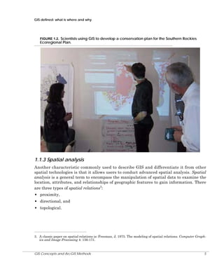
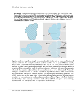
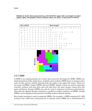
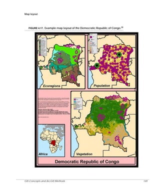
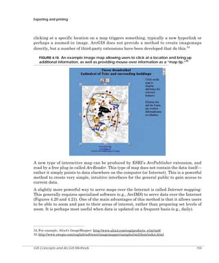
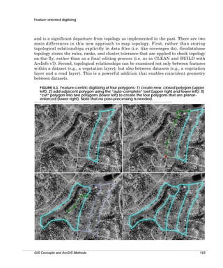
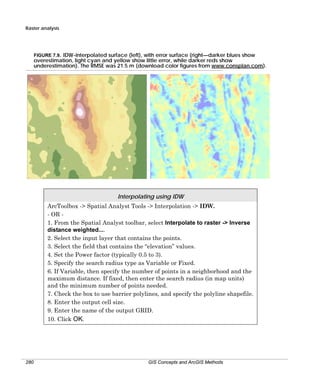
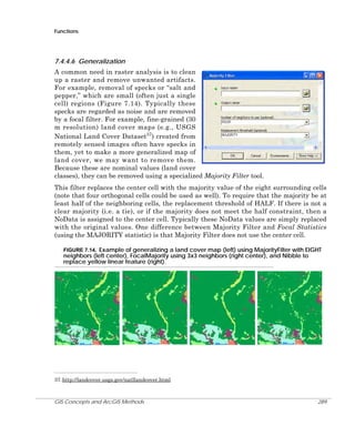
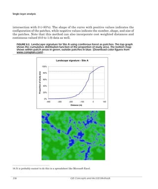
FIGURE 7.2. Example of combine function, illustrating Combine ( [G1], [G2] ). Combining G1
(left) with G2 (left center) creates a new raster (right center) with values indexing unique
combinations of G1 and G2. The attribute table (right) has fields with original values of G1
and G2 (download color figures from www.consplan.com).
3
2
1
3
2
1
3
2
G1
G2
1
1
Value
1
1
2
1
2
1
3
3
3
Third, the values at a single location in a stack of rasters can be compared to a specified
criteria and the number of occurrences that the condition is met can be sent to an output
raster. For example, imagine that you had twelve rasters each representing the monthly
precipitation amount for a given year, and you wanted to determine the number of months
that exceeded 100 mm of precipitation. There are three tools that can be used that
examine the number of times the value is less than, equal to, or greater than the
conditional value.
Counting the occurrences that a location meets a condition
ArcToolbox -> Spatial Analyst Tools -> Local -> Equal to Frequency.
ArcToolbox -> Spatial Analyst Tools -> Local -> Greater Than Frequency.
ArcToolbox -> Spatial Analyst Tools -> Local -> Less Than Frequency.
Fourth, the values at a single location can be examined to see which meets a specified
criteria, and then the value that meets the criteria can be assigned to the output raster
(rather than the number of occurrences). There are two tools that do this. The Popularity
tool determines from the list of values at a location the value that is the nth most popular
(where n is an integer that specifies the condition/place). The Rank tool orders the list of
GIS Concepts and ArcGIS Methods
247](https://image.slidesharecdn.com/arcgisconcept-140104094415-phpapp01/85/Arc-gis-concept-24-320.jpg)

This document provides an overview and introduction to the third edition of the book "GIS Concepts and ArcGIS Methods" published in July 2007. The book was written by David M. Theobald, an associate professor at Colorado State University, and published by Conservation Planning Technologies. It covers fundamental GIS concepts and how to apply them using ArcGIS software. The book is available for purchase on the publisher's website at www.consplan.com and has an ISBN of 0-9679208-4-1.


