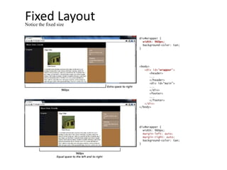
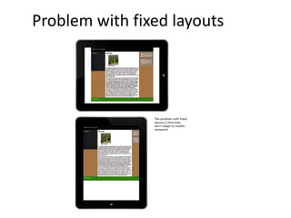
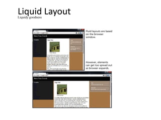
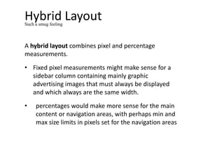
APPROACHES TO CSS LAYOUT
Section 5 of 7
Approaches to CSS Layout
One of the main problems faced by web designers is
that the size of the screen used to view the page can
vary quite a bit.
• 21-inch wide screen monitor that can display
1920x1080 pixels
• older iPhone with a 3.5 screen and a resolution of
320x480 px
Satisfying both users can be difficult; the approach to
take for one type of site content might not work as
well with another site with different content.
Approaches to CSS Layout
Most designers take one of two basic approaches to
dealing with the problems of screen size.
• Fixed Layout
• Liquid Layout
• Hybrid Layout
Fixed Layout
In a fixed layout, the basic width of the design is set by the
designer, typically corresponding to an “ideal” width based
on a “typical” monitor resolution
The advantage of a fixed layout is that it is easier to produce
and generally has a predictable visual result.
Fixed layouts have drawbacks.
• For larger screens, there may be an excessive amount of
blank space to the left and/or right of the content.
• It is also optimized for typical desktop monitors;
however, as more and more user visits are happening via
smaller mobile devices
It isn't even broken
Fixed LayoutNotice the fixed size
Problem with fixed layouts
Liquid Layout
In a liquid layout (also called a fluid layout) widths are not
specified using pixels, but percentage values.
Advantage:
• adapts to different browser sizes,
Disadvantages:
• Liquid layouts can be more difficult to create because
some elements, such as images, have fixed pixel sizes
• the line length (which is an important contributing factor
to readability) may become too long or too short
Liquidy goodness
Liquid LayoutLiquidy goodness
Hybrid Layout
A hybrid layout combines pixel and percentage
measurements.
• Fixed pixel measurements might make sense for a
sidebar column containing mainly graphic
advertising images that must always be displayed
and which always are the same width.
• percentages would make more sense for the main
content or navigation areas, with perhaps min and
max size limits in pixels set for the navigation areas
Such a smug feeling

Approaches to CSS Layout

  • 1.
    APPROACHES TO CSSLAYOUT Section 5 of 7
  • 2.
    Approaches to CSSLayout One of the main problems faced by web designers is that the size of the screen used to view the page can vary quite a bit. • 21-inch wide screen monitor that can display 1920x1080 pixels • older iPhone with a 3.5 screen and a resolution of 320x480 px Satisfying both users can be difficult; the approach to take for one type of site content might not work as well with another site with different content.
  • 3.
    Approaches to CSSLayout Most designers take one of two basic approaches to dealing with the problems of screen size. • Fixed Layout • Liquid Layout • Hybrid Layout
  • 4.
    Fixed Layout In afixed layout, the basic width of the design is set by the designer, typically corresponding to an “ideal” width based on a “typical” monitor resolution The advantage of a fixed layout is that it is easier to produce and generally has a predictable visual result. Fixed layouts have drawbacks. • For larger screens, there may be an excessive amount of blank space to the left and/or right of the content. • It is also optimized for typical desktop monitors; however, as more and more user visits are happening via smaller mobile devices It isn't even broken
  • 5.
  • 6.
  • 7.
    Liquid Layout In aliquid layout (also called a fluid layout) widths are not specified using pixels, but percentage values. Advantage: • adapts to different browser sizes, Disadvantages: • Liquid layouts can be more difficult to create because some elements, such as images, have fixed pixel sizes • the line length (which is an important contributing factor to readability) may become too long or too short Liquidy goodness
  • 8.
  • 9.
    Hybrid Layout A hybridlayout combines pixel and percentage measurements. • Fixed pixel measurements might make sense for a sidebar column containing mainly graphic advertising images that must always be displayed and which always are the same width. • percentages would make more sense for the main content or navigation areas, with perhaps min and max size limits in pixels set for the navigation areas Such a smug feeling