Downloaded 19 times

![Nir ElbazNIR ELBAZNir Elbaz
Responsive Web Design
var vCard = {
“name”: “Nir Elbaz”,
“company”: “Como (formerly Conduit)”,
“position”: “Senior Software Engineer”,
“email”: “nire0510[at]gmail.com”
};](https://image.slidesharecdn.com/rwd2015-151122123301-lva1-app6891/85/Responsive-Web-Design-2-320.jpg)


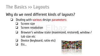
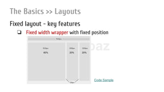

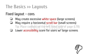
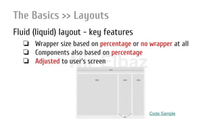
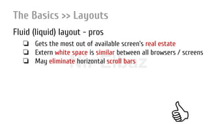


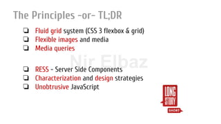


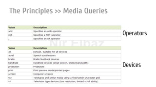
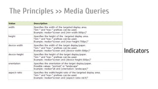


The document outlines the principles of responsive web design (RWD), emphasizing its importance due to the diverse array of devices used by consumers today. It covers various layouts, including fixed, fluid, and elastic, as well as the role of media queries and flexible images in achieving an optimal user experience across different screens. The author also highlights challenges and approaches for implementing RWD effectively while presenting statistics to support the need for mobile-friendly designs.


![20260201 [FOSDEM] gomodjail - library sandboxing for Go modules.pdf](https://cdn.slidesharecdn.com/ss_thumbnails/20260201fosdemgomodjail-librarysandboxingforgomodules-260201225659-76609ec4-thumbnail.jpg?width=640&height=640&fit=bounds)


