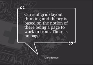
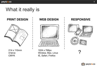
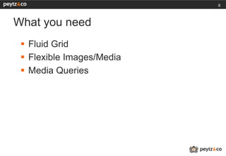
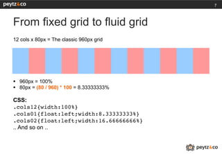
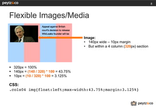
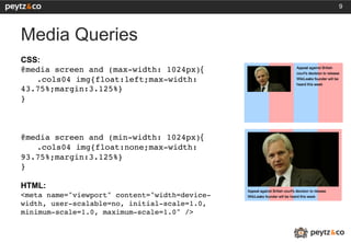
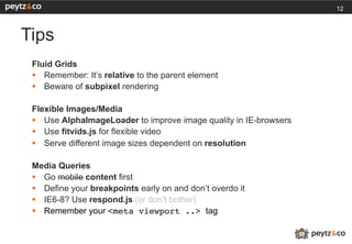
1


Responsive Web Design
Drupalcamp Copenhagen, September 25th 2011
2


The What
Current grid/layout
thinking and theory is
based on the notion of
there being a page to
work in from. There is
no page.


          Mark Boulton
4


What it really is
PRINT DESIGN     WEB DESIGN           RESPONSIVE


 214 x 110mm    1024 x 768px
 4-farve        Window, Mac, Linux       ?
 CMYK           IE, Safari, Firefox
5


The How
6


What you need
 §  Fluid Grid
 §  Flexible Images/Media
 §  Media Queries
7


From fixed grid to fluid grid
12 cols x 80px = The classic 960px grid


§  960px = 100%
§  80px = (80 / 960) * 100 = 8.33333333%

CSS:
.cols12{width:100%}!
.cols01{float:left;width:8.33333333%}!
.cols02{float:left;width:16.66666666%}!
.. And so on ..
8


Flexible Images/Media

                                         Image:
                                         •  140px wide – 10px margin
                                         •  But within a 4 column (320px) section


§  320px = 100%
§  140px = (140 / 320) * 100 = 43.75%
§  10px = (10 / 320) * 100 = 3.125%

CSS:
.cols04 img{float:left;max-width:43.75%;margin:3.125%}!
9


Media Queries
CSS:
@media screen and (max-width: 1024px){
   !.cols04 img{float:left;max-width:
43.75%;margin:3.125%}!
}!
!
!
!
@media screen and (min-width: 1024px){
   !.cols04 img{float:none;max-width:
93.75%;margin:3.125%}!
}!
!
HTML:
<meta name="viewport" content="width=device-
width, user-scalable=no, initial-scale=1.0,
minimum-scale=1.0, maximum-scale=1.0" />!
!
!
10


The Show
11


The Tips
12


Tips
 Fluid Grids
 §  Remember: It’s relative to the parent element
 §  Beware of subpixel rendering

 Flexible Images/Media
 §  Use AlphaImageLoader to improve image quality in IE-browsers
 §  Use fitvids.js for flexible video
 §  Serve different image sizes dependent on resolution

 Media Queries
 §  Go mobile content first
 §  Define your breakpoints early on and don’t overdo it
 §  IE6-8? Use respond.js (or don’t bother)
 §  Remember your <meta viewport ..> tag
13


The Links
14


The Links
The article: http://www.alistapart.com/articles/responsive-web-design/

The book: http://www.abookapart.com/products/responsive-web-design

The tweets: @beep @rwd @adactio @markboulton
15


The Who
16


Kim Johannesen
 §    Head of Design, Peytz & Co
 §    http://peytz.dk
 §    @peytz / @peytzdesign
 §    kjo@peytz.dk
 §    http://kimblim.dk
 §    @therealkimblim / @overflowhidden
The End

Responsive Web Design - Drupal Camp CPH

  • 1.
    1 Responsive Web Design DrupalcampCopenhagen, September 25th 2011
  • 2.
  • 3.
    Current grid/layout thinking andtheory is based on the notion of there being a page to work in from. There is no page. Mark Boulton
  • 4.
    4 What it reallyis PRINT DESIGN WEB DESIGN RESPONSIVE 214 x 110mm 1024 x 768px 4-farve Window, Mac, Linux ? CMYK IE, Safari, Firefox
  • 5.
  • 6.
    6 What you need §  Fluid Grid §  Flexible Images/Media §  Media Queries
  • 7.
    7 From fixed gridto fluid grid 12 cols x 80px = The classic 960px grid §  960px = 100% §  80px = (80 / 960) * 100 = 8.33333333% CSS: .cols12{width:100%}! .cols01{float:left;width:8.33333333%}! .cols02{float:left;width:16.66666666%}! .. And so on ..
  • 8.
    8 Flexible Images/Media Image: •  140px wide – 10px margin •  But within a 4 column (320px) section §  320px = 100% §  140px = (140 / 320) * 100 = 43.75% §  10px = (10 / 320) * 100 = 3.125% CSS: .cols04 img{float:left;max-width:43.75%;margin:3.125%}!
  • 9.
    9 Media Queries CSS: @media screenand (max-width: 1024px){ !.cols04 img{float:left;max-width: 43.75%;margin:3.125%}! }! ! ! ! @media screen and (min-width: 1024px){ !.cols04 img{float:none;max-width: 93.75%;margin:3.125%}! }! ! HTML: <meta name="viewport" content="width=device- width, user-scalable=no, initial-scale=1.0, minimum-scale=1.0, maximum-scale=1.0" />! ! !
  • 10.
  • 11.
  • 12.
    12 Tips Fluid Grids §  Remember: It’s relative to the parent element §  Beware of subpixel rendering Flexible Images/Media §  Use AlphaImageLoader to improve image quality in IE-browsers §  Use fitvids.js for flexible video §  Serve different image sizes dependent on resolution Media Queries §  Go mobile content first §  Define your breakpoints early on and don’t overdo it §  IE6-8? Use respond.js (or don’t bother) §  Remember your <meta viewport ..> tag
  • 13.
  • 14.
    14 The Links The article:http://www.alistapart.com/articles/responsive-web-design/ The book: http://www.abookapart.com/products/responsive-web-design The tweets: @beep @rwd @adactio @markboulton
  • 15.
  • 16.
    16 Kim Johannesen §  Head of Design, Peytz & Co §  http://peytz.dk §  @peytz / @peytzdesign §  kjo@peytz.dk §  http://kimblim.dk §  @therealkimblim / @overflowhidden
  • 17.