Downloaded 218 times
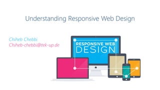


Responsive web design (RWD) involves optimizing images and layouts for different screen sizes to provide an easy viewing experience across devices. As mobile devices are increasingly used to access the internet, responsive design ensures usability regardless of whether someone is on a phone, tablet, or desktop computer. Key techniques include using relative font sizes and fluid grids that flow and adapt to different screen widths, as well as media queries to load different CSS styles for specific screen sizes. Frameworks like Sencha.io and JavaScript libraries can also help serve responsive content to older browsers.