
Recommended
More Related Content
What's hot
What's hot (20)
Viewers also liked
Viewers also liked (20)
Similar to Rihanna and Olly Murs album advert analysis
Similar to Rihanna and Olly Murs album advert analysis (20)
Recently uploaded
Recently uploaded (20)
Rihanna and Olly Murs album advert analysis
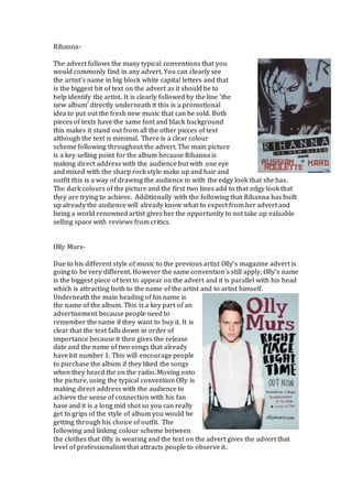
- 1. Rihanna- The advert follows the many typical conventions that you would commonly find in any advert. You can clearly see the artist’s name in big block white capital letters and that is the biggest bit of text on the advert as it should be to help identify the artist. It is clearly followed by the line ‘the new album’ directly underneath it this is a promotional idea to put out the fresh new music that can be sold. Both pieces of texts have the same font and black background this makes it stand out from all the other pieces of text although the text is minimal. There is a clear colour scheme following throughout the advert. The main picture is a key selling point for the album because Rihanna is making direct address with the audience but with one eye and mixed with the sharp rock style make up and hair and outfit this is a way of drawing the audience in with the edgy look that she has. The dark colours of the picture and the first two lines add to that edgy look that they are trying to achieve. Additionally with the following that Rihanna has built up already the audience will already know what to expect from her advert and being a world renowned artist gives her the opportunity to not take up valuable selling space with reviews from critics. Olly Murs- Due to his different style of music to the previous artist Olly’s magazine advert is going to be very different. However the same convention’s still apply. Olly’s name is the biggest piece of text to appear on the advert and it is parallel with his head which is attracting both to the name of the artist and to artist himself. Underneath the main heading of his name is the name of the album. This is a key part of an advertisement because people need to remember the name if they want to buy it. It is clear that the text falls down in order of importance because it then gives the release date and the name of two songs that already have hit number 1. This will encourage people to purchase the album if they liked the songs when they heard the on the radio. Moving onto the picture, using the typical convention Olly is making direct address with the audience to achieve the sense of connection with his fan base and it is a long mid shot so you can really get to grips of the style of album you would be getting through his choice of outfit. The following and linking colour scheme between the clothes that Olly is wearing and the text on the advert gives the advert that level of professionalism that attracts people to observe it.