Call Girl in Bur Dubai O5286O4116 Indian Call Girls in Bur Dubai By VIP Bur D...
King of leon magazine advert analysis
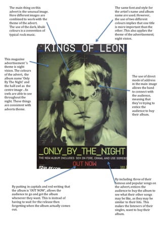
1. The main thing on this
advert is the unusual image.
Here different images are
combined to work with the
theme of the advert.
The use of the dark, khaki
colours is a convention of
typical rock music.
The same font and style for
the artist’s name and album
name are used. However,
the use of two different
colours implies that one title
is more important than the
other. This also applies the
theme of the advertisement;
night vision.
By including three of their
famous and popular songs on
the advert, entices the
audience to buy the album to
see what their other songs
may be like, as they may be
similar to their hits. This
makes the listeners of their
singles, want to buy their
album.
By putting in capitals and red writing that
the album is ‘OUT NOW’, allows the
audience to go and get the album
whenever they want. This is instead of
having to wait for the release then
forgetting when the album actually comes
out.
This magazine
advertisement ‘s
theme is night
vision. The colours
of the advert, the
album name ‘Only
By The Night’ and
the half owl as the
centre image . As
owls are able to see
throughout the
night. These things
are consistent with
adverts theme.
The use of direct
mode of address
in the main image
allows the band
to connect with
the audience,
meaning that
they’re trying to
entice the
audience to buy
their album.