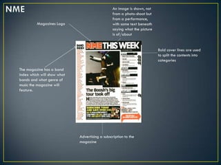
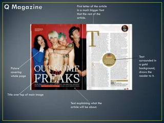
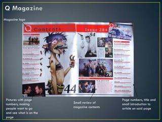
The document describes and compares the layout and design of the contents pages of two music magazines, NME and Q Magazine. Both magazines use bold text and different colors for titles, artists names, and page numbers to make content easy to find. NME uses more graphics and colors, appealing to a younger audience, while Q Magazine has a more mature look but still guides readers through detailed contents. Overall, the magazines have similar contents page structures using features like main cover lines and page layouts, but NME targets younger readers while Q provides more detailed content.


![Mary ellen mark[1]](https://cdn.slidesharecdn.com/ss_thumbnails/maryellenmark1-130620052900-phpapp01-thumbnail.jpg?width=640&height=640&fit=bounds)


