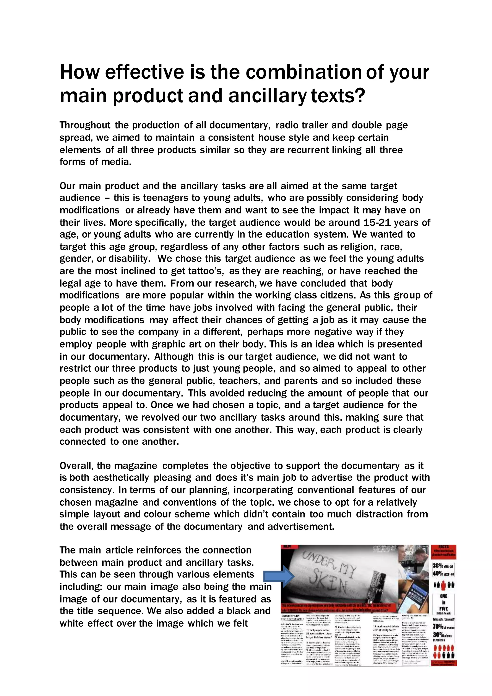
The document discusses how the main documentary product and two ancillary texts (a magazine article and radio trailer) were designed to be consistent and reinforce each other. Specifically:
- The products target teenagers and young adults considering or with body modifications.
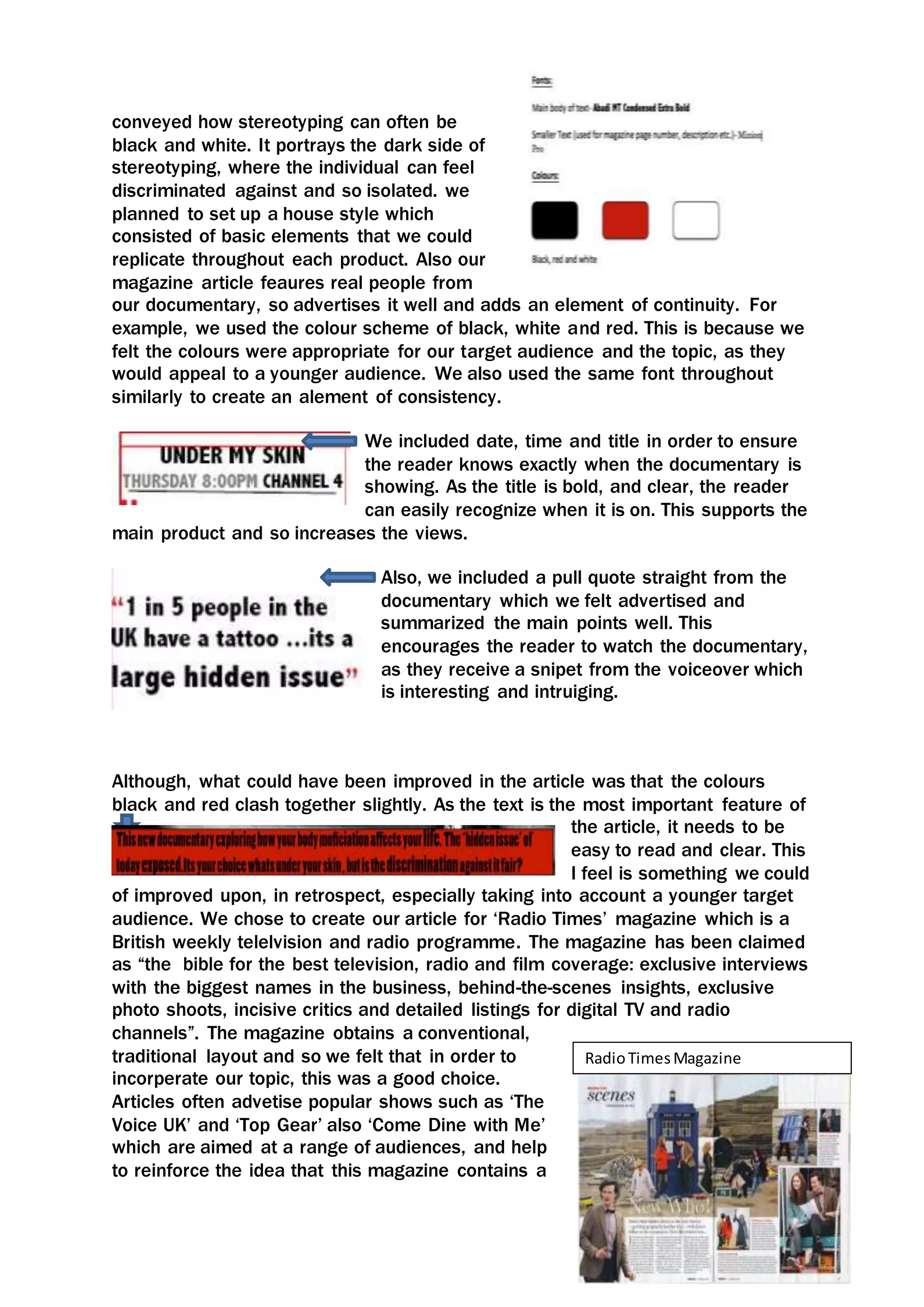
- Elements like images, colors and fonts were replicated across all three products to create a cohesive style.
- The magazine article advertises the documentary by featuring real people interviewed in it and including audio snippets from it.
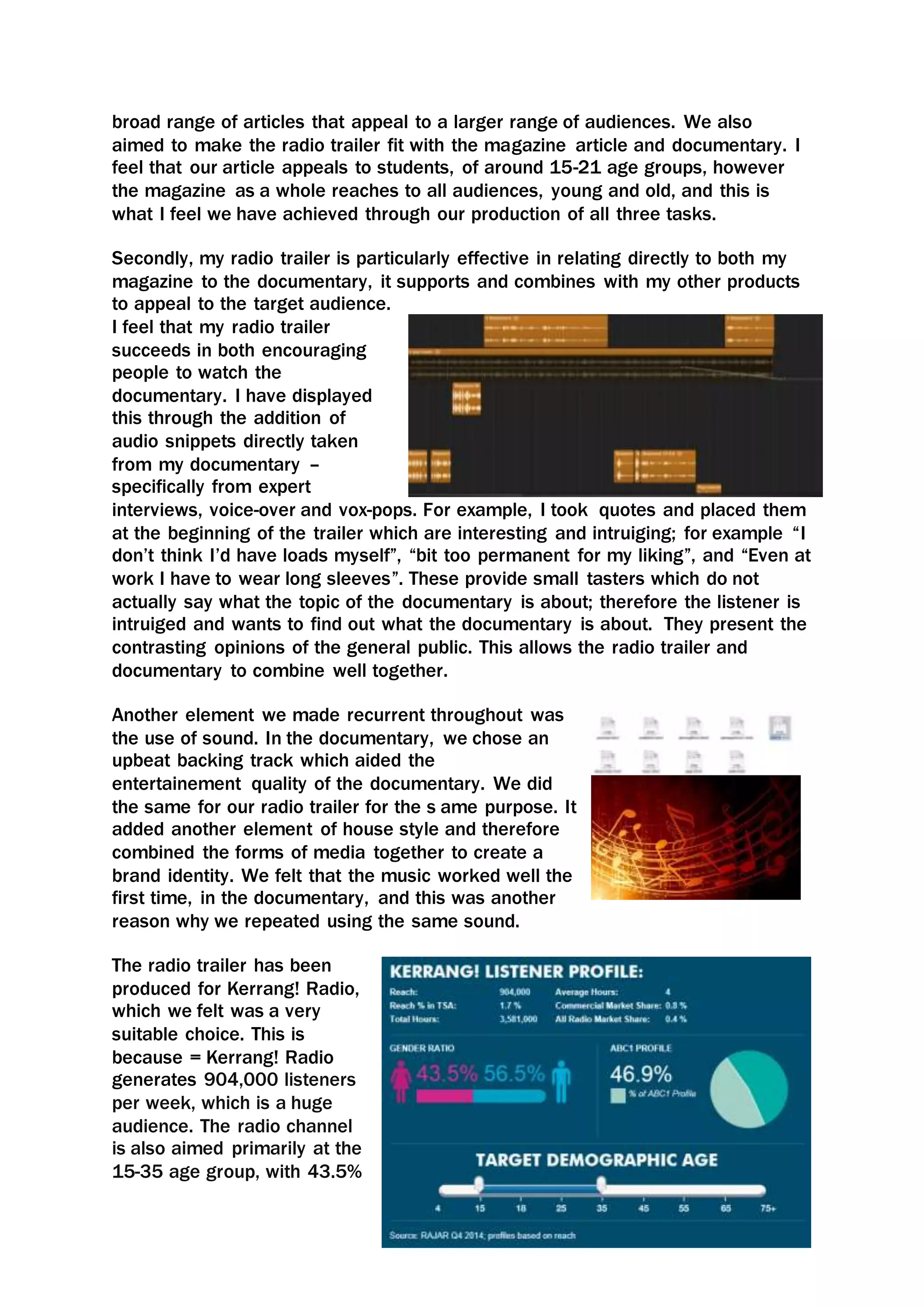
- The radio trailer also uses audio snippets to intrigue listeners and encourage them to watch the documentary.
- An upbeat soundtrack was used in both the documentary and radio trailer to further link the pieces together.


![Reading Techniques [Autosaved].pptxReading Techniques [Autosaved].pptx](https://cdn.slidesharecdn.com/ss_thumbnails/readingtechniquesautosaved-251211193055-b8821f9d-thumbnail.jpg?width=640&height=640&fit=bounds)


