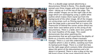
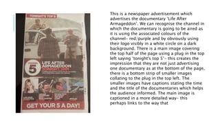
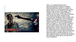
NEWSPAPER DOUBLE
PAGE SPREADS
ADVERTISING
DOCUMENTARIES
Leah Douglas
This is a double page spread advertising a
documentary filmed in Rome. This double page
spread uses three images with one larger than the
other- taking up ¾ of the top of the page. The
other smaller images are on the right side of the
page which are overlapping using a subtle white
outline which makes them stand out from the
background of the other image. All of the images
are using props such as filming equipment which
give the page quite a personal feel as it gives the
impression of behind the scenes action which has
never been seen before prior to the airing of the
documentary. There is a bold, worn text used for
the main headline of the page. This could
demonstrate that when watching this
documentary that we will experience the depths of
Rome as a country and be shown traumatic
footage. There is a sub title underneath the main
headline which is also in white, standing out from
its background image. There is a small text box
on the right page which contains little information
about the genre of the documentary and a bit
about it in general. There is also a plug at the top
This is a newspaper advertisement which
advertises the documentary ‘Life After
Armageddon’. We can recognise the channel in
which the documentary is going to be aired as
it is using the associated colours of the
channel- red/purple and by obviously using
their logo visibly in a white circle on a dark
background. There is a main image covering
the top half of the page using a plug in the top
left saying ‘tonight's top 5’- this creates the
impression that they are not just advertising
one documentary as at the bottom of the page,
there is a bottom strip of smaller images
collating to the plug in the top left. The
smaller images have captions stating the time
and the title of the documentaries which helps
the audience informed. The main image is
captioned in a more detailed way- this
perhaps links to the way that
This is a newspaper advertisement
advertising a documentary which is being
broadcasted on channel 4. This is evident
through the use of graffiti style font on the
channel 4 logo at the right side of the page.
This choice of font links to the theme of
documentary as it is about art. I like this idea
and think I will try and incorporate these
ideas into my own work when I come to
advertise my own documentary. The image
used in the advertisement relates to the
subject of the documentary as the boy is
used as a stereotype of teenage boys and is
relevant to the documentary. The date and
time of the showing of the documentary is at
the bottom left hand corner of the double
page spread. The font is in white on a black
background which makes it stand out as the
contrast of colours is extreme. On the
bottom hand right corner there is a website
link which is the channel 4 websites link to
the documentary and where you can view it
online.
This is an advertisement of a
documentary for channel 4 called
disarming Britain which is stated in
white font on a red background at the
bottom left corner of the page. The
image used on this advertisement
relates to the topic of the documentary.
The image has been edited using
contrast and shadows which makes the
image look mysterious and intriguing-
which is inevitably the purpose of the
advertisement as it will make people
want to watch it. The channel 4 logo is
on the right hand side of the page. In
white which stands out from its dark
background. I have noticed that all of
the advertisements of documentaries
use their logo to show what channel the
documentary is being shown on, it is
also advertising the channel by showing
the audience what genre of television
they broadcast.

Newspaper double page spreads advertising documentaries

  • 1.
  • 2.
    This is adouble page spread advertising a documentary filmed in Rome. This double page spread uses three images with one larger than the other- taking up ¾ of the top of the page. The other smaller images are on the right side of the page which are overlapping using a subtle white outline which makes them stand out from the background of the other image. All of the images are using props such as filming equipment which give the page quite a personal feel as it gives the impression of behind the scenes action which has never been seen before prior to the airing of the documentary. There is a bold, worn text used for the main headline of the page. This could demonstrate that when watching this documentary that we will experience the depths of Rome as a country and be shown traumatic footage. There is a sub title underneath the main headline which is also in white, standing out from its background image. There is a small text box on the right page which contains little information about the genre of the documentary and a bit about it in general. There is also a plug at the top
  • 3.
    This is anewspaper advertisement which advertises the documentary ‘Life After Armageddon’. We can recognise the channel in which the documentary is going to be aired as it is using the associated colours of the channel- red/purple and by obviously using their logo visibly in a white circle on a dark background. There is a main image covering the top half of the page using a plug in the top left saying ‘tonight's top 5’- this creates the impression that they are not just advertising one documentary as at the bottom of the page, there is a bottom strip of smaller images collating to the plug in the top left. The smaller images have captions stating the time and the title of the documentaries which helps the audience informed. The main image is captioned in a more detailed way- this perhaps links to the way that
  • 4.
    This is anewspaper advertisement advertising a documentary which is being broadcasted on channel 4. This is evident through the use of graffiti style font on the channel 4 logo at the right side of the page. This choice of font links to the theme of documentary as it is about art. I like this idea and think I will try and incorporate these ideas into my own work when I come to advertise my own documentary. The image used in the advertisement relates to the subject of the documentary as the boy is used as a stereotype of teenage boys and is relevant to the documentary. The date and time of the showing of the documentary is at the bottom left hand corner of the double page spread. The font is in white on a black background which makes it stand out as the contrast of colours is extreme. On the bottom hand right corner there is a website link which is the channel 4 websites link to the documentary and where you can view it online.
  • 5.
    This is anadvertisement of a documentary for channel 4 called disarming Britain which is stated in white font on a red background at the bottom left corner of the page. The image used on this advertisement relates to the topic of the documentary. The image has been edited using contrast and shadows which makes the image look mysterious and intriguing- which is inevitably the purpose of the advertisement as it will make people want to watch it. The channel 4 logo is on the right hand side of the page. In white which stands out from its dark background. I have noticed that all of the advertisements of documentaries use their logo to show what channel the documentary is being shown on, it is also advertising the channel by showing the audience what genre of television they broadcast.