The advert uses a dull color scheme of dark blacks and maroon to reference the album title "Flaws," suggesting imperfections. It features a photograph of an unhappy girl to imply flaws and convey realism over brightness, aligned with the indie music genre. Separating the album description and a quote in a different font color helps both elements stand out and get the message across effectively.
Presentatie "Social media voor een tanstation in 10 stappen" van Yocter door Godfried van Loo, gepresenteerd op de Benzinedag te Antwerpen, 12 oktober 2011.
Presentatie "Social media voor een tanstation in 10 stappen" van Yocter door Godfried van Loo, gepresenteerd op de Benzinedag te Antwerpen, 12 oktober 2011.
To approach the surplus economy where differentiation is a challenge you need a fresh approach and a clear vision on branding. Credits to Idris Mootee.
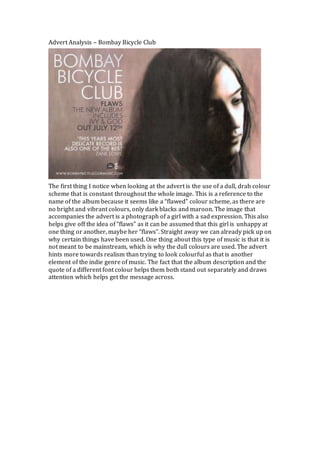
1. Advert Analysis – Bombay Bicycle Club
The first thing I notice when looking at the advert is the use of a dull, drab colour
scheme that is constant throughout the whole image. This is a reference to the
name of the album because it seems like a “flawed” colour scheme, as there are
no bright and vibrant colours, only dark blacks and maroon. The image that
accompanies the advert is a photograph of a girl with a sad expression. This also
helps give off the idea of “flaws” as it can be assumed that this girl is unhappy at
one thing or another, maybe her “flaws”. Straight away we can already pick up on
why certain things have been used. One thing about this type of music is that it is
not meant to be mainstream, which is why the dull colours are used. The advert
hints more towards realism than trying to look colourful as that is another
element of the indie genre of music. The fact that the album description and the
quote of a different font colour helps them both stand out separately and draws
attention which helps get the message across.