Download to read offline
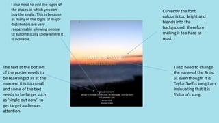
The font color on a poster is too bright and blends into the background, making the text hard to read. The name of the artist needs to be changed to accurately reflect that the song belongs to Taylor Swift, not Victoria. The text at the bottom of the poster requires rearranging - some text like "single out now" should be larger to grab attention, as the current font size is too small. Logos of places where the single can be purchased need to be added, as major distributor logos are very recognizable and will let people know automatically where the single is available.


