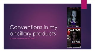
2. Poster – conventions of form
• The placement of the image is conventional for the form, as it is
the in the centre of the page, and is a close up/mid shot of the
main character. This convention is also seen on posters like
Insidious.
• The use of sans serif fonts is conventional, as it is clear and
ordered
• The blocking bill is in the conventional place – also seen on
• Cloverfield poster
• The title of the film is under the image.
• Variety of colours used to grab attention
• Language – the use of the text ‘from the makers of possession’ is
conventional for posters as it grabs a wider audiences attention.
3. Poster – conventions of genre
• The use of reds, to connote violence, and blacks to connote mystery.
• The use of the main character as the image, and using a close up to show
her facial expression – this stands out and also highlights her eyes – this is
conventional in posters of this genre as it shows the emotion and can also
highlight the horror and evil inside of the antagonist of the film.
• The slogan ‘can you keep a secret?’ at the top of the poster is conventional
as it gives a slight insight into the storyline of the movie, and links to the
horror genre as it is using a rhetorical question which makes you question
the film and what is going to happen in the film.
• The low key lighting is conventional as it connotes mystery and fear, but the
high key lighting challenges conventions as this kind of lighting could
connote a more happy type of film. However this type of lighting does make
the character stand out.
• The costume worn is conventional as it links to the normal family lifestyle
which quickly changes storyline – these are common in the horror genre.
• The sans serif font is conventional as it is stands out and makes an impact on
the target audience – as do horror films.
• Language – the film title ‘possession’ links well to the horror genre as it is a
key theme used.
4. Effect of conventions on my target
audience
The effect of using key conventions of form on my poster on my target audience would
be that they would be able to easily identify my product as being a poster, due to the
clear layout and clear blocking bill at the bottom of the poster. The use of the image in
the centre of the poster draws attention to it for the audience.
The effect of using key conventions of genre on my poster on my target audience would
be that they would be able to clearly identify the genre of the poster and film. The use of
colours like reds and blacks connote violence and mystery, which would highlight to the
audience that the genre is horror. The image being central draws attention to it and the
close up shot, highlighting the horror genre.
The use of high key lighting in my image challenges conventions of genre, but highlights
the main character to the target audience. This high key lighting would be associated
with a different genre of film, such as romance films, so this type of lighting may make it
difficult for the audience to know the genre of film.
5. Magazine Cover – conventions of
form
• The font used is sans serif, which is conventional for a
movie magazine poster, also shown on Empire magazine
• There is a variety of colours used
• Cover lines on the left side which link to the genre
• The masthead is in the top centre of the page
• The layout is organized and clear
• The image used is a mid shot, which is conventional and
also seen on Empire magazine. This type of shot shows the
character and their body language, which can give an
insight to the genre.
• The barcode is in the bottom right corner
• Language – other films being mentioned is conventional
to show that it is a movie magazine.
6. Magazine cover – conventions of
genre
• The colours used are conventional as they connote blood, violence
and mystery, which are all key themes within the horror genre.
• The language used is conventional as it mentions other horror films
• The image used would be conventional as it is of the main character,
and is a mid shot so shows her body language and her facial
expression. However a close up would be more conventional.
• The font type is plain and simple, but would also stand out quite well
due to the colours and boldness, which is conventional on a magazine
of this genre.
• The costume worn is conventional as it links to the family storyline, which
is a common storyline in this genre. This gives an insight into the story for
the audience.
• The low key lighting is conventional as it connotes mystery. However,
this lighting would be too low key, so could challenge conventions.
7. Effects of conventions on my target
audience
The effects of using key conventions of form on my magazine cover is that it would be
clear to the audience that it is a movie magazine, as the layout is clear and ordered, and
the language used mentions other films of a similar genre.
The effects of using key conventions of genre on my magazine cover is that it is clear that
it is a horror magazine and that my film is of the horror genre, as it is central. The language
used shows the genre, and the colours (red, blacks and whites) used connote blood and
violence, which are key themes in the horror genre. The font used on my title is the same
as used on the poster, which uses continuity and establishes a key link between the two
products for the audience. The image used is conventional in the genre as you can see
her facial expression slightly, but this image slightly challenges conventions, as it would be
more conventional to use a closer image, or for the image to be a bit lighter for a
magazine cover to make it clearer.