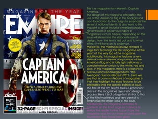
1. This is a magazine from Marvel’s Captain
America.
The design of this magazine integrated the
use of the American flag in the background
as a foundation to the design to emphasis the
sense of national identity & also work to the
thought of an all inclusive American product.
Nevertheless, It becomes evident in
magazines such as Empire, depending on the
issue will determine the elaborate use of
design, how the text is laid out and to what
effect it will have on its audience.
Moreover, the masthead always remains a
large font featuring the title ‘magazine of the
year’ at the very top of the magazine.
Additionally, this magazine features a very
distinct colour scheme, using colours of the
American flag and a fairly right yellow as a
complementary colour to the white, red and
blue. In this magazine, there is a clear link to
previous and upcoming products ‘The
Avengers’ due for release in 2012. here we
see that a common feature of magazines is
that they highlight the extra features to be
integrated into the specific edition or issue.
The title of the film always takes a prominent
place in the magazines layout and design
process. Here it is of a large font similar to that
of the title/masthead and very central to
emphasise the main focus of this issue.
Additionally, this magazine promotes its
contents on the front page as a device to
entice the reader further to purchase the
magazine and find out more or build upon the
foundation they have been given.
2. This is a very unique and distinct magazine front
cover employed by Empire. Compared to the
Captain America issue, this issue features the
elaborate use of direct links to the film, presenting a
sense of anchorage to tie down the main message
of the film. It becomes very evident that this is an
action film and the use of a night vision effect that is
created through a computer generated
programme to create this product.
Nevertheless, further links are made by the use of the
gun being in close proximity to the ‘target’
integrating the words ‘Amazing 2010 preview issue’
to both entice the readers to watch the film and to
also present a direct link to the film as without this the
product will lose its significance. The main aim of
such media products is to market and promote the
film.
One interesting feature is that the barcode is
placed in a place that is not usually given to the
barcode, but given for more elaborate text.
Nevertheless, the subscribing information is given
prominence and segregated to a degree to
emphasise the importance of subscription to such
media products for upcoming offers ad deals. This is
a feature all magazines employ & is something I must
integrate into my own magazine to create a high
quality, professional product.
Looking back at the background image as a basis to
this design is the use of blending and contrasting to
almost hide the image but to also present the theme
of the film in greater detail. This emphasises the
action and violent nature of this film as there is an
exploding car in the background. This links to the
theory of Laura Mulvey on male pleasures, that such
elements in an action film is what attracts men to this
3. Sherlock Holmes stands out with the plain times new
roman font employed by the designers.. The colour
scheme is clear and the blue and white text all helps link it
to image and reinforce it’s purpose on the cover. The
writing SHERLOCK HOLMES is layered on the top to signify
its importance and join the image with the anchorage
text. The words ‘world exclusive’ are integrated to make
the magazine seem new and valuable. The colour of the
background is white in the centre and the surrounding
colour is a sky blue. This Is to signify the main character
Sherlock Holmes as a calm character making the
magazine seem inviting and subtle.
In comparison to Empire, the top of the page is fairly
congested with information, ‘10 coolest Movies being
made Right Now’. This feature allows there to be an
introduction of various characters from other films to be
introduced and from this it becomes evident that different
magazines have alternate design philosophy's which work
to successfully market and promote a film.
Nevertheless, the use of text in this magazine is fairly
straightforward and simple, looking to avoid elaborative
fonts that may mislead the audience. This again works to
link the films themes and narrative to the way in which the
media products such as magazines and posters are
designed.
Moreover, the price of the magazine is reflective of its
target audience. This could be identified as a middle-
working class magazine priced at £4.99. Taking into
consideration the genre of the film as well, this could be
aimed at a middle class demographic.