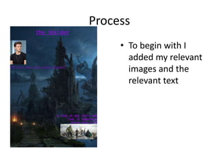
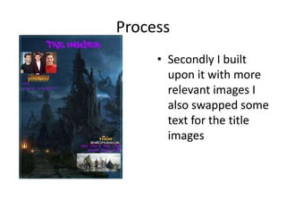
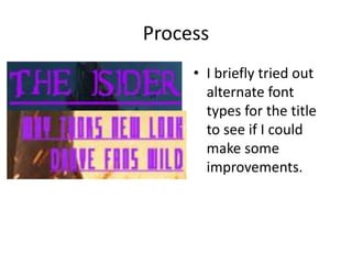
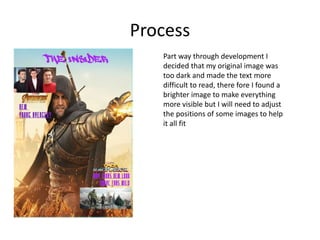
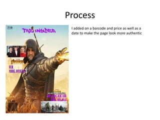
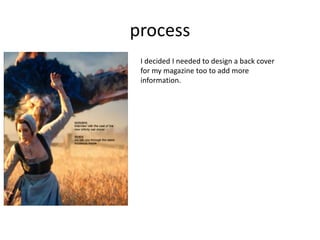
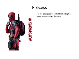
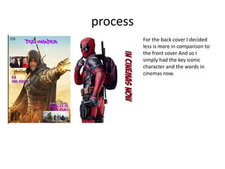
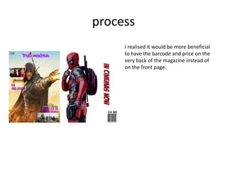
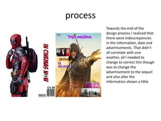
Production Reflection
Cameron bird
Process
• To begin with I
added my relevant
images and the
relevant text
Process
• Secondly I built
upon it with more
relevant images I
also swapped some
text for the title
images
Process
• I briefly tried out
alternate font
types for the title
to see if I could
make some
improvements.
Process
Part way through development I
decided that my original image was
too dark and made the text more
difficult to read, there fore I found a
brighter image to make everything
more visible but I will need to adjust
the positions of some images to help
it all fit
Process
I added on a barcode and price as well as a
date to make the page look more authentic
process
I decided I needed to design a back cover
for my magazine too to add more
information.
Process
For the back page I decided the best option
was a separate advertisement
process
For the back cover I decided
less is more in comparison to
the front cover And so I
simply had the key iconic
character and the words in
cinemas now.
process
I realised it would be more beneficial
to have the barcode and price on the
very back of the magazine instead of
on the front page.
process
I decided to add a little more
detail to the back page while
keeping the simplistic
theme. I also swapped the
pages over after realising I
had put them on the wrong
sides.
process
Towards the end of the
design process I realised that
there were indescrepencies
in the information, date and
advertisements. That didn’t
all correlate with one
another, all I needed to
change to correct this though
was to change the
advertisement to the sequel
and also alter the
information shown a little

6. fmp production reflection

  • 1.
  • 2.
    Process • To beginwith I added my relevant images and the relevant text
  • 3.
    Process • Secondly Ibuilt upon it with more relevant images I also swapped some text for the title images
  • 4.
    Process • I brieflytried out alternate font types for the title to see if I could make some improvements.
  • 5.
    Process Part way throughdevelopment I decided that my original image was too dark and made the text more difficult to read, there fore I found a brighter image to make everything more visible but I will need to adjust the positions of some images to help it all fit
  • 6.
    Process I added ona barcode and price as well as a date to make the page look more authentic
  • 7.
    process I decided Ineeded to design a back cover for my magazine too to add more information.
  • 8.
    Process For the backpage I decided the best option was a separate advertisement
  • 9.
    process For the backcover I decided less is more in comparison to the front cover And so I simply had the key iconic character and the words in cinemas now.
  • 10.
    process I realised itwould be more beneficial to have the barcode and price on the very back of the magazine instead of on the front page.
  • 11.
    process I decided toadd a little more detail to the back page while keeping the simplistic theme. I also swapped the pages over after realising I had put them on the wrong sides.
  • 12.
    process Towards the endof the design process I realised that there were indescrepencies in the information, date and advertisements. That didn’t all correlate with one another, all I needed to change to correct this though was to change the advertisement to the sequel and also alter the information shown a little

Editor's Notes

  • #3 Discuss the tools and processes used in your production. Log your thoughts and feelings about your work.
  • #4 Discuss the tools and processes used in your production. Log your thoughts and feelings about your work.
  • #5 Discuss the tools and processes used in your production. Log your thoughts and feelings about your work.
  • #6 Discuss the tools and processes used in your production. Log your thoughts and feelings about your work.
  • #7 Discuss the tools and processes used in your production. Log your thoughts and feelings about your work.