7. Looking back at your preliminary
task, what do you feel you have learnt in
   the progression from it to the full
                product?
Cover Comparison

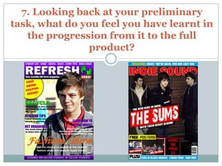
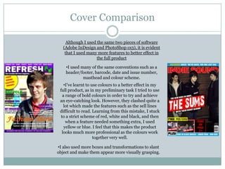
     Although I used the same two pieces of software
   (Adobe InDesign and PhotoShop cs3), it is evident
    that I used many more features to better effect in
                     the full product

    •I used many of the same conventions such as a
    header/footer, barcode, date and issue number,
             masthead and colour scheme.
    •I’ve learnt to use colours to a better effect in my
 full product, as in my preliminary task I tried to use
   a range of bold colours in order to try and achieve
 an eye-catching look. However, they clashed quite a
    lot which made the features such as the sell lines
 difficult to read. Learning from this mistake, I stuck
  to a strict scheme of red, white and black, and then
     when a feature needed something extra, I used
    yellow or blue. I feel that this makes the product
   looks much more professional as the colours work
                     together very well.

•I also used more boxes and transformations to slant
object and make them appear more visually grasping.
Cover Comparison (continued)

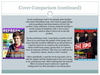
    •In the preliminary task I was already quite familiar
   with many PhotoShop tools, and I tried to apply things
      such as gradients and drop shadows all over the
   product. Upon reflection, it seems cluttered and that it
       needs a pinch of simplicity with a ‘less is more’
       approach, which is what I tried to do in the full
                          product

   •In the preliminary task, I used quite a number of sell
    lines to try and frame the subject of the image, but I
   knew that this would be difficult in my full product as
      I had my mind set on a band as the main feature,
     which would mean using a group shot, so I steered
   clear of using any sell lines. This way you could see the
          band more clearly, which is what I wanted

    •More specifically, I used the levels tool quite a lot to
   edit the subject and the background of the cover image
   in my preliminary task. After realising that the desired
         effect of contrast wasn’t achieved, I made the
      background very dull and plain in my full product
Contents Page Comparison

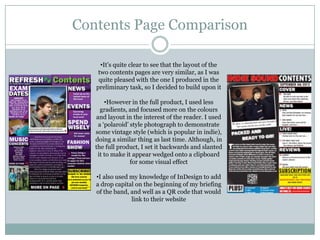
     •It’s quite clear to see that the layout of the
    two contents pages are very similar, as I was
    quite pleased with the one I produced in the
   preliminary task, so I decided to build upon it

       •However in the full product, I used less
     gradients, and focused more on the colours
   and layout in the interest of the reader. I used
    a ‘polaroid’ style photograph to demonstrate
   some vintage style (which is popular in indie),
   doing a similar thing as last time. Although, in
   the full product, I set it backwards and slanted
    it to make it appear wedged onto a clipboard
                 for some visual effect

   •I also used my knowledge of InDesign to add
   a drop capital on the beginning of my briefing
   of the band, and well as a QR code that would
                link to their website
Conclusion

 I believe that since my preliminary task, I have
 developed a broader range of skills within InDesign
 and PhotoShop, using features more effectively to
 appeal to the target audience

 I think that my sense of design has also improved, in
 that I have become much more disciplined in using
 the layout and effects of features/objects, rather than
 just using every skills I know when it may not be
 relevant to the task

Question 7 evaluation

  • 1.
    7. Looking backat your preliminary task, what do you feel you have learnt in the progression from it to the full product?
  • 2.
    Cover Comparison Although I used the same two pieces of software (Adobe InDesign and PhotoShop cs3), it is evident that I used many more features to better effect in the full product •I used many of the same conventions such as a header/footer, barcode, date and issue number, masthead and colour scheme. •I’ve learnt to use colours to a better effect in my full product, as in my preliminary task I tried to use a range of bold colours in order to try and achieve an eye-catching look. However, they clashed quite a lot which made the features such as the sell lines difficult to read. Learning from this mistake, I stuck to a strict scheme of red, white and black, and then when a feature needed something extra, I used yellow or blue. I feel that this makes the product looks much more professional as the colours work together very well. •I also used more boxes and transformations to slant object and make them appear more visually grasping.
  • 3.
    Cover Comparison (continued) •In the preliminary task I was already quite familiar with many PhotoShop tools, and I tried to apply things such as gradients and drop shadows all over the product. Upon reflection, it seems cluttered and that it needs a pinch of simplicity with a ‘less is more’ approach, which is what I tried to do in the full product •In the preliminary task, I used quite a number of sell lines to try and frame the subject of the image, but I knew that this would be difficult in my full product as I had my mind set on a band as the main feature, which would mean using a group shot, so I steered clear of using any sell lines. This way you could see the band more clearly, which is what I wanted •More specifically, I used the levels tool quite a lot to edit the subject and the background of the cover image in my preliminary task. After realising that the desired effect of contrast wasn’t achieved, I made the background very dull and plain in my full product
  • 4.
    Contents Page Comparison •It’s quite clear to see that the layout of the two contents pages are very similar, as I was quite pleased with the one I produced in the preliminary task, so I decided to build upon it •However in the full product, I used less gradients, and focused more on the colours and layout in the interest of the reader. I used a ‘polaroid’ style photograph to demonstrate some vintage style (which is popular in indie), doing a similar thing as last time. Although, in the full product, I set it backwards and slanted it to make it appear wedged onto a clipboard for some visual effect •I also used my knowledge of InDesign to add a drop capital on the beginning of my briefing of the band, and well as a QR code that would link to their website
  • 5.
    Conclusion  I believethat since my preliminary task, I have developed a broader range of skills within InDesign and PhotoShop, using features more effectively to appeal to the target audience  I think that my sense of design has also improved, in that I have become much more disciplined in using the layout and effects of features/objects, rather than just using every skills I know when it may not be relevant to the task