Download to read offline
![International Research Journal of Engineering and Technology (IRJET) e-ISSN: 2395-0056
Volume: 10 Issue: 10 | Oct 2023 www.irjet.net p-ISSN: 2395-0072
© 2023, IRJET | Impact Factor value: 8.226 | ISO 9001:2008 Certified Journal | Page 68
Analyzing Value and Risk
Determining complex metrics such as value and risk
requires many different variables to be factored in, making
it almost impossible to see accurately with a plain
spreadsheet. data viz can be as simple as color-coding a
formula to show which opportunities are valuable and
which are risky.
Plot patterns to make predictions.
Combined with advanced analytics, big data viz helps
business cases that require finding patterns in data sets.
Some of these patterns can be seen with the naked eye, for
example, on a bubble plot. Others can be recognized only
by smart, easy-to-understand algorithms. Using patterns &
other insights, executives can make predictions by
identifying trends and building a strategy based on real
insights rather than assumptions. data viz allows us to
recognize emerging trends and respond quickly on the
grounds of what we see. Such patterns make more sense
when graphically represented; because visuals and
diagrams make it easier for us to identify correlated
parameters. Certain relations are obvious, but others need
to be recognized carefully and clarified to help us
concentrate on a particular data point that can affect
business.
Determining errors
This advantage clearly shows why data viz is important,
even indispensable. In some cases, visualized data can
show errors, and inaccuracies or even help measure risks.
Monitoring the performance of paper printing machines,
for example, can help determine errors before they lead to
malfunction or breakdown. In terms of people’s safety, it
relates to preventing accidents at the workplace and, in
some cases, even saving lives.
2. LITERATURE SURVEY
Marketing analytics is a field that leverages data to
enhance marketing decision-making. This case study
offers an overview of marketing analytics specifically
focusing on visualization, segmentation, and class
prediction. It also explores the connections between
marketing analytics and other disciplines like expert
systems, statistics, and operations research [1].
A study conducted in this research below[2] determined
that business analytics has an impact on marketing
performance particularly when mediated by marketing.
Essentially businesses that utilize business analytics to
comprehend their customers and market trends can
enhance their marketing performance by leveraging
channels to connect with and engage their customers.
Customer relationship management (CRM) enables
retailers to collect and analyze customer data to gain
insights into customer behavior. This information can be
utilized to anticipate customer responses over time and
develop targeted marketing strategies geared toward
enhancing customer satisfaction and overall company
value [3]
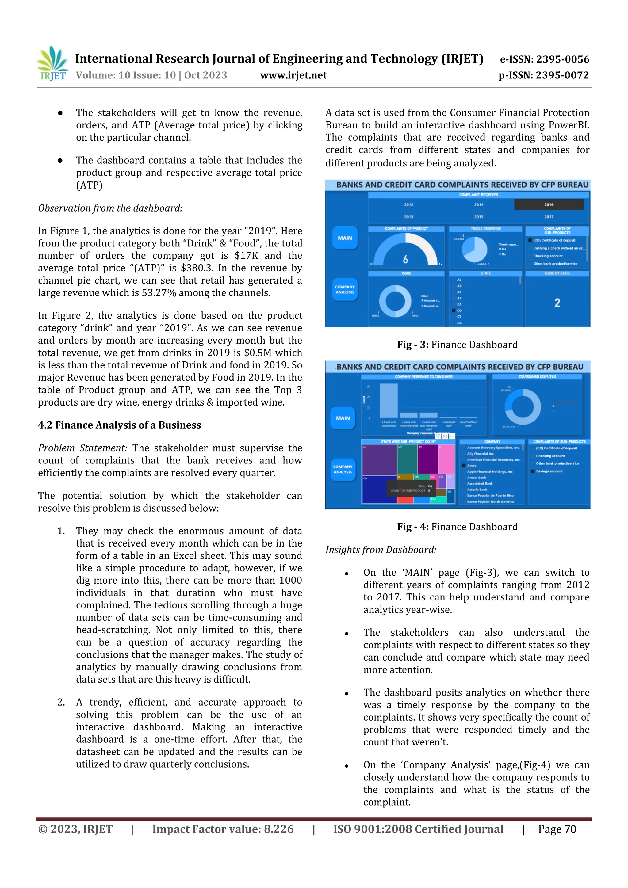
Finance is a very important aspect of business.
Understanding the capital markets, sales, cash flow,
revenue, profit-loss, etc. is not everybody’s cup of tea.
Comparing these aspects simultaneously can help
understand the company’s roadmap. Some of the aspects
of finance like intertemporal and portfolio decisions can
generate time series which can be used to predict future
values [4].
The paper studies [5] that Bank providers must attempt to
better understand their customers in an attempt not only
to anticipate but also to influence and determine
consumer buying behavior. The paper accordingly
presents and develops a model that attempts to articulate
and classify consumer behavior in the purchasing of
financial products and services.
The 21st-century emerging phenomenon of Fintech is a
widely popular concept. Financial technology (Fintech) is
about technology that aims to automate the use of
financial services. Fintech has twin foundations namely
data science discipline and finance expertise, like
fundamental knowledge in investment analysis offered by
the CFA program. The industry is dependent on roles like
machine learning and data engineers' expertise in finance.
Sales data [6] can contain many records, and filtering sales
data to identify significant intuitions is a frequent strategy
in sales analysis. Managers and owners benefit from tools
like dashboards for visualizing gathered data. The
products that are offered by various sales locations are
typically shown by certain tools.
3. PROPOSED IDEA
Concentrating on the business sector, an idea to utilize the
data viz tool to simplify data understanding is proposed in
this paper. There are instances wherein the stakeholders
may not be experts in a particular field and to navigate
them through the story of data, a dashboard comes in
handy. In this paper, the three major niches of business;
sales, finance, and marketing are chosen to demonstrate
how dashboards enhance storytelling and interpretation
in the field of business. The dataset for the respective
niches is taken and a dashboard is made to demonstrate
the difference that data viz creates in decision making. It
highlights how data viz benefits the business stakeholders
and can be a very reliable alternative for the decision-
making process in a business.](https://image.slidesharecdn.com/irjet-v10i1011-240109131048-f4737ad7/75/Data-Visualization-advances-Business-by-promoting-easy-story-telling-and-informed-decision-making-using-Microsoft-Business-Intelligence-2-2048.jpg)
![International Research Journal of Engineering and Technology (IRJET) e-ISSN: 2395-0056
Volume: 10 Issue: 10 | Oct 2023 www.irjet.net p-ISSN: 2395-0072
© 2023, IRJET | Impact Factor value: 8.226 | ISO 9001:2008 Certified Journal | Page 72
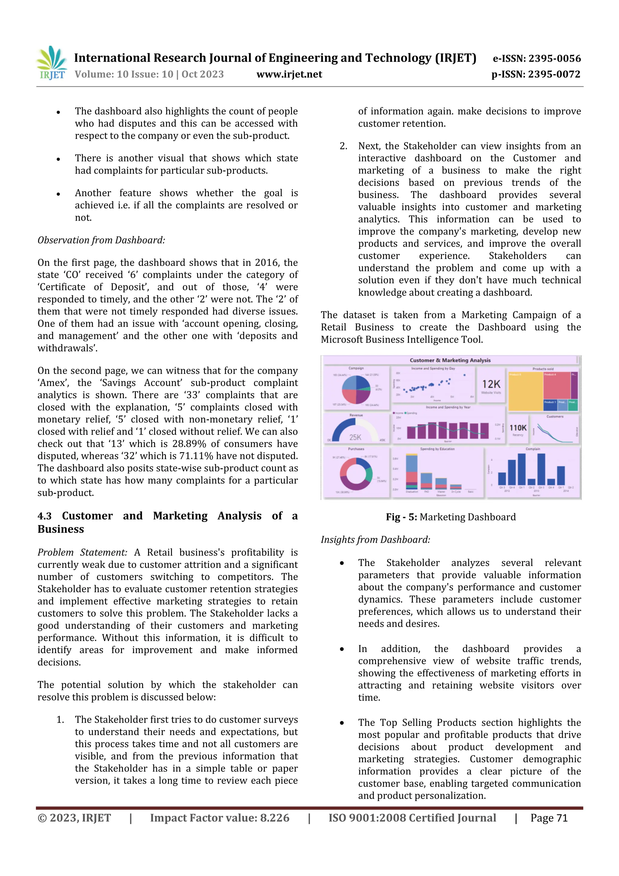
In addition, the analysis shows Education vs.
consumption that highly educated customers
spend more, suggesting marketing efforts aimed
at this demographic.
Finally, quality feedback analysis sheds light on
common customer complaints related to product
quality and informs efforts to improve the overall
quality of products and services. Together, these
parameters enable a Stakeholder to make
informed decisions, refine strategies, and promote
business growth.
Observation from Dashboard:
Observing The number of website visits has steadily
increased over the past year. This suggests that the
marketing efforts are working, and the company is
attracting more visitors to its website. Product ‘6’ is the
most popular and top-selling product, followed by Product
‘1’. This information can be used to guide product
development and marketing.
Most customers are aged 25-34. This information can be
used to target marketing messages and develop products
and services that appeal specifically to that demographic.
Highly educated customers spend more money. This
suggests that the company should focus its marketing on
this demographic.
The most common complaint concerns the quality of the
products. This information can be used to improve the
quality of the products and services provided by the
company.
5. KEY FINDINGS
● BA can be used to improve customer analytics by,
segmenting customers, understanding customer
churn, and measuring customer satisfaction.
● BA can be used to improve marketing analytics by,
tracking the performance of marketing
campaigns, measuring the ROI of marketing
campaigns, and identifying new market
opportunities.
● BA extensively utilizes data-driven insights to
provide optimized financial processes like
investment decisions, and risk management
strategies, cost analysis, compliance, and
performance analysis, with the ultimate aim to aid
organizations in achieving an edge in the industry.
6. CONCLUSIONS
Answering detailed analytics to make informed decisions
without the help of these interactive dashboards isn’t easy.
The stakeholders, even with very little background in
finance, can easily interpret the dashboard and make
decisions. This is a rough analytics board that can differ in
reference to the requirements of the company. The
company may want to create and combine different sets of
data points to get results that satisfy their needs.
Implementing a dashboard in the field of finance can be a
breakthrough. These dashboards and their results can
encourage further research and implementation in
predictive analysis. Likewise, businesses understand
customer behavior, track the performance of marketing
campaigns, identify new growth opportunities, and be
better at how they allocate their resources, where they
expand, and the products and services they offer.
Businesses can use analytics to identify the most
profitable customer segments and target those segments
with specific marketing campaigns. Alternatively,
businesses can use analytics to track the performance of
marketing campaigns and determine which campaigns are
most effective.
7. REFERENCES
[1] France, Stephen & Ghose, Sanjoy. (2019). Marketing
Analytics: Methods, Practice, Implementation, and
Links to Other Fields. Expert Systems with
Applications. 119. 456-475.
10.1016/j.eswa.2018.11.002.
[2] Kabiraj, S. and Joghee , S. (2023) “Improving
Marketing Performance: How Business Analytics
contribute to Digital Marketing”, International Journal
of Technology, Innovation and Management (IJTIM),
3(1), pp. 9–18. doi: 10.54489/ijtim.v3i1.209.
[3] Verhoef, Peter & Venkatesan, Rajkumar & McAlister,
Leigh & Malthouse, Edward & Krafft, Manfred &
Ganesan, Shankar. (2010). CRM in Data-Rich
Multichannel Retailing Environments: A Review and
Future Research Directions. Journal of Interactive
Marketing - J INTERACT MARK. 24.
10.1016/j.intmar.2010.02.009.
[4] J.G. De Gooijer, R.J. Hyndman “25 years of time series
forecasting”
[5] Int J Forecast, 22 (2006), pp. 443-473 Beckett, A.,
Hewer, P. and Howcroft, B. (2000), "An exposition of
consumer behaviour in the financial services
industry", International Journal of Bank Marketing,
Vol. 18 No. 1, pp.15-
26.https://doi.org/10.1108/02652320010315325](https://image.slidesharecdn.com/irjet-v10i1011-240109131048-f4737ad7/75/Data-Visualization-advances-Business-by-promoting-easy-story-telling-and-informed-decision-making-using-Microsoft-Business-Intelligence-6-2048.jpg)
![International Research Journal of Engineering and Technology (IRJET) e-ISSN: 2395-0056
Volume: 10 Issue: 10 | Oct 2023 www.irjet.net p-ISSN: 2395-0072
© 2023, IRJET | Impact Factor value: 8.226 | ISO 9001:2008 Certified Journal | Page 73
[6] Damodar, Harsh, Hitesh & Rashid (2021). An
application for sales data analysis and visualization
using python and django. International Research
Journal of Modernization in Engineering Technology
and Science Vol.18 No.06 pp-1757. e-ISSN: 2582-5208
[7] P., Priyadarshini & Kalyan, Veeramanju. (2022).
Business Intelligence for the Evaluation of Customer
Satisfaction in E-Commerce Websites- A Case Study.
International Journal of Management, Technology, and
Social Sciences. 660-668.
10.47992/IJMTS.2581.6012.0243.](https://image.slidesharecdn.com/irjet-v10i1011-240109131048-f4737ad7/75/Data-Visualization-advances-Business-by-promoting-easy-story-telling-and-informed-decision-making-using-Microsoft-Business-Intelligence-7-2048.jpg)

1) The document discusses how data visualization advances business by promoting easy storytelling and informed decision-making using Microsoft Business Intelligence. It explores how data visualization serves as a transformative tool, facilitating seamless storytelling and informed decision-making through platforms like Microsoft BI. 2) The document proposes using data visualization tools across sales, finance, and marketing domains to simplify data understanding and enhance decision-making in today's data-driven business environment. Interactive dashboards are created using sample datasets from different business areas to demonstrate how data visualization benefits stakeholders and can be a reliable alternative for decision-making. 3) Insights from the interactive dashboards show how data visualization can provide key metrics and trends to stakeholders in different